Build Design Systems With Penpot Components
Penpot's new component system for building scalable design systems, emphasizing designer-developer collaboration.
medium bookmark / Raindrop.io |
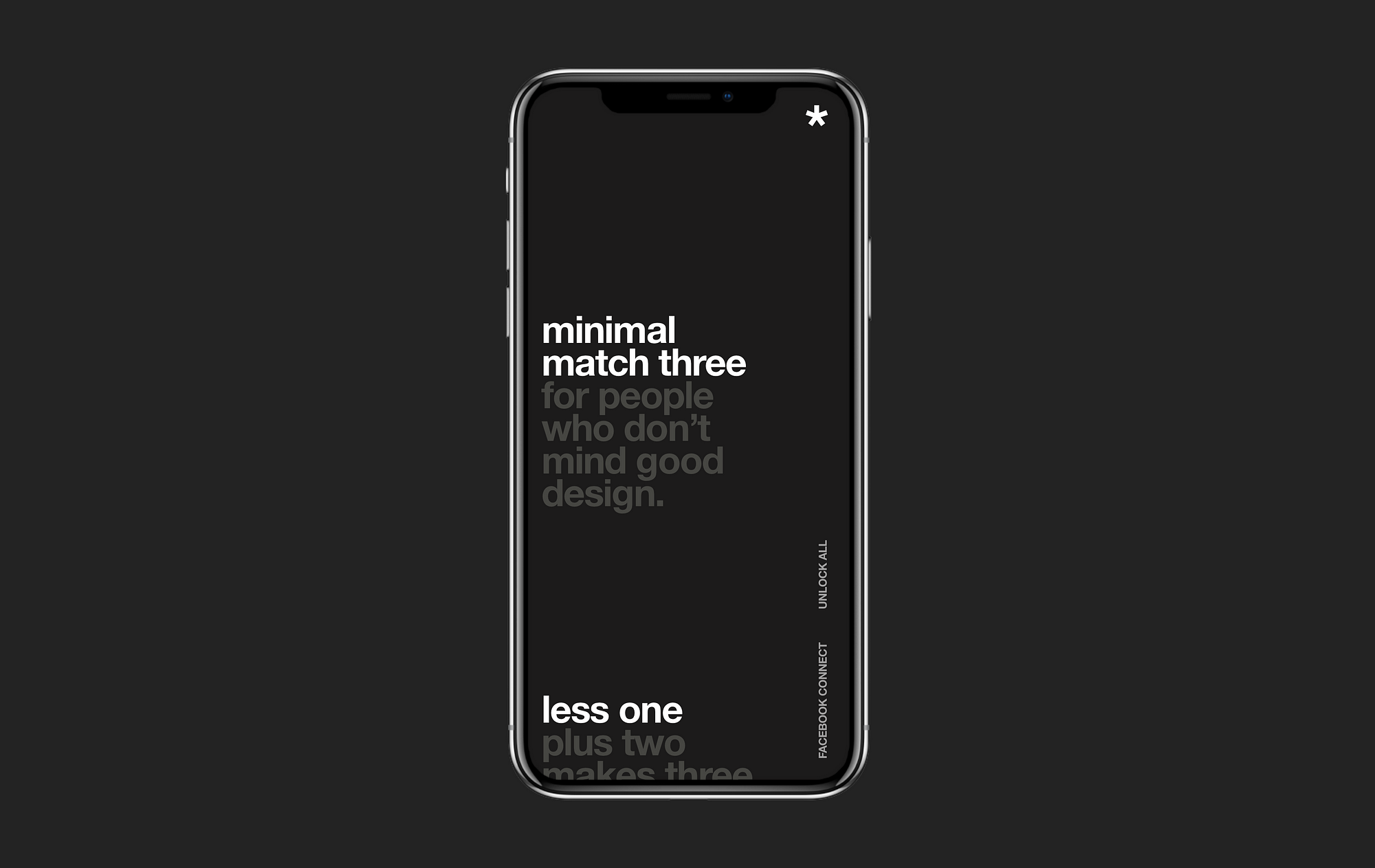
Minimal Match Three — Home Screen
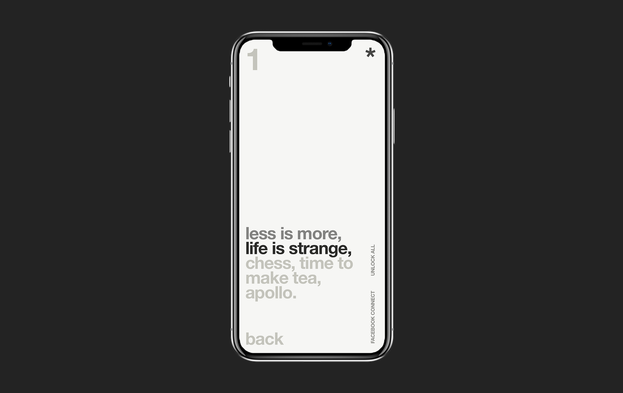
To solve an interactive navigation like a video game, in this case a match three game, the UI needs to lean into the same interactions of the native apple interface
The design for this match three app is based on the idea that popular app genres can have modern clean aesthetics, simple gameplay design and tell a story without resorting to candy crush-ing or cute animals.
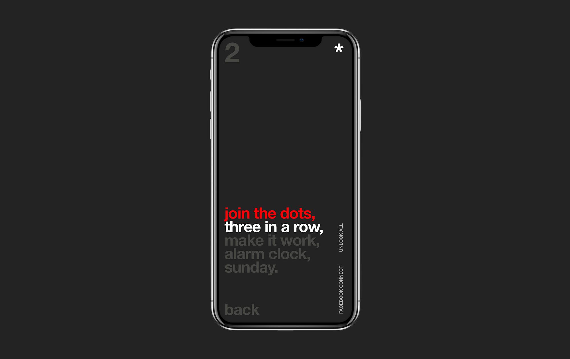
Minimal Match Three—Level Selection
The navigation of Minimal Match Three is bottom left, top right and centre stage. I’ll go into some more detial:
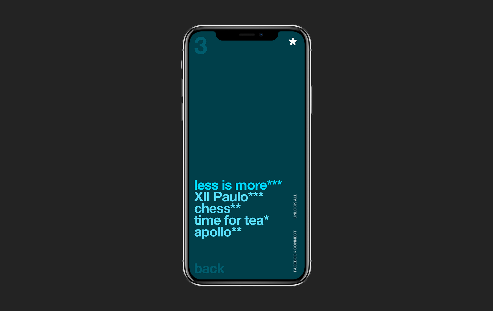

Minimal Match Three — Gameplay area
The area of gameplay that is available on large screen is minimal when held in portrait mode, and smaller still when standing on a crowded moving bus.
iPhone X makes UI design easy—because all there is no UI
The UI disappears, there is no need for faint lines, small arrows, tiny text.
UI on iPhone X is should be as invisible as the iPhone itself, the content should be the main interaction point.
In this respect text as a button — something Windows Phone innovated on, is a interesting new UI pattern for the iPhone X.
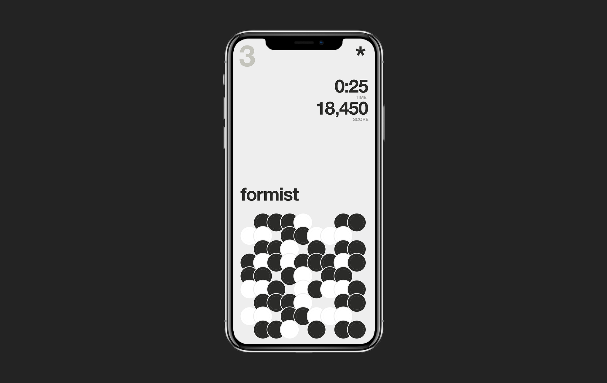

Minimal Match Three—Level Theme Progression
In the advertisements by Samsung for the edgeless display content becomes the focus of the device not the UI.
What Apple understands is that by removing the edge of the screen you need to remove the UI at the same time, and by doing so the content needs to work harder then ever to convey the actions the user should take next.
Now more then ever, content that is not clickable, is not usable.
If you want to talk more about design — feel free to reach out at zakarykinnaird.com or find me on LinkedIn.
Show your support
Clapping shows how much you appreciated Zakary Kinnaird’s story.
Be the first to write a response…
prototypr.io
AI-driven updates, curated by humans and hand-edited for the Prototypr community