The End of Reading Is Here
Jul 8, 12:08 PM
Optimists once believed that universal literacy was inevitable. Now it seems that the age of reading might be a short anomaly in human history.
theatlantic.com
medium bookmark / Raindrop.io |
How much hell are you willing to put your users through?
Of course the answer you’d like to give is “None!” But if you’re developing web applications, you’re going to make your users wait for results at some point.
“ While speedy response times are best, there are simply times when even a server upgrade won’t allow you to comply with the guidelines for system speed. In these cases, you simply must reassure the user that the computer isn’t out for lunch but is working faithfully on their request. “ — Progress Indicators Make a Slow System Less Insufferable
Waiting is a pain point. No one’s favorite part of a roller coaster ride is the wait leading up to it.

Totally looks like fun.
If waiting is a given, we should do everything we can to lessen that pain for the sake of our users. Disney has experimented with “interactive waiting lines” for their rides. While it’s about as fun as it sounds, at least it’s something.
In web development, we do something almost as fun: progress indicators. (Also called: progress bars, throbbers, loading bars, loading circles, loading icons, spinning pinwheels, or wait cursors.)
Here are the 7 Levels of Progress Indicator Hell from least painful to most painful.

This is a progress indicator that displays the accurate status of your application. It is difficult to do well and requires a lot of extra code (besides doing what the user asked the application to do). It’s great for users — but still belongs in Hell because waiting is a pain point no matter how accurate the wait time is.
The Accurate Progress Display is tough to pull off. Developers have been struggling with the problem for decades. If you’re the UX person pitching it, your team might ask if you can achieve a similar effect without as much dev effort.

Many applications can approximate the wait time for users. The progress indicator can touch on different stages of a request and let users know. It’s not great because the time spent in each stage can differ wildly, leading to a “jumpy” progress bar.
For example, the call could take 20% of the time, the query 70% of the time, the sort 2% of the time, and the return 8% of the time. The user spends most of their time staring at a bar that is 20% full and then suddenly it jumps a bit and is done.
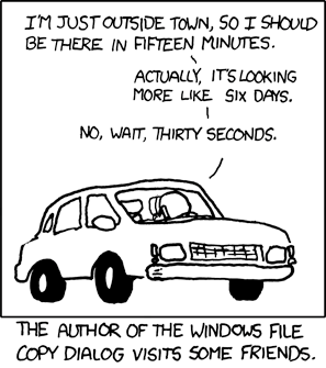
Credit: https://xkcd.com/612/

A throbber is a simple spinning or loading indicator that animates infinitely. At this level, we add perception tricks that make the user feel as if the loading is happening faster than it is.
“It is argued that subjective time is not only the most readily manipulated, but also the most important. After all, our perception is our reality. We do not have to make faster computers to make computers feel faster. “- Chris Harrison
You can use perception tricks on Accurate and Semi-Accurate Progress Displays too. But they are most needed at the Third Level of Progress Indicator Hell and below, where forward progress is not measured and the wait can be most frustrating.
Here’s three of my favorite:
Not all progress bar designs are created equal. Some appear to fill faster than others. Chris Harrison has researched this, pitting various designs head-to-head against each other:
UX designers must balance this perception trick with the application / brand design.
Provide some text to the user (true or fake) about the status of the application.
“Many times, if users are informed, they may be more patient. It can be helpful to add additional clarity by including text that tells the user what is happening or explains why the user is waiting.” — Smashing Magazine
Adobe does a good job of this. Check out “Reading brushes…” below. (Adobe cycles through dozens of these statuses depending on how long it takes to load on the user’s machine.)

Studies have shown humor’s effectiveness in alleviating anxiety. Savvy businesses, like Southwest Airlines, often use humor during times of potential anxiety:
A masterclass in how to relieve anxiety with humor
Waiting on a response from an application definitely raises anxiety levels in users, and humor can be a great tool to alleviate that. (This is best in consumer-facing applications, as it may not be acceptable in some enterprise applications.)

To users, it appears that a progress bar is moving somewhat quickly, then it slows down and down and down, until finally they can’t tell if it’s moving at all.
This is a pretty mean trick to pull on users, though developers may have had nothing but good intentions. The devs coded a progress indicator that is essentially a throbber but looks like a bar filling up. It slows down as the request takes longer, crawling along the asymptote at an infinitesimal non-zero pace until the request is complete (if the request completes!), and at that point the meter shoots up to full.

To developers this looks like a working solution that is mathematically elegant. Unfortunately, users hate it.
“Changes in speed will be noticed and will impact user satisfaction: if the progress moves quickly only to hang on the last percentage remaining, the user will become frustrated and the benefits of showing progress will be negated.”— Progress Indicators Make a Slow System Less Insufferable

You see this all over software applications.


These are just animations that loop. Throbbers tell users the application is working on a request, but make them wait too long and they’ll abandon it. Throbbers are best used with short requests. If used with perception tricks, they can move up two levels of Progress Indicator Hell. Else, they remain here.
“Showing an animated graphic on loop offers feedback that the system is working, but it doesn’t give any information about how long the user will have to wait… And if a spinner is rotating indefinitely, users cannot be sure if the system is still working or if it’s stopped, so they may decide to abandon the task entirely. “— Progress Indicators Make a Slow System Less Insufferable

Or:

You typically see this on government websites or applications where consumers have little choice in the market. (My health insurance portal recently dropped this one on me.)
Intellectually, there is little difference between this and a infinitely-looped animation. But static text just feels so frozen.
Users are more likely to feel your app is stuck or broken with this type of progress indicator.
The Nielsen Norman Group says it best: “Static progress indicators: Don’t use them.”

No progress indicator whatsoever.
Just the still husk of your application’s frozen interface working hard in the background while the user sits there bewildered, frustrated, praying for the end to come.

With Connections, a web-based insurance management application, we sometimes left users in the Seventh Level of Progress Indicator Hell. It was my goal to get us to at least the Third Level.
We implemented a YouTube-inspired progress bar in our header to display the progress of the user’s database request.

It’s basically a throbber, but we used a few perception tricks to ease the anxiety of waiting for our users:
It’s a pain point of every software application. Hopefully I’ve shown that your application can rise from the depths with a little UX and design work. Don’t let your users wallow in the pits of Progress Indicator Hell. The uppermost level of an Accurate Progress Display might not be doable in your application, but with a little creativity, you can rise up and keep the waiting pain low.
AI-driven updates, curated by humans and hand-edited for the Prototypr community