New Posts
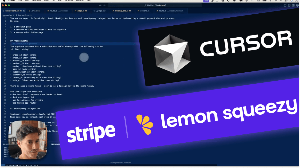
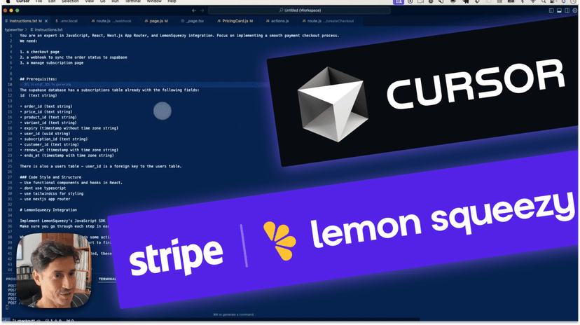
What's Cursor Composer? How to Build Full Apps with AI
Composer in Cursor can pretty much write a full app for you using AI like Claude (Anthropic). Composer progresses Cursor's AI code assistance from just editing single lines of code and individual pages, to editing and creating multiple pages at once.
Trending in Toolbox
Latest Posts
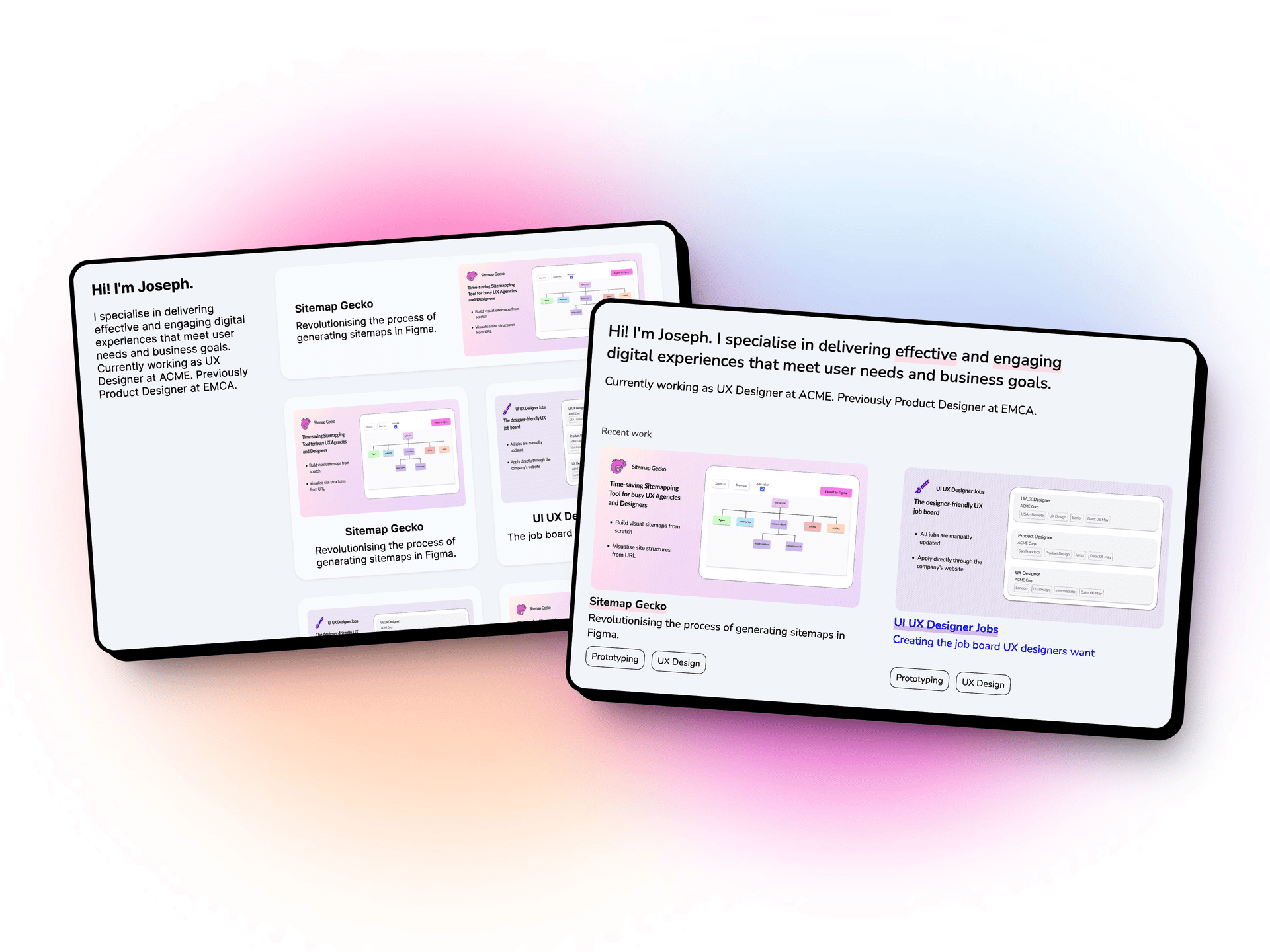
Craft the Perfect UX Portfolio with these 2 Free HTML Templates
Craft a professional UX portfolio with these 2 free HTML templates. Designed for usability and responsiveness, these templates—Estandarte and Vertifolio—offer customizable layouts suitable for all devices. Even without coding experience, you can host your portfolio for free on Netlify. Download these templates to create a polished, online presence for your UX work.
Get hand-picked stories every week
Join 25,000+ creatives who enjoy a regular dose of inspiration and motivation, delivered to your inbox every week.
AI
CodePen? AI Editors are like Pens for Code
Replacing Cursor AI with Aider and Zed. Open Source LLMs and DeepSeek-R1. 90% of my code is now written by AI—half by Claude, some by OpenAI, and a bit by Ollama
Accessibility
How to use huge type on the web
Last week’s post looked at websites that dared to use huge type and did it well. With this week’s post I’ll explore what it is that works well about the...
Accessibility Tools
Get hand-picked stories every week
Join 25,000+ creatives who enjoy a regular dose of inspiration and motivation, delivered to your inbox every week.

Branding
Why Everything Looks the Same
Do you ever get the feeling that everything around you looks the same? How economic globalization, generational transition, and...
Psychology
Conversational AI: The AI Companion Who Doesn’t Care
When Microsoft launched their conversational AI, Bing, it quickly became clear that it was capable of what seems like human behavior -it revealed itself to have a secret identity named “Sydney”, proclaimed love for a
Product Design
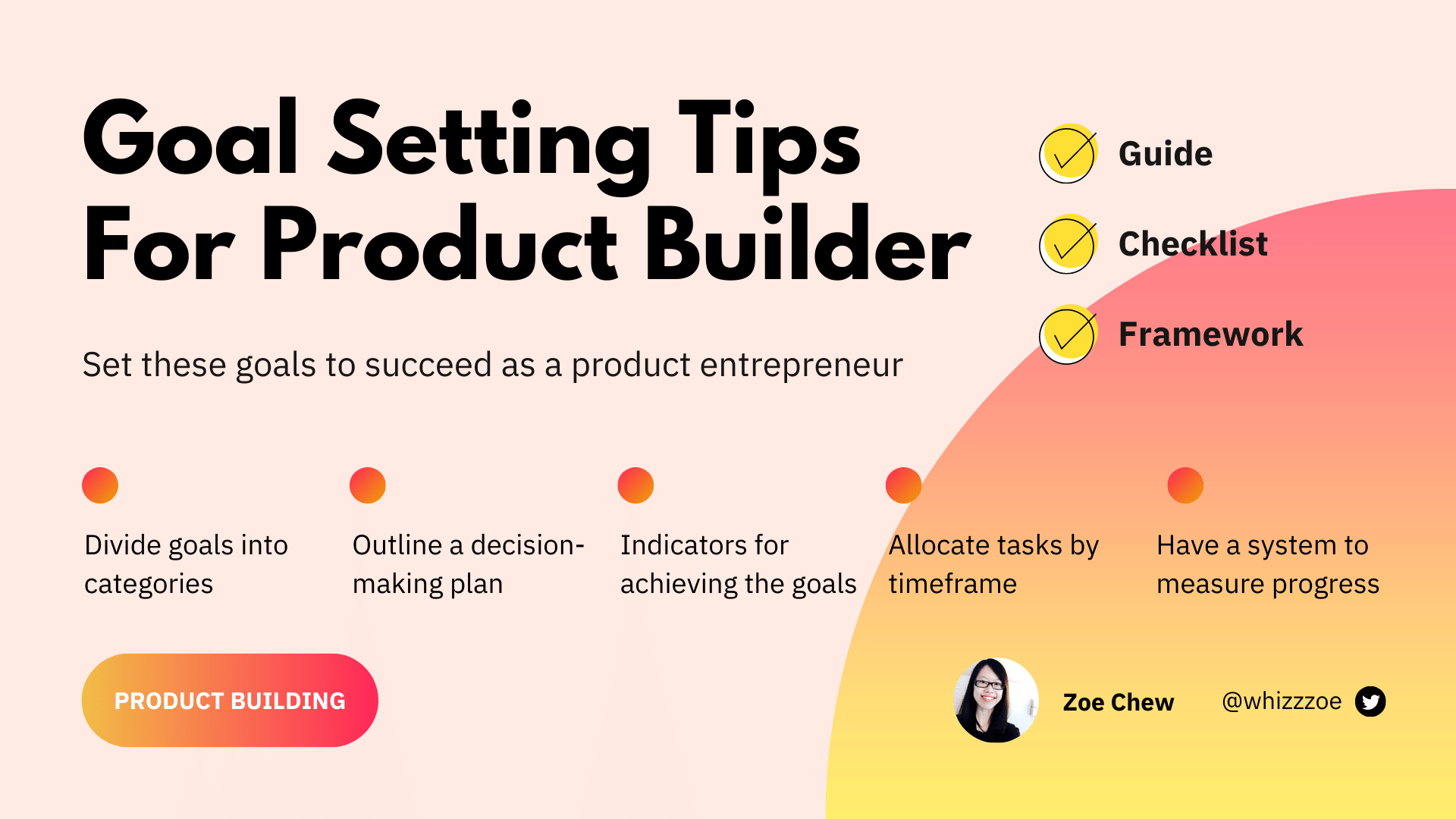
How to set the right goals as a product maker?
Note: This article is part of my toolkit newsletters 🚀 where I share resources about building things. Join me :) As a product builder, I build things full-time...


