Issue 9
By Design.
By Design is a fortnightly letter reaching ~170,000 people following the Prototypr publication. Written by Sophie Clifton-Tucker, we unearth unheard voices, and break down the barriers in design and development.
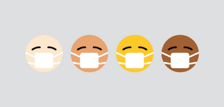
Many of us don’t have to consider accessibility features when using products, and yet I’d bet my last Rolo you use them more than you realise. Telling Alexa to turn up Beyoncé on a Friday night? Voice assistance. Switched your Twitter over to dark mode? Visual impairment. Dictating your latest WhatsApp to Siri whilst driving (naughty)? Yup, you’ve got it, it’s all accessibility.
But whilst your WhatsApp message could wait for 5 minutes until you get home, and you could probably withstand the glare of Twitter’s light mode for a touch longer, for some people these features aren’t just a luxury — they’re a necessity.
For some of us, picking up our mobile phones and having a jolly good scroll is second-nature. Now close your eyes, and give it a go. Not so easy, is it? To see just how much we take for granted, view this incredible video by Kristy Viers.
There is a distinct overlap when it comes to accessibility and usability; the end-goal being to make a product as easy to use as possible. However, usability depends on accessibility too — if a website isn’t accessible, usability can’t exist! For example, designing for people with no vision lays a solid foundation for those who can see.
“The truth is inclusive design is just better design.” — Anna E. Cook
Many of the big dogs have been leading the way in catering to a wider variety of needs, so they’re a great example to look to. As well as ‘Dim’ and ‘Night’ options, Twitter also has a font size slider, so you can see people’s REALLY ANGRY TWEETS IN BIG. Netflix has the options of subtitles; not just for when you’re chewing very crunchy crisps. Even for design tools: Webflow lets you check text accessibility right from their color picker, and Stark brings accessible design to Figma, XD, and Sketch.
But making sure interfaces are accessible isn’t always a walk in the park for teams lacking resources — cue the big dogs! Adobe open sourced their design system library to help teams lacking resources to prioritise accessibility, internationalisation, keyboard, touch support, and more. Then there’s frameworks like Tailwind.css that are built with accessibility-first. The resources are out there!
As of February 2020, the Department of Justice (DOJ) entered into 175 settlement agreements addressing how the Americans with Disabilities Act (ADA) applies to ICT accessibility. The Government noted that access to information and electronic technologies is a civil right, and a vital employment issue for individuals with disabilities. Across the pond, as from the 23rd September, public sector websites in the UK will have a legal duty to make sure websites and apps meet accessibility requirements, and by the 22nd of June this will extend to all mobile applications, too.
So, from subtitles, to volume control, font sizes and clear contrast, we’re getting back on track with making the web a more inclusive place. After all, nobody should be denied the right to the fantastic spectacle that is Tiger King.

Hot off the Press
- Seeing Through Someone Else’s Eyes: You’ve probably taken a test for colorblindness before; usually on Buzzfeed, at 2 in the morning, whilst putting off some important project. Most commonly this is the PseudoIsochromatic Plate (PIP) Color Vision Test (where you have to identify shapes and numbers made from dots within circles). Sometimes we don’t even realise we’re seeing things differently to others until it’s discovered this way. When designing, you want your users to experience your product and enjoy its myriad colours in the same way across the board — enter Team Stark’s Colorblind Generator. Sister to the Colorblind Simulator, this plugin shows you what your design looks like through the eyes of those with different types of color blindness, allowing you to design with accessibility from the very start. What’s more, the artboard elements are editable, so you can tweak your palette to perfection before publishing.
- AccessiBe — Your AI Assistant: AccessiBe is an AI-powered widget that scans and analyses website elements, and adjusts them to blind users’ screen readers. With this, you’re ensuring your website is fully compliant and certified. Every 24 hours, the AI scans for new and revised content to fix. Lawsuits aside, there’s no reason not to implement this simple, single line of JavaScript code, allowing all users to experience your site equally.
- The ABCs of Accessibility: According to the WHO, approximately 1 billion people live with a disability. Microsoft has embraced the maxim “nothing about us, without us”, creating and developing technologies accessible to everyone. To raise awareness on inclusion and diversity, they’ve rewritten the ABCs with a fun twist.
Prototypr Roundup
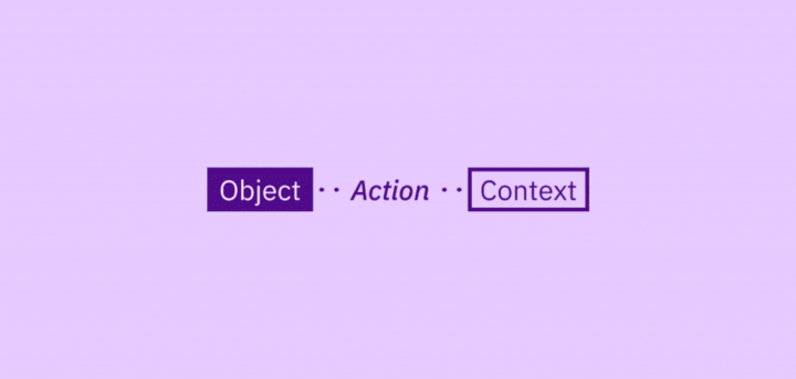
How to Write an Image Description: With insights from Bex Leon and Robin Fanning, Alex Chen has come up with this helpful how-to guide on how to write a good image description. Providing descriptions for imagery and video are required as part of WCAG 2.1 (for digital ADA compliance), but without them, you’re completely excluding those with low/no vision — and that’s not cool. Alex adopts an object-action-context structure in order to capture the essential aspects of an image.
9 Ways to Make Social Content Accessible: In a bid to help create more inclusive campaigns, H Locke has put together 9 components to consider before hitting that ‘publish’ button. She brings up some sage points that may not even occur to those without visual impairments — for example the overuse of hashtags and emojis. The last thing anyone needs is a robotic voice reading out 30 hashtags or describing 5 emojis in a row whilst trying to have an Instagram lurk. As a UX designer, your responsibility doesn’t end with your own products — ensuring your work for clients is inclusive is also on your watch.
“If you’re not designing accessible experiences, you’re not being inclusive.” — H Locke
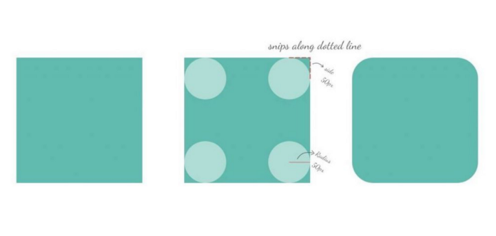
The Rounded User Experience: As a designer you’re bound to (over)think about every aspect of your design, from the size of your button to it’s edges — or lack thereof. But have you ever considered the science behind it? Psychologically speaking, we’re conditioned to think hard, sharp things = danger, and soft, round things = safe. With this in mind, Sandhya Subramaniyan suggests that for a happy and friendly user experience, you may opt for a button or text box with rounded edges over a sharp rectangular one.
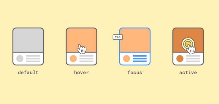
UI Case Study — Card Components: nana Jeon’s case study explores different card styles on different states, namely hover, focus, and active. This is an imperative part of the design process in terms of accessibility as it provides further visual feedback to improve overall user experience.
Available for Hire
Every week, designers looking for work are signing up to our Prototypr People page. Don’t miss out on the fun — create your account, and click ‘Available to Hire’ to increase your visibility and job prospects. Don’t forget to add your Ko-Fi badge for the opportunity to earn a few bob towards that next cappuccino!
Tamara Sredojevic • Web Designer
LinkedIn | Website | Prototypr
- Tamara Sredojevic works with people on a mission: charities, humanitarian organisations and indie makers. She also optimises existing websites so users can do what they do best without disruption.
- She was hired by Borago Insights, a London-based consultancy that helps charities make sense of their data, to rebrand their agency and modernise the overall look of their website to improve user experience.

Samuel Couto • Senior Product Designer
LinkedIn | Website | Prototypr
- Samuel strives to turn early stage UX research into actionable insights and lead design teams to craft delightful and functional user experiences. Throughout his 10+ years of experience, he’s helped ship impactful experiences within the education, fashion, finance and e-commerce industries.
- He was the Team Lead on a project to design a functional user experience and enrich the classroom experience for teachers and students at Education First (EF).
Championing Women in Tech
Upcoming events supporting women in tech:
Just F*ing Ship It 3rd edition [2020]. The concept is simple: 30 days to build and launch something. You have until October 31st. Interested? Register here.

Women in Tech Stories: An impressive selection of talented women in technology sharing their personal journeys — Free to attend, and open to all! Click here to register.