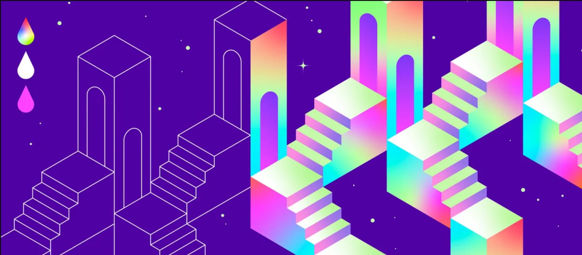

Color gradients are not a new design concept, but they are very much having a moment right now. While they were a popular design trend in the late 1990s into the 2000s, they eventually took a back seat to the surge of flat design concepts that emerged between 2005 and 2015.
As a result (or reflex) from the flat design movement, the pendulum has now swung back toward trends like color gradients as a way for designers to add depth and interest to their designs. Brands like Adobe, Instagram, and Aaptiv have embraced this resurgence in their brand marks and logos.
In this article, we’ll take a look at what color gradients are, some best practices for their use, and how you can incorporate them into your UX color palette.

What is a color gradient and why should designers use them?
Color gradients, or color transitions, are defined as a gradual blending from one color to another. This blending can occur between colors of the same tone (from light blue to navy blue), colors of two different tones (from blue to yellow), or even between more than two colors (from blue to purple to red to orange).
Color gradients are great for adding depth to an image because of their inherent interaction with light and darkness. Combining a gradient with varying levels of opacity can help create a sense of proximity and distance to images as well. They make more colors available for design use because they vary and flow through many different color tones. Designers can also use color gradients to subtly guide their users’ eyes and attention toward a specific area of a product.
Keep in mind that there are several styles and patterns of color gradients. They all have a central starting point where the color starts; then, from that point, the initial color progressively blends into other colors. Visually speaking, this creates a certain pattern. The pattern, size, shape, area, and color choices will all affect how the color gradient looks.
Types of color gradients
Now that we’ve defined what a color gradient is and why designers might choose to use them, let’s dig a little deeper into some of the most common types of color gradients.
Linear
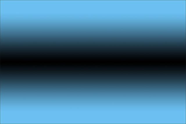
A linear gradient creates a band of colors originating from a straight line. Note that the line doesn’t have to be vertical or horizontal or even straight. The gradient transitions smoothly from one color to the next.

Radial
A radial gradient radiates out from a central point. There’s room to play with the center point, size, and rate of transition in a radial color gradient.

Conic
A conic gradient is similar to a radial gradient in that they are both circular and use a center point for the color’s beginning. The difference here is that while a radial gradient transitions from the center to the exterior of the shaded area, a conical gradient shades in a circular, clockwise (or counterclockwise) fashion.

Diamond
A diamond gradient is best used in quadrilateral (square or rectangle) shapes. It forms a diamond shape from a central starting point, and the endpoints are in the corners of the diamond.

Reflected
A reflected gradient is like a linear gradient mixed with a mirror. The color is mirrored from a center line in each direction as opposed to a linear gradient that only shades in one direction.
Best practices for using gradient color design
Along with sticking to the basic visual design principles, here are some things to keep in mind as you wade into the waters of color gradients.
Choose the right colors
It’s safest to use analogous colors (those next to each other on the color wheel) or shades of the same tone. Take the time to try multiple combinations of both tones and shades.

Experiment with more than two colors, but don’t overdo it
Sometimes using only two colors in a color gradient can create a muddy, grey color in the center. That makes for a very unpleasant transition for the users’ eyes. Try adding another color to the middle, like one between your two primary colors on the color wheel.

Create smooth transitions
It’s a good idea to use soft color transitions to get a smooth gradient. Sudden or dramatic shifts in color can be jarring and off-putting, hurting the overall user experience.

Purposefully choose your light source
Having a clear idea and plan for your source of light in a color gradient allows you as a designer to create a path and a plan for your users’ attention. You can use light to help guide the users’ eyes to the most important part of your page, app, or product.

Make use of separate shapes and patterns
By using different shapes for the fill color and gradient color in your design, you can apply a gradient over an existing color in a way that incorporates more tones but isn’t messy or forced. Using two different shapes, like a circle and an oval, allows you to create two similar and cooperative points of origin or sources of light. This adds depth and interest to your design without complicating it.
Play with the opacity
Another great way to work with color and light in a design is to adjust the opacity of your color gradient. Doing this allows you to let the colors blend—not just with each other but also with the background, which will make your design feel fuller and developed.
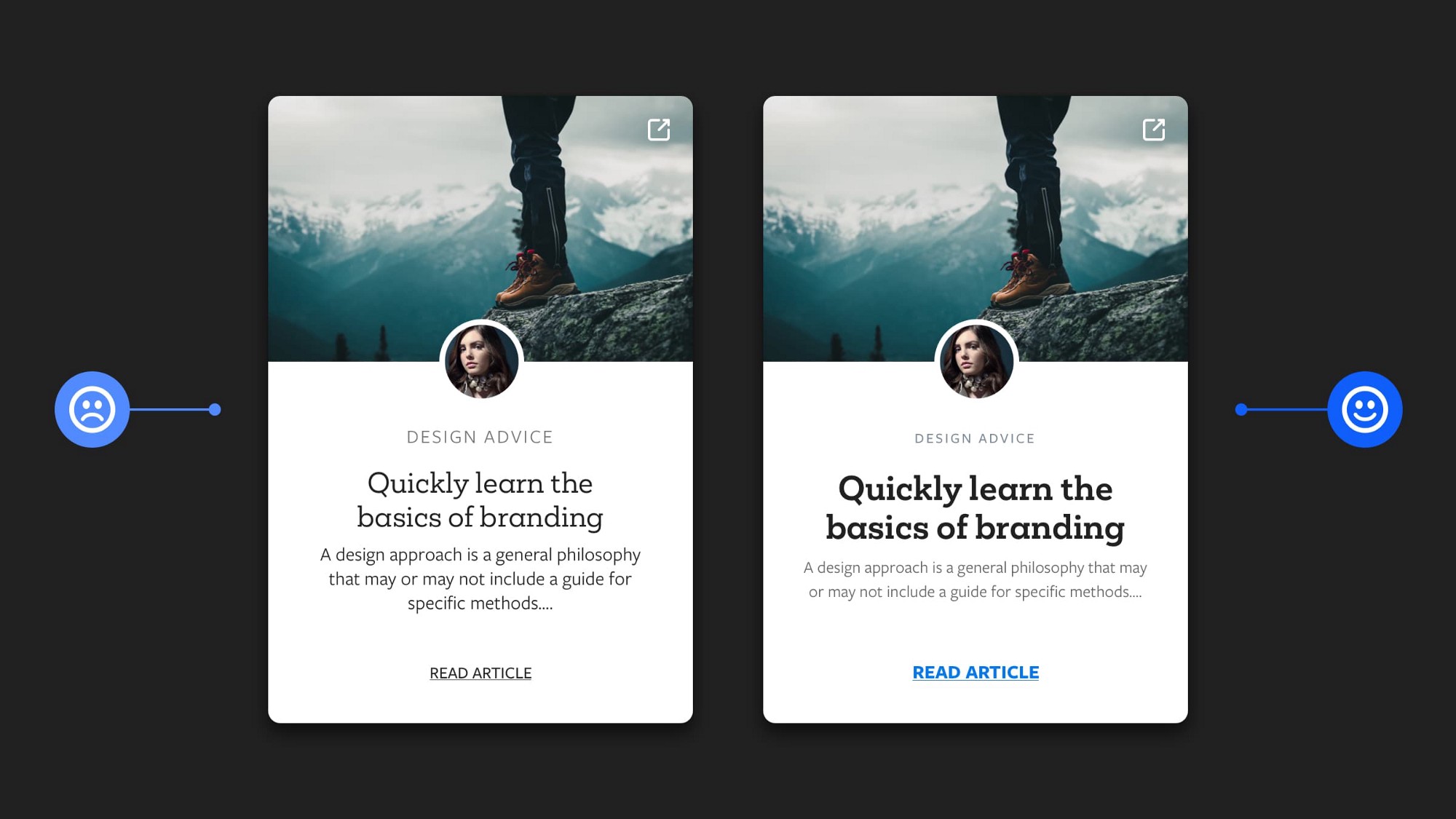
Don’t forget about color contrast
Beautiful, functional design shouldn’t come at the cost of accessibility. Always check the color-contrast ratio and adhere to the Web Content Accessibility Guidelines (WCAG) accessibility color contrast standards.

Fade to Black
While color gradients are nothing new, you may see them popping up more often in app designand UI design as a way to add more depth and personality to a formerly flat design-focused world. By understanding what, why, and how to use color gradients in your designs, you add another tool to your collection that you can use to create beautiful and useful user experiences.
Originally posted by Will Fanguy in XD Ideas.


