“We value your privacy.” For every website that says it, why do I get the feeling that the complete opposite is true? Literally popping onto screens a couple years ago, this is one of the most blatant examples of slippery marketing copy on user interfaces, where positive spin is used to mask negative outcomes for users. Design researcher Caroline Synders calls this use of language a ‘content strategy dark pattern’:
A ‘content strategy’ dark pattern is where language and design create misinterpretations
Large steps towards making Dark patterns illegal were made in 2019*, but throughout 2020 and even today, the crackdown appears to have lead the relationship between language and design to become even more sneaky and strategic. Shady euphemisms are employed to trick users into handing over personal data, and manipulative descriptions continue to deceive people.

From Facebook to Medium, this article calls out increasingly deceitful web copy techniques used today by the masters of the dark arts of design writing.
The purpose of this article is to demonstrate dark patterns in UI copy through examples. Dark patterns often exist to support business goals, and so it may not be a designer or writer’s choice to implement them.

Dark Patterns and “Asshole Designers”
There are different labels and categories for dark patterns depending on where you look. Harry Brignul’s darkpatterns.org is the most well-known, with labels such as ‘Confirmshaming’ and ‘Privacy Zuckering’. Then, there’s a more recent study of “Asshole design”, which highlights 6 strategies of deceitful design, including Nickle-and-Diming, Entrapping or Misrepresenting. Here’s a table from the study:

Whilst the above offer great definitions, to address dark patterns specific to copy on elements in user interfaces, I’ll use the following terms in this article:
5 Terms for Dark Patterns in UI Copy
- Shady Euphemisms: where any words that can be perceived negatively (e.g. paywall) are disguised with a more positive phrase (e.g. partner program).
- Humbug Headers: Use of friendly headings to deflect negative things
- Self-serving Syntax: Sentences are reordered to support a bias or motive.
- Manipulative Button Text: Button text that tries to get you to reconsider (similar to confirmshaming)
- Walls of Jargon: Use of large paragraphs of small text that nobody will read.

1. Shady Euphemisms
This is where anything that can be perceived negatively is rephrased, or rebranded to sound positive. Using a positive tone is widely practiced to make websites easier to understand, and is therefore common practice across many websites and apps. For instance, here’s the ‘Writing Positively’ guide from Mailchimp’s content style guide:

As shown above, the practice of positive writing includes turning negative language into positive language, much like a euphemism, where mild or indirect expressions are used in place of a blunter truth. The goal is to make us feel things – and it happens fairly often on the web:
Medium
‘Paywall’ → ‘Partner Programme’
Amazon
‘Cancellation’ → ‘End Benefits’
Facebook
‘Tracking’ → ‘Personalised Ads’
1.1 When ‘Writing Positively’ Becomes Misleading (Medium.com)
‘Paywall’ → ‘Partner Programme’
For example, blogging platform Medium often persuades writers to publish stories behind a paywall. However, due negative associations with the word ‘paywall’, they often replace it with more positive terms and phrases such as ‘PartnerProgram’ or ‘Meter my story’, as highlighted in the following screenshot:

If we take a closer look at the word choice underlined in pink, a few shady issues arise:
- Masked Outcomes: Opting in with the checkbox performs a restrictive action (putting an article behind a paywall). However, the positive wording masks this as an incentivised action – earning money.
- Misleading Terminology: Choosing positive words can cause confusion if they’re not easy to understand. Whilst this euphemism for paywall, ‘Meter my story’, is more pleasent, it can also be confusing as it’s not a widely used term.
- Opt-in by default: This option is checked by default, meaning you actively have to say no to earning money when unchecking it.
Reading between the lines, the option can be translate as follows:

Is it a dark pattern?
Because of the difference in the description of the checkbox, and the outcome of checking it, the example above could easily be classified as a dark pattern. Important information (the writer’s story won’t be available to non-paying readers) is obscured through word choices that persuade users down a predefined path that favours shareholder interests.
We define asshole designer properties as instances where designers explicitly assert control over the user’s experience, implementing obnoxious, coercive, or deceitful behaviors that are almost solely in the shareholder’s best interest.
Asshole Designers, by Colin M. Gray, Sai Shruthi Chivukula, and Ahreum Lee
1.2 Cancel? That’s not a word 🤑 (Amazon)
Cancel → End Benefits
Amazon’s cancellation page is another example of positive wording that can mislead. Similar to Medium’s ‘PartnerProgram’ branding for Paywall, Amazon use ‘Prime Benefits’, or ‘Benefits’ as a veil for cancellations. So instead of a negative ‘Cancel Membership’ page, you get the more positive ‘End Benefits’ page. In the following screenshot, every trace of the word ‘Cancel’ is repackaged as ‘End Benefits’:

Again, even though it’s more positive, it becomes less clear – possibly by design. Founder of Creative Good, Mark Hurst, also conveys this in his post “Why I’m losing faith in UX“:
Increasingly, I think UX doesn’t live up to its original meaning of “user experience.” Instead, much of the discipline today, as it’s practiced in Big Tech firms, is better described by a new name.
UX is now “user exploitation.”
Mark Hurst, founder of Creative Good
In his article, Hurst explains how Amazon have fallen from leaders in User Experience design, to one of the biggest pushers of “user exploitation” design.
This has not gone unnoticed by others either, and Amazon face a few legal challenges:
We are filing a complaint against Amazon for breaching European law. Using manipulative techniques, or #darkpatterns, is endemic online & need to end.
See report & complaint here: https://t.co/wUSrMoUH6E [Thread]— Finn Lützow-Holm Myrstad (@finnmyrstad) January 14, 2021
For more on this, the BBC has a follow up article on Amazon’s cancellation tricks.
1.3 You Call it Tracking, We Call it ‘Personalisation’ (Facebook)
Tracking → Personalised Service
This third example of shady euphemisms is common across social media websites, like the friendly Facebook. As one of the most aggressive miners of personal data, Facebook intentionally package all of this intrusive behaviour as a feature that benefits users.
For example, cross-website tracking and hidden pixels becomes your ‘Ad preferences’. In fact, there’s no clear mention of tracking or mining – it’s all euphemisms and positive spin that masks what’s happening in order to make users feel in control:

The above screenshots are taken from Facebook’s privacy checkup, and although nothing is factually untrue, it raises the question – is information being withheld?
Dark Patterns vs Positive Writing
Despite the good intentions of writing positively for users, as shown in the above examples, there’s also a very dark side to it, and it’s often intentional. It’s acceptable for websites to be persuasive, or have a bias towards their own goals, but when positive wording and euphemisms mask information or mislead users, as Arielle Pardes shows in Wired, it becomes more unethical:
By definition, design encourages someone to use a product in a particular way, which isn’t inherently bad. The difference, Yocco says, is “if you’re designing to trick people, you’re an asshole”.
Arielle Pardes, quoting Victor Yocco
For instance, the upcoming privacy changes on Apple’s iOS expose that Facebook avoid the word “Tracking” at all costs, despite it being the most accurate term to use for explaining their behaviour:

In contrast to their original requests for tracking consent, on Apple devices, Facebook will be forced to use 2 simpler options:
- ❌ Ask App Not to Track
- ✅ Allow Tracking
Here’s a screenshot from Apple’s User Privacy and Data Use page on asking permission to track:

Despite this being clearer, Facebook doesn’t appear too happy with it as it’s likely to negatively affect their profit margins, so there’s currently a battle going on over privacy in big tech. If you want to dive deeper into this saga, check out Sara Fischer‘s media trends newsletters at Axios.
In a similar vein to these shady euphemisms, let’s move on to see how header text can be used to distract and deflect:
2. Humbug Headers
Not too dissimilar from shady euphemisms, in this case, large header text is used to distract or mislead users when they’re confronted with choices, such as agreeing to personalised ads (again), or upgrading an account. The header often says something reassuring to deflect from what’s going on in the UI.
For example, this personalised ads request from Twitter starts by saying “You’re in control”, but the entire modal encourages you to accept tracking for personalised ads (the primary blue button):

It seems to cause mistrust more than anything:
Lmao @ this popup from this morning. It says “You’re in control”, has some words, then gives me two options:
1. Turn on personalized ads
2. Keep less relevant adsSo, the question is, “Ads or ads?” Thanks for giving me control, Twitter. 😂 pic.twitter.com/WCeDPjOqym
— Ashlee Boyer 🦻 (@AshleeMBoyer) July 15, 2020
Feigning Good Intentions
Here’s another example where the titles aren’t untrue, but they elaborately feign good intention to gain an end. Instagram and Reddit both want us to download their more addictive mobile apps, but disguise it as a benefit to users:

Since the mobile websites are already well-made, as Android Police highlight, these popups could indeed be a ploy to suck you into using their app every day. The popups themselves actually make the websites harder to use:
Reddit’s mobile website is well-made and fast, but for ages, the platform has been pushing anyone who visited that site to the official app instead, complete with an obnoxious banner that shows up every time you open a Reddit link in your phone’s browser.
It’s probably because downloading the app massively benefits the company, as social media apps are often much more addictive than their web counterparts through the use of notifications that aim to grab attention (as opposed to functional notifications). Avery Hartmans at Business Insider explains this in her article on the sneaky ways apps like Instagram, Facebook, Tinder lure you in:
App makers are using deliberate techniques to attract your attention. They aren’t simply relying on you to come to them whenever you have downtime…Instagram sends dozens of push notifications each week and uses “Stories” to attract you.
Conversely, there do exist legitimate cases where a mobile app would better than the web version, such as that of a writing app, or even when there aren’t resources for a solid web experience. But for these giants, it’s really not the case:
“Don’t you want to view it in the official Reddit app for the best experience? No, no I don’t. And the official reddit app is not the best experience.”
So clever it’s confusing
Here’s another header, this time from Medium.com, that also deflects from the real purpose:

The intention here may be good, but due to the tone used, it can also come across riddling, or even arrogant. Famous web developer, Wes Bos, highlights that artful headings such as this often lead to more confusion than benefit (and that may be the intention):
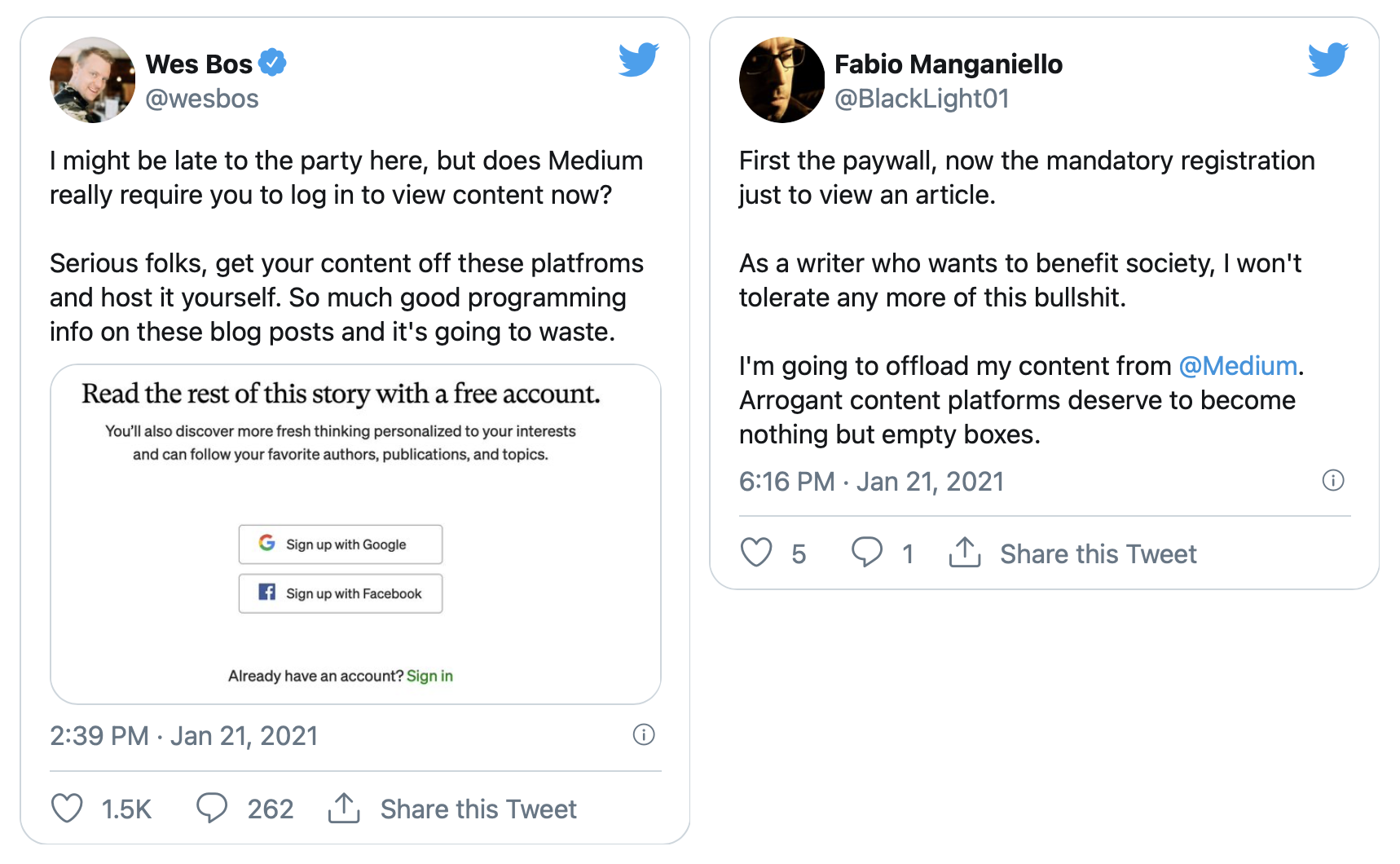
Here, Wes Bos is concerned that users now have to log in to read any Medium article, when in fact they don’t. Because the messaging is consistently indirect, nobody is ever too sure what it really means. To quote Tyson Fury, they’re “going around the bushes and putting their arse in the hedge”.

3. Self-serving Syntax
Here, a user is presented with one or more options, but sentences explaining those options are structured to deflate the negative ones. Continuing with Medium, there’s a lot of self-serving syntax in this simple dropdown:

Similar to the first Medium example in section 1, Medium is again off-handedly convincing users to put articles behind their paywall. Instead of asking directly though, here’s how they structure the request to disguise intentions:
- Positive options first: At first glance, it looks like there’s 1 single positive option – allow Medium to recommend your story to a wider audience. This option actually has less significance, but is intentionally prioritised.
- Negative option last: The most important option is bundled along secondary because it can be perceived negatively: “Recommended stories are part of Medium’s metered paywall”
- Disguised outcomes: The outcome of checking the box actually agrees to multiple conditions, when it would make more sense if the options were mutually exclusive.
Peter‘s tweet here sums it up perfectly:
I mean, do I want editors to be able to recommend this? Sure! Do I also want it not to go behind a paywall? Absolutely! How can these two things be mutually exclusive?
— Peter Bihr (@peterbihr) December 5, 2019
Double Negatives
Usually, a writer would prioritise the most important and impactful information first, so that users are well informed of all implications of their choices. With this in mind, it becomes even more worrying that the checkbox above is opted-in by default. It’s clear that this is intentional when you look at Medium’s help page:

Even the help page is confusing through the use of a double negative statement. They explain that to remove your article from the paywall, you have to uncheck the box.
According to Plainlanguage.gov, double negative statements like this should be avoided for clear, and understandable language:

More disguised outcomes
Let’s not forget Facebook are experts at this one too. The following example originated in 2018, but things haven’t changed much since, as you’ll see below. Here, Facebook frames face recognition as a security feature, shifting ‘benefits’ to the top.
In doing so, they hide what we all know is equally, or even more true – they want to extract more data from you. Jennifer’s commentary sums it up:
2018 Facebook:
Sure #Facebook, I’ll take a milisecond to consider whether you want me to enable #facialrecognition for my own protection or your #data #tracking business model. #Disingenuous pricks! pic.twitter.com/s7nngaHVSq
— Jennifer Baker (@BrusselsGeek) April 20, 2018
2021 Facebook:

For more on how social media sites like Facebook continue use tricks like this, Wired has a great article on it.
4. Manipulative Button Text
Similar, but more subtle to Brignul’s confirmshaming (where users are guilted into opting into something), here, button text is crafted to persuade you down a preferred path. For example, Amazon try to get people reconsider canceling subscriptions by adding ‘and End Benefits’ to the cancellation button:

And they also make the opposing option positive: “Keep My Membership and My Benefits”.
Confirmshaming is the act of guilting the user into opting in to something. The option to decline is worded in such a way as to shame the user into compliance.
This page could actually be a lot simpler:

Going back to Hurst’s article on the downfall of UX, he suggests something along the same lines:
What should be a single page with a “Cancel my subscription” link is now a six-page process filled with “dark patterns” – deceptive design tricks known to mislead users – and unnecessary distractions.
This twitter thread from digital policy maker, Finn, delves a bit deeper into the deflective wording used in these buttons:
9. After having clicked «cancel my benefits», we get to the next screen. Here we are told that we can save money by switching to annual payments. Even though we are in the middle of ending the subscription, Amazon wants us to extend it by a year instead. pic.twitter.com/9tPeoaLFpE
— Finn Lützow-Holm Myrstad (@finnmyrstad) January 14, 2021
“Keep Less Relevant Ads”
The button text on the Twitter modal used in a previous example works in a similar way. Instead of an option to decline ads, you’re given the option to ‘Keep less relevant ads’:

As illustrated above, it looks as if simple options have been reworked to portray a friendlier, but more manipulative message. However, at least the description itself is transparent and human. Instead of framing ads into a user benefit (like the Facebook example in section 1), they explain that ads are used to keep their service free ✅.
5. Walls of Jargon
Banking on the research that nobody on the internet reads, large walls of text are a great way to get users to agree to whatever you need. Here, what might be more fitting on a terms and conditions page is squished into a modal, often with a single choice – to accept. Take WhatsApp’s most recent confusing update for a quick example of this:

As well as the large amount of text, there are 5 links out to pages with even more information to read before agreeing. As tech journalist, Jennifer Baker says, “Who other than a tech journalist has time for reading all that?”
I’ve now delved into the new #Facebook T&Cs… WHO (other than a tech journalist) has time for this??? Obviously what they’re counting on. It’ll take an article rather than a tweet to do this justice. #dataprotection #ePrivacy Grrrr!
— Jennifer Baker (@BrusselsGeek) April 23, 2018
According to The Verge, the WhatsApp example above actually lead to mass confusion. And this isn’t the first time Facebook’s terms and conditions have caused such chaos, showing their preference towards money over user privacy mightn’t have changed much since back in 2012:

In that instance, Facebook was attempting to “borrow” your photos and sell them to third party companies. And like the recent WhatsApp example, they were forced to reconsider.
As surprising as it may sound, people DO pay attention to these “boring” legal agreements, and when they see something that is unclear or confusing, they speak up.
If you’re interested in how privacy policies themselves are perfectly crafted to “to tell you things without actually telling you things”, Shoshana Wodinsky‘s article in Gizmodo is a must read: What Facebook’s Privacy Policies Don’t Tell You. Check out her Twitter for more comprehensive research into privacy issues:
ive spent two years researching the minutiae of whatsapp’s privacy policies / combing through every page its business-facing code / getting into shouting matches w random engineers over this shit
this is the most comprehensive explanation you’ll read 💃 https://t.co/bq08JKTk1V
— shoshana wodinsky (@swodinsky) January 15, 2021
Do Ethical Tech Companies Exist?
It might be argued that some of the above examples aren’t dark patterns, but just badly written copy or thoughtless errors. Although when you see it coming from an actual writing platform, or a company with smart people working for them like Amazon and Facebook, it becomes hard to believe.
This isn’t an accident. Instead, and this is the point of Decade 3, there’s a highly-trained, highly-paid UX organization at Amazon that is actively working to deceive, exploit, and harm their users.
Mark Hurst</cite
Tech founder Paul Azorín furthers this when writing that such companies are known to prioritise money over what’s right:
Large tech companies such as Facebook, Google, and Amazon are known for making unethical decisions. Tech companies should focus on what’s right instead of simply what makes money.
From shareholders pressure, to greed, there are many forces pushing companies towards the use of dark patterns. Of the examples above, the transition from ethical to deceiving is most noticeable with Medium, where the burden of $135 million funding turned them from a pleasant to use writing platform, into one riddled with those confusing messages.
Corporate and crooked
Another example where ethics are disregarded for money was when analytics app, Baremetrics was sold by its creator and founder, Josh Pigford, to a venture capital firm. Straight away, the corporate acquirers implemented bizarre messaging and popups to prevent customers from cancelling subscriptions:
Before you use, or subscribe to @Baremetrics, please make sure you read this. This happened today. I went to their app to try & unsubscribe because we feel that Stripe’s own dashboard is good enough for us after they added reporting specifically.
Few clicks around, I saw this: pic.twitter.com/havlVm4X4j
— Tarek Khalil (@cmdkhalilov) December 22, 2020
Now that money seems to be the priority, you have to have a call with ‘non-salesperson’ Brian before cancelling your subscription.
Cheap prices and fast delivery wins
Even though all of this can be frustrating for customers, at the end of the day, these sneaky tricks are business tactics to support the goal of generating profit. Author of How Design Makes the World, Scott Berkun, points this out when suggesting customers of companies like Amazon are happier with cheaper prices and next day delivery than good UX. Similar to a Medium writer who benefits from excellent distribution – they can put up with the downsides and dark patterns because the service is so good.
You can have a great user experience in one sense and be exploited, or exploit others, at the same time.
Scott Berkun, author of How Design Makes the World
Despite them being annoying, dark patterns still exist because they’re getting results. The question remains though, at what point are these patterns illegal and unethical? When do they start to ruin a product?
Resources to Push Back and Further Reading
If you disagree with shady practices and dark patterns, here’s a few different ways to push back against sites that use them:
Tips for Writers and Designers
As an ethical designer, or anyone producing UI copy, as Andrea Drugay states, you can try and write your way out of using dark patterns:
The point isn’t that only someone with the title “UX Writer” can write their way out of dark patterns. The point is that anyone who is writing product copy should be able to write their way out of dark patterns.
In her article, ‘The role of UX writing in design ethics’, Andrea suggests the following prompts you can use to push back:
I don’t feel comfortable writing language that misleads users. I suggest we use ___ instead.
This flow seems misleading. How might we get the information we’re looking for without implying the feature already exists?
UX writing best practices typically have the button call-to-action match the verb in the header. This modal would be more clear if the implied action in the title matched the CTA. How about we rephrase it like this: ___?
Read her post for more of these.
Ask Why
As writer of the book White Hat UX, Trine Flibe states, the best way to understand why things are done unethically is to simply ask why:
Ask why something is being done unethically; ask why you are told to make a black hat feature; question the current state of things.
Find out more about ethical design in her post on Smashing, Ethical Design: The Practical Getting-Started Guide.
Find Ethical Work
Alternatively, you can always find an ethical company to work for instead. Ethical freelance collectives like Thea might be a good place to look too:

Use Privacy-Focused and Ethical Alternatives
As a web user, you can opt for ethical alternatives. Instead of Facebook, use Space Hey 👾. Instead of Google Analytics, try Simple Analytics. The sites have curated alternatives for both of these:
For more privacy-focused alternatives, check out this article from mindful UX studio, This Too Shall Grow.
Call out shady behaviour
As shown in this article, Dark Patterns haven’t gone away – they’re now subtler and sneakier, and are likely to be just as effective (or they wouldn’t exist). Writing an article like this can help call them out and get people talking about them. Alternatively, just add a comment, or tweet to DarkPatterns.org to get dark practices listed in the hall of shame.
Thanks for reading, I’ll be coming back to edit it (missed a few image captions, alt text, and links).
Also, thanks to Ann and Sophie for the feedback on this article.
*Edited 17th Feb 2021: a bill was proposed to make dark patterns illegal, which may not have been actioned yet.