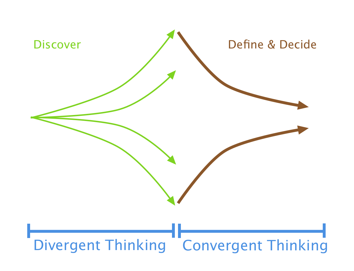
Throughout the process, I’ve also constantly ensured that I was cycling regularly between divergent and convergent thinking to ensure I’m:
- Keeping my mind open to exploring all possible solutions
- Keeping check of business objectives and general feasibility
Divergent vs Convergent Thinking Model
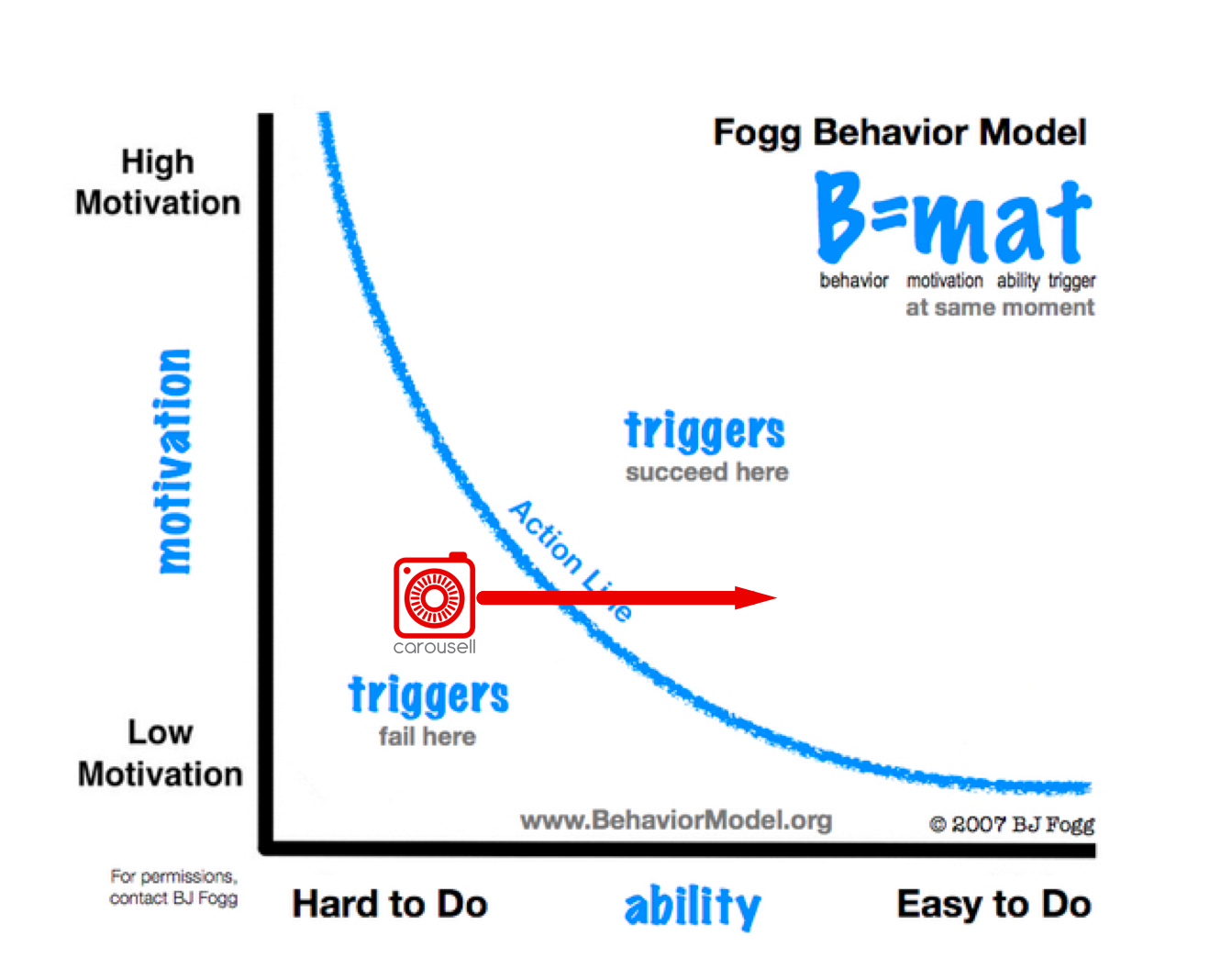
I also kept in mind BJ Fogg’s Behavioral Model which illustrates the impact UX has on changing user behaviour. My objective was to ensure users could achieve their goal as easily as possible (ability).
BJ Fogg’s Behavior Model
1. Empathizing with the User
Provisional Personas
To kick off the process, I created a provisional buyer and seller persona, meaning they were based on assumptions and online research rather than actual user research. Some online research showed that that the majority of users were urban dwellers, aged 25+, have strong purchasing power and are digital natives. This gave me comfort in knowing that the user base that I will be testing in San Francisco will be very similar to that of Carousell in Singapore.
The purpose of this exercise was to create a rough user-led compass, a ‘North Star’ if you will, to guide my very early design process.
Guerilla Usability Testing
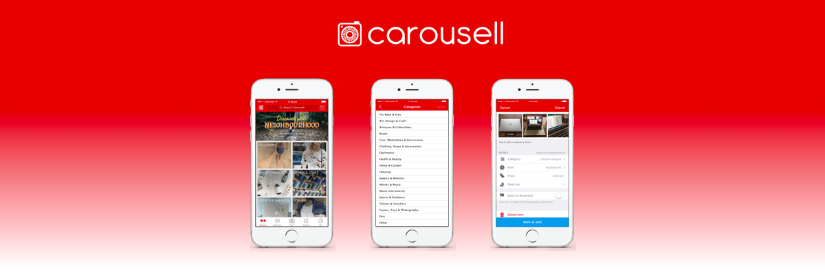
Using my provisional personas, I conducted guerilla usability testing to identify pain points in the Carousell iOS app.
Guerilla testing is “the art of pouncing on lone people in cafes and public spaces, [then] quickly filming them whilst they use a website for a couple of minutes” — uxbooth
I tested the app from the seller’s and buyer’s point of view. Six users were given a pre-defined scenario split into two parts (sell item and buy item), and asked to perform the following tasks on an iPhone 7:
Sell items
- Sell an item (Macbook Air Laptop) on Carousell app
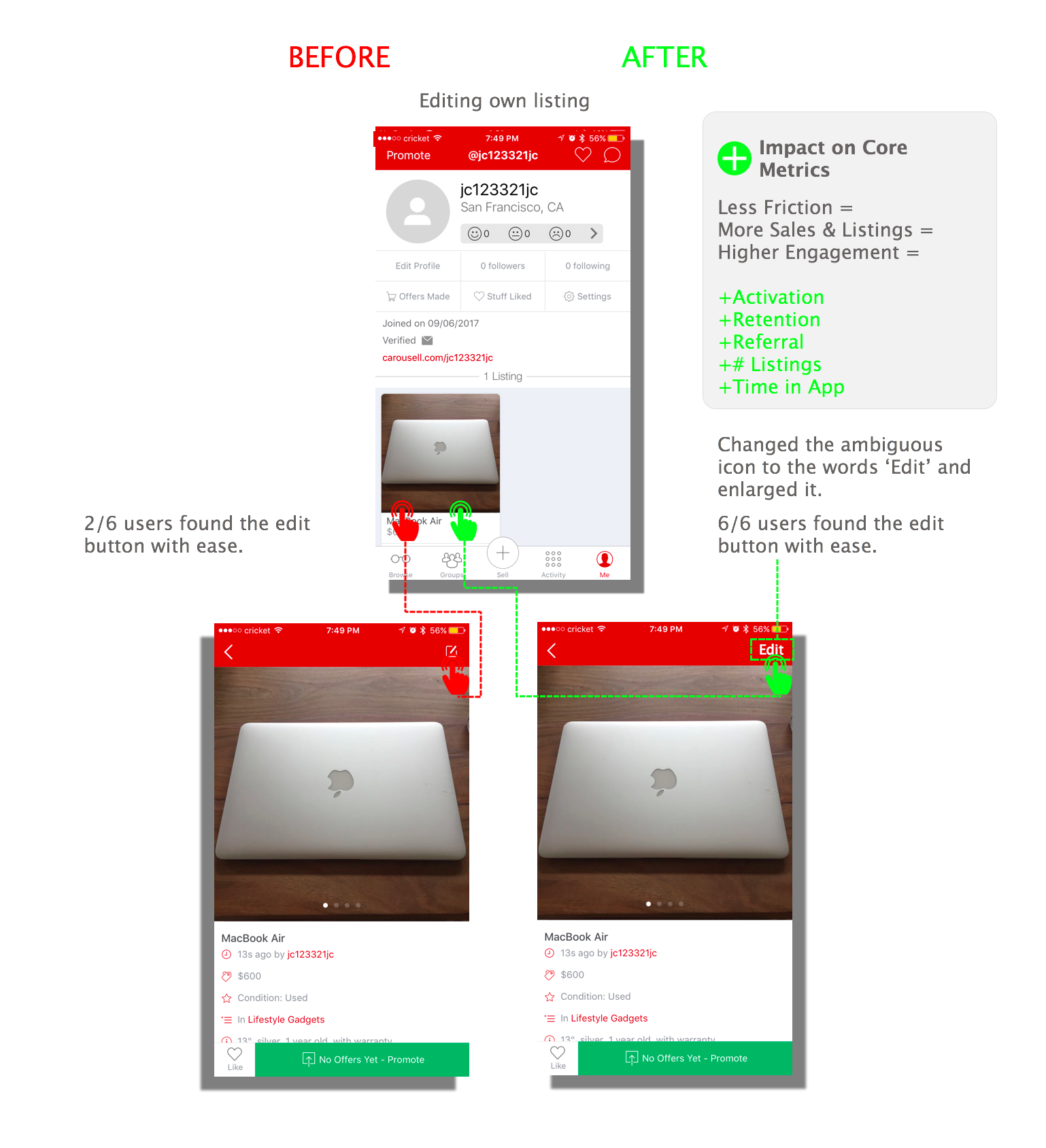
- Change information of existing listing
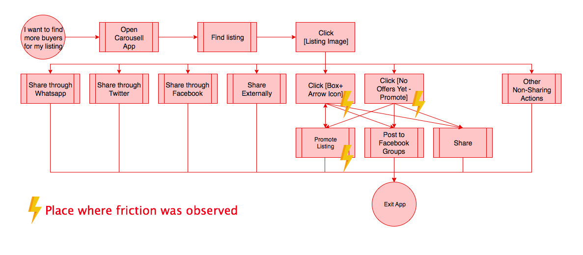
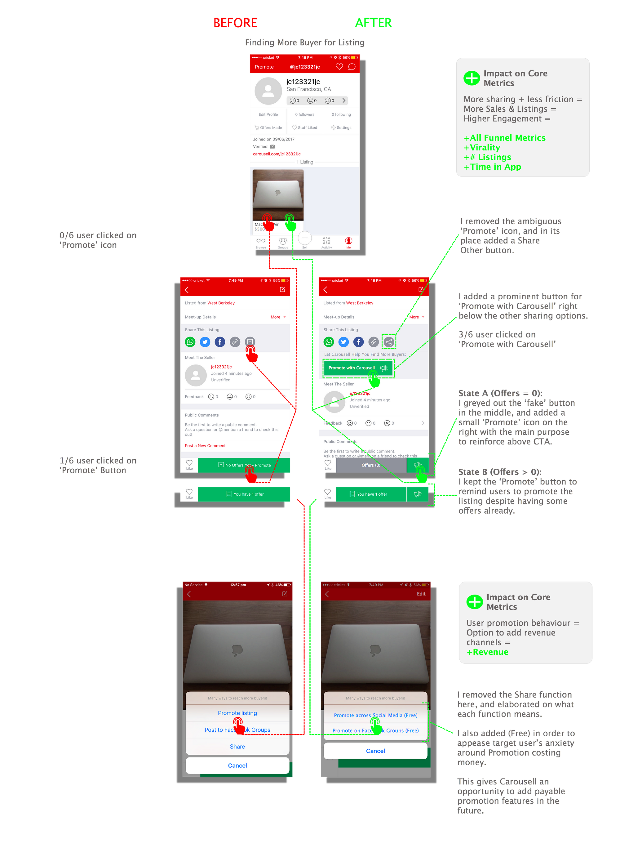
- Find more buyers for your listing
Buy items
- Find an item you want to buy (used dining table)
- Save the listing you like
- Find out more information about listing
- Buy the item
User Interview Process:
My approach was straightforward. I had several hypotheses of what elements of the task flow were important for Carousell’s business. I created a script to guide the interviewee to experience the full task flow from both perspectives. I made sure to only ask non-leading, open ended questions from a neutral disposition in order to understand the deeper ‘whys’ behind their actions and words.
I also asked a few general questions to give me an idea about the user’s buying behaviours.
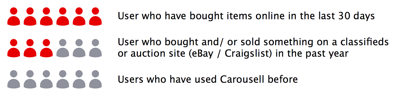
Behavioral information from interviewees
Updated Personas
I then used the information gathered from the user interviews to update my provisional personas, giving them more weight and validation.
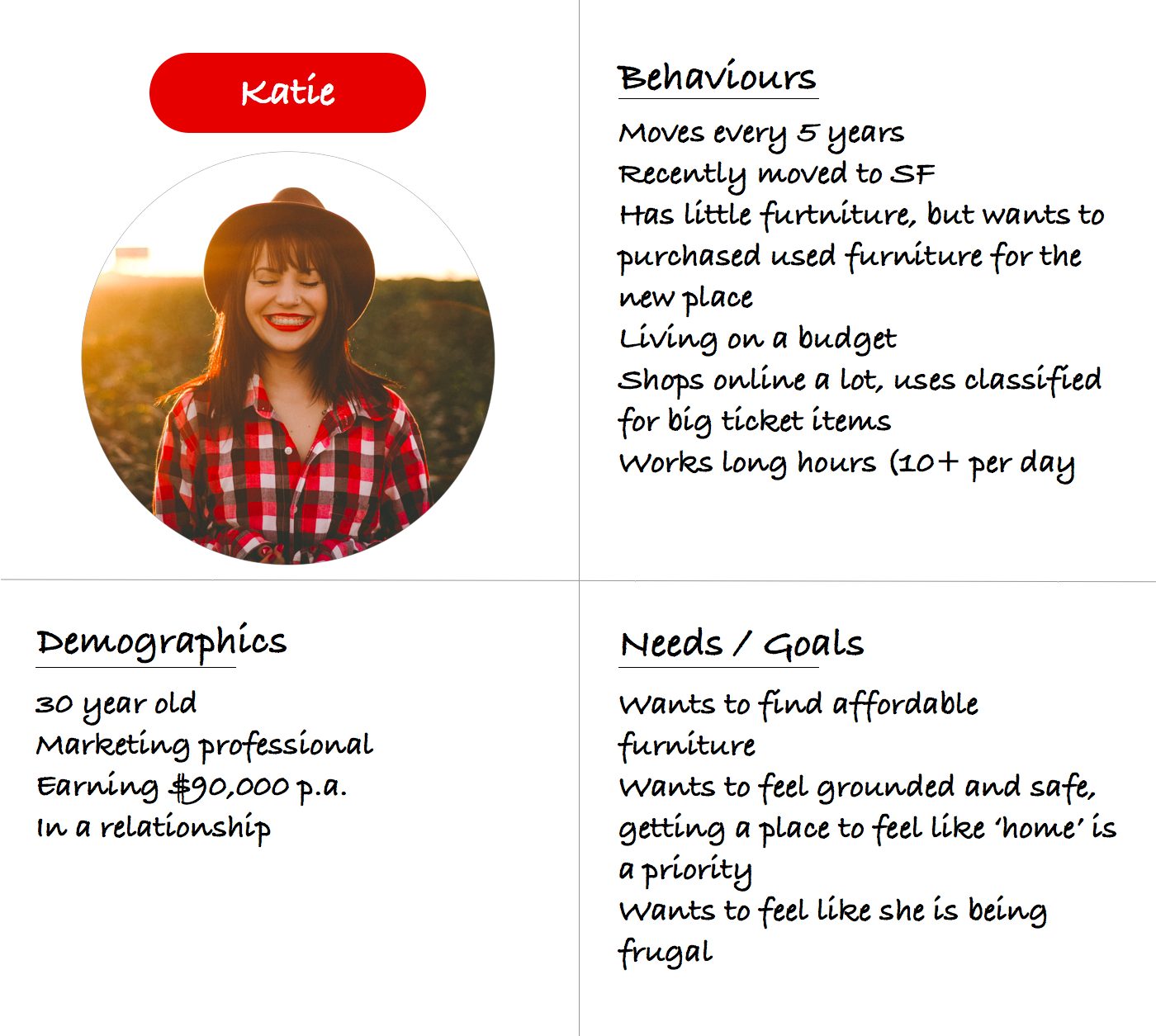
The first is Katie, who is about to move into her new place in San Francisco. She uses Carousell to buy affordable furniture quickly so that she can feel ‘at home’ as soon as possible.
Provisional Persona 1: Katie (Buy-side)
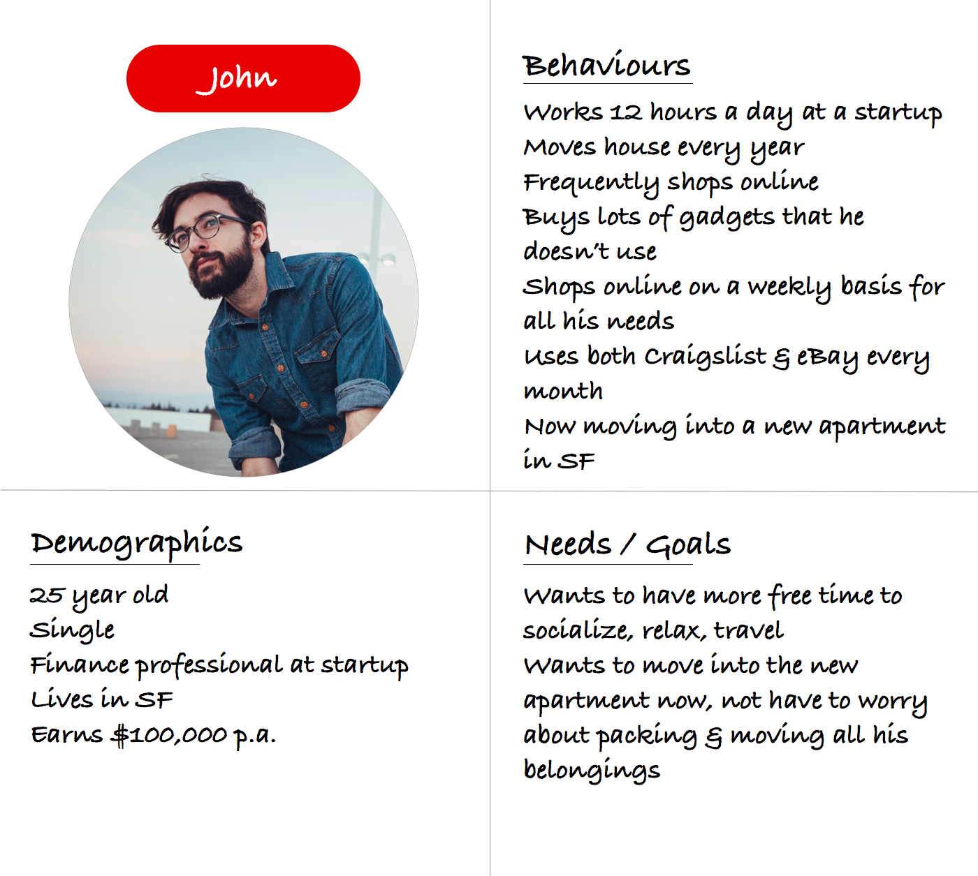
The second provisional persona is John, who is moving apartments for the second time in 2 years. John wants to sell a lot of his unused things because he’s tired of packing and unpacking stuff that he doesn’t even use.
Provisional Persona 2: John (Sell-side)
2. Defining the Problem
User Research Assimilation
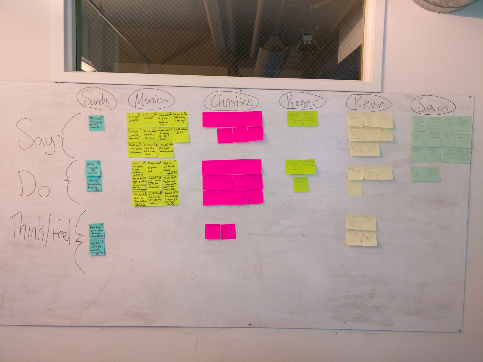
This was the fun part: extracting the key findings from my user interviews. I listened to my recordings and put each noteworthy finding into one of three buckets:
- What the user said
- What the user did
- What the user thought or felt (hypothesized based on non-verbal cues)
Categorizing Research Insights
Affinity Mapping
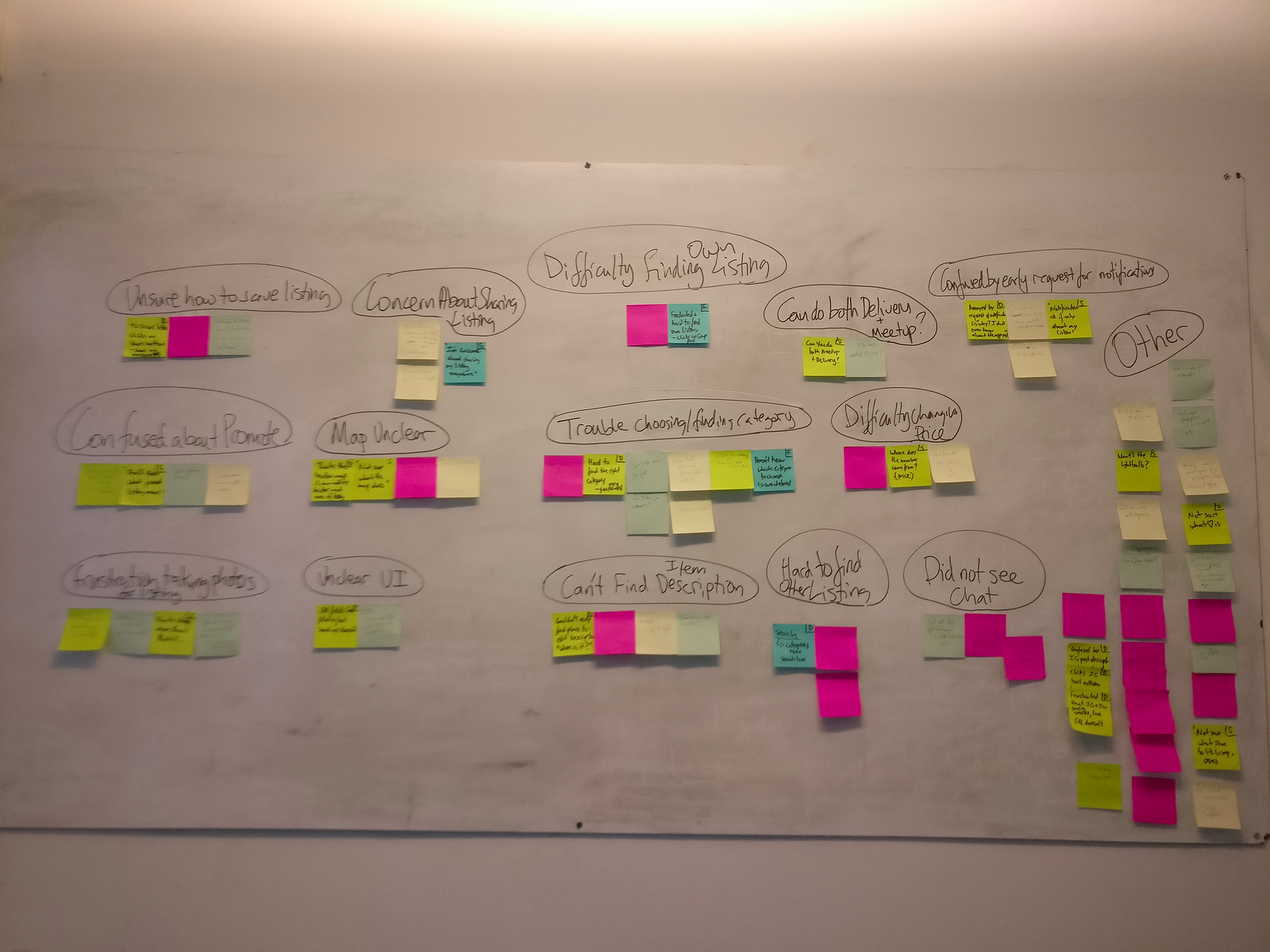
Next, I sorted these insights by order of affinity, grouping them into dedicated pain-point buckets.
Affinity Mapping
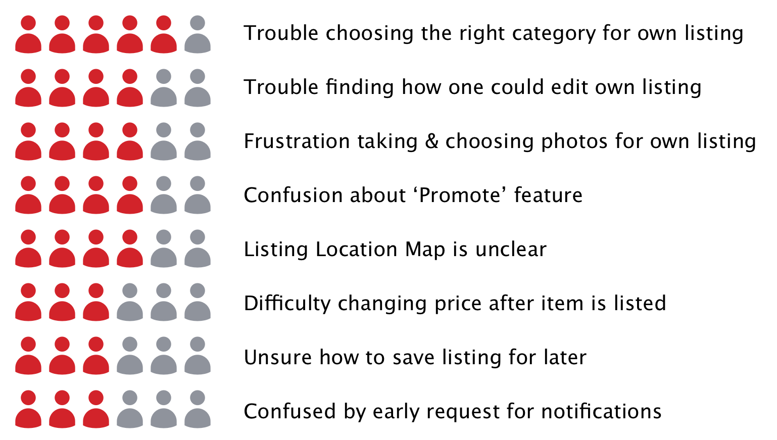
During the process, I prioritized pain points by frequency, and decided to focus only on the issues that came up with least 3 of 6 participants, putting the others on hold for later validation. With a bigger project scope, I would try and validate the lower frequency pain points in subsequent user interviews.
I still had 8 pain points left, which were still too many to focus on for the scope of this case study. They were, in order of frequency of appearance:
Top 8 Pain Points from Usability Testing
2×2 Prioritization Matrix
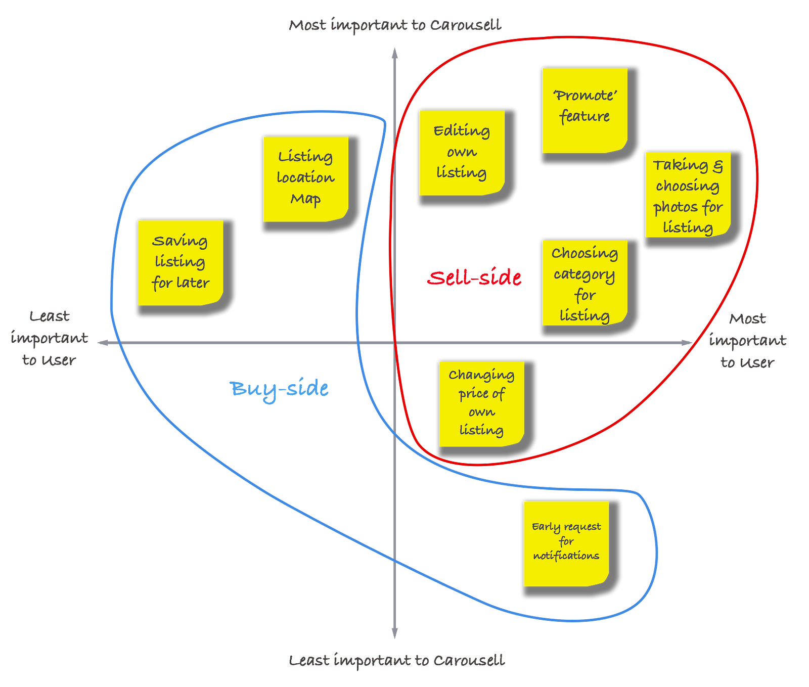
Next step was to prioritize the above 8 pain points, and for that I used a 2×2 matrix. I plotted the pain points on four quadrants, based on their importance to a user and to Carousell.
2×2 Prioritization Matrix: sell & buy side
The prioritization exercise showed that the most important pain points for both users and Carousell were on the sell-side of the workflow. This is in line with Carousell’s own focus on the seller experience.
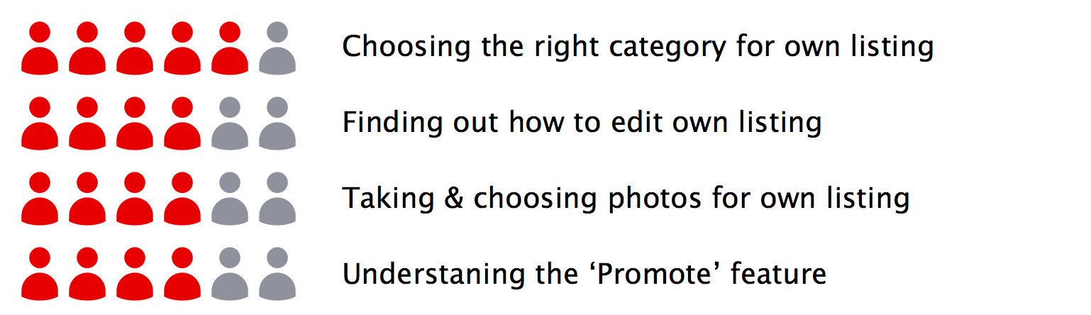
From here on I decided to focus entirely on the seller persona and the following associated pain points:
Top 4 Pain Points, Sell Side
USMO
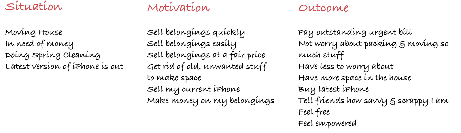
After understanding the key problem area I needed to focus on, I decided to dive deeper into John, the seller persona. The first step was to use a mostly divergent thinking process called USMO (User, Situation, Motivation, Outcome) to help me generate user scenarios.
Completing the USMO exercise was a natural segway into creating several key Job Stories for John.
Jobs-to-Be-Done
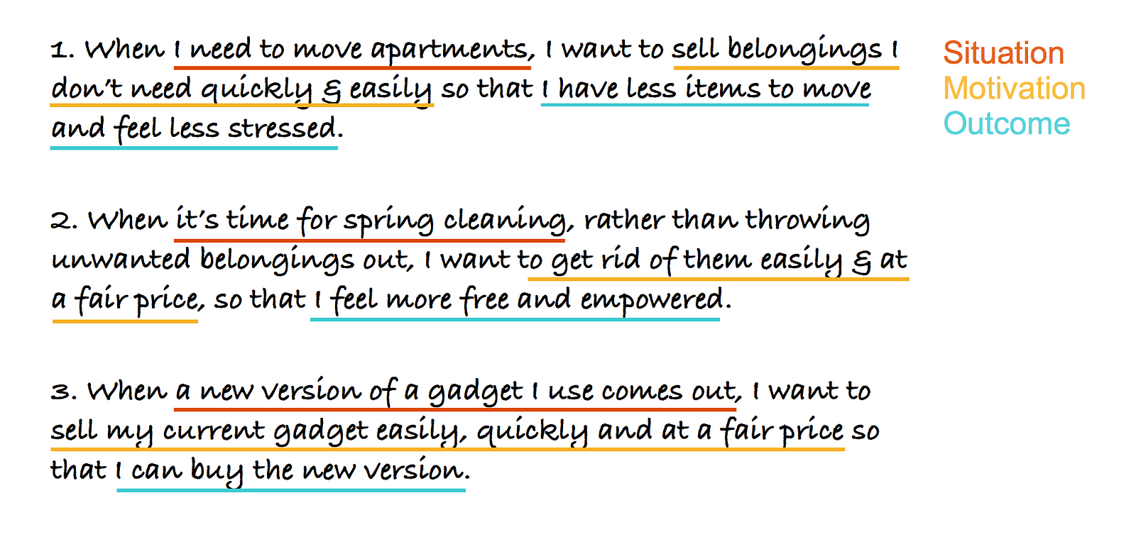
I used Jobs-to-be-Done Framework to explore various situations, associated motivations and desired outcomes Carousell sellers may be experiencing. This culminated into artifacts called Job Stories:
3 Job Stories for John, the Seller Persona
Scenarios
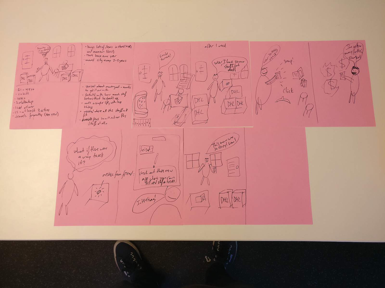
Using Job Stories, I wanted to further embody the holistic user journey beyond the usage of the Carousell App. I sketched out several scenarios using story boards which depicted the user journeys in line with the 3 Job Stories synthesized above.
Story Board Scenarios (my sketching skills have somehow remained stagnant since grade 2)
The above synthesis and production of UX artifacts allowed me to more deeply embody John as the seller persona.
Ideating and Prototyping
The next part of the process involved diving deep into the pain points, mapping out the relevant task flows and ideating solutions via paper UI prototypes. Once I settled on a finalized version, paper prototypes were converted into Hi-Fi prototypes ready for testing using Sketch and Marvelapp.
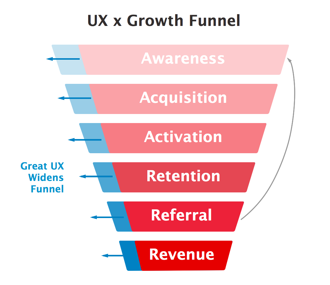
I kept in mind the core growth metrics for Carousell (# of listings, time in app), and hypothesized design changes that would have a positive impact on them. In a follow-up process, I would run tests on these hypothesises using rigorous split testing on the Carousell iOS app.
Now let’s dive into the process in detail.
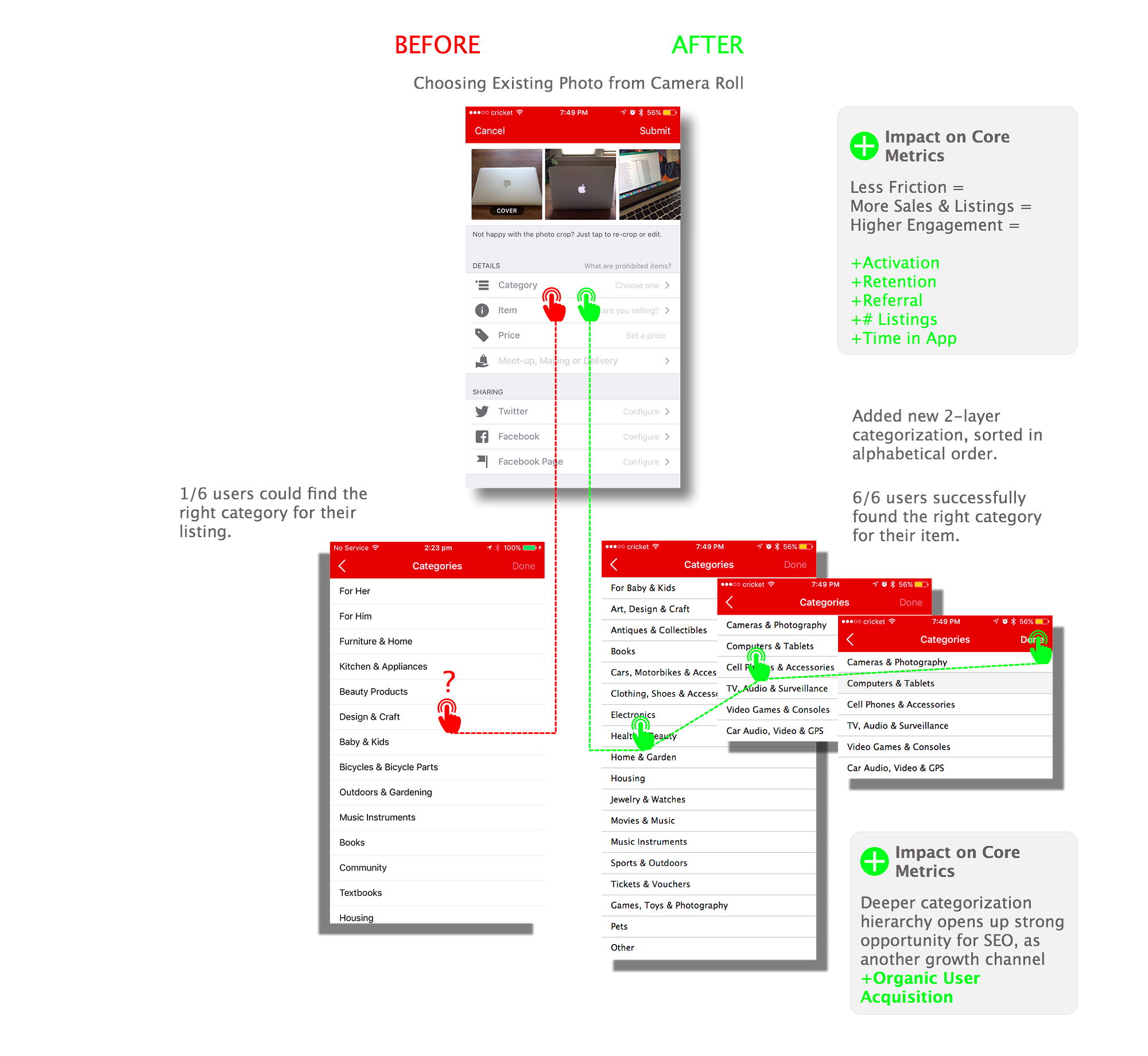
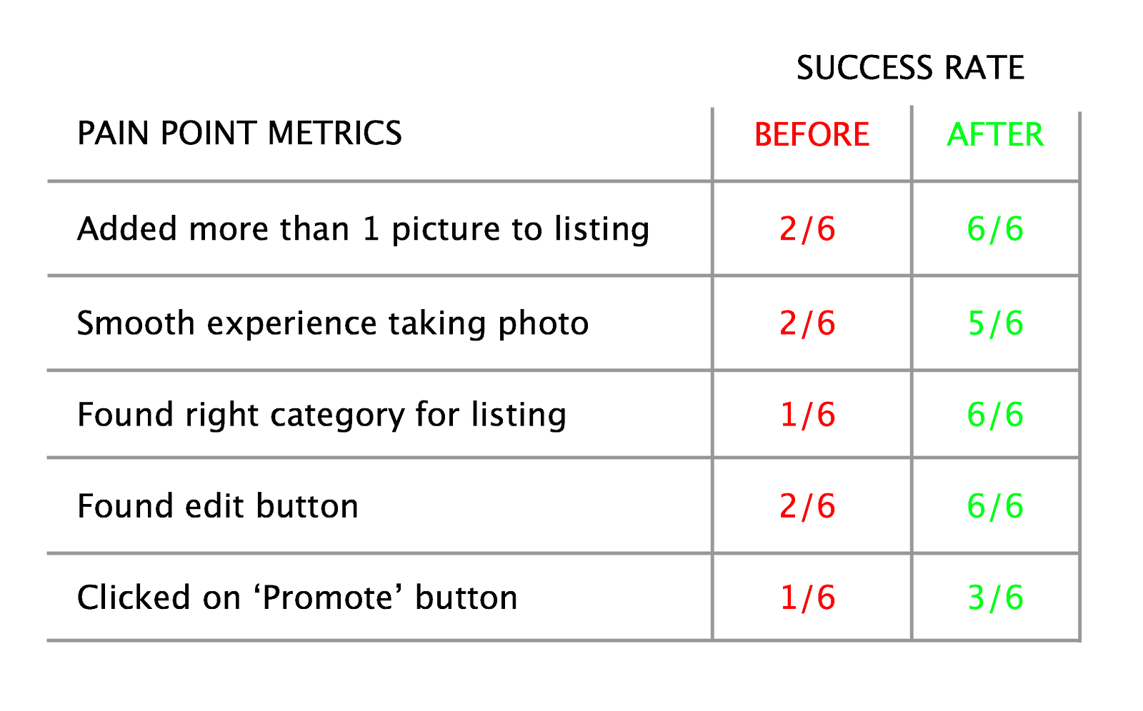
Being able to list an item quickly and easily is critical for both user and Carousell. From the user interviews there were two points of friction that stopped a smooth flow towards listing: difficulty taking the photo and choosing the right category.
Pain Point 1: Taking and choosing photos for own new listing
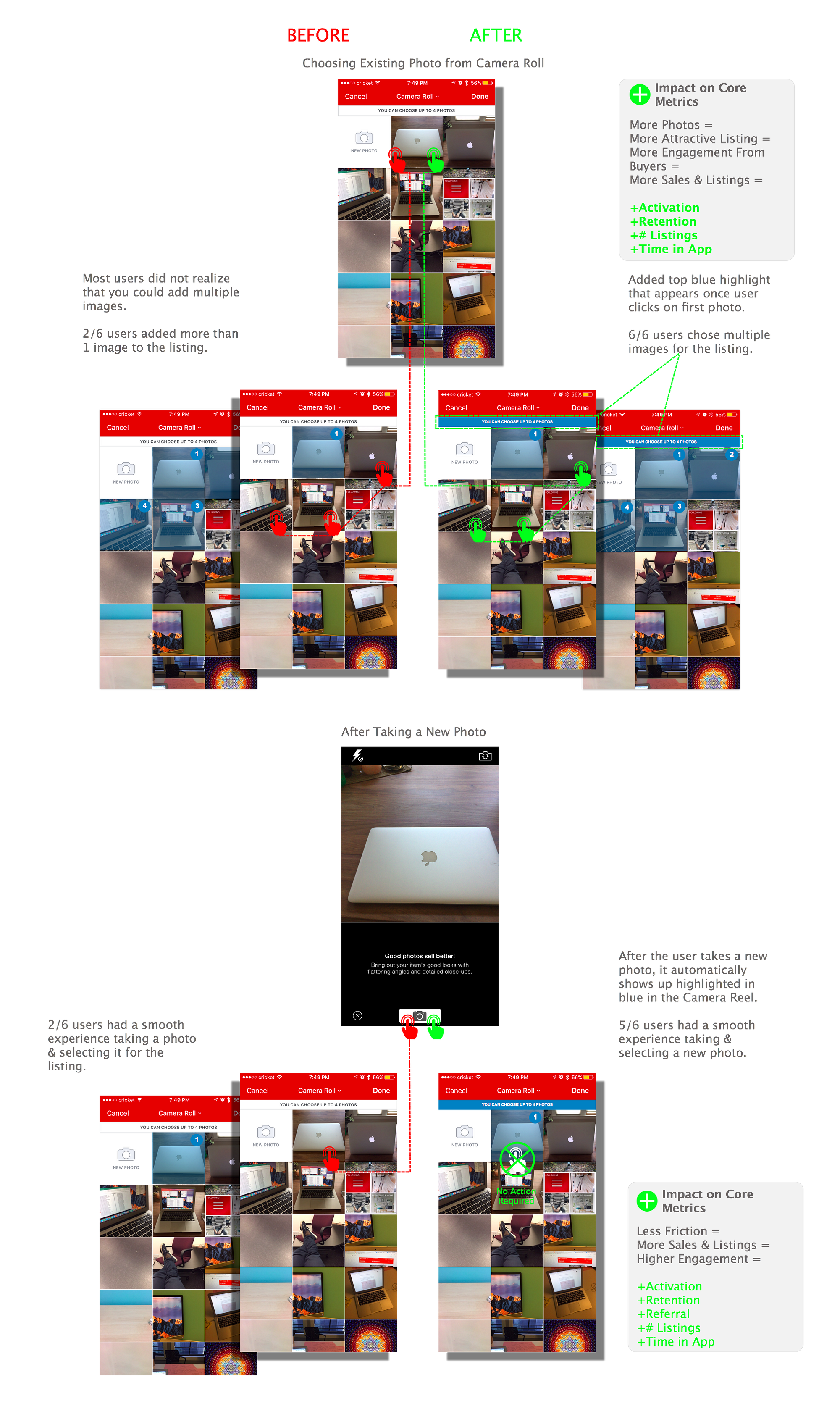
4 out of 6 users had a frustrating experience taking and choosing photos for their new listing. Users did not immediately realize that you could choose multiple photos in the photo library. Some users also expected the photo they took to show up automatically as the default photo for the listing. The delayed appearance of a photo in the camera reel definitely contributed to this frustration.
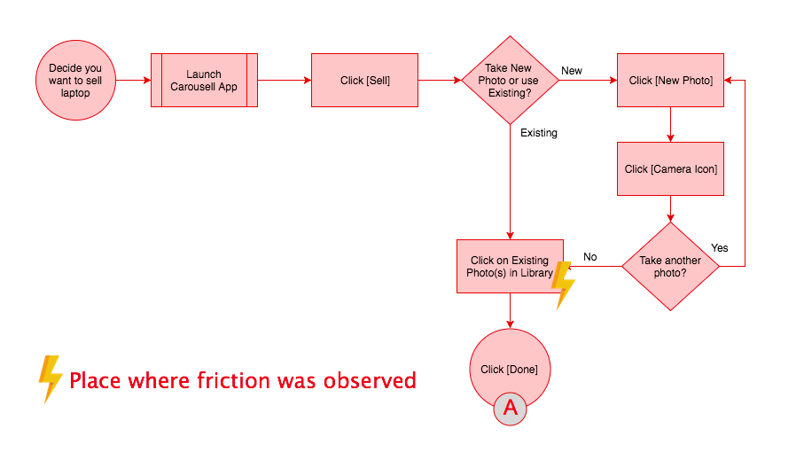
Task Flow
Task Flow 1: Taking and choosing photo(s) for new listing
Solution: add a feature where photo that had just been taken is auto-selected in the camera reel, and a highlighted reminder that user can choose up to 4 photos