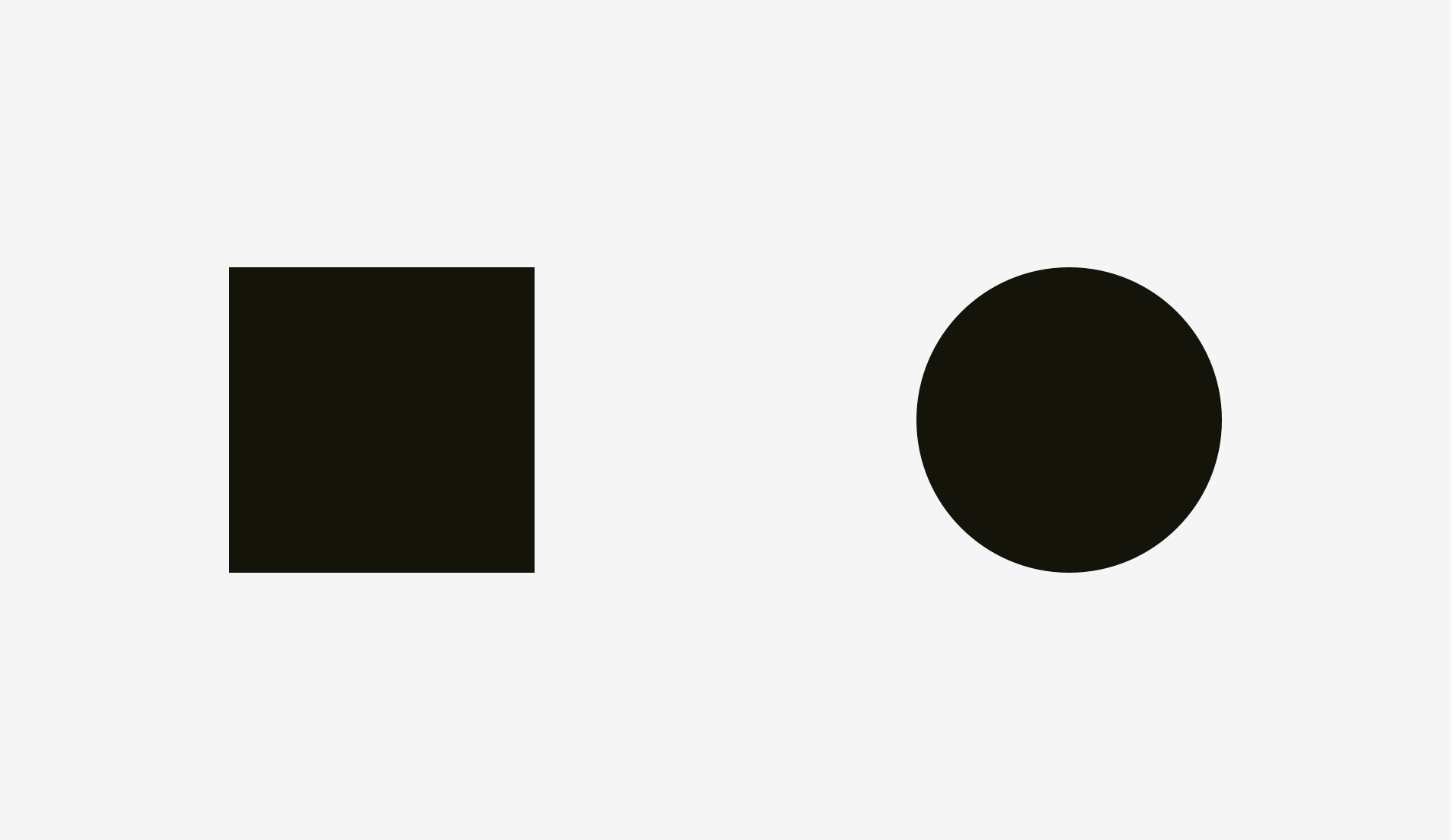
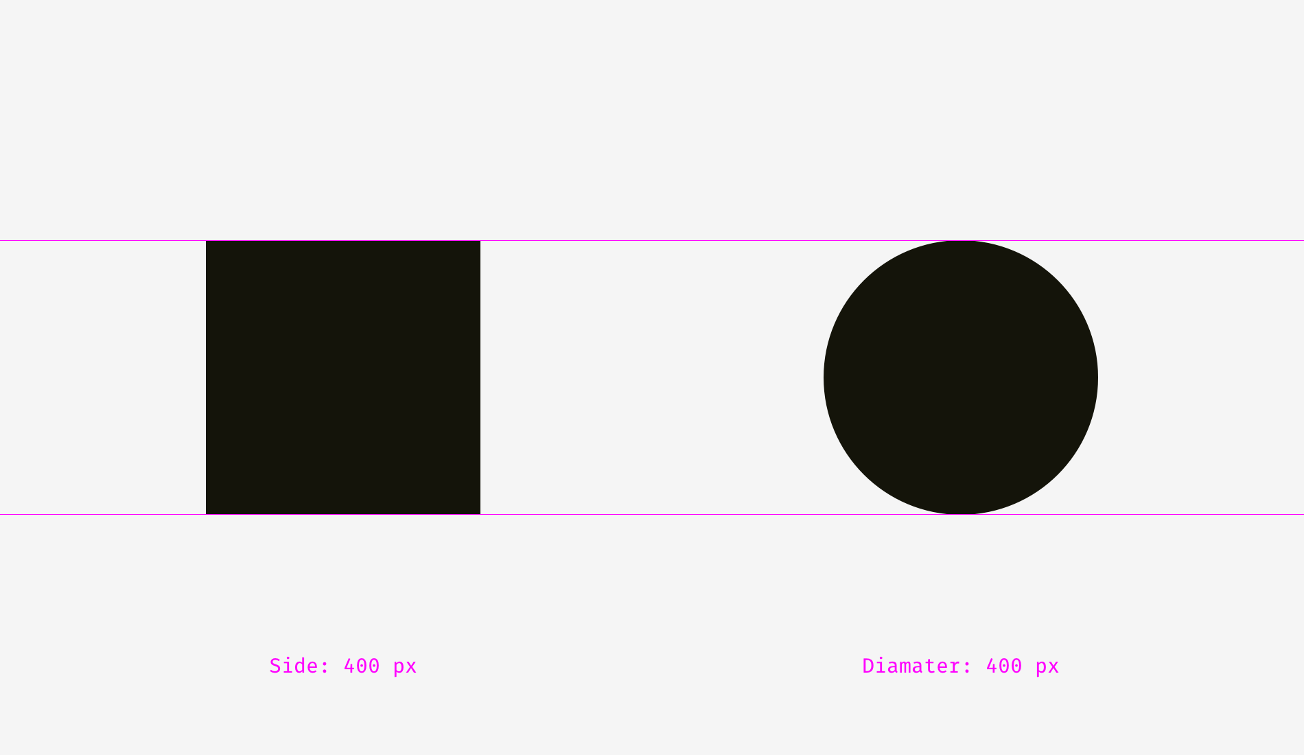
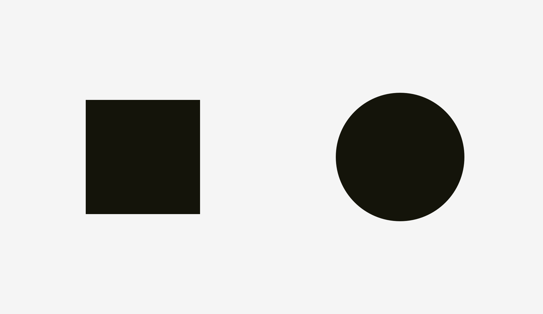
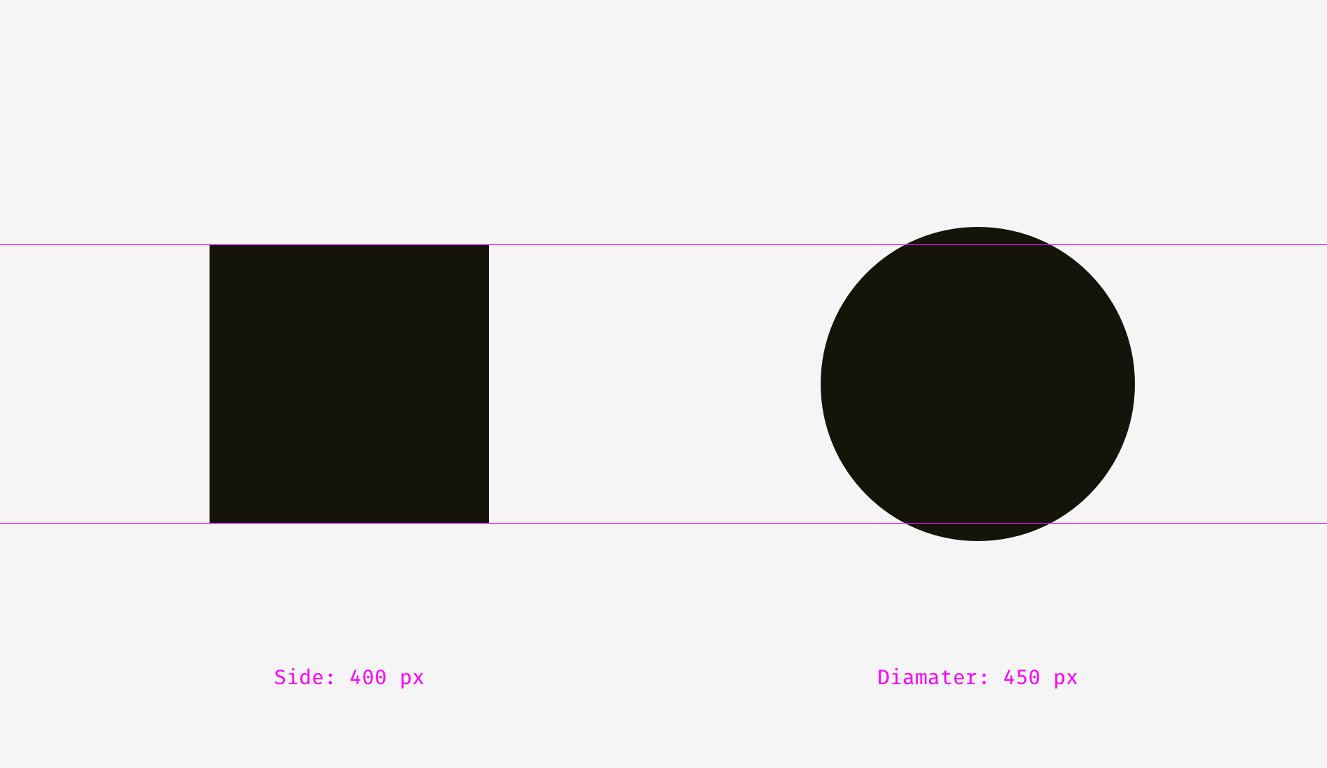
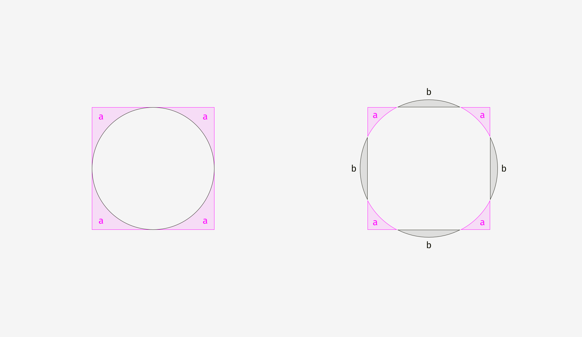
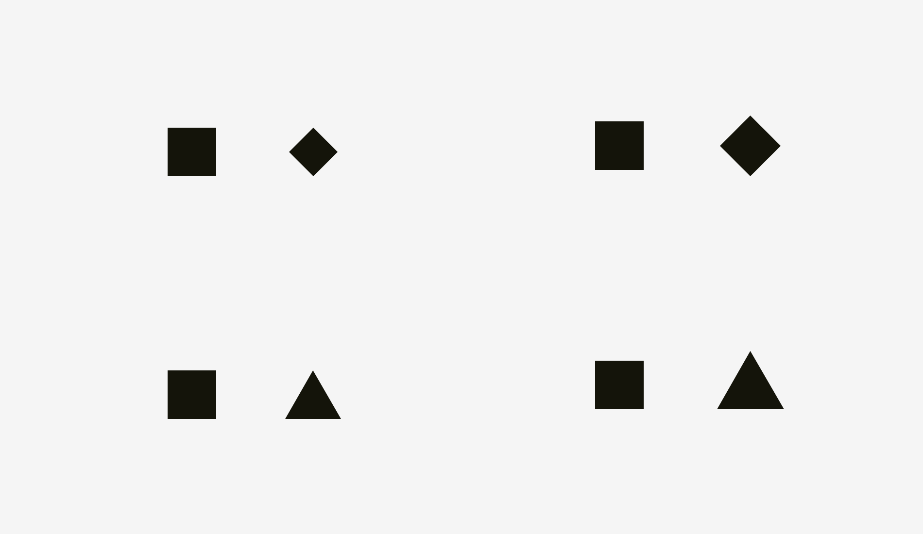
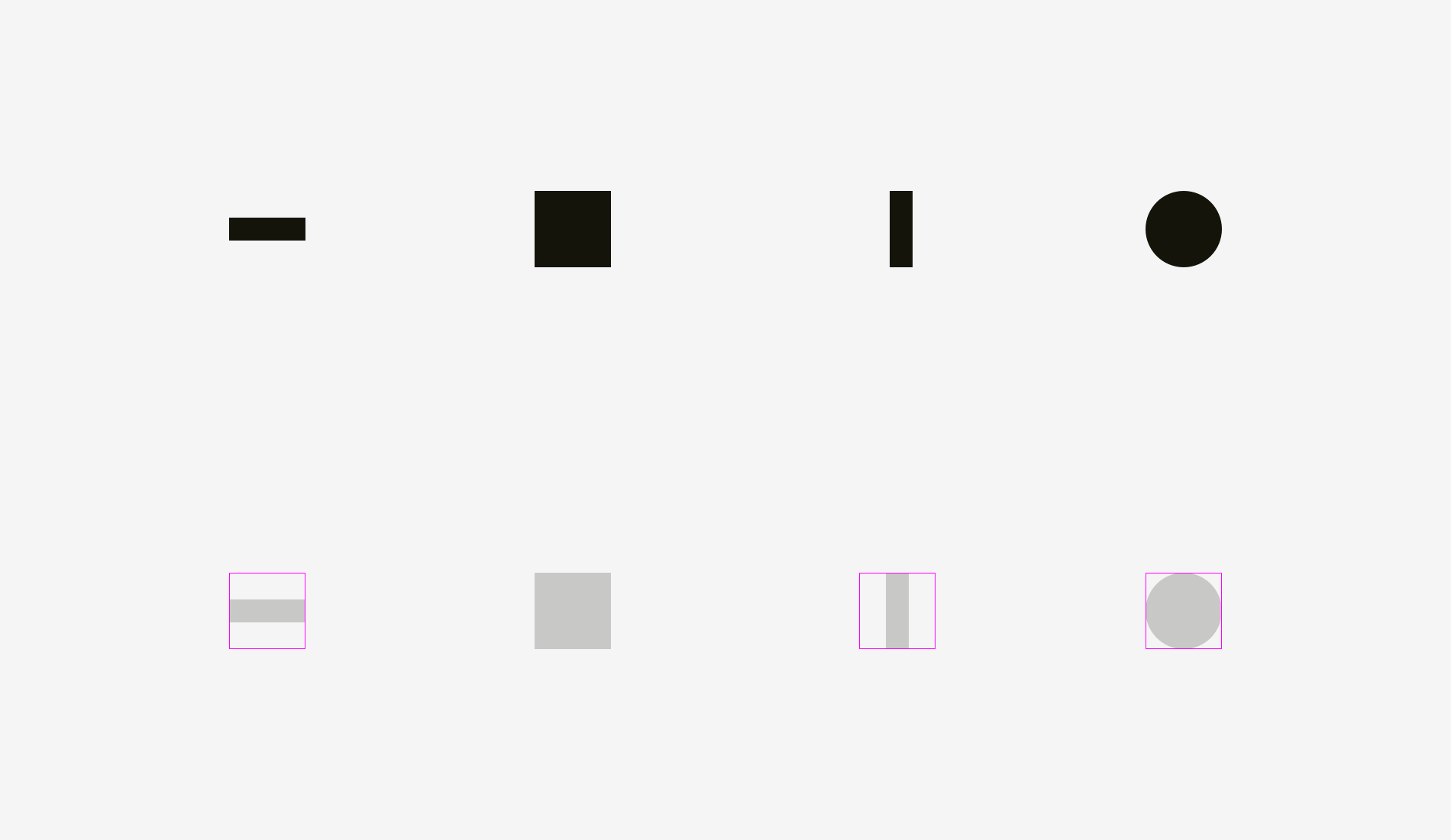
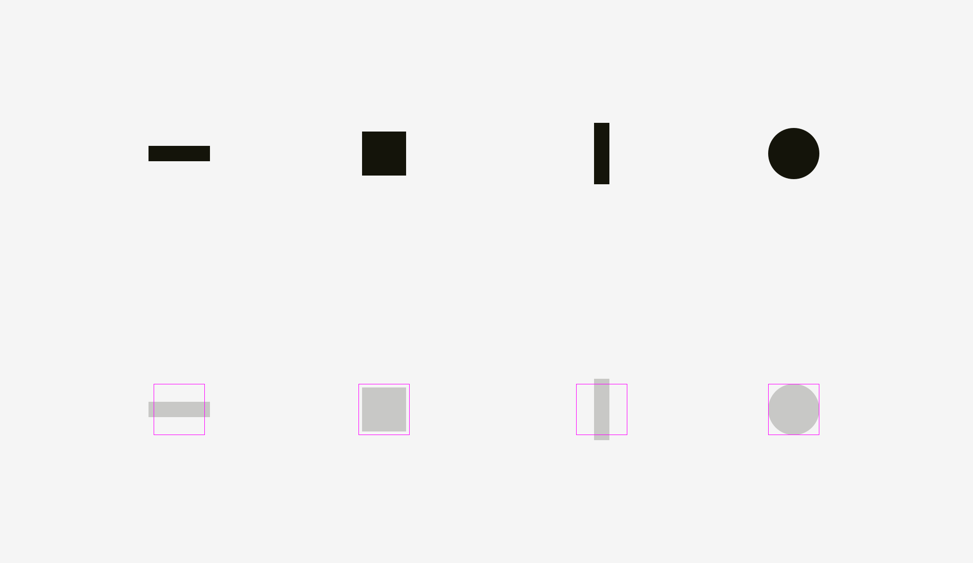
2. Alignment of different shapes
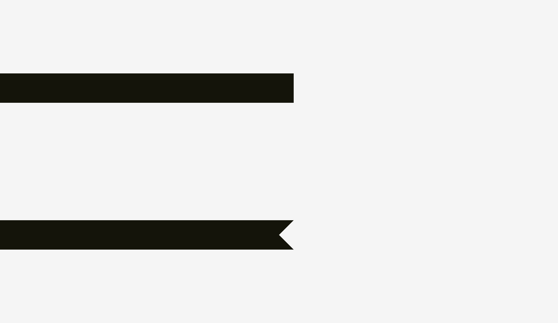
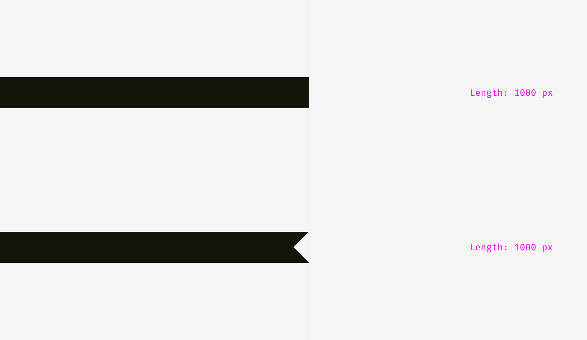
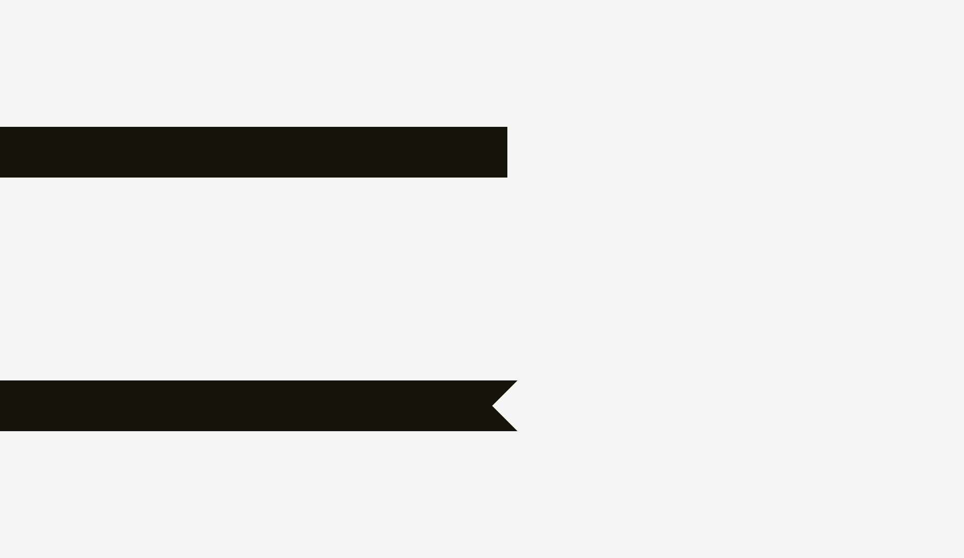
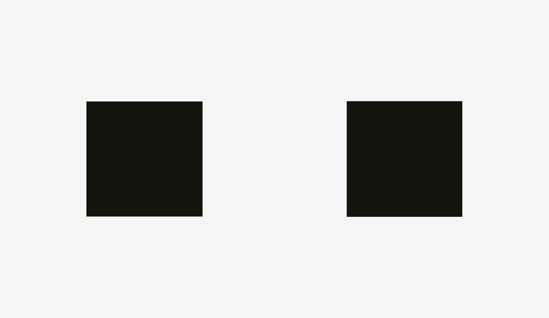
Optical alignment is a logical continuation of the optical balance topic and the phenomenon of optical weight. Take a look at the stripes below. Do they look as if they are of the same length?
In terms of pixels, the answer is a firm “yes”. However, at first sight, the lower stripe looks shorter than the upper one.
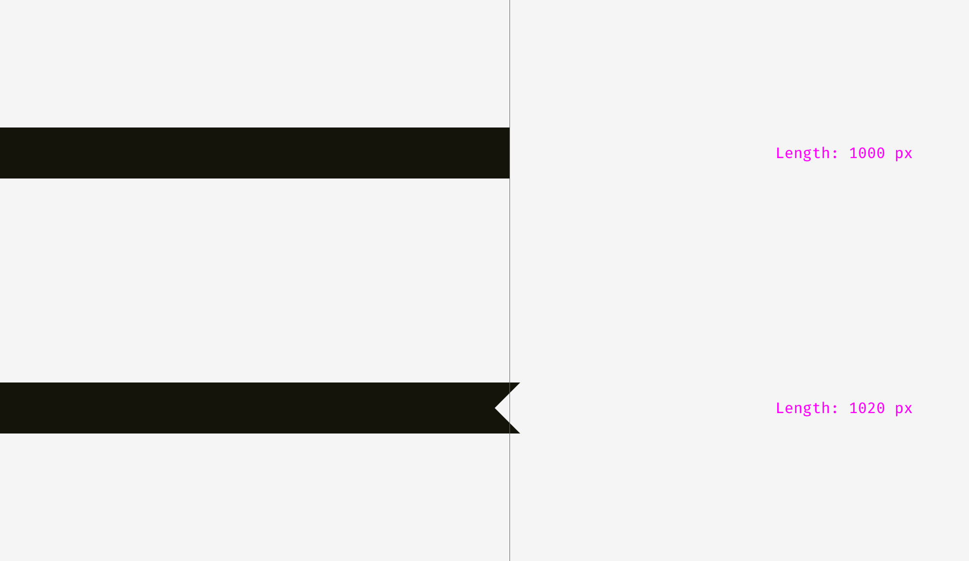
One more picture of the two stripes. Has anything changed?
I applied optical compensation for the lower stripe. Allowing the spikes to go 2o pixels beyond the length of the upper stripe is the way to compensate a gap between the spikes and make both shapes optically equal.
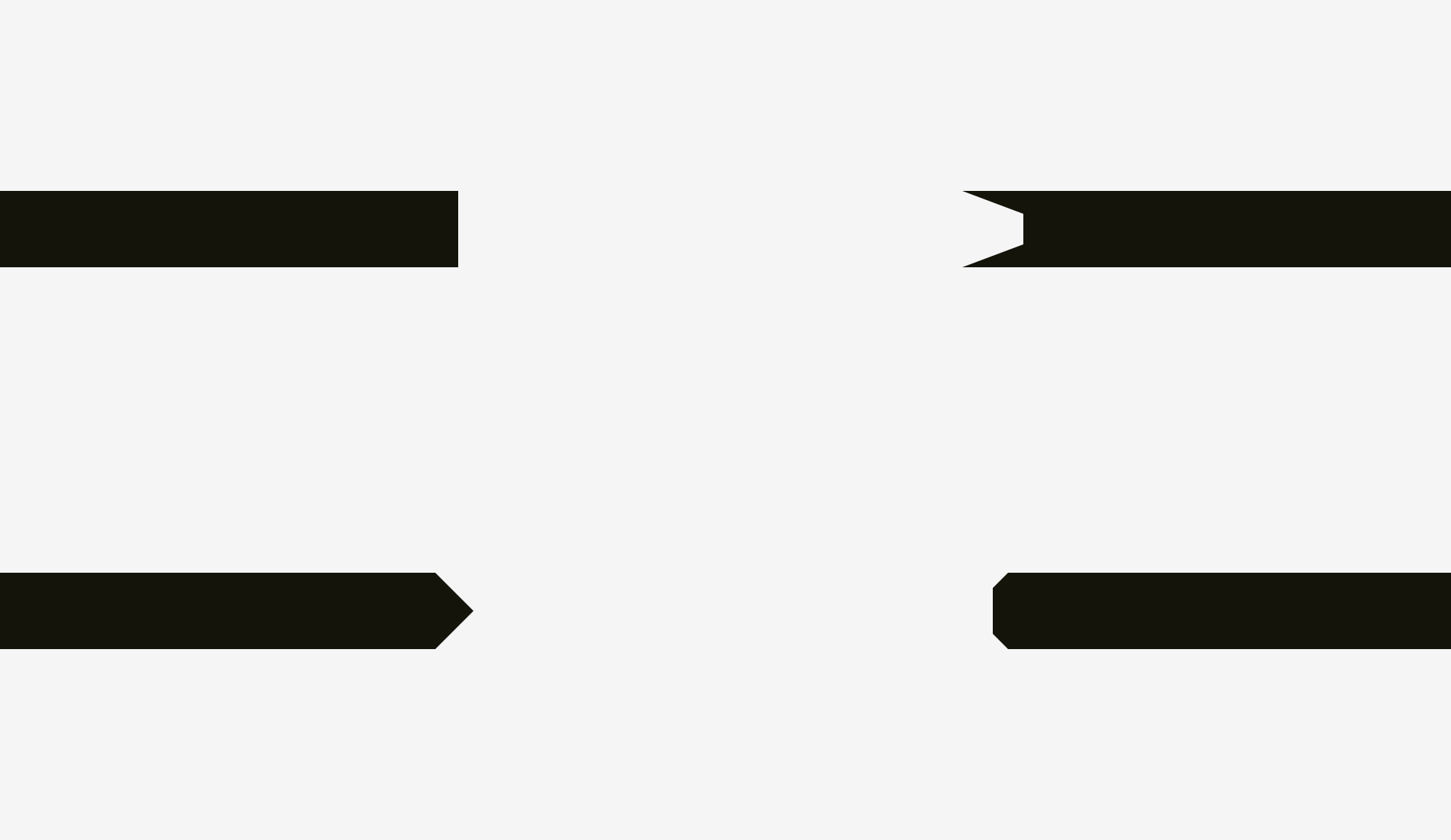
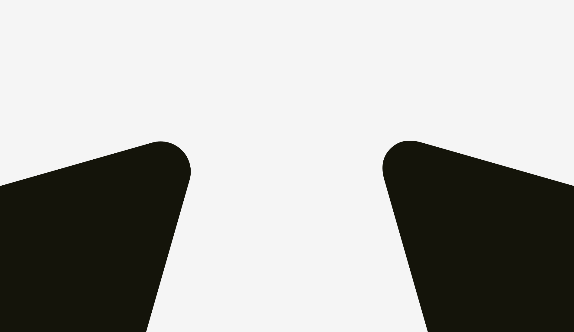
And now some more sophisticated examples of differently shaped stripes.
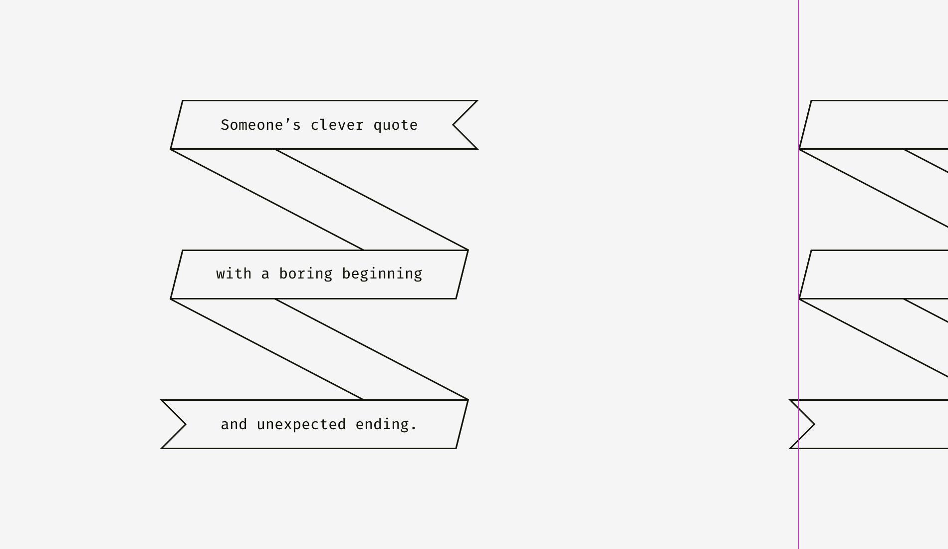
So, if you are creating a poster with folded stripes and text on them or you are putting a bright “discount” stripe on a product card of an online store, mind making them optically balanced. Sharp edges should go a bit beyond the rest of the shape, especially if it’s a rectangle.
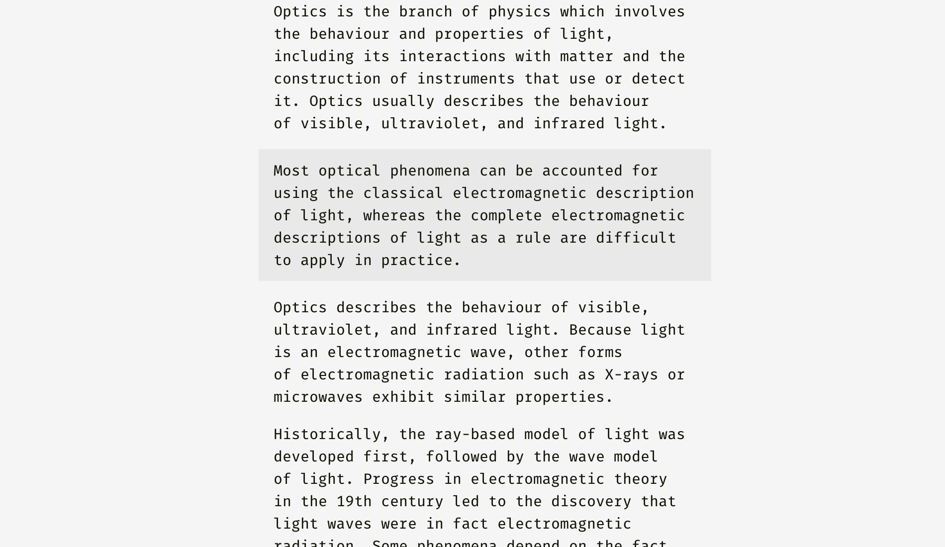
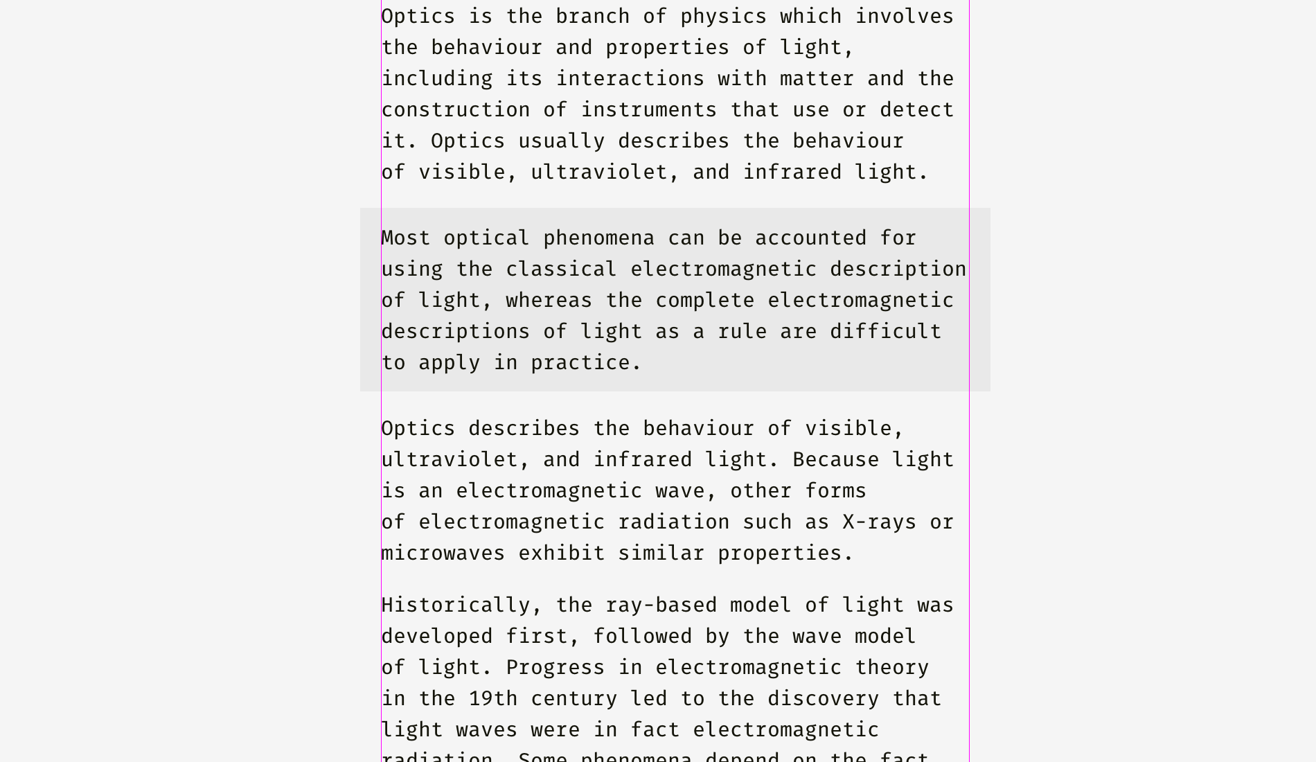
And what about aligning plain text and paragraphs that have a background? It depends on the visual density of the background. If it’s light, you can align the highlighted paragraph with the rest of text.
Since the background is light, it doesn’t interrupt the usual text flow.
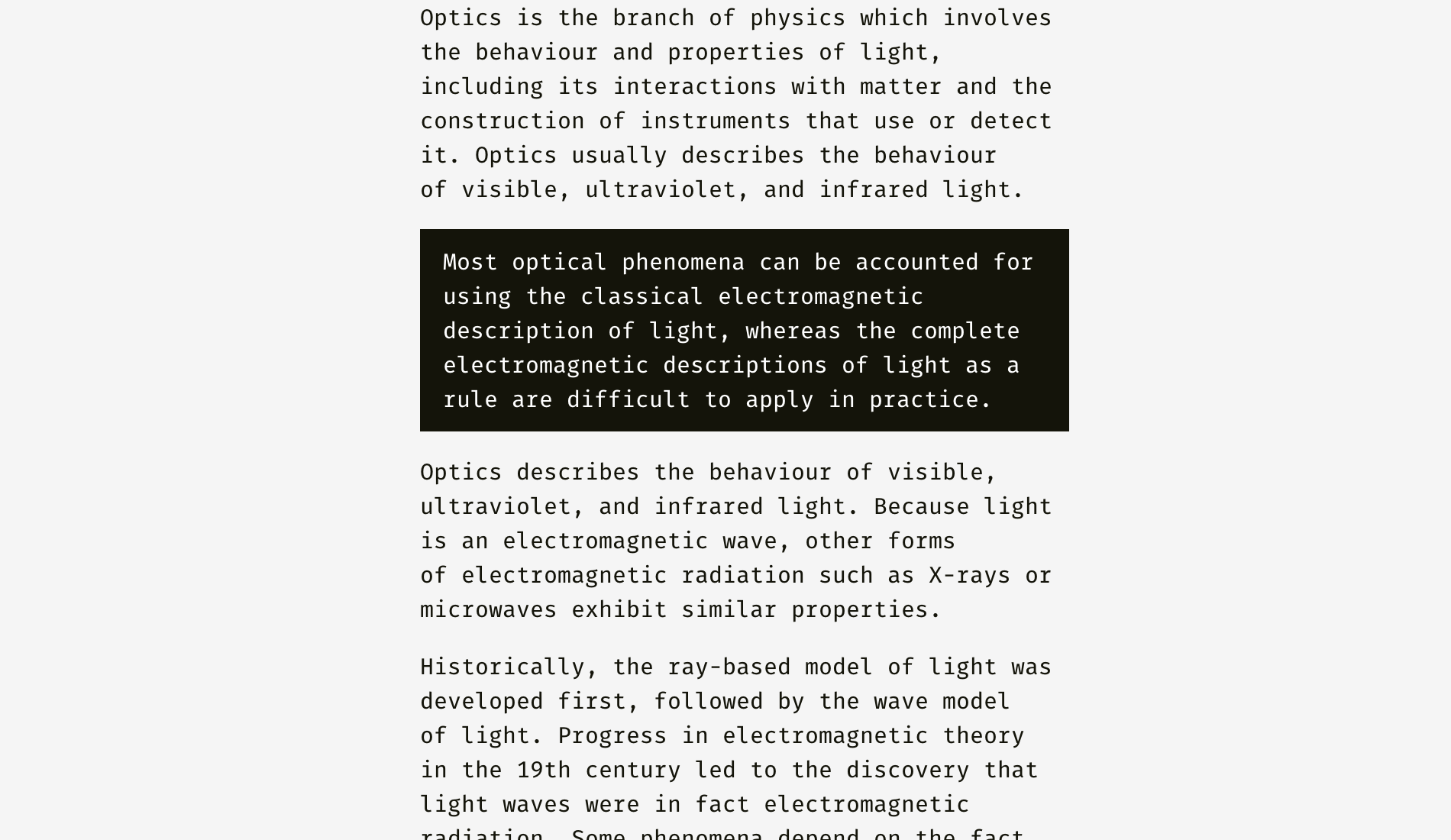
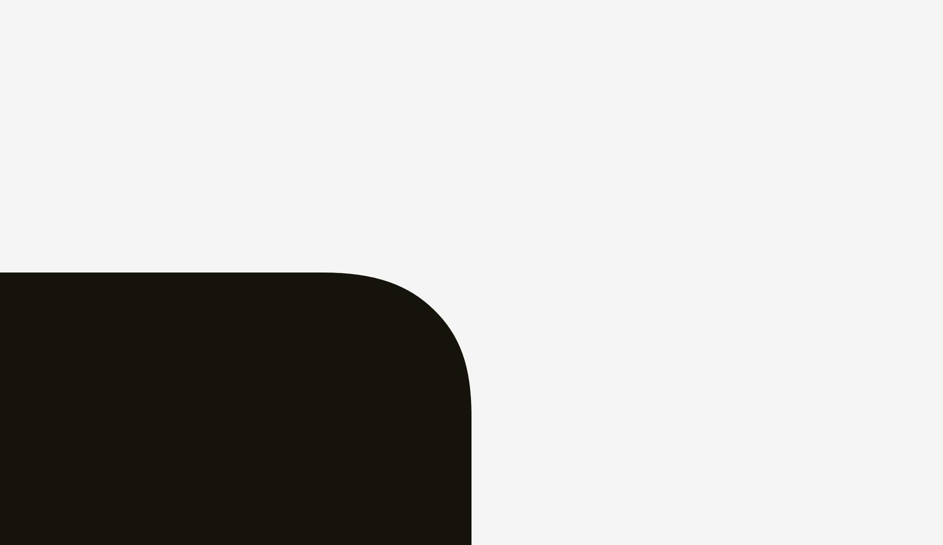
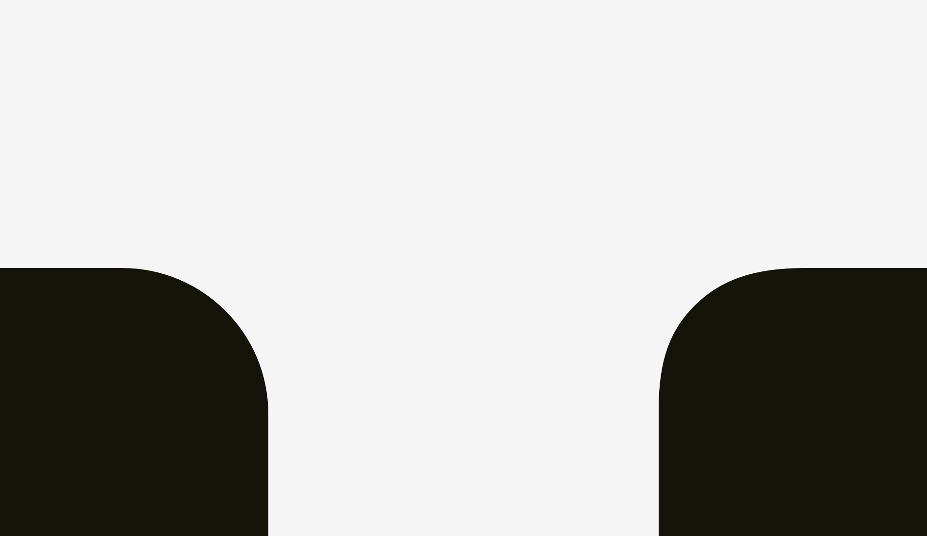
A different approach can be applied to a dense background. On the picture, the black background is aligned with the rest of text while the white text inside of it is placed with indents.
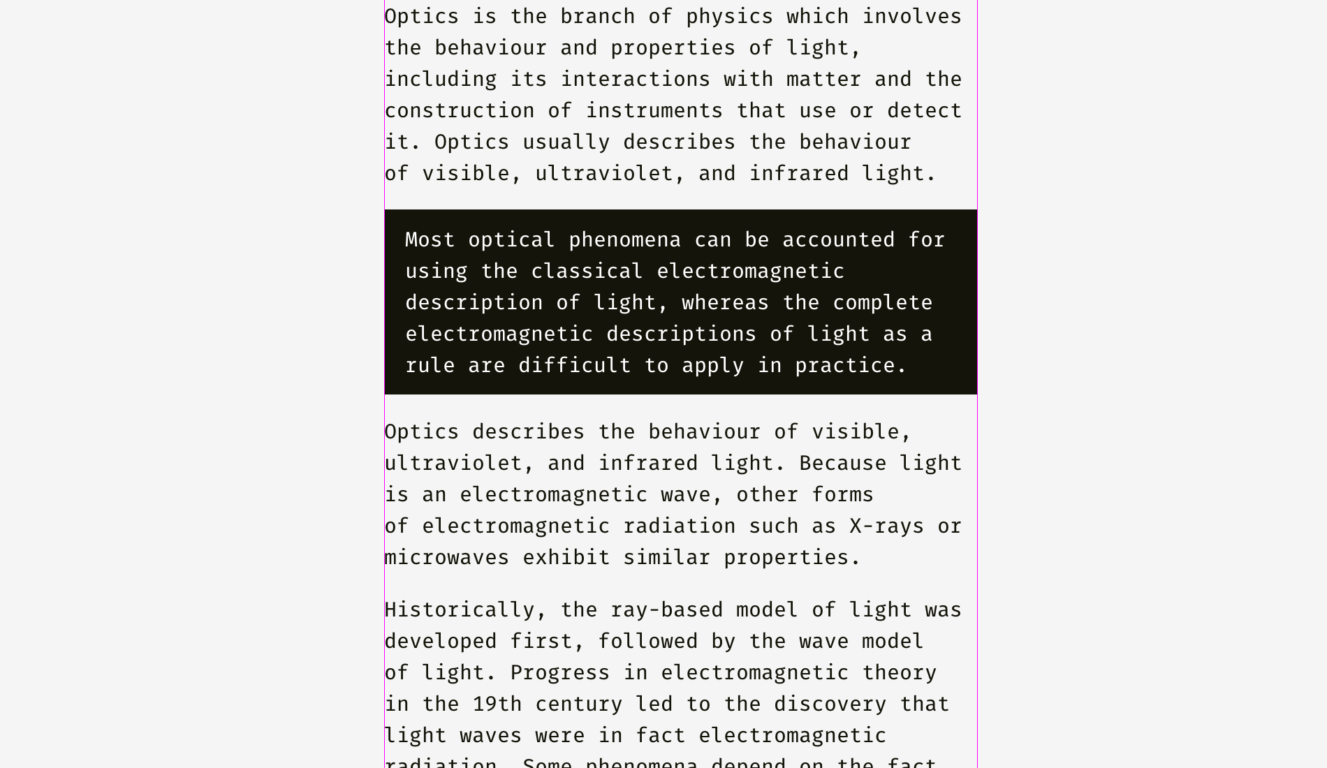
Unlike the case with the light background, the black one has substantial optical weight, and if the goal is to insert a paragraph seamlessly, it’s better to align it the way shown below.
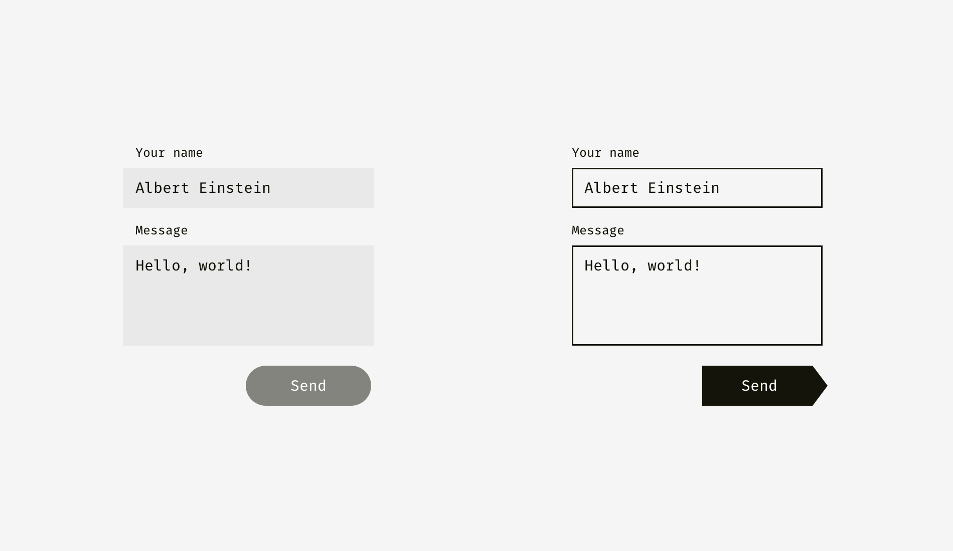
The same principle will work with buttons and input fields. Of course, it’s not a dogma, just the optics-based vision of an interface.
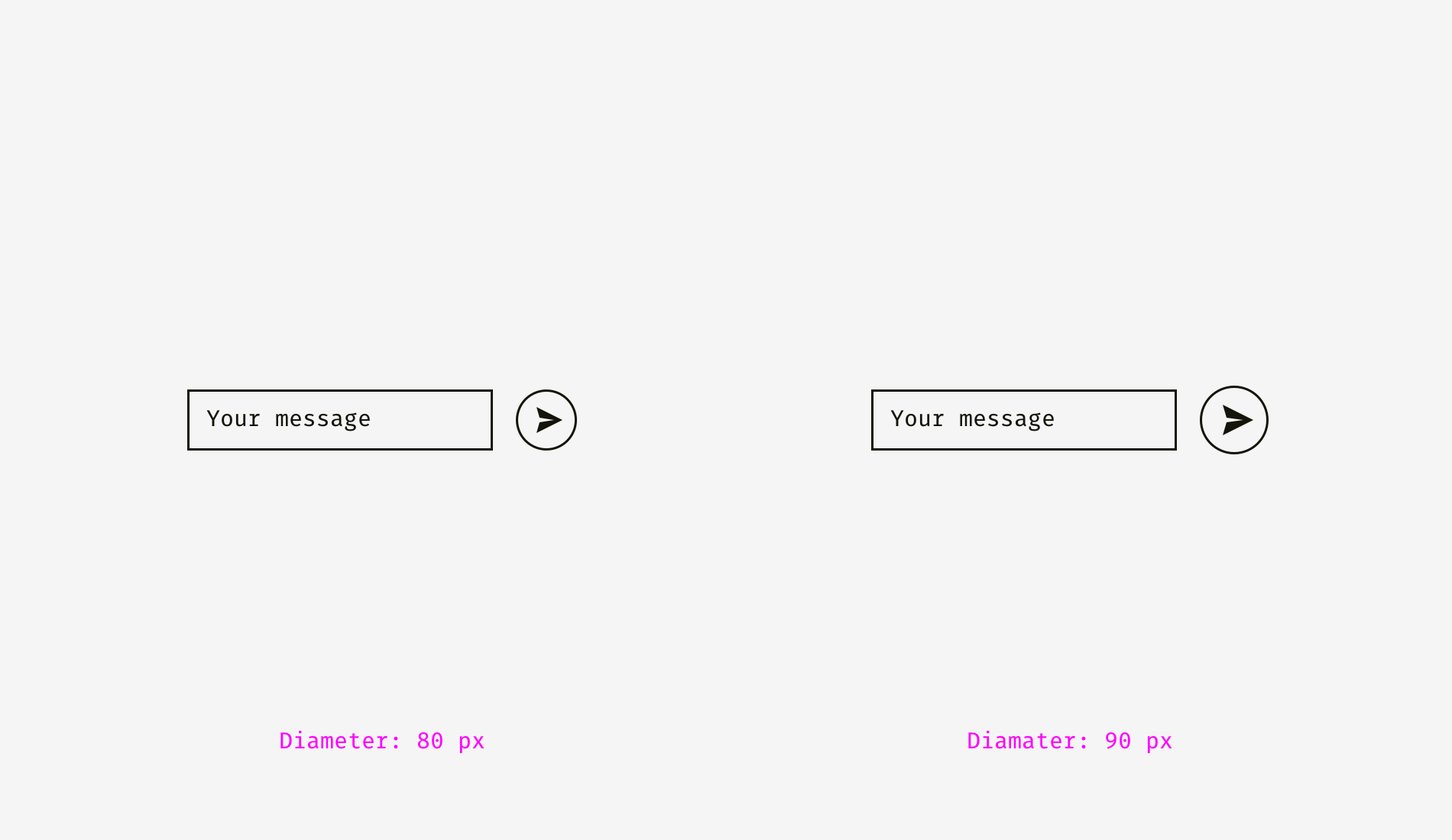
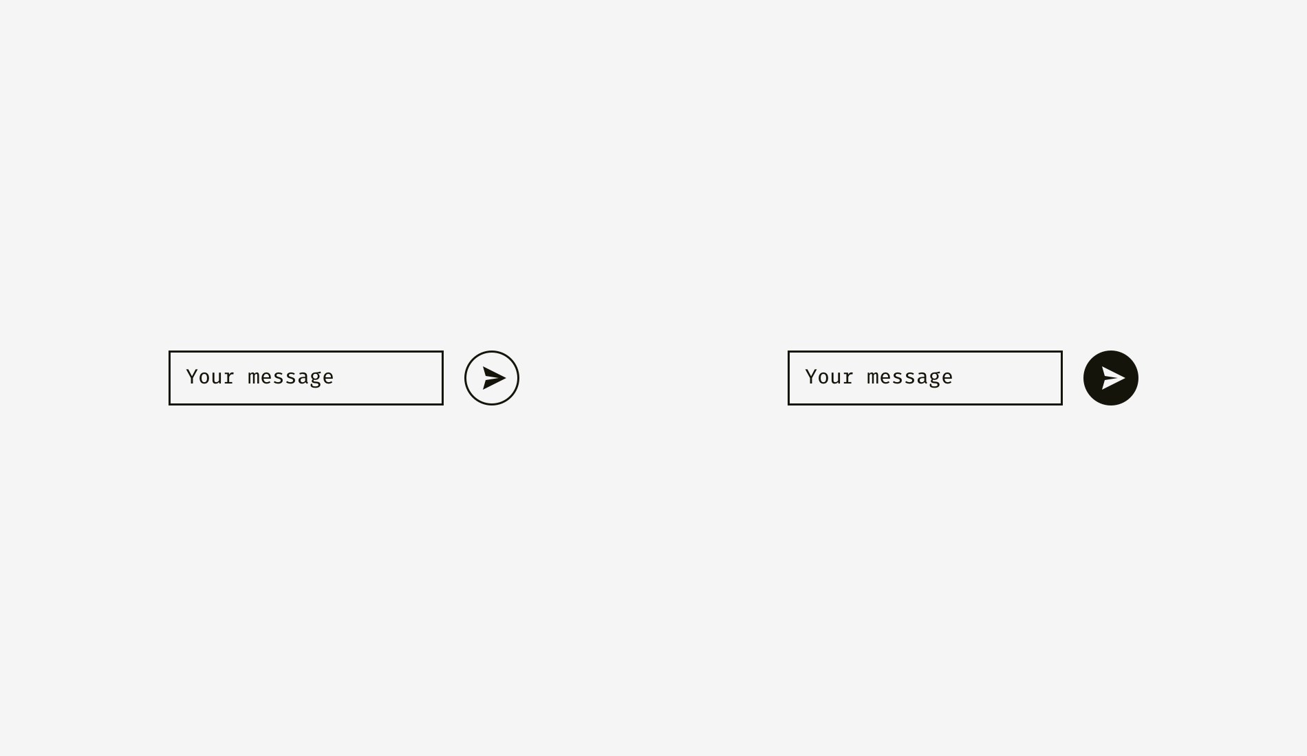
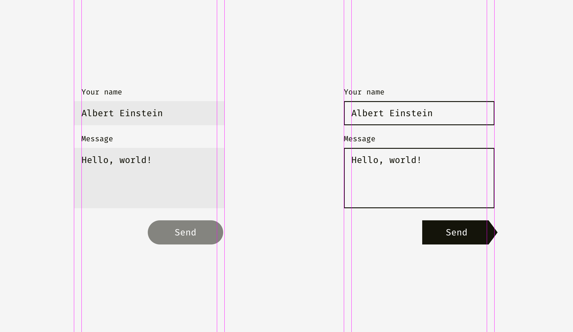
The light background of input fields on the left can go beyond input labels and user’s input. The right edge of “Send” button is not fully aligned with the right edge of input backgrounds since the button is darker and looks heavier from optical perspective.
On the right, inputs have solid borders, and I aligned them with the labels while user’s input has indents inside of the boxes. “Send” button has a triangular side. The button is moved a bit rightwards to look balanced with the rectangular input fields above.
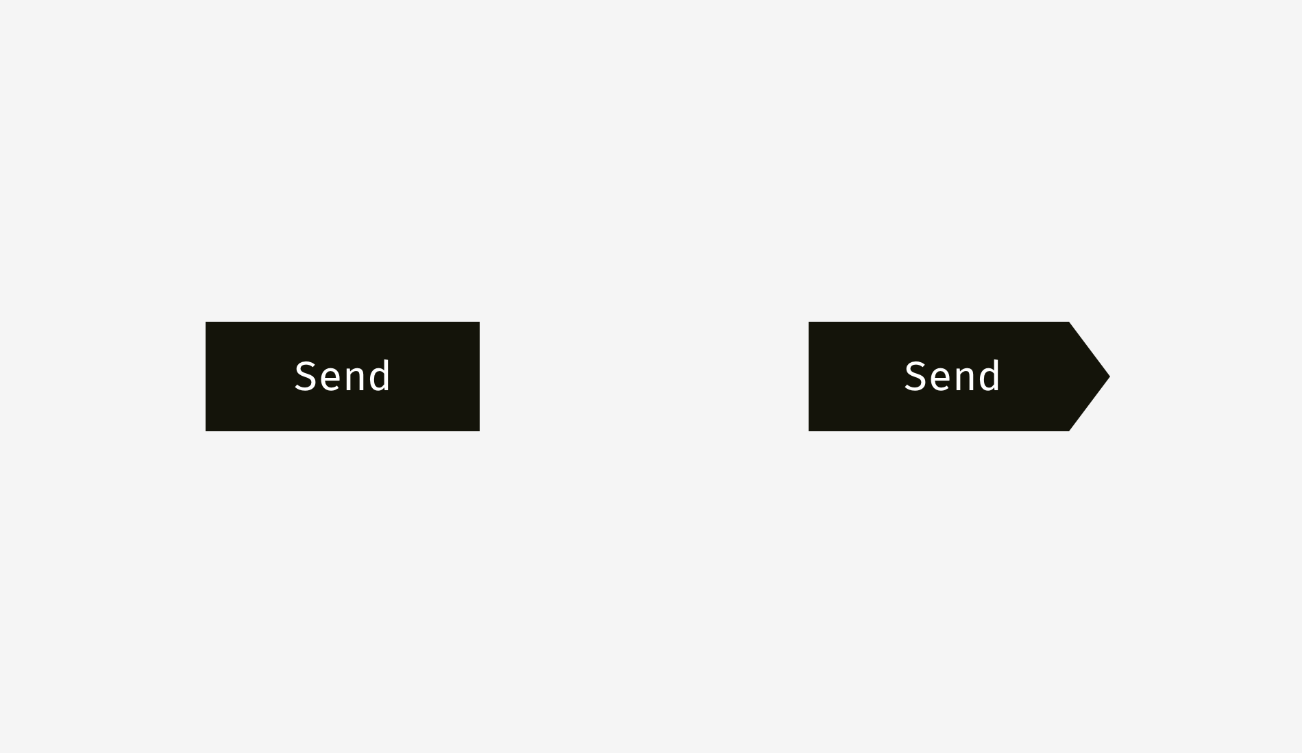
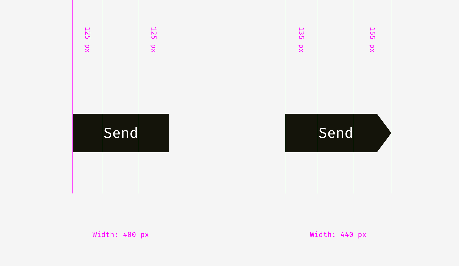
And here we are approaching to one more aspect of alignment — the alignment of text and icon buttons. Look at the buttons below. The text looks centered, doesn’t it?
The trick is that on the right button I moved the word a bit to the left, since the right edge is triangular. Moreover, the arrow-like button is 40 pixels wider to look optically equal to the rectangular one.
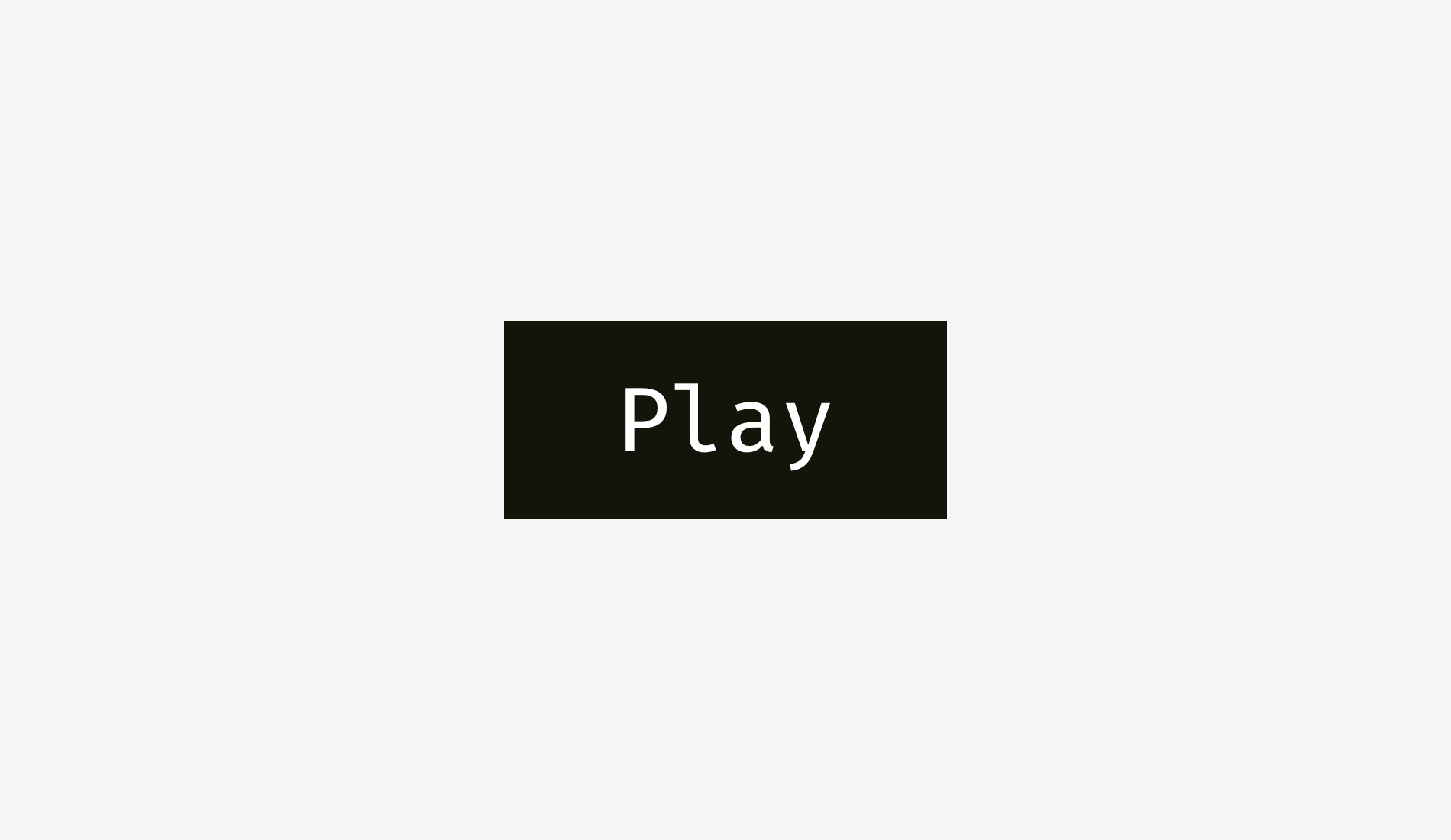
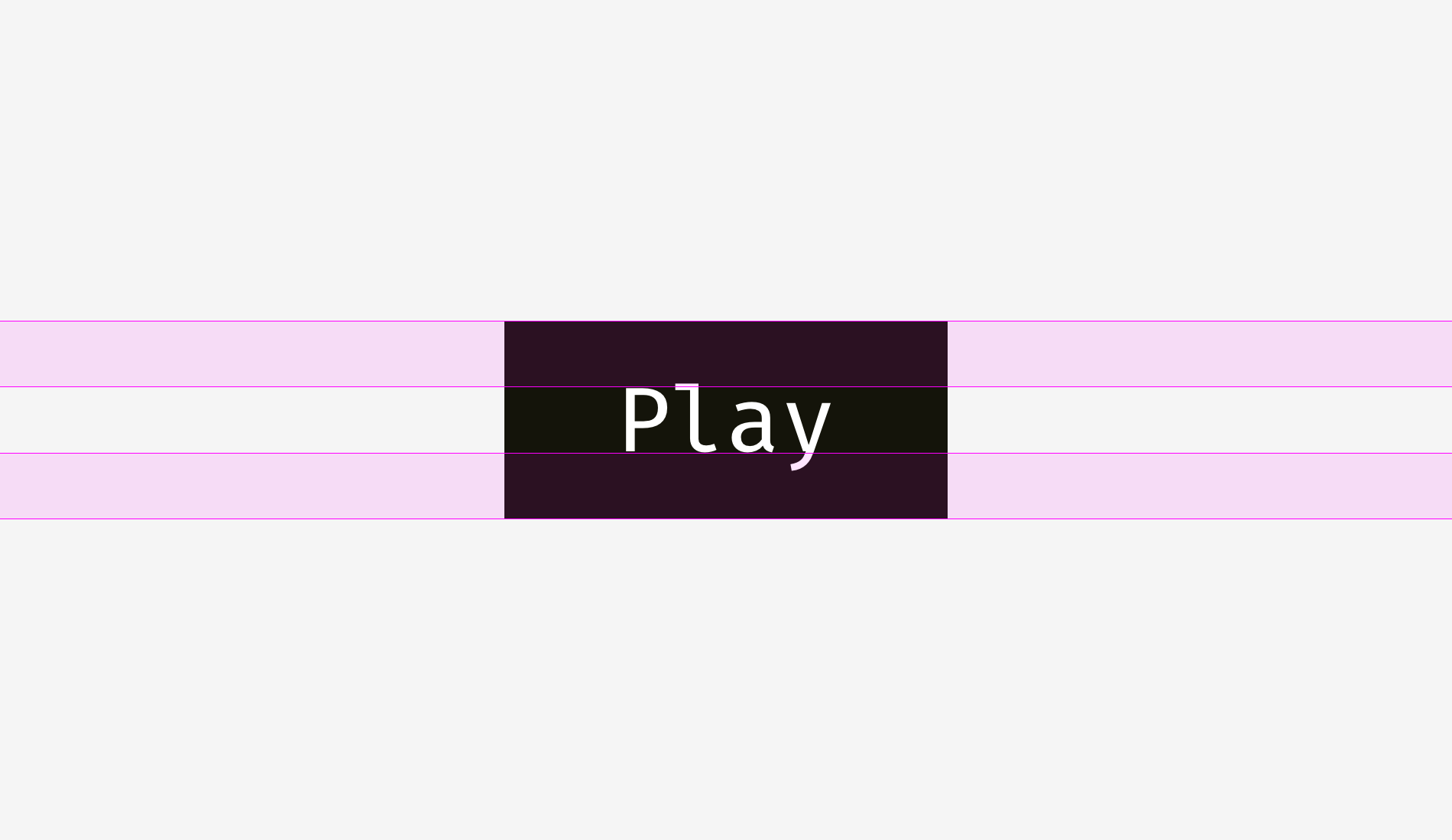
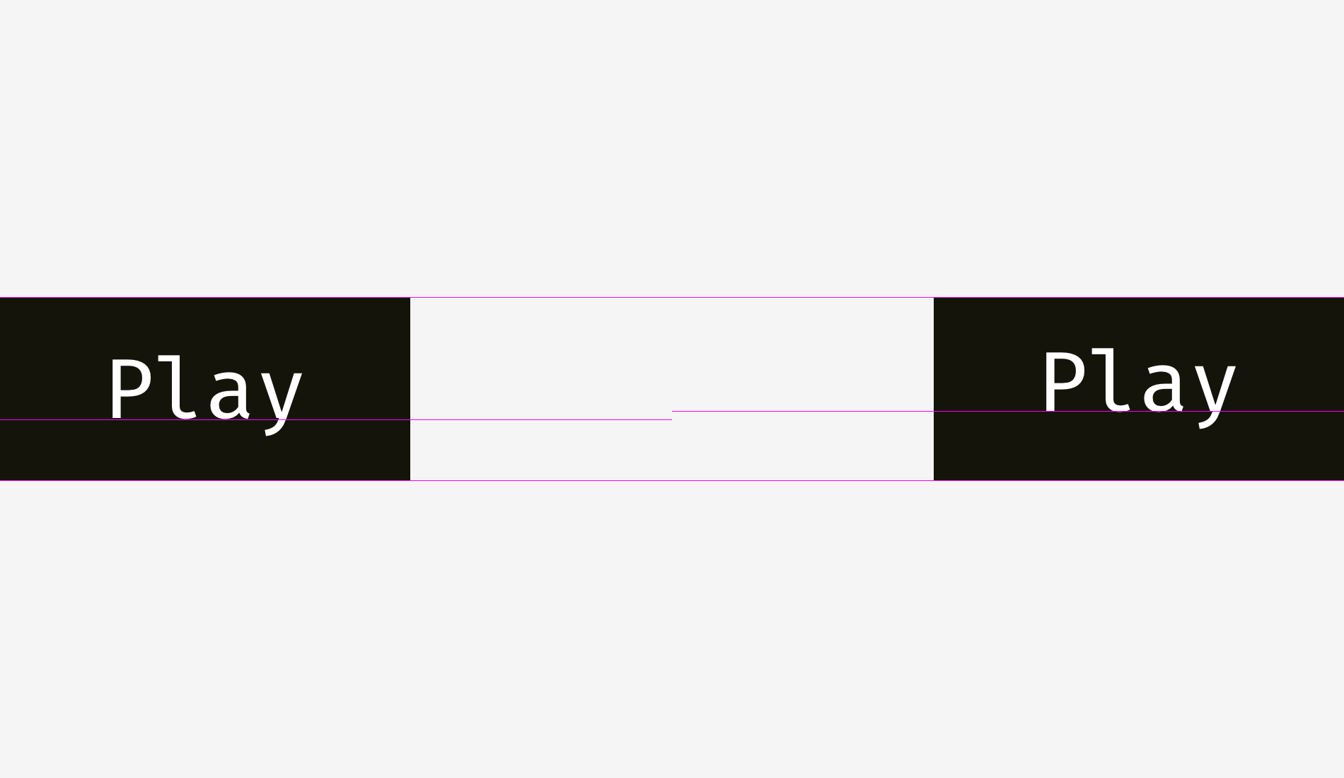
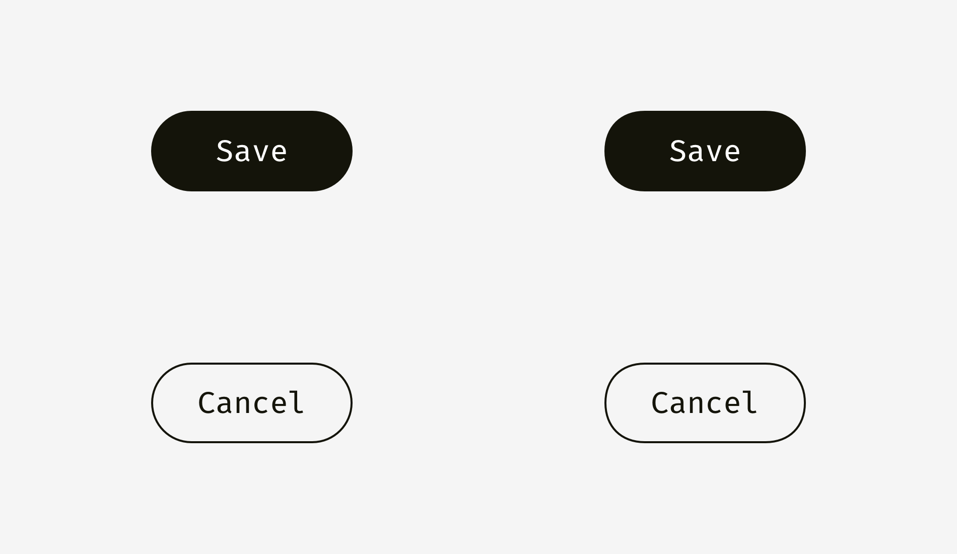
Not only do text buttons have horizontal alignment, but also they have vertical alignment of a word and a background. The first approach I’d like to tell about is used in the interfaces of various operating systems, sites, and applications. It’s the alignment based on the height of an uppercase letter of a font (so-called cap height). It equals the height of either “H” or “I”.
Basically, the space above and below an uppercase letter and the edge of a button is equal. It makes sense because command names usually are written in title case and English letters have more ascenders — upper sticking out parts (l, t, d, b, k, h) — than descenders — lower hanging parts (y, j, g, p).
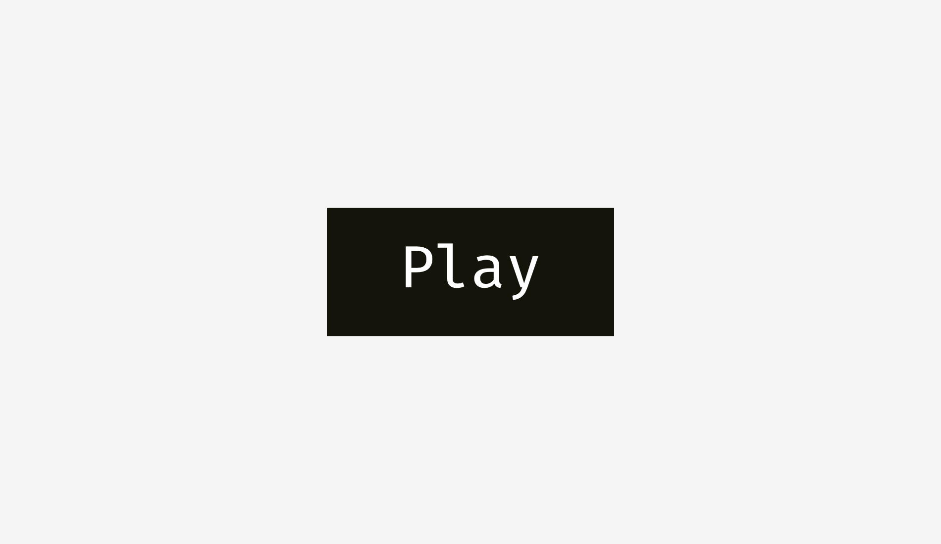
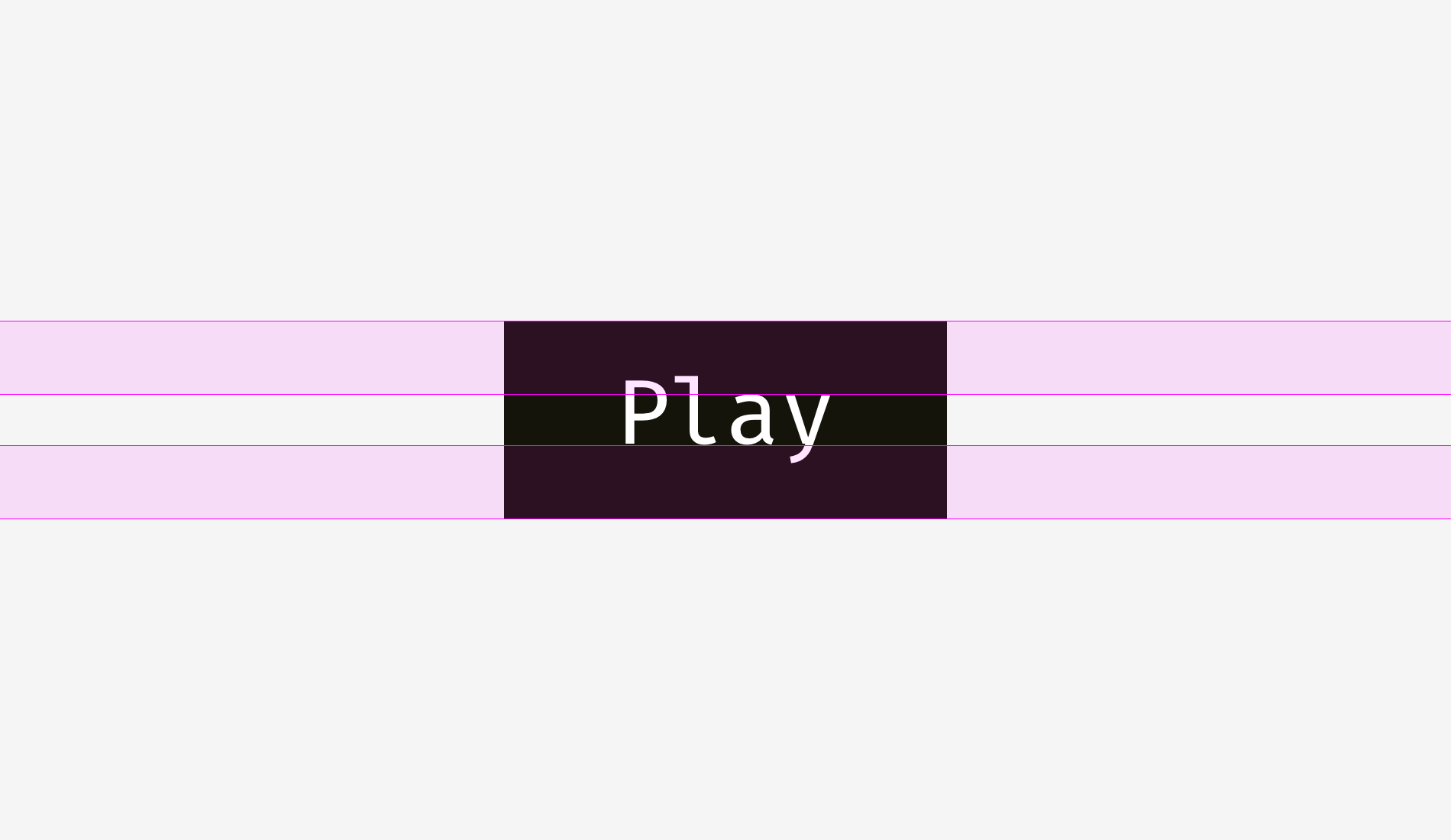
Another approach is to align a name and a background using the height of a lowercase letter of a font (so-called x-height). It equals the height of — not surprisingly— the letter “x”.
This approach also makes sense because the main optical weight of a text is concentrated in the area where lowercase letters are placed.
Is there any difference between these approaches? Yep, there is a difference. However, it’s not that big.
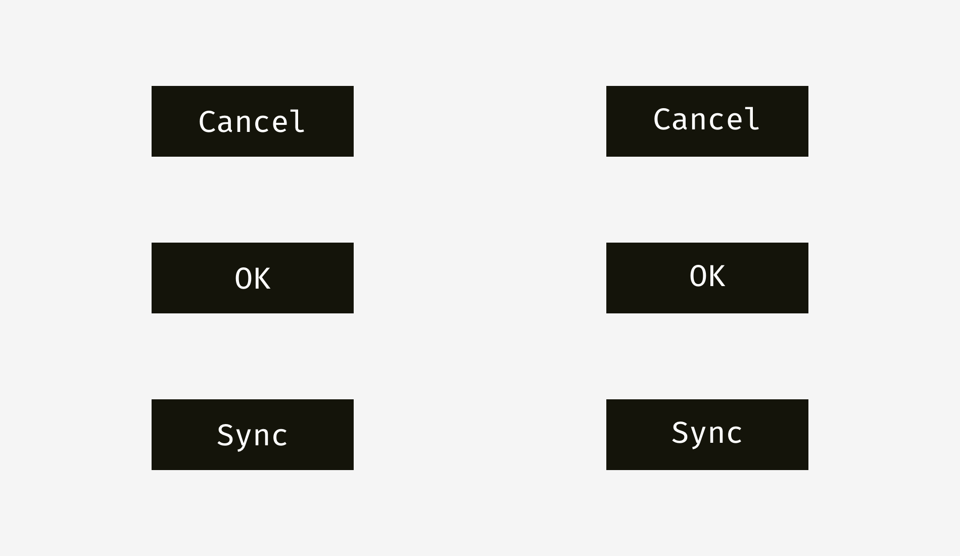
More examples for comparison below. The cap-height approach represented by the left column is definitely better for “Cancel” and “OK” — so widely used buttons — because “Cancel” has no descenders and “OK” is all capitals. The x-height approach shown in the right column is better only for “Sync” button, the name of which has both an upper and a lower sticking out elements; “Cancel” and “OK” words seem to be placed too high.
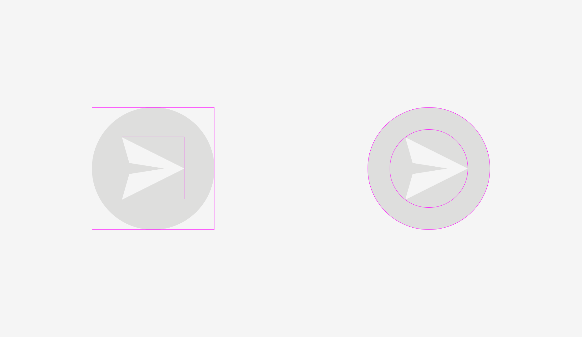
The situation with icon buttons is slightly different. Let’s put a popular “Send” icon on a round button. Which variant looks more balanced?
Hope you’ve noticed that something is wrong with the left one. It happens because of different alignment methods. The first option treats the icon if it was a rectangle. To a certain extent that’s right because when you send an SVG or PNG file to a developer it’s a rectangular sheet with a paper plane art on it. The right variant shows the icon placed the way all its sharp edges have equal distance to the circular button background.
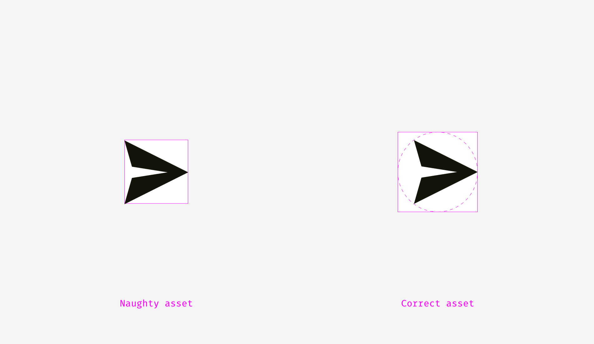
If you prepare a file for a developer, you need to reserve some area, so that they can center the icon on the background optically right.
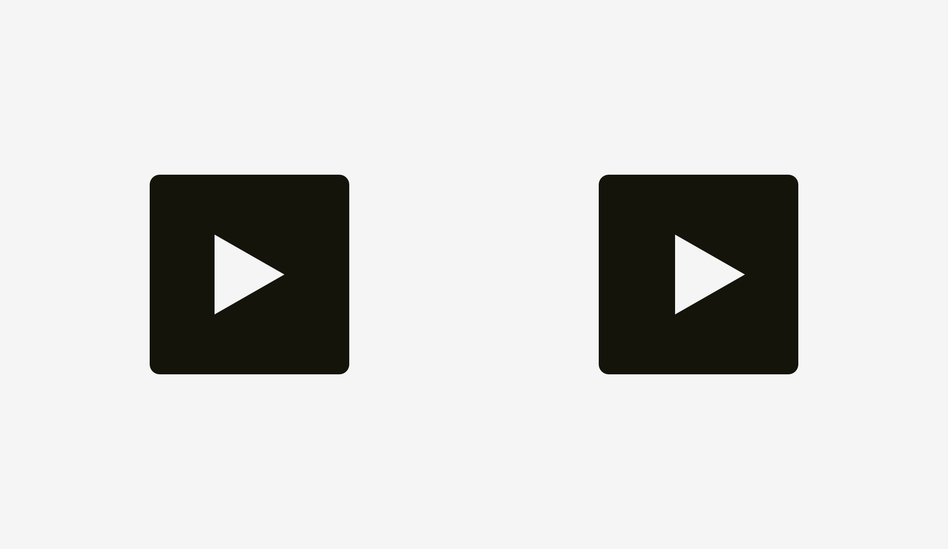
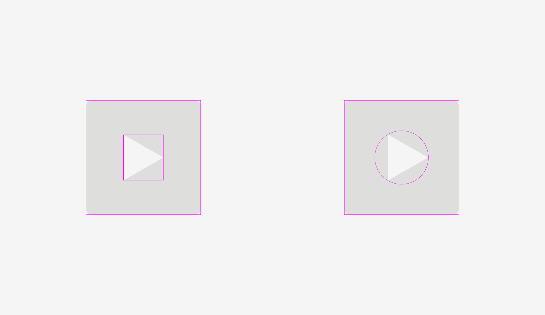
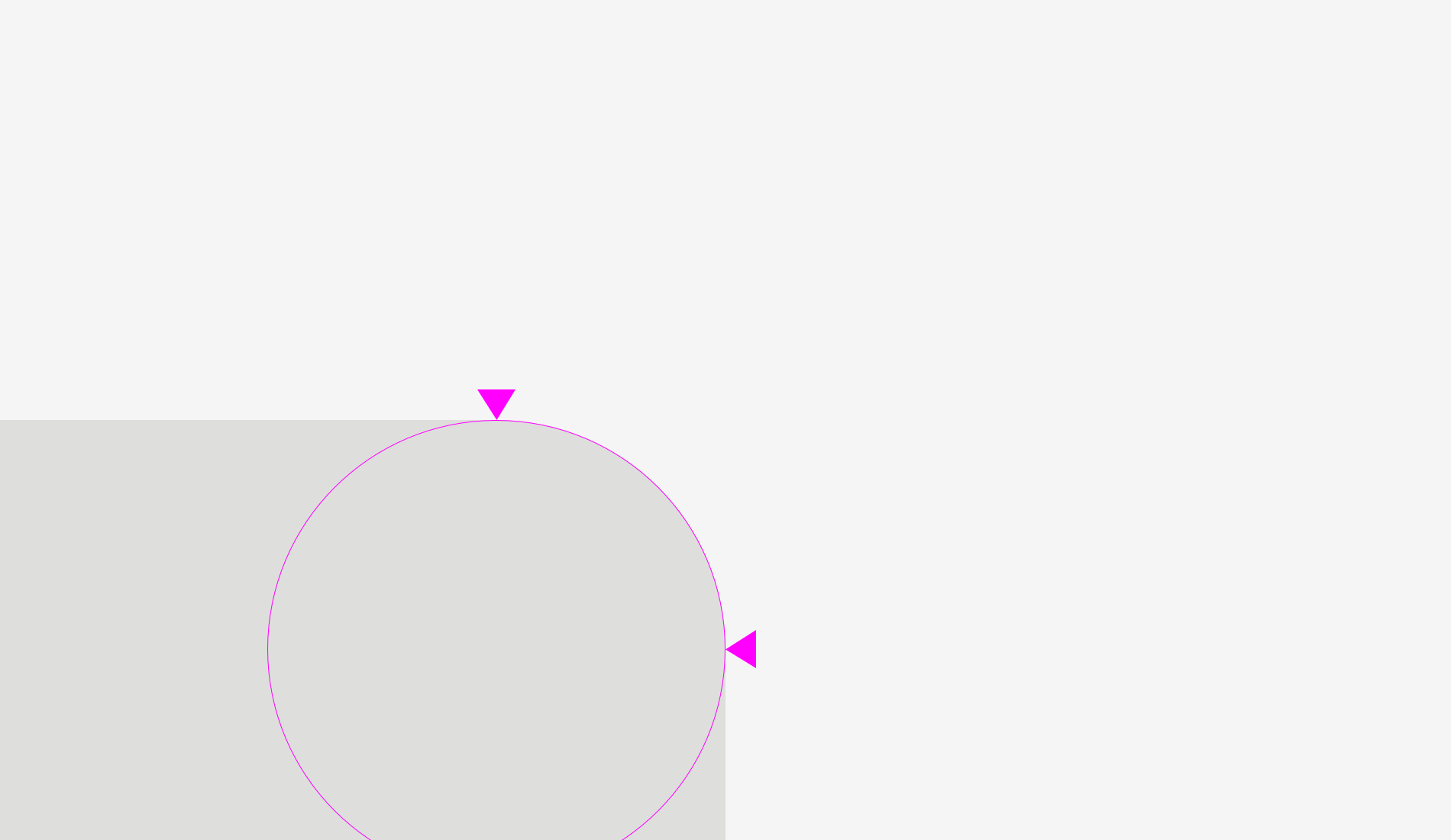
The same story with “Play” buttons. If you directly align these shapes — a rounded rectangle and a triangle — they’ll look odd.
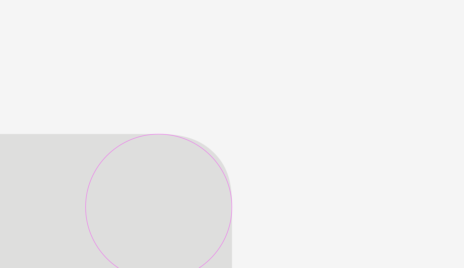
If you want to position the triangle optically better, encircle it and align this circle with the button background.
Important to remember
- Shapes with sharp edges should be larger to look balanced with the neighboring rectangular objects.
- Cap-height alignment is an effective and widely used method of positioning button names on button backgrounds.
- One of the effective ways to correctly position an triangular icon on a button is to encircle it and align the circle with the background.