How to Design Empty States?
To make blank slate useful, consider inserting quick tutorials, videos, help tips, call to action-elements, screenshot of the page when it is in “normal” stage — anything that helps the user and makes him happy with your app. — Patternry
Here is a couple of tips on how to design effective Empty States. Let’s go through them one at a time.
1. Be informative
When an empty state occurs, it is visible to the user. Tell them why they’re seeing this screen.
When a user sees an empty state, 2 things should be conveyed.
- Purpose of the screen (what can I expect to see here?)
- Why am I currently seeing an empty state?
Dropbox favorites. Image credit: tympanus.net
Copy in design is very powerful. It effectively communicates what users need to know. The lesser the words used, the better.
If you read carefully, the copy answers both those questions above. It tells us:
- What is this screen?
- What’s the use of marking a file as a ‘favorite’?
2. Handle Failure States — Don’t scare your users
If it’s an error, tell them what went wrong. Take it a step further by suggesting how to resolve the error. Remember the Google Chrome example?
Here’s what you can do with Empty States for an error:
- show a non-technical copy for error text
- suggest possible steps to resolve the error (as simple and short as possible)
- Don’t use technical jargon that can confuse users
- Allow them to reload (retry loading a page)
Image credit: emptystat.es
3. Encourage Users to take action
A simple, yet highly-effective way to get users to interact, is to use a CTA (Call-to-Action).
A call-to-action (usually abbreviated as CTA) is an image or line of text that prompts your visitors, leads, and customers to take action. It is, quite literally, a “call” to take an “action.” — blog.hubspot.com
In other words, for our apps, CTAs are buttons. Big bold, attention-hogging buttons. When a user sees a screen, the should immediately be able to see that CTA (button). That’s what makes it effective.
Material Design provides us with a Floating Action Button. That’s a perfect candidate for a CTA!
Some examples would be a note-taking app. Prompt first-time users to add a new note by using a CTA button. Or a recipe app, where the CTA is to add a new recipe.
Marvel App — Project empty state by Murat Mutlu — Dribbble
Yet for some screens, there is simply nothing to do. Example, Gmail Spam screen.
Gmail App — Spam
4. Display Starter Content
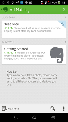
Remember the Google Keep app? We spoke about it as an example for Empty States. That’s called Starter Content.
Evernote app — starter content for first-time users
With this, 2 goals can be achieved.
- Help familiarize users with how notes work
- Use these ‘starter content’ notes to flaunt the app’s features
Take Twitter. Every new user needs to follow few people to get started. In this way, no new user’s home feed is going to be empty. This can also be seen as a way of Twitter reinforcing what it’s all about.
5. Stick to your brand — be consistent
You might have a lot of freedom when designing Empty States. But make sure you stick to your brand.
By that I mean, make sure you stick to your styleguide and color palette. The last thing you want is a screen that feels alien within your entire app.
Alright, this might not be a design tip that’s specific to Empty States. But even so, it is still important. It’s easy to get carried away!
For example, if your brand color is blue. For the sake of emphasis, don’t make your Empty State’s CTA button red! Agreed that you might want to emphasize an alert or danger. But don’t do it at the cost of inconsistency.
6. Use Humor
Sometimes, humor can play a big role in damping down the seriousness of an issue.
A great example of using humor in design is Mailchimp. They know how well to design it so that it engages the user.
Mailchimp — what users see after sending a campaign. Image credit: smashingmagazine.com
So before you use humor, make sure it’s in the right context. For example, a good place to use it would be content not found screens (empty search results).
On the contrary, a bad place to use it would be in an error state. Say a failed task. It’s worse if the error was on your part.
Using humour is fun and is a welcome relief. But also think of scenarios when a customer comes to your site to complain, or they have a problem with your product or service. They may not be in the best mood and that humorous message could be a tipping point for a customer to leave permanently. — spotless.co.uk
7. Keep it simple
Arriving at the last design tip, this is the most important one to remember.
With all the tips mentioned above, it’s easy to include everything and go overboard! Don’t do that.
Remember that simple designs are always more effective.
Here’s a great empty state interaction. It’s lovely, but it’s also so fancy. If my app is simple and not animation-heavy, I wouldn’t attempt anything like this, just for an Empty State!
An Empty State is supposed to be a lightweight screen. If there is an action to be performed, make sure it’s just one. Don’t offer many points of interaction on a single empty state! That’s just confusing.