

Letter
Introduction & goal
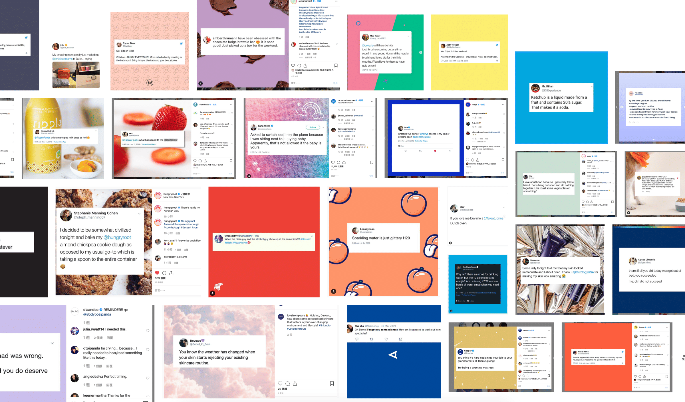
What do you see here? Can you figure out some pattern here? 🙂 Great if you do. If not totally fine, but I’d like to bring your attention here to discover the problem along with me.
Problem Statement

We see plenty of users get screenshots from Twitter and share them on Instagram, Facebook or other social media. Brands will also share quotes, positive press, blog posts, etc. from various sources. However, it’s a tedious process for them; they need to take screenshots, upload them to Canva or some other design editing tool to create the desired look — before finally being able to post it.
The idea of this app is to ease the process: Get text from source, edit, and post it on mobile. We aim to speed up the flow of the work and guide users — including target customers or Brands that create consistent brand image for their sharing — to the Buffer app to schedule their posts.
Goal and Expectations
- How many people download the app, both platforms
- Key metric: Track weekly active users (WAU)
Sketches & User flows
User stories
- When I want to post the content from Twitter to IG, I want to get the content by adding the URL so that I don’t have to screenshot it and upload to design tool like Canva.
- When I grab screenshots, I want to edit it on my phone and then easily schedule it to post.
Users (mainly on Instagram) will share tweet screenshots. They are often quotes, product ratings, or news/blog links. When I dug into it more, I discovered there were a series of process steps they needed to go through: Tweet/link > Screenshot > Decide what size, a post or Story > Upload on a design tool > Edit in design > Post.


Design

Design Exploration
With the problem in mind, we started to focus on the key functionality that would help user achieve their goals. Our scope focused around ways to ease the user’s workflow and reduce the steps it took to post a screenshot. Here are some highlights of the first iteration of the app.
Highlights from v1 (launched on March 23, 2020)
Navigation

In my first exploration, there were two key points: navigation and properties. As shown in the screenshot above, the first iteration allowed users to launch Twitter within Remix. Soon I discovered that it was not necessary. This was based on the user’s habit; they checked Twitter and when they encountered tweets they wanted to share, they screenshotted and edited it. Besides, users were able to use the “share Tweet” via share sheet or copy the URL directly and paste in here. In other words, users start their actions from Twitter side instead of opening Remix first.
Also in this early exploration, users could only see the available options after pasting the URL and tapping “Create image.” The options for changing sizes, style and background were hidden until you tried it. This was a problem because we wanted to let users directly see the value of the app.
Users still needed to be able to paste the URL whenever they copied it to create the image. So I brought out the three options to the tab bar as part of the navigation. When a tab was selected, it helped guide users move forward or go back by showing Previous/Next. This seemed like a good solution at first, but I discovered it actually created more confusion because:
- The users actually won’t know how many more steps are to come.
- They thought they need to finish this series of steps to export.
- Previous tab is confusing because it might mean previous step.
So with all this in mind, I changed to a design that let the user know they can export the image right away. A main tab now makes it easier to allow user to insert URL, and prevents problems that occurred when the URL step was missed. Now that the previous/next steps were removed it took away having to guess the right gestures and actions needed to select properties and export the image.
Edit & save colors

At first, the app only provided some default colors in the custom background area — to test the water if those were helpful. After doing more research and reaching out to marketing managers, I found that users (brands) would go close to their brand colors and variation to keep a consistent brand image. This told us that custom color might be a key function for users; it was highly likely that the users would want to reuse their brand colors across multiple images. After checking with engineers to confirm they had time to accomplish the added scope, I decided to provide this feature to users along with an option to type in the exact hex code in their background.
Another feature we included: When users paste news/blog links, they can double tap to edit the title to re-purpose the articles for social engagement. Individuals and brands can see the valuable part that allows them to change the title/keywords/tone to avoid repetition across their marketing channels.
Templates

To design the templates, we first started by researching what users were doing today. I analyzed 50 business and personal brands to look for patterns in their posts. I discovered some common themes for users’ backgrounds:
- Custom backgrounds (Brand pattern or image)
- Text on white background (likely to ensure readability)
- Text on plain background
- Showing the source of quotes, mentions, or Twitter logo to make it clear where it is coming from.


I designed all the templates with these themes in mind, especially wanting to make sure users could clarify where the image came from. And because users were able to change the background color, we were careful about the color contrast ratio applied to the text on a simple background.
——————–
Highlights from v2

We discovered that for direct-to-consumer brands, it was important and valuable to be able to efficiently show their product across different social media channels. By incorporating Shopify (#1), brands can easily go through their product list and select one (#2) and share immediately if they want to cross channels to promote their products immediately (#3).
And if they want to change their product style, we also made a series of product templates for users to start with.

In designing the onboarding slides, I always think about how this app can be marketed to the consumer side. I hope to make it easy for users to understand what this app offers; I work backwards and try to focus on the key features I need to single out to attract users’ attention and give us a better position for this app.
One question we considered: Should there be a login? We decided that for this part of the process, we wanted to bring values to users in a most straightforward way. Users don’t need to sign up or log in to use those basic features.
The outcome
- We launched on Product Hunt and earned #2 product of the day.
- Exceeded our download goal; in the last 12 months, it has ~26K downloads with 1,000 weekly active users.
- Received great user feedback from customers who felt their screenshot process was greatly improved.

Credits:
- The whole mobile team worked on this Remix project.
- Two iOS engineers.
- Two Android engineers.
- And others who helped give feedback and comments that shaped the apps.

 Buy me a coffee