Creator Series | Ep. 3 – Meet Chris Bam Harrison
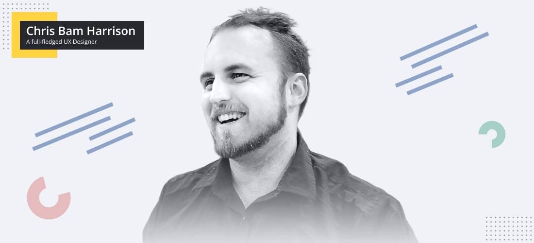
Chris, “Bam”, as everyone calls him, is an accomplished UX designer with roots in graphics design, and a huge passion for video game development 🎮. Quite an all-rounder, Chris has dabbled in almost everything over the last 10 years: from product design, branding and marketing, to building large-scale design systems (cue Figma, Abstract, and Zeplin).
I’m one of those annoying people who loves what they do.
Based in Melbourne, Chris currently works as a UX Designer, researching and crafting mobile app experiences at ME Bank in Australia. And all the while, he restlessly explores game design passion through side projects (jump down to question 6 of the interview), sharing what he learns in awesome gaming publications like SuperJump and Kotaku.

1. Chris, you nurture a strong passion for both design and games. Where did the love for games come from?
I grew up playing video games with my Dad, and then later my siblings. For as long as I can remember, it was the de-facto way to spend time with family. I was going to school when the SNES and Nintendo 64 got big, so my gaming obsession grew from family to friends as well.
Games mean lots of things to lots of people, but for me personally, it’s always been about being able to share cool moments and experiences together. My brother and I still reminisce about games we played together 15–20 years ago — much to the chagrin of anyone who has to listen to us do so — and those shared experiences mean a lot.
I was coming home from an 8-hour day as a UX designer, only to spend another 4–5 hours in the evening working on GameTrack.
2. When did you find out you wanted to be a UX designer, and what inspired you then?
I’ve always really liked graphic design. I picked up a not-quite-legitimate version of Photoshop around when I started high school, and got totally obsessed with photo manipulation and web design. When the Star Wars prequels came out, I lost about a year of my life learning to rotoscope light saber blades on to wooden dowels.
I went to University to study graphic design and the course I took had a bit of everything; digital and web design, marketing, publication, package design, etc. My skill set was heavily skewed to the digital design end of things, and my marks reflected that. However, I really liked the logic and rules that went into publication. I found myself picking projects that involved UI, because I enjoyed the mix of creativity and strict constraints. This was all before the iPhone was a thing, so I was making a lot of websites or mockup software.
Once UI/UX design started to be a thing you could get a job for, I knew that was something I wanted to do, so I started building a portfolio and eventually landed a UX role. The rest is history.
3. At the moment you work in an industry that’s quite different from gaming. How challenging is UX design in the banking sector?
Although different products often require drastically different aesthetic or design treatments, there are certain things in the UX field that tend to be ubiquitous, regardless of the product you’re working on. For example, it doesn’t matter if it’s banking or shopping or gaming, people want the product to be easy to use. They want to achieve goals quickly, they want to feel confident in what they’re doing.
Knowing a product inside-and-out is valuable, but often you won’t have the time or ability to immerse yourself. In those situations, coming back to the core things everyone wants in a product can be helpful.
Understanding the users is about taking yourself out of the picture and gaining a more holistic view of who they are.
Once you’ve got those core values, it’s really key to understand your user. It’s a very easy mistake to just assume that you as the designer are also a customer. After all, we’ve all got a bank account, right? Realistically, however, understanding the users is about taking yourself out of the picture and gaining a more holistic view of who they are. As UX designers, the end-user is the person you’re responsible for. They’re your customer and your client. If you don’t understand their needs, motivations, and pain points, you can’t do them justice.
For banking in particular, there’s some specific challenges. Privacy and security are much more important to people than it would be in, say, a fitness app. They also want to understand a lot of really complex information in the simplest, most intuitive way possible. We look at ways to communicate the customers’ core needs without asking them to become experts in our field. I’m a strong believer in the idea that your bank should support you in getting the most out of your money, so we talk a lot about how we can help customers get the most out of our services and feel confident about their banking.
4. What’s your workflow like, for example, when you begin a new project?
Every project differs a little bit, but once the problem has been defined, I start with research and insight. Gathering past research, available data, understanding and any previous attempts at solving the problem.
All that material helps me define what I think I know, and what I think I don’t know. From there, I’ll take those assumptions and test them with users to see what’s accurate.
Although there are lots of ways to do this, I really love one-on-one user interviews. They help me really get to know someone who my work will impact directly.
I feel like if I can really empathize and understand someone on a personal level, I can use that connection and insight to build something that will really work for them in the real world, rather than something that simply tested well in a focus group or on a survey.
A good user journey map becomes a checklist when it comes to screen design
After that, I’ll start to build out journey maps or user flow diagrams to understand what actually needs to be built. It’s not enough to know you need an account page — you also need to know how users get there, get out of there, where they come from, and where they can go. From a practical point of view, a good journey map also becomes a checklist when it comes to screen design.
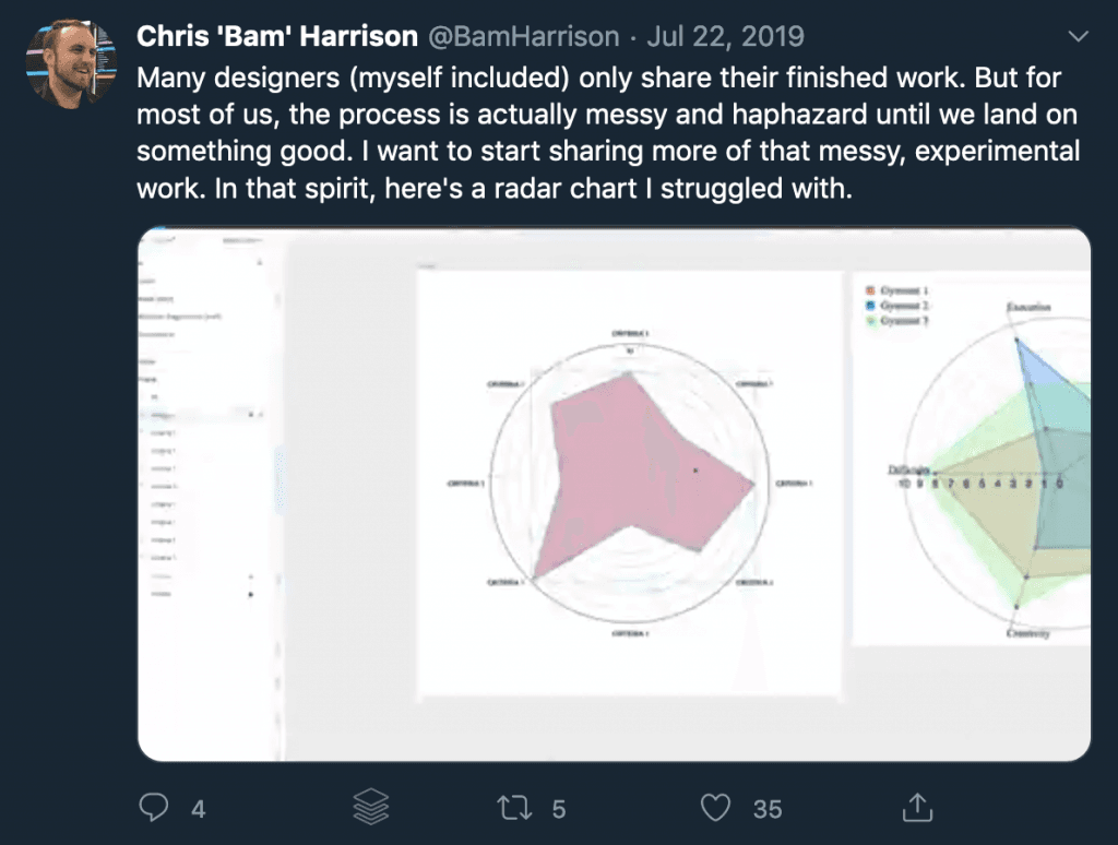
Once I feel like I’ve got the knowledge I need and have a good plan in place, I’ll put together low-fidelity designs or prototypes to take to users again and continue to test as I move through the design process. This typically repeats as the designs evolve. Once users are really liking what we’ve got, I’ll hand over those designs to developers and work with them throughout the development process.
5. And what tools do you use?
I don’t think anyone who’s ever asked me that hasn’t ended up regretting it, as I love talking about tools way too much. This is going to feel like a shameless plug, but I recently did a round-up of my favorite tools this year.
By far my favorite tool on the market right now is Figma. I moved from Sketch to Figma about three years ago, and I absolutely love it. The interface is lightning fast and extremely intuitive, and their feature releases are consistently full of creative, intelligent new features that honestly improve my work. It’s also got amazing real-time collaboration tools, and having those sorts of features in a larger design team is essential.
I’ve also recently fallen in love with ProtoPie — it’s a surprisingly lesser-known prototyping tool that’s actually fun to use, and does just about everything you’ve ever wanted out of a prototyping tool. I’d encourage anyone to check it out.

6. Any side projects you’ve worked on that you’re really proud of?
Honestly, I’m that annoying person that hates everything they’ve made mere moments after they’ve finished making it. That being said, there’s a few projects that are really cool milestones in my career that, whilst not perfect, I’m really glad I was a part of.
My favorite projects are always the ones where I really push myself into learning new things.
Back in 2013 I took one of my favorite video games, Civilization V, and converted it into the setting of one of my other favorite video games, World of Warcraft. It’s a super nerdy project that I did entirely in my free time, and looking back on it, it’s not exactly my best looking piece of work. That being said, I learned so much doing that project. I got stuck into programming, did some 3D modeling, animation, audio, writing…the list goes on. I think my favorite projects are always the ones where I really push myself into learning new things, and this was definitely one of those.

I also have a soft spot for a personal project I worked on last year called GameTrack. It’s nothing particularly special — the idea was a simple video game collection tracker. The project itself was really when I realized how much I actually love what I do; I was coming home from an 8-hour day as a UX designer, only to spend another 4–5 hours in the evening working on GameTrack. It really helped me flex my design skills and was just really fun to work on something — especially as my brother was the developer and working with him was fun.

I’m also really happy with some of the work I did in my previous job at Tabcorp, but I can’t really talk about that too much! I will say though, it was very rewarding to be part of a larger team, and to become a customer advocate inside such an expansive business. It can be a challenge to keep the user at the heart of everything that you do, but it’s incredibly rewarding when you build something your customers love.
7. Why are they your favourite? What were the most impactful outcomes from them?
For me, the best projects to work on are the ones that develop you into a better designer. The work I picked isn’t my best work, and in some cases it’s really rough or unfinished or unpolished. However, I loved working on those projects because I was pushing myself as a designer and learning new skills and techniques.
I think that’s also what I love about my everyday job. I’m not a financial expert, and I don’t have a lot of knowledge about banking (Not yet, anyway!). This means I really have to work hard and do everything I can to understand both the business, and more importantly, the customer. I really love immersing myself in a problem, and to do my best work, I have to do that.
It’s also fun to see my work actually out in customers hands, enjoying the things I’ve made. Hearing that an app I worked on is easier to use, or a product I helped design is loved by customers, is really very rewarding.
8. On side projects. When can we expect a Chris Bam Harrison game? 🙂
Never! Just kidding. Maybe. While there’s lots of principles and practices that software UX and games UX have in common, it’s a very different practice that requires a different set of skills.
Mainstream UX — at least in the sense of applications and software — has only really started to mature over the last 10 years. Video Games, on the other hand, have had some form of UI or UX since their very inception. Early digital mapping software was almost indistinguishable from the in-game maps you’d have seen in early video games. The digital heads-up displays you see in newer cars is basically what racing games have had for the last 20 years. In software UX we have the luxury of learning from a lot of existing patterns and designs out in the world. Game UX people don’t always have that luxury — they have to be incredibly creative and brave in their choices.
Furthermore, many great video game UX designers are also amazing artists. They’re not just digital designers, they often also do digital painting, or 3D modelling, or animation, or a plethora of other skills. Although they don’t always get the credit, the great UX designers in games are literally the cream of the crop of our industry. I look at the work Ryan Klaverweide did on Destiny, for example — it’s not just great UX, it’s also a beautiful piece of artwork. The work of Emma Koch and Jessie Gillespie is also a phenomenal example.
So, maybe one day! I’ll have to skill-up in the artistic department quite a bit first. And convince my brother to code it.
9. You write quite regularly. What does writing represent to you? (i.e. opportunity opener, learn, share, etc)
Initially, I started writing about games UX because it was the sort of content that I wanted to read, but I couldn’t find many other people writing about it. I didn’t really expect it to go anywhere — I was mostly just doing it as an outlet for a few thoughts of my own.
I was lucky enough to have some of my earlier writing get picked up by a few websites, which gave me a little audience to engage with. That was really exciting, and encouraged me to keep writing. It’s also given me the opportunity to meet people interested in similar topics, which is really rewarding.
10. Finally, any advice for those just starting in design?
In my opinion, the best thing you can do is just get to work. It’s a really, really hard industry to break into at times — it took me years before I landed my first full-time professional job. When that opportunity arose, I had a well-rounded body of freelance and personal work that I could use to really showcase myself.
Always remember that the end-user is your client. The best UX you can make will happen when you treat the user as your primary stakeholder.
The other thing I would tell anyone starting out is to always remember that the end-user is your client. Often, you’re being paid by a developer, or a studio, or a corporate business. Even though they’re the ones writing your paycheck, the best UX you can make will happen when you treat the user as your primary stakeholder. If you build something they will love, chances are you’ll meet all your other goals too.
11. Is there anything else you’d like to share with the Prototypr community?
If you’re looking for advice, a mentor, or just someone to chat design to, please feel free to reach out!

Read more from Chris in our blog →
Popular Stories
The User Experience of Lootboxes
Overwatch League’s UI is an eSports Game Changer
UX Design Tools for 2018 (For Mac AND PC)

 Buy me a coffee


