[post_gallery]
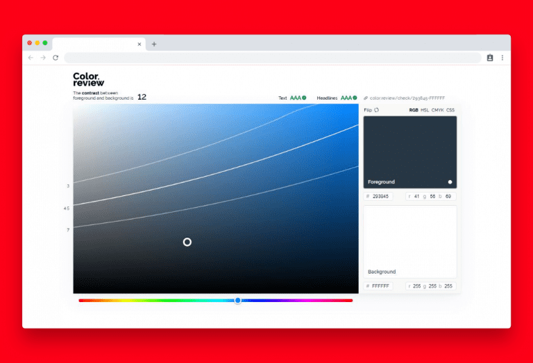
Color.review
We experience contrast differently in different colors. Because of how our eyes work, blue text on a white background will be much more easily read than a yellow. When you are designing for humans, in whatever medium,
Related links
[link-preview url=”https://color.review/”]


