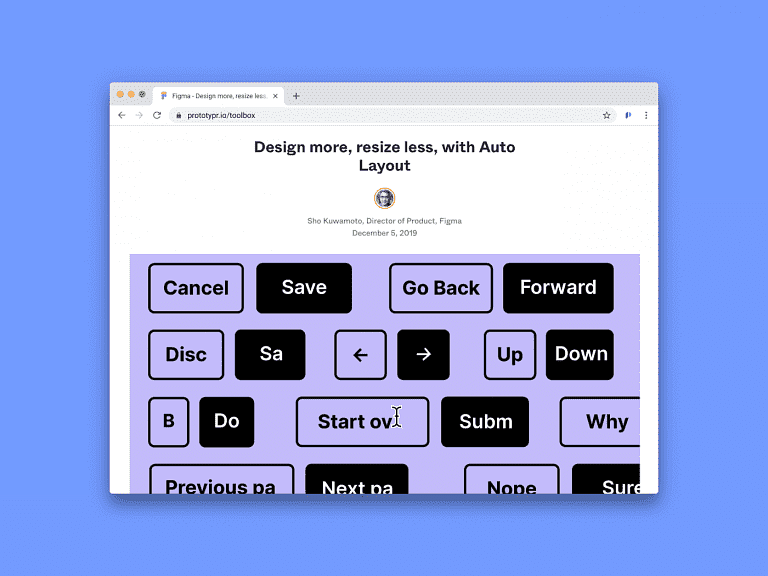
Figma is listening to the design community and just keeps on growing. The tool’s Auto Layout feature is out, meaning that:
- 💎 Buttons resize with their text
- 💫 Lists rearrange themselves when items are moved around
- 🌈 Elements are nested to respond to their content
Design more, resize less. Auto Layout is here.
— Figma (@figmadesign) December 5, 2019
Read more: https://t.co/se416TBfsR pic.twitter.com/KmLL3YNjzG
Before and After
This gif from Tony demonstrates just how much time Autolayout can save you. Here, he compares the old way with the new way:
This is how much time the new Figma Autolayout update is already saving me. This is an example of what I did before versus what’s possible now.
— Tony Gines (@TGines) December 5, 2019
Thanks @figmadesign #autolayout pic.twitter.com/4N3BgFaNsz
How it’s made
Autolayout is a very useful feature, and a many design and enginerring decisions must have been made to get this working. Sho Kuwamoto, Director of Product Design at Figma, explains why items in an Autolayout frame go backwards:
A lot of people have been asking why the items in an Auto Layout frame go backwards in @figmadesign.
— Sho Kuwamoto (@skuwamoto) December 10, 2019
I usually hesitate to answer seemingly simple questions that end up requiring super long answers, but… here we go!
1/n
Related Reads
Here’s a couple more articles on our blog on how Auto Layout works. Thanks to Chris Bam Harrison and Davi Costa for sharing their experiences.
Putting Figma’s Auto-Layout through its paces
First, let’s talk about fundamentals. For most people, auto layout is going to allow you to design elements that contain text without having to redesign them when the text changes. The first use most of us will have for this feature are dynamically resizing buttons, as seen in this great tweet: As the length of the text increases, so does the other elements in the button.
What “Auto Layout” in Figma allows
Objects can resize frames, but frames can’t resize these objects. 🚨 Disclaimer: This article covers the state of the feature as of December 2019. It’s probable that the shortcomings explained here will be addressed in the near-term. Hopefully 🙏 “When you add Auto Layout to a frame, the items inside are stacked next to each other (either vertically or horizontally).


