Here’s to all the previously forgotten and archived portfolios that helped shape and inform our present-day version.
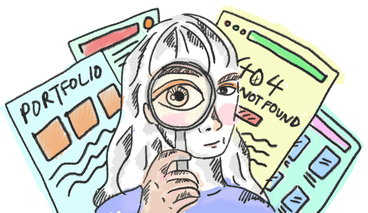
A designer’s journey is one that’s littered with many portfolios. Many of which have been reduced to a mere 404 error page, an abandoned link or another archive in the folders. Recently, while updating my portfolio, all the forgotten versions that preceded came to mind. I thought it’d be interesting to have an unabashed compilation of it all.
Even as I take inspiration from other designers’ portfolios, I am reminded that we all took a journey to arrive at our present-day version. My portfolio journey has been one that’s filled with frustration, procrastination and comparisons — and I believe I’m not alone.
I encourage us to take a look back at our previous portfolios, how we built and crafted them. Acknowledging (and sometimes laughing at) every cringe-worthy and embarrassing moment — that’s how we grow right?
Background
Since university, the thought of a design portfolio has always lurked. Exacerbated by classmates seemingly armed with polished PDF decks and professors chiming in on the importance of documentation. Or simply just driven by a designers’ innate desire to display our craft.
I’ve had countless conversations with my design friends — just unpacking the amount of stress and worry over creating and updating our design portfolio.

- “Is PDF or website portfolio better? Static vs. online portfolio?”
- “Where should I host it on? Squarespace, Wix, Cargo, Weebly, Webflow, Adobe portfolio, Uxfolio, Notion, WordPress… etc. ”
- “How frequent should I update my portfolio?”
Truth is, there are no right or wrong answers, as long as you start.
I’ll briefly share some of my takeaways as I took a deeper look into my past portfolios. Scroll on for the tell-all, or browse my portfolio compilation here.
2014: The Rite of Passage
A Behance account is probably the rite of passage for most student-designers. This portfolio marked the start of my path as a designer — tinkering with materials, obsessing over millimeters and learning to get my hands dirty.
I initially archived the projects as they were no longer relevant. But I’ve since made them live again — for me to relive the cringe anytime!
Takeaway: It can be slightly embarrassing to display old works or past portfolios out in the open, but fundamentals always make for a good story.
2015: Website Templates
Dabbled into website templates for the first time when I hosted my first ‘proper’ portfolio over at Cargo Collective.
There was zero thought given to the storytelling of each project and the process. It was simply a platform to ‘dump’ images and text.
It took me multiple portfolios later to realise the importance of storytelling the design process, beyond the pretty images.
Takeaway: In hindsight, I’ve realised that by starting a portfolio early, I gave myself more chance to try and fail at it, earned myself more time to get better at documentation.
2017: The Great Migration
Looking to update my portfolio, I decided to shift hosting site onto Wix. This was the worst decision.
There was a lot of frustration with Wix, but it made one thing clearer—Templated websites were starting to feel like a handicap.
The layout constraints that once made sense for someone with no coding background, started to feel more like a hindrance. The visual options that came with the templates were limited, and often, bad.
Takeaway: There are plenty of website builder tools available in the market and they all work in very similar ways. A mistake I made was switching between 2 similar platforms for the sake of ‘updating’. Be very clear why you need to make a switch between platforms for your portfolio.
2018: Unsettling PDF
After a rather disappointing run with Cargo and Wix, I decided that it was the end of templated websites. I ran back to the arms of Adobe’s InDesign.
Yearning for that 100% control over each pixel and layout
How ironic to seek ‘refuge’ with InDesign. Considering how much heartbreak it brought, through countless of force quits and unrecovered files.
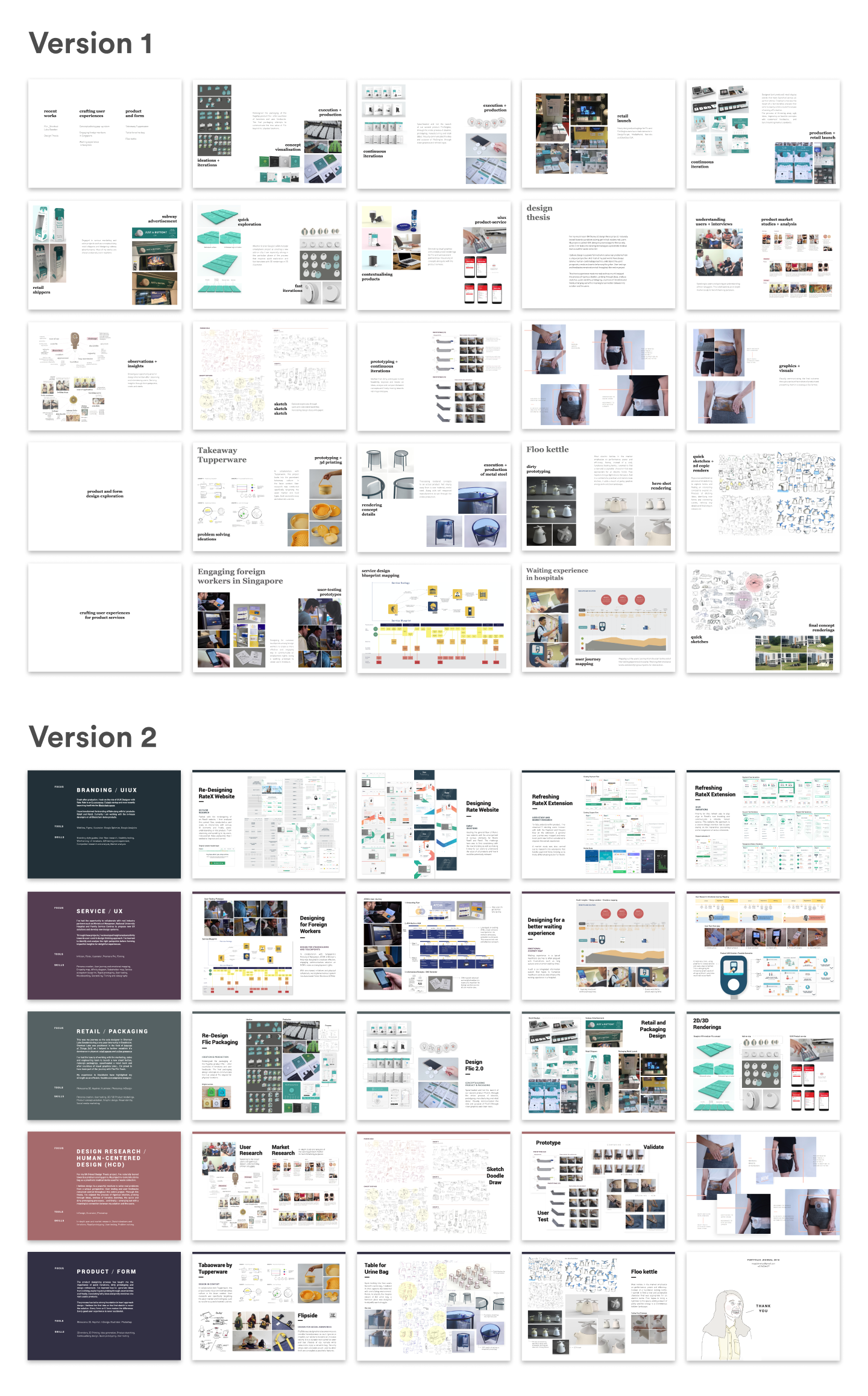
Finishing up the PDF portfolio naturally felt accomplished — but also unsettling.
In 2018, I was transitioning into the realm of digital product and UIUX. With a supposed claim in the craft of mobile and web experience, I was greedy for an online presence and the thrill of owning a domain.
Takeaway: PDF portfolio may be good during interviews but an online website gives you greater discoverability. An interactive and responsive website speaks louder of the craft in a way that a static PDF could not.
2019: Procrastination
My 2019 resolution was to work on my website portfolio… It never happened.

Indeed, one’s portfolio journey is never complete without procrastination.
2020: Present Day
Portfolios have always seemed like another item on a designer’s checklist to complete. But…
If a portfolio is a case study of yourself, then there’s no project more important, more fulfilling and more fun than that.
Takeaway: Don’t let the pressure of perfection and completion get to you. Perfection is crippling. A portfolio is never completed. Aim for a MVP version and continuously improve from there.

For the first time, I approached my portfolio as a passion project rather than a to-do. Plus, I was relieved from the pressure of working against the clock. All of which, gave me room to have fun with it and enjoy the process.
Takeaway: A portfolio will always be a chore — tedious but necessary (we should at least make it an enjoyable chore).
WIP and KIV
To end off, I’ll state the obvious. Portfolios will always be WIP and KIV — Work In Progress and Keep In View
Cheers to all the forgotten and archived portfolios that led to the present day. No matter how embarrassing or cringe-worthy, it is evidence of one’s growth as a designer and a testimony for further growth.
“Your portfolio is the biggest investment you can make in your career. Doing your best work makes your portfolio better. Making your portfolio better leads to more great work. And the circle continues” — Tobias Van Schneider
I hope to inspire you to take a trip down memory lane and look back at our forgotten portfolios. I believe we’ll learn a thing or two about the growth we’ve made in our craft or the shift in our mindset. And hopefully, we’ll be reminded of the starry-eyed passion we had for our craft when we were just starting out.
