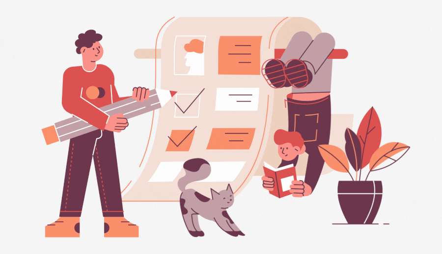
The Check-Questionnaires can help you assess your design output quickly.
I believe this is always a hard question for us — Designers. In most instances, design output is affected by the feeling of the reviewer. That’s why it’s harder to define a design that is good enough to send than cook a dish or sew an outfit.
Summary of experience after a few years working in the industry, I built a list of questions called:
“The Check-Questionnaires”
and use it as a checklist to review designs before sending or presenting them to clients. These questions sorted by descending priority:
1. How are Mood and Tone?
Design is all about storytelling in pictures. And just like every story needs a mood and tone, so should your design output. “What is the story you want to tell?” and “What the mood you want to set?” Ask yourself these questions to make sure the design output conveys that at first sight.

2. Does it match the brief?
When you have a good enough design brief, that means it will list the must-have, should-have, and nice-to-have things. Make sure your design output contains the “must-have” requirements, a few “should-have” elements, and “nice-to-have” items if it doesn’t affect the design’s aesthetics too much.

3. Does it have a focal point?
Like every story always has the main character, the design has the main object too. Let it be the first thing viewers see in your output.

4. Does it have eye flow?
If the anchor point serves as the starting point, the eye flow will serve to convey the story of the design. Having a smooth flow will help the design concept be more coherent.

5. Does the text work well?
If your design has text, make sure viewers can read it. In case that it has two or more fonts, try to pair them in harmony. A safe bet when it comes to pairing fonts is to combine a serif font with a sans-serif font.

6. Is the color scheme harmonious?
Color has a tremendous impact on the viewers’ emotions. Hence, in addition to using the required number of colors (question 1), we must also consider the hue’s position, the contrast harmoniously according to the visual law.

7. Is it balanced?
The “balance” I mentioned here is not only about visual but also function. By way of illustration, you have to remove some beautiful decorative elements to increase readability for users on a UI screen.

8. Does it have a contrast?
Many things create contrast, including color, size, shape, etc. The most common mistake I make is “over contrast.” Sometimes, I make a vital object to stand out that the rest is no harmony and even sporadic.

9. Does it make good use of the spacing?
Not so tight, but not so incoherent as well. Use spaces appropriately to create eye comfort and improve comprehension. Furthermore, it helps to connect the design elements into groups.

Sum up
Before sending a Design output to the client, ask yourself:
- How are Mood and Tone?
- Does it match the brief?
- Does it have a focal point?
- Does it have eye flow?
- Does the text work well?
- Are the color schemes harmonious?
- Is it balanced?
- Does it have a contrast?
- Does it make good use of the spacing?
The better you answer these nine questions, the easier you identify the right time to deliver.
 Buy me a coffee