A take on Design Token definition, organization, and specificity.
A Design System’s strength comes from knowing how and when to apply options (like purple-40 or color-warning) correctly to contexts (like backgrounds or typography). This grounds the option as a design decision or what is known as a Design Token in System Design.
Design Token (noun): Design v̶a̶r̶i̶a̶b̶l̶e̶s̶ decisions applied to a specific context.
Variables ≠ Design Tokens

Variables take the mystery out of obscure values but they don’t bridge the gap between naming and use. They answer “What options do I have?” yet leave “What choice do I make?” unclear.
Design Tokens are used in place of hard-coded values and variables in order to ensure flexibility and unity across all product experiences and/or platforms. They are also platform-agnostic so it makes it easier to communicate with developers using these terms.
Tokens aren’t supposed to be only supposed to be used to give meaning to colors. They should also be used for everything that gives personality and character to your Design System; something I like to call The Anatomy of a Design System:
- Color
- Typography
- Space (dimensions, padding, margins, etc)
- Shape
- Elevation
- Iconography and Illustrations
- Animation
- Sound
- Haptics
Token types
The way to organize a robust and extensible Token architecture depends on how many levels of abstraction you would like to have. Personally, I like the following configuration.

Values
These are the raw values in code such as color values, absolute and relative length units, percentages, numbers, etc.
Base Variables
Base variables are the primitive values in a design language, represented by context-agnostic names. These can be directly used, and are inherited by all other token types.
Common *Tokens*
Common tokens relate to a specific context or abstraction. Common tokens help communicate the intended purpose of a token and are effective when a value with a single intent will appear in multiple places.
Component *Tokens*
Component tokens relate to a specific component using them. Their scope only targets the component they belong to. Component tokens communicate not only the targeted properties but also their states.
Anatomy of a Design Token and Organization
Token names follow a strict naming convention that communicates when and where this token is supposed to be used without having to look at its underlying value.

The Token above is a complex one, but it narrates a story. Without looking at the documentation or the value, both designer and developer can tell it is a color token, meant to be used on the background of containers like cards or sections, for example. It also communicates that there might be different variants that convey hierarchy, and it also communicates that it is targeting a specific state of that surface.
Design and code
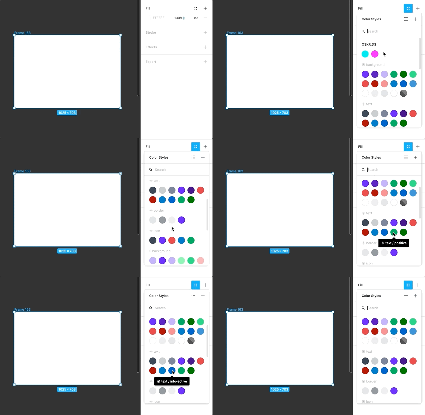
If using Figma, you can also organize the tokens so that is intuitive for designers. It also makes it easy for them to spec/redline designs.

Design Systems and Tokens
As Systems designers, it is our duty to optimize at scale the experiences of Designer and Developers when consuming our product; the system itself. If the organization of style primitives is not prioritized, there will be a lot of friction between designer and developer as well as many stylistic inconsistencies that could be avoided by having a token architecture.
A healthy and extensible Design System uses Design Tokens. It does not just use variables.
Stay safe,
Sources:

If you have any feedback/comments/suggestions, please share them in the comments. I would love to hear your thoughts.


