To create a truly open and inclusive web, adapting what we create to different languages and cultures goes a long way. It not only makes the web usable for more people, but also democratises access to important information and educational material.
A huge amount of educational content, especially in the design and development industry, is only tailored to Western audiences. So in this article we’ve curated some tools and resources to help understand localisation in particular, and how to make what we create more accessible to those in different regions.
Localization is more than just writing your content in multiple languages. You need a strategy to determine what localization to send, and code to do it.Sam Richard in Smashing Magazine
As we spoke about in our last article, localisation (or ‘l10n’) is the process of adapting an existing app or website for a different region by adding locale-specific features and text (e.g., translating the language).

Although all translation processes are a form of localisation, not all localisation processes involve translation. Localisation can also take the form of changing date formatting, currency symbols, or removing images that are culturally insensitive. In short, making your product accessible and appropriate for a different audience.

Use multilingual typefaces
It’s not just what you say, but how it’s displayed that matters in the design process – especially regarding font styles from one language to another.

Chinese, Japanese, Korean, and Hebrew are just some of the more visually detailed languages that use more pixels than alphanumeric characters.
Whilst English typography uses parameters like ascender, cap height, baseline and descender, Japanese for example uses none of these, and often requires a larger font size, and more generous letter spacing and line height.
Without the right font for the right language, the design of an app can quickly be destroyed. Google on Noto fonts
Choosing the right font for the text you’re localising is a great way to navigate these issues. As shown above, Google released Noto as a font for every language, but here are 16 more multilingual fonts to explore.

Adapt your visuals to your audience
Images tend to be the first thing people look at when a page loads, and can set the overall tone. For example, a seemingly innocuous illustration of a bacon strip could be considered highly offensive in countries where pork is prohibited. And although it’s commonplace to see women baring their skin or wearing tight clothes in Western cultures, it’s considered a religious no-no in others. (More on cultural differences later.)
Additionally, whilst it’s deemed acceptable – and even patriotic – to display the Star-Spangled Banner or Union Jack, it’s considered highly offensive to use the Saudi Arabian flag in certain situations.
Emojis can convey a whole host of emotions, as Andy Murray demonstrated in a Tweet summary of his wedding day:

But emojis can also appear vastly different across devices and cultures, altering their meaning. When in doubt, leave it out.

“In China, the slightly smiling emoji is not really used as a sign of happiness at all [and] instead implies distrust, disbelief, or even that someone is humouring you.” – Alex Rawlings for BBC Future
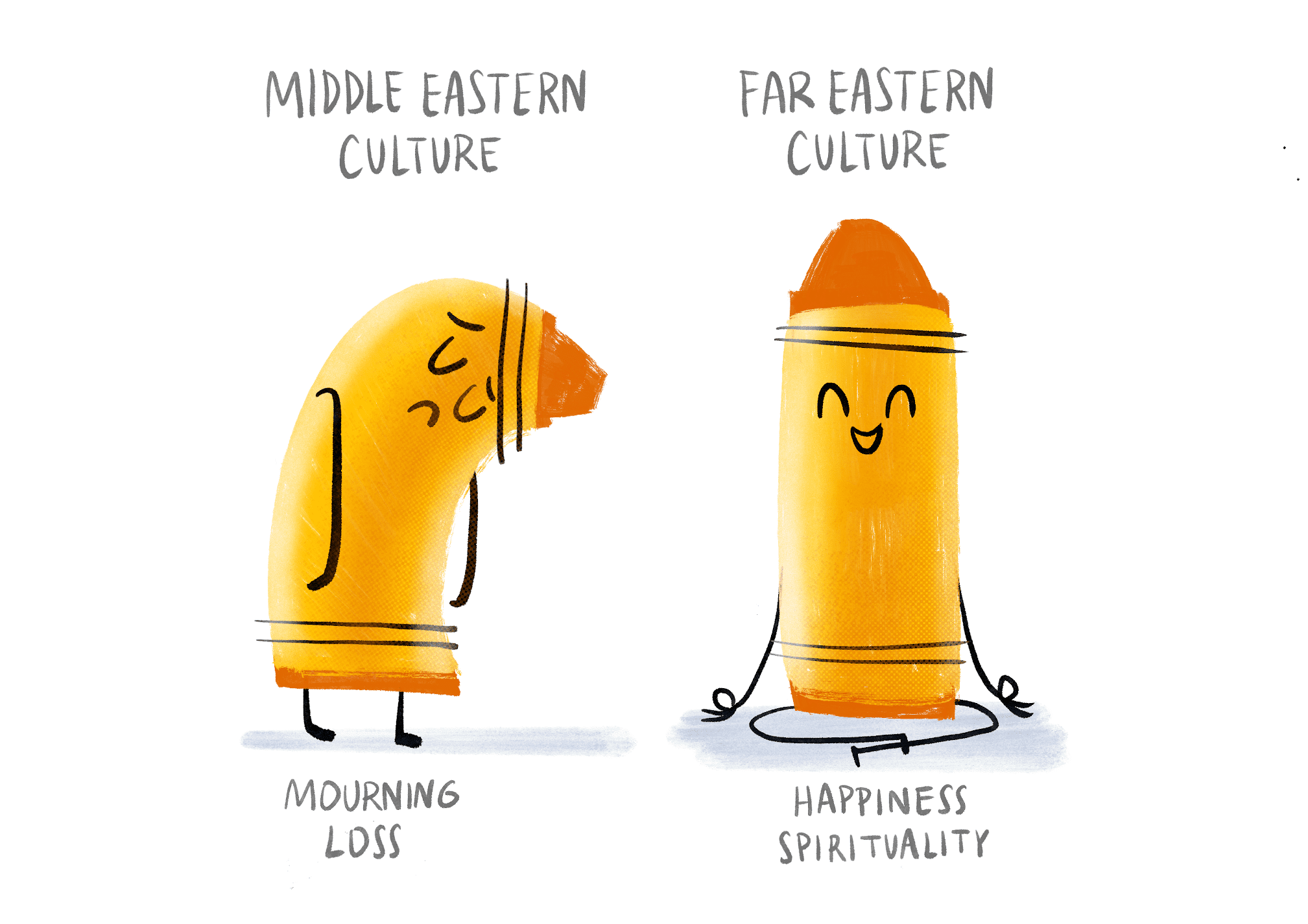
Colour connotations vary between cultures and religion, and could cause an unintentional reaction. The colour yellow generally represents happiness, but in Latin America is associated with death and mourning. The colour red, whilst a lucky hue in China, represents communism in the Eastern Bloc.
For a more in-depth analysis of colour meanings across the globe, check out this article.

Localising your text elements
Bidirectional text support during the initial internationalisation phase means once you get to localising your product, supporting RTL Hebrew or vertical Kanji symbols shouldn’t be an issue. But then comes the tricky part… translation software such as Google translate isn’t always reliable, and can leave the text even more confusing than it was in its original version.

“Considering 65% of people prefer to read content in their local language, that’s a pretty huge barrier.” –CSA Research
Where possible, it’s always best to get the human touch and find someone proficient in the language to translate. A close second is a reliable plug-in. Two examples are Smartcat Translator and Look! Translator.
Spelling variations between American English (AmE) and British English (BrE) has caused many internet wars. Here are the rules each tends to favour (or is that favor?).


Differences in numbers across regions
This includes:
Numeric ComponentExamples and ResourcesDate and time formatUK uses dd/mm/yy, whilst USA uses mm/dd/yy
🛠 Moment.js javascript library has multiple locale support.
Time ZonesChina: CST, US: EST, PST, CST, Europe: CET…
🔖 Localizing Times in JavaScript
🛠 Moment Timezone can parse and display dates in any timezone.
Currency$, ¥, £, €, ₩, Kr…
🔌 Figma Plugin: Format Currency by Yuan Qing Lim
🔖 Localization sounds simple, but it is not: Part 2 — Supporting multiple currencies
🔖 Formatting localized currency (example design guidelines)
Units of MeasurementImperial vs metric.
🛠 JS Quantities – a javaScript library for quantity calculation and unit conversion
🔖 Displaying metric and imperial measurements
DecimalsUK/USA use a period where Spain uses a comma and vice versa. E.g. One thousand and ten euros = 1.000,10 € – the “.” is used to separate thousands and “,” to indicate decimals.


Case Studies
Here are some well-known brands who have successfully localised their offerings, and how they did it:
Netflix – 4 things to learn from Netflix’s localization strategy
Spotify – Spotify localisation: a case study

So there you have it, the A-Z of how to localise your product. When you adapt your app or site for a new jurisdiction, it’s not just the translation of text you need to think about; there are cultural discrepancies, linguistic nuances, and imagery blunders to consider. Research your target market, and get that cultural thumbs up before launching your product…providing it’s not in Greece.

Have you localised a product recently? What are some of the challenges and wins you experienced? Let us know!


 Buy me a coffee


