The most critical aspect of every homepage is how effectively it catches the visitor’s eye and captures their attention. That’s why it is crucial for your homepage to answer three key questions about your company and/or product in just a few seconds
Most established businesses and companies in today’s day and age recognize the importance of having an online presence to reach a wider range of potential clients. Putting a lot of thought and effort into a website homepage design can really make the difference between leaving potential customers with a good or bad impression of your company or product. That is why it’s especially important to come up with a creative website homepage design, with particular focus placed on its homepage.
A home page of website is what a visitor lands on after clicking a search result. Since this will likely be one of the very first impressions that the visitor has of a company or product, it’s incredibly worthwhile to make this main page design look as welcoming and engaging as possible.
A strong homepage design can entice visitors to spend more time exploring the product or service on offer, inviting them to learn more and, hopefully, convincing them to purchase. Before we look at the 20 best homepage designs, let’s first go over some of the basic elements that a modern homepage should consist of.
Effective introduction of your business
The most critical aspect of every homepage is how effectively it catches the visitor’s eye and captures their attention. That’s why it is crucial for your homepage to answer three key questions about your company and/or product in just a few seconds. Keep these questions in mind when designing your homepage:
1. Who are you? (What is your company, product, or service about?)
2. What do you do? (What does your company, product, or service actually do for its users?)
3. How are you better than your competitors? (How does your company, product, or service solve a problem or fulfill a need for users better than the other options available?)
By ensuring that your homepage quickly and clearly conveys the answers to these three simple questions, you’ll be able to help visitors understand what your business is all about while also quickly giving them the confidence they need to make a purchase.
Many businesses have adopted the strategy of creating short slogans or taglines that highlight their unique value propositions (UVPs). These taglines easily describe the company’s offer and establish an almost instant, memorable connection with the visitor. They are often showcased on the homepage and used in much of the company’s branding and marketing strategies.
Responsive, clean homepage design
Your website’s visitors will come through on a variety of devices, from PCs to tablets to smartphones. As mobile penetration continues to increase around the world, it’s no wonder that almost 60% of all current website traffic is done via a mobile device.
To ensure a better user experience with your website, it’s important to factor in responsive homepage design. Responsive design means that the user’s experience is the same or very similar, no matter what device they are using to visit your website. Navigation is made easy so that users can roam through different pages on your website quickly, functionality is similar so that users don’t have to switch devices in order to access the “full-feature” site, and design is clean, making sure that your offer is clearly displayed to users on every screen size.
Making your website’s experience consistent, regardless of the screen size or type of device a visitor is using, will help you keep your branding recognisable. Presenting a cohesive design and prioritising its responsiveness when building your website will help you connect with visitors across platforms, ensuring they have a positive experience with your business.
Dynamic, interactive, and engaging
People tend to remember emotionally charged events better than neutral ones. Applying this knowledge to your homepage’s design can help you create a positive experience for your visitors.
A dynamic homepage can evoke positive emotions in visitors, increasing the chances of their interaction with your website becoming a memorable one. Making use of changing illustrations, animations, videos, or mini-games can help you connect with users in a positive manner. Even smaller details like mini-animations in headers and footers can make a visitor’s experience better.
Dynamic layouts can also give visitors a glimpse of the whole package. Implementing aspects of virtual reality or 360 degree virtual tours of the page, product, or company will help the user feel like they have a good understanding of what your business is all about and can also solidify the connection they make with your brand.
Occasionally updating content on a homepage to reflect the current needs of customers or share your company’s latest news is another way to keep a website dynamic and constantly relevant to visitors. A great example of this type of dynamic homepage layout can be found on IBM.com.
In other words, adopting a dynamic approach when it comes to the design and layout of your homepage will help you keep users engaged while also providing them with a positive, unique experience that keeps them coming back to your site for more!
Simple, sleek navigation
Browsing through your website should be user-friendly. Interacting with your site should never result in frustrated visitors as a negative experience can significantly damage the potential relationship.
A smart, intuitive homepage prioritises simple navigation with menus that are easily identifiable and visually separated by colour and contrast. Labelling of various pages makes logical sense so that users can quickly identify where a navigation tab or button will take them. Ensuring that a website visitor always knows where they are within your website is important as well so keep in mind that little details like visual representation of a selected tab (through highlighting, contrast, or colour change) can really make a difference. A great homepage design will allow visitors to move with ease between pages and screens, always communicating to the user where they are while keeping them engaged to continue exploring.
Appropriate calls-to-action
Visitors to your homepage is a great start, but what do you do with them once they are there? Modern homepages make use of their traffic by focusing visitors with a specific call-to-action (CTA) such as “Sign up now!”, “Join today”, “Get started with a free trial”, “Subscribe now” or one of these other very clickable CTA examples.
The main goal of every webpage should be to capture the target audience’s attention in order to guide visitors further into the website, encouraging them to go check out a case study, leave their contact information, or otherwise engage with the company. Using appropriate CTAs and refining your website’s messaging to guide visitors through a particular path can turn any homepage from just a brochure to a powerful sales engine.
Modern standards for website front page design
Until recently, the world of design was quite static, closed, and symmetrical. As graphic design and technology has matured, designers have begun to be more daring, bending the rules and designing with a less rigid and more creative approach.
This year, we’ve begun to see an increasing amount of asymmetric layouts for websites as designers leave behind the perfectly balanced world of monotonous, and sometimes boring, standards. By using a minimalistic approach to form the skeleton of a design and incorporating more creative approaches when positioning elements and choosing colour palettes, designers are able to play around and develop new, exciting standards.
Nonetheless, most modern websites are generally made up of the following:
Creative layouts
Relevant CTAs
Appropriate use of whitespace
Pleasing colours
Fitting fonts and other supporting elements
Engaging, cinematic experiences
Pleasant background music
Since your homepage can make or break a visitor’s first impression of your business, it is crucial that it has an effective introduction that explains who your company is and what your product is all about. You also need to factor in responsiveness into your design, while making sure that the page is dynamic, engaging, simple to navigate, and gets users to complete your call-to-action. Make updates to your homepage and website as needed to keep your online presentation modern and effective and you’ll be sure to have your visitors coming back for more!
Now that we’ve gone of the theoretical parts of what it takes to make a great homepage, let’s take a look at the 20 top homepage design examples to see how these parts work in practice. But before we go any further, we suggest that you read the 10 Mistakes to Avoid When Creating a Homepage.
Homepage examples
1. Plex.tv
What makes this homepage great?
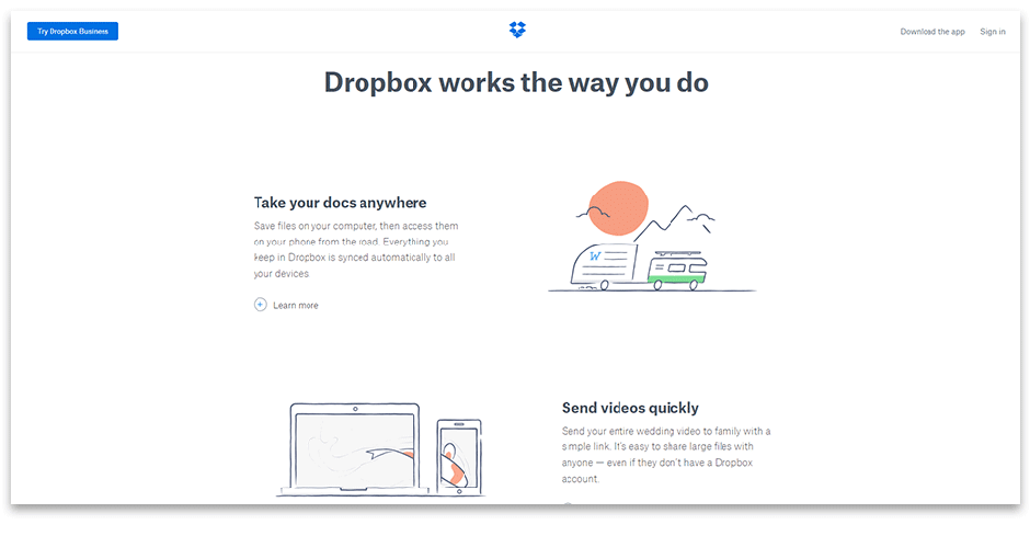
Informative, but succinct. Making use of interactive aspects like videos and sliding customer testimonials keeps copy text to a minimum while still successfully explaining what the product is.
A focused content-oriented approach allows users to get specific information about the product, like where and how it works and what actions users need to do to get started.
All calls-to-action are placed wisely. The page design and layout works just as well for new users or for existing users that want to add more devices to their account.
Clean, neat, and simple design displayed on a layout which is updated fairly often.
Charming hand-drawn funny illustrations pair with informative copy to explain the product effectively.
A powerful tagline that fully explains the product: “Get to all your files from anywhere, on any device, and share them with anyone”.
Bonus: Dropbox is a well-known product and the company is now focused on promoting Paper, their new document creation tool. Paper’s homepage is separated by three coloured blocks which make up the three different parts of the whole product: business solution, document tool, and classical application. The clean, clear design is in tune with the rest of Dropbox’s branding, but is powerful enough to stand alone.
Visit the website: Dropbox.com
4. Storytrail
What makes this homepage great?
Modern material design and user-friendly navigation.
The company’s mission is clearly stated on the homepage, helping visitors understand what the company is all about.
An unobtrusive main animation reflects the essence of the project.
The сontent disappears and appears with smooth animation, keeping visitors engaged and encouraging them to explore more.
The background video serves two purposes – to both capture the visitor’s attention and to create engaging, interesting content;
The restaurant’s homepage entertains the user, allowing them to get an inside view of this business which builds up a greater capacity for emotional connections with the help of the main character.
Subdued colours and simple font keep the visitor engaged with the main character.
User-friendly design and simple navigation balances nicely with the background video.
The screen splits when selecting a tab on the menu bar which allows visitors to read relevant information while preserving the engaging nature of the video content.
The overall feel of the homepage leaves the visitor with positive energy and an “insider” perspective on the business.
The homepage gradually immerses the user in the game world.
It has an outstanding set of font solutions.
The sound effects of the clashing swords adds to the overall atmosphere.
It is easy to trace micro-interactions with the user that follows the simple rule: trigger->rule->feedback-> loops and models. Microinteractions are an unending cycle.
The clear homepage design highlights how Trello differs from many old-school task managers.
The homepage contains a powerful slogan: “You can organize everything with anyone” and explains how to do that in just a few blocks.
Modern image elements (like a friendly-looking husky) give users positive feelings towards the brand.
An appropriately stylised logo hints at what the service is. These smaller details can have a big impact on a visitor’s overall impression of the page.
A combination of bright colours subtly communicates that this service is simultaneously fun and professional.
The page comprises of mixed bright colors and simple forms.
A minimalistic layout and amazing typography makes it easy for users to concentrate on what’s important.
The background video on the main screen sets the mood, showcasing the company’s achievements and, at the same time, immersing the visitor in the company’s work.
A small trophy icon with the number of awards received is placed subtly in a corner of the page, adding value and trust while also piquing a visitor’s curiosity to find out more about these achievements.
Animations are very smooth and responsive.
Trendy parallax scrolling effects are used in a modern split screen page.
The loader is done in the corporate style of the company.
One of the most creative homepage designs that features online web-camera shots with active navigation tabs. You can click any element on the floor or on the banner.
You can observe what people are doing in the office at the moment.
Compelling font and navigation tabs are also placed in the footer.
This is a modern long-scrolling page.
The company features a memorable logo in bold that is made up of one typographic symbol – ampersand – which is fitting with their branding and is relevant to their industry.
The button that features the new album is placed in the right upper corner and has a scroll of text to attract attention – this solution deserves praise.
The subscription form at the bottom of the page has a fun, fascinating animation.
The website has a remarkable grid which makes it very engaging with all its animation. Information is presented in such a way that visitors want to read and learn more about the band.
We hope these good website design examples have helped you understand what it takes to create a great homepage and find inspiration for new layout ideas! If you’re looking for ways to improve your homepage design or are starting a new project and need a brand new website for it, check out our Dribbble page or contact us! We’ll be more than happy to assist you in finding the best layout and design to reflect your unique business needs!