
First of all, thanks to everyone for giving so much love to An ultimate guide to selecting the perfect artboard size for mobile with over 50K views.
Since then I’ve been receiving a lot of people asking me to write an article for web/ desktop applications.
As I discussed in my guide for mobile,
“I have been calculating different screens, dpis, dips, pts, pixels, etc… and tried to find the best way to increase productivity without spending and wasting time to select perfect Artboard size for Mobile UI Design”
I used the same approach to find the perfect artboard size for Web/ Desktop UI Design.
People generally design over 1440 x 900, isn’t that the one we supposed to use?
Uhmm it is one of the sizes, best fit for Apple’s Macbook devices but not the only size to design for all. There are various sizes available in several design tools to choose from, those are either puzzling or favor certain devices.
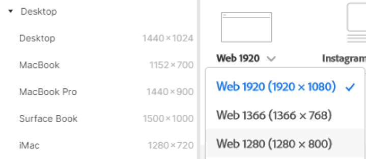
Based on what is available on Design tools like Figma and Adobe XD, there are a lot of disparities. As we know, these artboard sizes are not as per the display resolution of devices they’re accountable for and that increases the confusion to select the perfect artboard size for a unified system that works everywhere.
What’s the way then?
Well, as I said — “Aspect-Ratio matters the most”
Read my guide for mobile to get to know more about Aspect ratio, though in simple words:
It is a ratio between the height and width of a scalable resolution of an image or a screen.
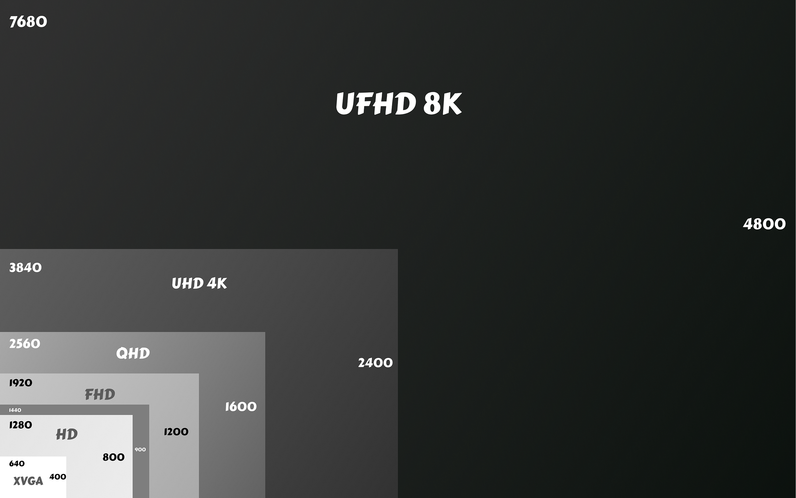
Let me tell you a bit about different screen resolutions available in the market these days based on their aspect ratio.
According to Screensiz.es, 16:9 is the most popular aspect ratio. Due to its considerable width, this format is considered panoramic. It is now the standard for television, videos, and online content.
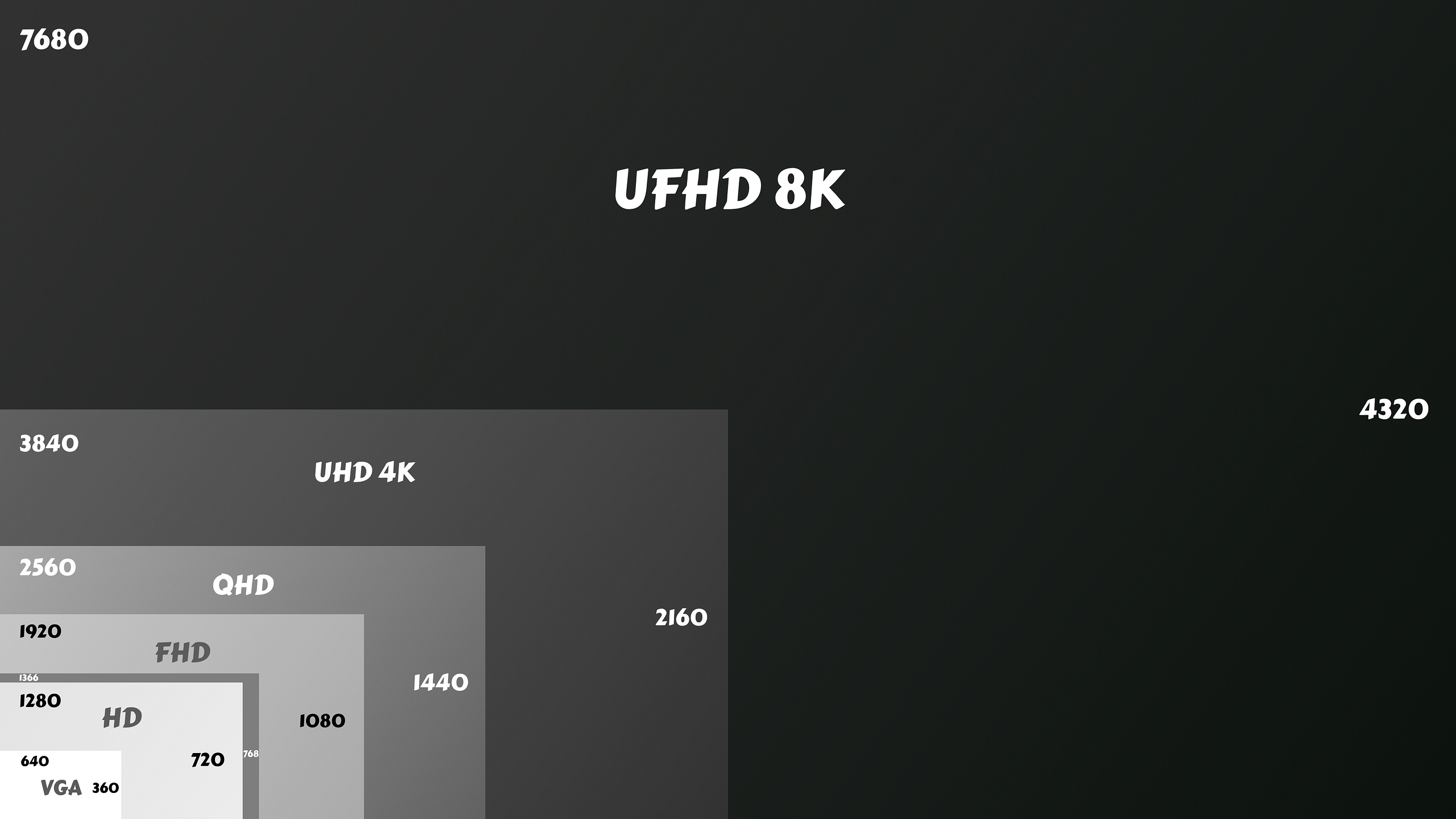
Now you know why they describe screen sizes in K, which stems its initials from Kilo or simply close to 1000.
On the other hand, 16:10/ 8:5 is another ratio popular among Apple Mac devices. This ratio provides a larger height to the content and best suitable for Web Pages, Word documents, and more data-centric applications.
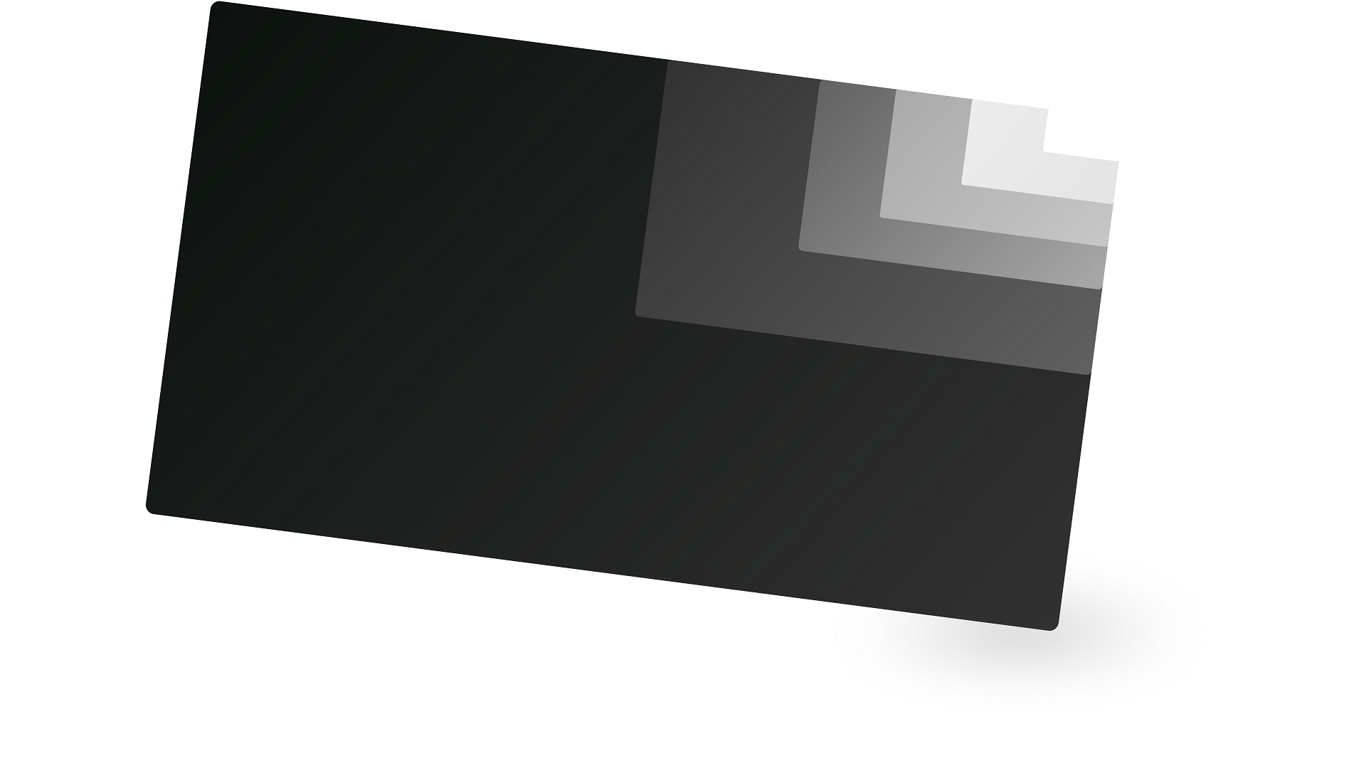
Larger screen resolution may result in a larger area for your fix sized elements, they might look tiny compared to the smaller screen resolution.
Web elements are upscaled with high sharpness in larger resolutions to maintain an aspect ratio of individual elements. Technically, more pixels lit up to display the same data on varied screen sizes.
But again, what artboard size is recommended in 2021 🤔?
To get artboard size for your Web UI design you have to first figure out the target audience, analyze their device usage and select at least one aspect ratio from 16:9, 16:10, or rarely used 4:3.
Select an appropriate size for your application based on the Screen Resolution chart I’ve given above. I’d recommend using:
- 1280 x 720 (16:9) — Compatible with older gen HD panels
- 1366 x 768 (16:9) — Widely available Windows Laptops
- 1920 x 1080 (16:9) — New-gen FHD panels, available in Laptops, Monitors, iMac, and TVs
- 1440 x 900 (16:10) — Widely available Macbooks
- 2560 x 1600 (16:10) — New-gen Macbooks
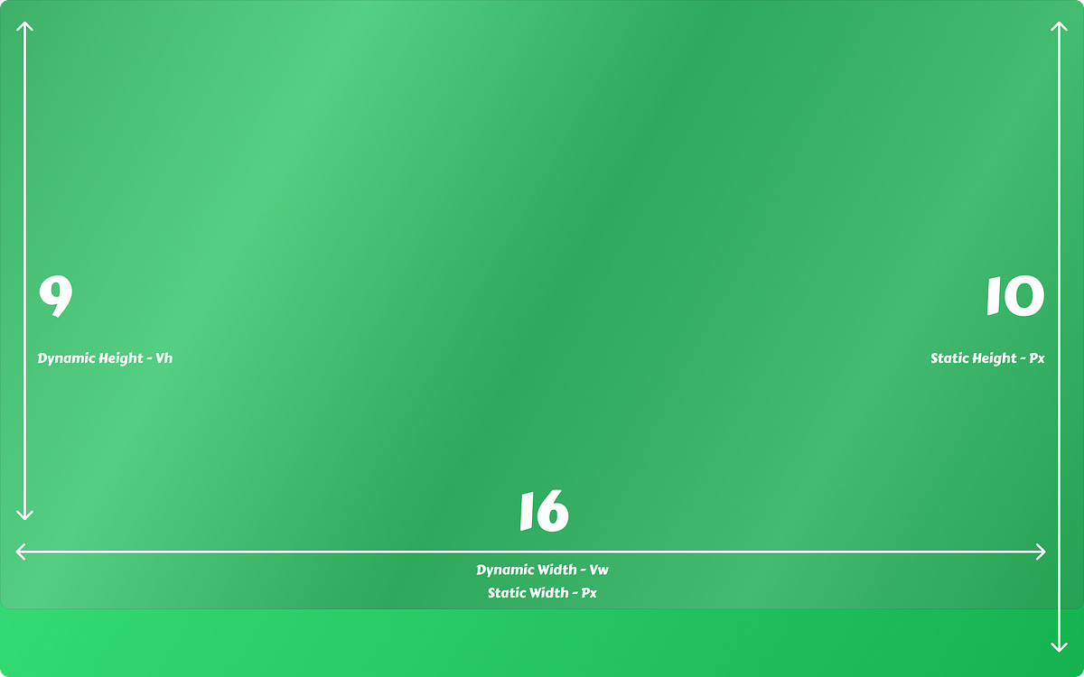
Keep in mind likewise mobile, here too the width remains constant and if you’re designing scrollable webpages, height doesn’t matter at all. Viewport height on the other hand can be kept as above resolution height and reducing either 72 px or 104 px for the URL bar and tab bar.
I only have Pixels to work with, how do I ask my developer to develop a responsive webpage?
Though Web is a complex space for designing applications in different layouts, there are CSS units that you should know as a designer to design better digital products.
Conclusion
So after this article hopefully, you’ve learned something. Let me quickly summarise all that I’ve said.
First of all, you should always do some research on your target audience and their device usage, and select at least one aspect ratio. Don’t worry there are primarily 2 popular aspect ratios in the current market i.e. 16:9 and 16:10. Select an artboard size based on aspect ratio and device compatibility. Use dynamic CSS units to handoff designs for responsive layouts and static CSS units for fixed layouts.
If you liked my article, meet me at Designer’s Virtual Cafe and say “Hi 👋”.
Buy me a Ko-Fi ☕ and support my content by pressing 👏.
You can write to me directly via WhatsApp or find me on Instagram or Dribbble as @appy013

 Buy me a coffee