...I see some problems and some inconsistencies in the UI.
I’ll be honest! I used to be a huge Apple fan. Watching the 2007 iPhone keynote led me to getting a jailbroken version from abroad a week after launch, as of course it wasn’t even available in my country. It was super expensive (half my salary) but it was the future!
While phones had been getting better, faster and more refined, there hasn’t really been a lot of innovation coming in the User Interfaces. Sure — things were improving steadily, but nothing as groundbraking as Twitter’s pull to refresh back in the day.

Enter the Dynamic Island
Yesterday Apple has finally restored my faith in their UI prowess, but not without some caveats. Let me be clear — I love this idea and can’t wait to see it in action.
For now though, let’s talk about some issues.

Front facing blur?
Imagine tapping constantly around the front-facing camera to access a feature or change something. That’s what the dynamic island is for after all.
All those taps will eventually smudge your front camera, so taking a selfie will require you to either wipe it every time, or take blurry photos.
While the use of otherwise wasted space is quite cool here, the fingerprinted photos can tell a whole different story.

Finger travel acciddents?
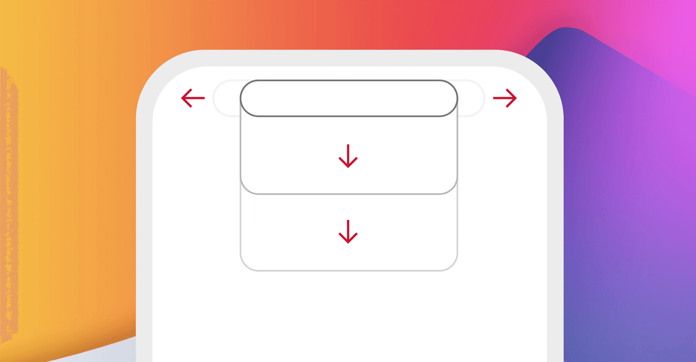
Displays get larger and larger, yet we haven’t evolved our fingers to be longer just yet. Sure — given our smartphone addiction that is bound to happen, but evolution usually works quite slow.
For now to access the top of the screen we need to shift the position of our hand with the device to be able to use it. That is not an optimal way of handling notifications as we’ll be reaching up many, many times every day. That can result in potentially losing grip and dropping the phone and shattering our new $1500 toy.
Apple already pushed the other way by moving the safari address bar to the bottom to allow for reachability. Here it’s coming back to making lives a little harder, albeit still looking cool.

The UI itself
And last but not least, while most of the UI and transitions looked sharp and refined, I noticed one part that stood out as a pretty od choice. I’m talking about the music player. Take a look at this:

The expanded music player album art has a very weird shape that doesn’t really match the roundness of the container. To me it looks unnatural, an easy fix would be this:

But then it gets a little weirder once it shrinks down the the pill shape. While most other examples in Apple’s keynote showed the items transform into circles, the album art stays a rounded rectangle which looks odd compared to the fully rounded shape of the pill.

A simple fix would be this — and it would look a lot more natural.

Conclusion
It’s refreshing to see some UI’s evolve. The dynamic island, and some foldable concepts of shifting interfaces are interesting and make the field feel like there’s still something to explore there.
For a while now that wasn’t the case.
I made a short Figma tutorial on how to use Smart Animate to create a Dynamic Island for your portfolio projects — worth having to show you’re following the recent trends in your work.
Enjoy!
Follow me on Twitter and YouTube to become a unicorn designer and progress faster.


