A Guide to Motion Design principles
The Rounded User Experience
Ever wondered what the fuss is with the rounded corners on buttons, cards, and other UI components? A rounded corner is usually achieved by using a border-radius…

Why wireframes are becoming obsolete
A couple of weeks ago, I posted a short excerpt from Basecamp’s Shape Up called Wireframes are too concrete. It highlights something that I’ve been experiencing over the past years, but never really got round to writing about — do wireframes still serve a purpose?

Text fields & Forms design — UI components series
Forms have existed for a significant amount of time, greatly simplifying the task of drafting complaints and various other legal pleadings. With the advance of information and its processing, means to gather the data are also evolving. As printed forms were here for years we can learn a few tips from their design.

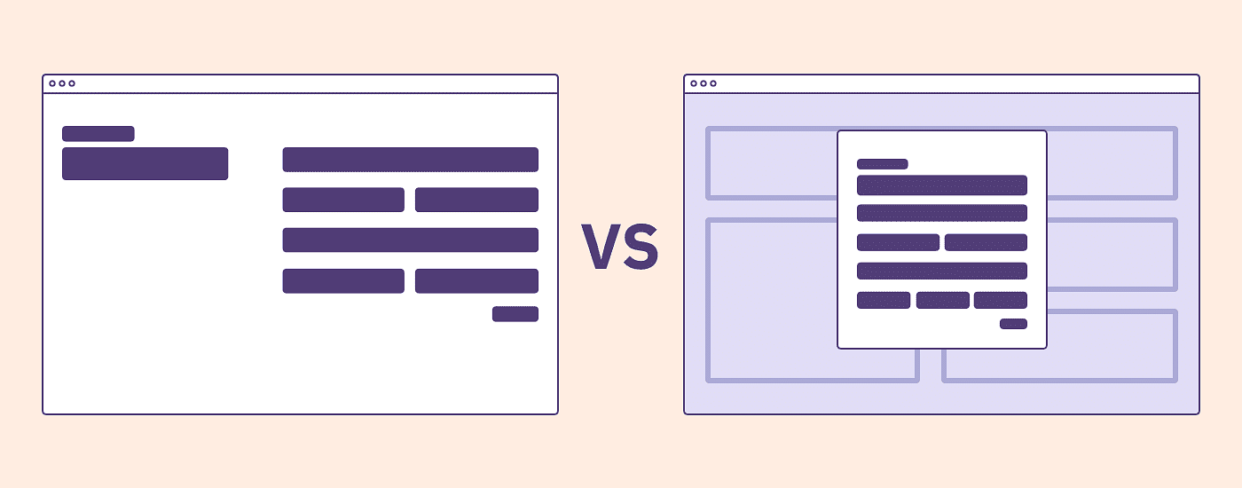
Modal vs Page: A Decision Making Framework
You’re creating a patient registration flow and your user is partway through the form wizard and needs more information on how to find and fill out their “insurance certificate number” in order to continue. Some users need to know what this means. Others need to know where to find it (hint: it’s on another piece of paper).


