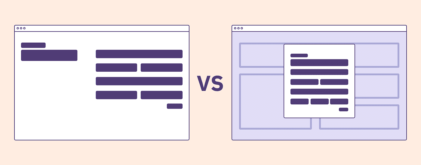
You’re creating a patient registration flow and your user is partway through the form wizard and needs more information on how to find and fill out their “insurance certificate number” in order to continue. Some users need to know what this means. Others need to know where to find it (hint: it’s on another piece of paper).
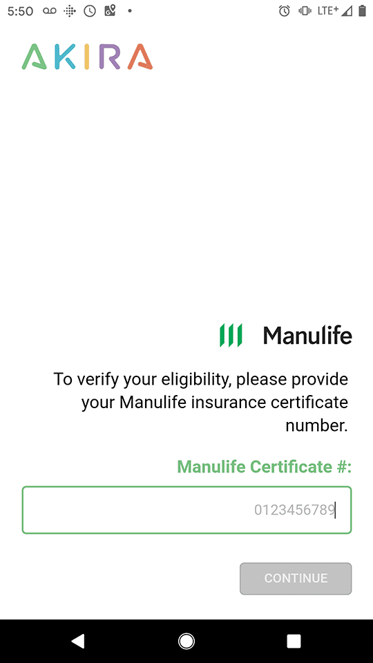
You’ve come to a crossroads. Do you interrupt the flow? Add a page? A modal? How do you decide what to do?
Problem: There Are No Definitive Rules For Using Modals
An extensive review of the available literature made it clear that there are no defined rules for the use of modal overlays, just a number of recommendations and guidelines (which I’ve provided in the references section at the end of this article).
Modals Help Us Not to Lose Context
Once upon a time, someone asked the question, ‘How do we convey important information without losing the context of the current screen?’ and modal overlays were born! Modal screens require people to focus on a single, self-contained task, in the context of their free movement within the information architecture of an application before continuing. This maintains the context of the current screen while still conveying the important information the user needs.
The Language of Modals
Ever had someone ask you, “What’s the difference between a modal, an overlay, and a dialog?”. Often they are thought of as the same thing or different only by a technicality. So let’s make sure we’re all on the same page before going any further:
- Dialog (dialogue): A conversation between two people. In a user interface, a dialog is a “conversation” between the system and the user.
- Mode: A special state of the system in which the same system has somewhat different user interfaces. Each mode may come with different actions, or the same action can produce different results depending on the mode of the system.
- Overlay: A content box that is displayed on top of another page. The overlay box is usually noticeably smaller than the underlying page.
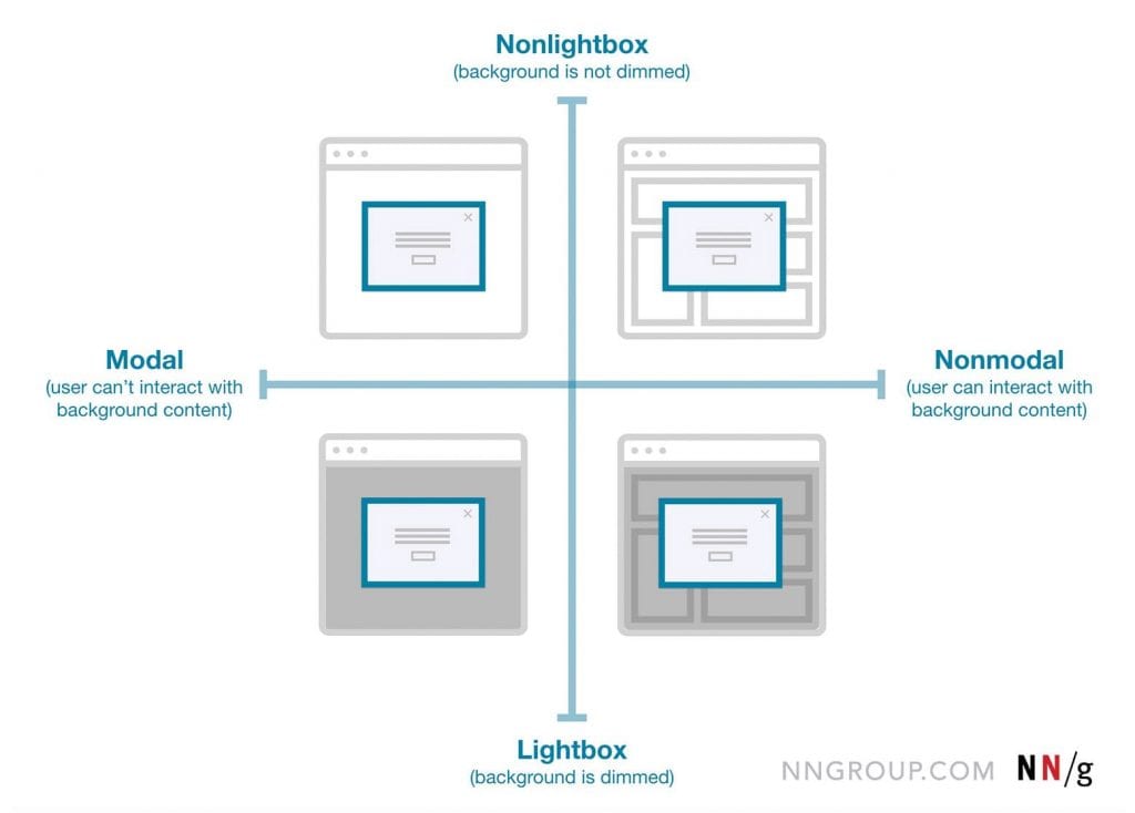
- Scrim/Lightbox: A temporary treatment that can be applied to surfaces for the purpose of making content on the surface less prominent or obscured, leading to the use of the term ‘lightbox’ to describe this visual effect of heightened focus on the overlay content.
- Modal: The content on the page is disabled until the user explicitly interacts with the overlay.
- Non-modal: Users can still interact with the background content (for example, by selecting links or tapping buttons) while the overlay remains visible.
Types of Modals
To make things easier, the Nielsen Norman Group created this very useful diagram to help us all understand some of the differences better:
Mapping Modality Across Components
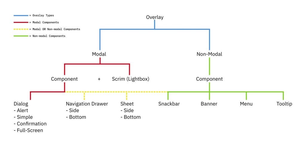
To make things even easier I made a handy dandy diagram connecting the terminology we just learned above☝️ with actual components from Google’s Material Design.

Solution: Here’s My Decision-Making Framework
I synthesized all the best guidelines, heuristics, and recommendations to create a flowchart that, when applied correctly, will help you to understand whether your design should live in an overlay or not. This can be paired with the overlay component map above to help you pick the right component to use. Combined, these tools will point you in the right direction and provide you with a strong justification for your decision.
I recommend using the following template to record your answers to each question as you progress through the flowchart.
Template: https://docs.google.com/spreadsheets/d/1fZhXsV-IFWM0ZuMLLc8gG1BXqeQxFkCoYvSJt0gl2II/edit?usp=sharing


Conclusion
Deciding whether to use a modal is difficult, and further complicated when you’re trying to determine what’s best for the user, rather than what’s easiest for the designer. Using this framework will reliably point you in the right direction and help you make better decisions about how and when to use modals. Every situation is unique, and there are times that this framework may not fit the specific design problem. However, it’s consistently helped me and my team, and I hope it will help you too.
Here are some other resources that helped me along the way, and you may find useful as well.
References
- Popups: 10 Problematic Trends and Alternatives
- https://www.nngroup.com/articles/modes/
- https://www.nngroup.com/articles/modal-nonmodal-dialog/
- https://uxplanet.org/modality-the-one-ux-concept-you-need-to-understand-when-designing-intuitive-user-interfaces-e5e941c7acb1
- https://uxplanet.org/best-practices-for-modals-overlays-dialog-windows-c00c66cddd8c
