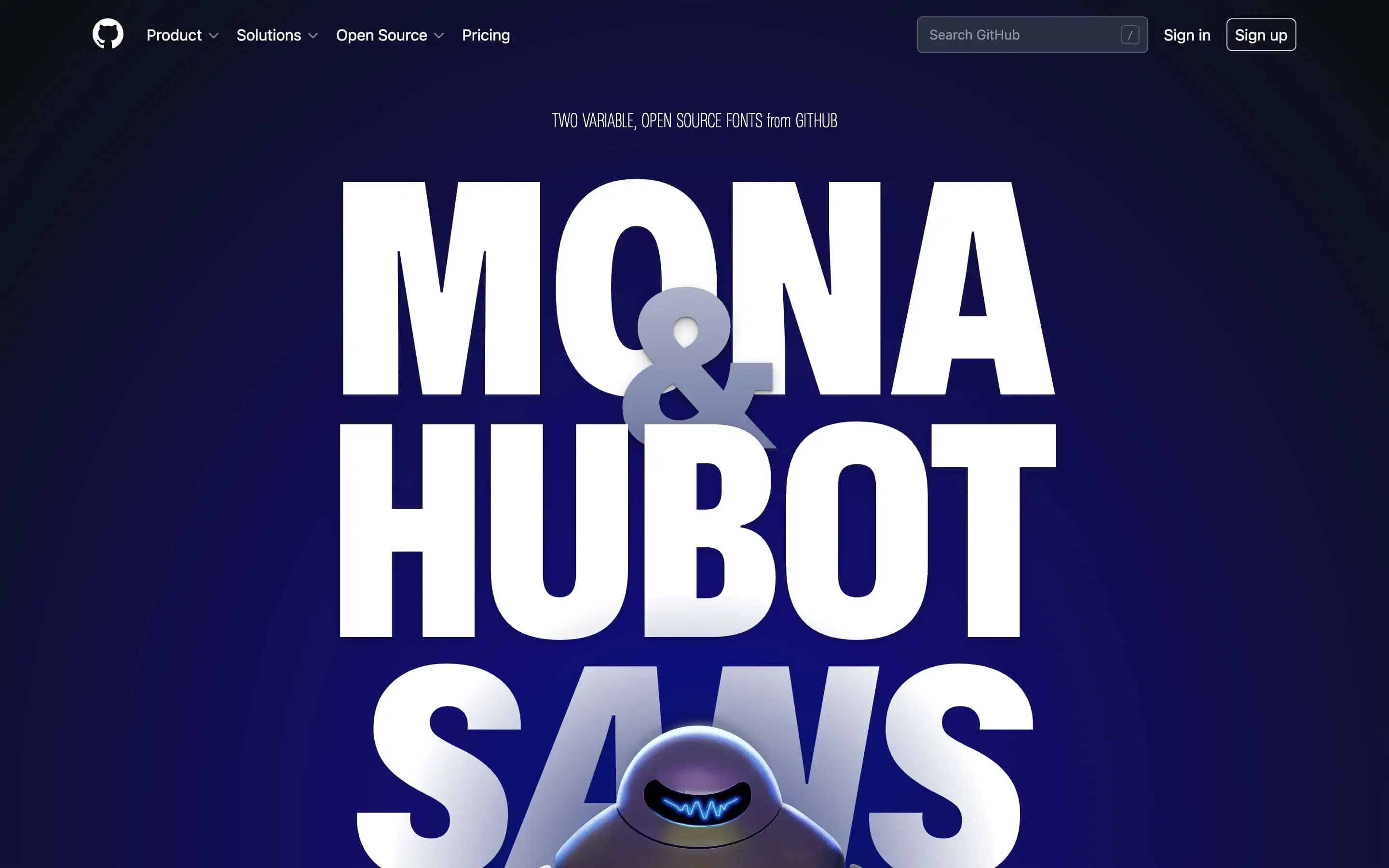
Legibility in User Interfaces
Sometimes, users find it hard to read microCopy on a mobile or desktop screen either because the characters are cluttered, hazy, or too small to read. Crabbed or hard to read microcopy creates interface friction that results in users taking more time to complete their goals or tasks.
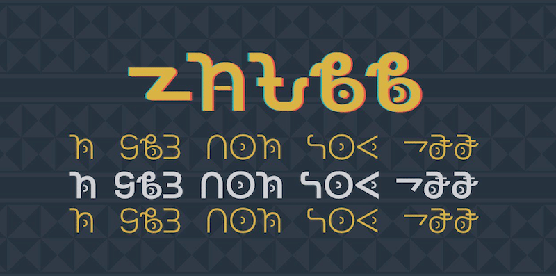
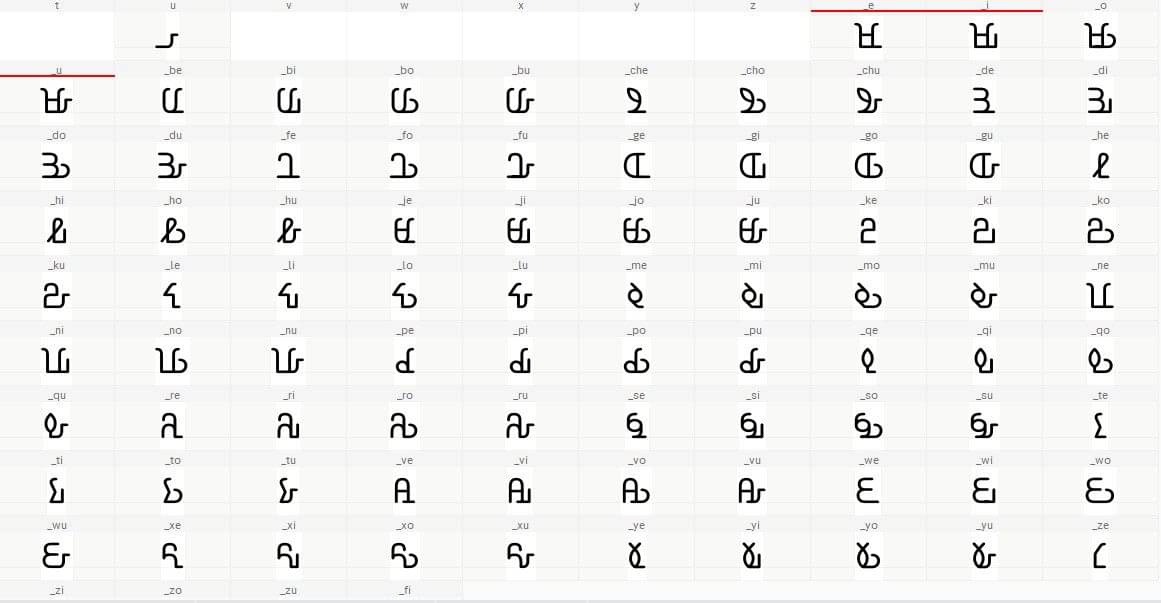
Decolonizing typography: creating a font for Afrikan writing systems
The driving force behind my relentless mission to create digital fonts for Afrikan writing systems, one letter at a time. In this case study I’ll walk you through the process of designing a font for the Bassa Vah Alphabet. The name ‘Bassa’ and a Bassa proverb. Background Bassa language is spoken by about 600 000 […]
How Important Is the Role of Fonts in Web Design?
When people visit a website, you don’t want to see an ugly design, staring you in the eyes. You want to see something beautiful and well organized. Web design is critical because it sets the first impression of a brand in the eyes of the consumer. It also plays an integral part in brand positioning, […]
