Radix Themes 3.0 is the latest update from the Radix component library - everything you need for building modern apps. This new update brings a new layout engine, colour palette generator, and fresh components such as spinner, skeleton, and segment.
Custom Color Palettes:
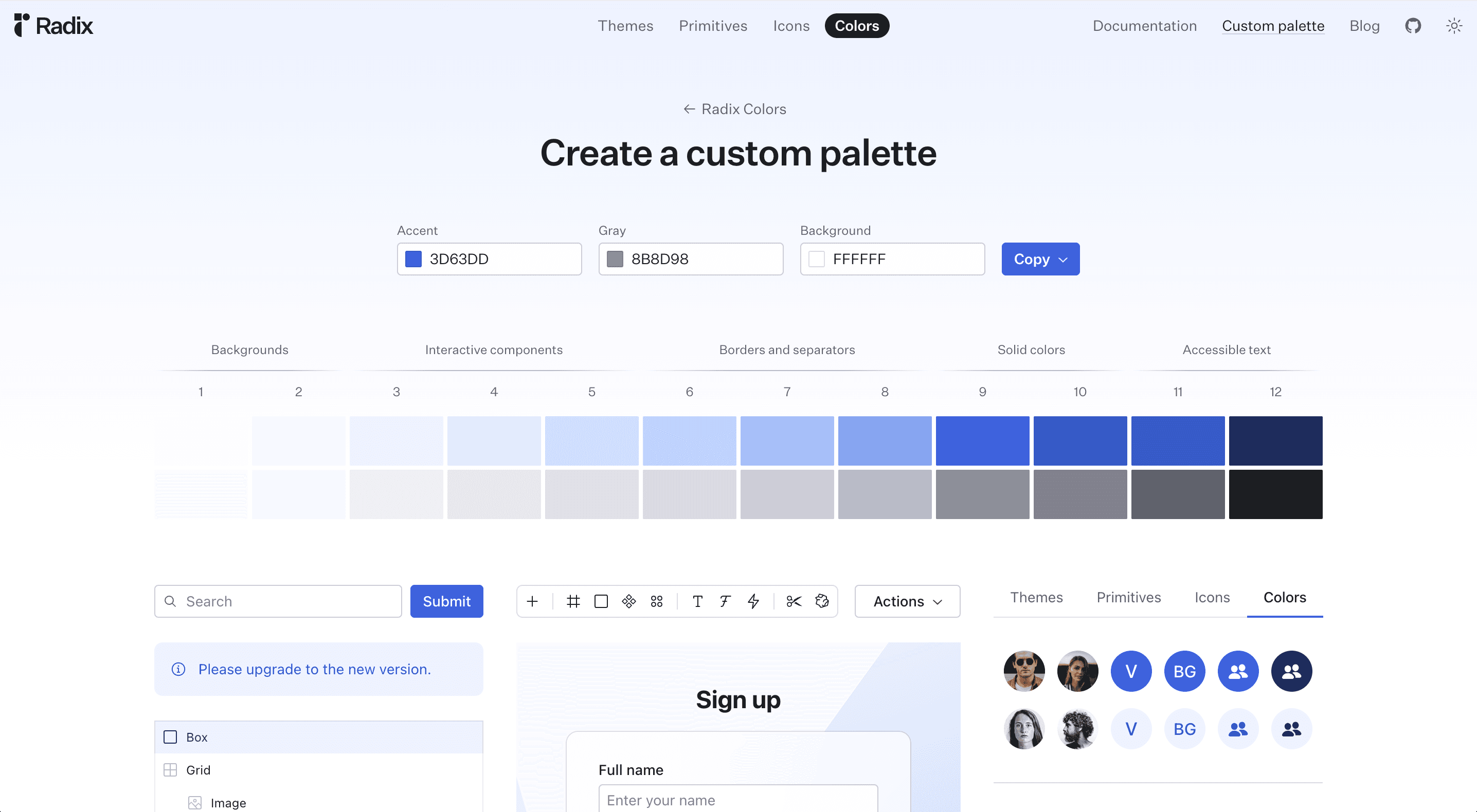
With Radix Themes 3.0, Radix have introduced a new custom colour palette tool which enables you to build your own brand palette for Radix Themes. See the interface below (or try it here) - you can specify primary colour, your preferred gray color, and a page background:

The output from the colour palette generator can be copy-pasted into your theme styles. With nearly 30 meticulously curated color scales, complete with light, dark, and alpha variants, you have the power to create your own unique brand palette with ease:

New Components in Radix 3.0
Radix Themes 3.0 introduces an array of new components, catering to the needs of all modern apps - from dynamic dashboards to information-heavy interfaces. Here's what's new:
Spinner Component

Spinner is a very useful animated loading indicator that can be used to show a loading state the rendering of child components. It is more than just a loading icon - it can eliminate layout shifts during data loading as the Spinner component also preserves child dimensions, streamlining the implementation of your app's loading states.
Skeleton Component

The Skeleton comopnent is a versatile loading component that mirrors the shape and size of child components, allowing for a consistent layout experience – no more positioning blocks for loading state, Skeleton does the lifting, making it simpler to code a loading blocks.
Segmented Control

The Segmented Control component is designed to offer a user-friendly and visually appealing interface when toggling between values. Crafted with precision, subtle design elements like font weight transitions seamlessly, enhancing the overall user experience.
More components
Data List - a dynamic component tailored for handling data in a structured and organized manner
Radio Cards - Like radio buttons, but nice cards instead
Checkbox Cards - Like Radio Cards, but work like checkboxes
Progress component - A nice loading bar that shows the progress for things like downloads.

Try it out
Above are just the highlights, the new Radix Themes 3.0 update has much more - explore it in the update blog post or the release notes. Transform your design and development workflow with Radix Themes 3.0!
