Localisation is often perceived as simple text translations across different languages. However, it goes beyond just some alphabets and letters. In order for digital products to be successfully adopted in various countries, it is important to be inclusive of user mindsets and cultures.
According to the World Wide Web Consortium, localisation refers to the adaptation of a product, application or document content to meet the language, cultural and other requirements of a specific target market (a locale).
On the other hand, internationalisation makes localisation easier through the design and development of a product, application or document content for target audiences that vary in culture, region, or language. It is more focused on setting up the right process, layout, and structure whereas localisation addresses the cultural factors and content.
It is a common misconception that localisation refers to text translations. However, it is a lot more complex and goes beyond just words — think about currencies, measurements, timezones, the format of numbers, addresses, and phone numbers, legal requirements, local content, local rules, and regulations.
Localisation does not necessarily mean only text content. For example, fast food giants like KFC and McDonald’s are also known for localising their menus. Instead of providing only Western options, they have expanded their menus in Asia to include local flavours such as porridges, rice dishes, sesame burgers, and yam pies. This ensured that they catered to both the younger and older market who may have preferred more traditional, local food.
Thinking about Localisation in Design
There are various other considerations when it comes to localisation and visual design. For example, in Hong Kong, people tend to read from the right to left and sometimes, top to bottom whereas, in parts of China, they would read from left to right, similar to Western cultures.
Here’s another fun example. Back in 2013, Coca-Cola ran a “Share a Coke” campaign where simple phrases such as “Share a Coke with John” replaced the logo on the label of the bottles. Each label had a different name. For Ireland, they included Irish names such as Oisín. In China, instead of using first names which was considered rude in the culture, they replaced this with “close friend”, “classmate”, “friend”, etc. Not only did they manage to stay true to their marketing campaign, but they also addressed the issues of cultural considerations very well.
So in terms of digital products, what do we need to think about when it comes to localisation?

Brand Name
Here’s a simple, and often overlooked example — your brand name. Does it mean what you want it to say in other languages? For example, cookware brand Silit means “anus” in the Indonesian language, though that did not stop the locals from their purchases of pots and pans.
Line Heights and Font Sizes
We need to remember that not all content will be in English. Other languages have special characters that may require increased line heights or larger font sizes for an easier read. For example, consider languages like Arabic, Chinese or Korean that do not necessarily use Latin alphabets. On the other spectrum, you have languages like French and German that may include additional umlauts. Each language would require its own style to ensure the best reading experience for your users.

Use of Punctuation and Formatting
On top of text translations, different languages also have their own punctuation and formatting. As seen with the example above, the full stops, comma, and enumeration comma are different from the norm with European languages. Another design consideration is type. How would you pair a font specific to Chinese, with a font for Latin languages?
Formatting not only affects paragraphs but also refers to calendar dates, currencies, addresses, and phone numbers. For example, in Germany, there are no apartment numbers and instead, people’s last names are used instead. In Hong Kong, addresses are much more specific with flat, floor, and block numbers as well as building and street names, followed by a district. In order to convey the right information, it is crucial that these are correct in each locale.

In terms of currencies, there are other factors to keep in mind:
- Symbols and placement: You have £, $, €, kr. and other currencies, but on top of that, the placement of the symbol also matters. For example, with USD, the $ sign goes in front whereas in French Canada, the $ goes to the right, after the numbers.
- Spacing: Individual countries and locations have their own formats. For example, there is a non-breaking space between the dollar amount and the euro sign for EU countries.
- Commas and Decimal Points: Another common point of confusion — for example, in Australia a comma is but in Germany or Vietnam, a decimal point is used in place of the comma.

Word Lengths and Column Widths
Languages like Chinese and Korean that are character-based are much shorter because essentially, each character is a word on its own unlike English words. However, there are also languages with much longer words that need to be considered, especially when designing multiple columns. Think of German and Finnish words in comparison to English — if the columns are too narrow, you would end up with hyphenations that break up the words.
One of the examples that I have personally experienced is having huge contrasts in regards to your typography system. A simple example is having a large heading and a much smaller body text size on a site. This may work for English, but when it comes to longer words like German, you would end up with hyphenations on the mobile site because of the length of the word, as well as the size of the heading and lack of space.


I have simply used Google translate for the sentence here but you can see how both texts sit differently within the same width containers. It may be a bit of an extreme example, but you get the idea. When it comes to visual design, it is very important that the components take all of this into consideration and allows for language localisation. For example, instead of having a two-column layout on mobile, have a single full-width column that allows for content scalability across languages.
Cultural Sensitivity to Icons and Colours
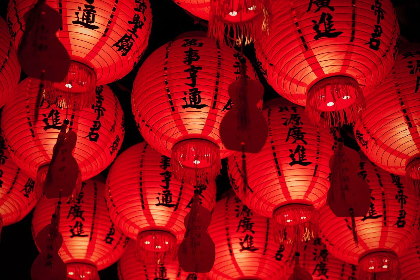
There is rarely a common, universal meaning to colours and icons. For example, red is a lucky colour in the Chinese culture but it is often used as an error or warning state in user interfaces and signage. Icons are not universal and like language, they need to be localised. With localisation, you create familiarity amongst users and therefore, the right communication.
Consider the type of markets you are about to enter. Are they progressive or more traditional? Are there any religious considerations to be mindful of? With more progressive and open cultures, you are more likely to be able to push for more playful and chancy ideas.
Think about emojis. Each year, more are added to the library, some of which are very culture-specific. One of my favourites is the bubble tea emoji 🧋 that was added in 2020. For context, bubble tea (or commonly known as boba tea) is a tea-based drink that originated in Taiwan, but became immensely popular all over the world.
The pinched fingers 🤌 was another emoji that was added in 2020. In Italy, is commonly used in frustration, disbelief or disagreements. However, in Israeli cultures, it can also mean “hold on” or “relax”.
Another interesting example was Facebook’s like button. You would think that the thumbs-up icon would have a universal, positive meaning for everyone. However, this single gesture may have had very different connotations in other cultures. For instance, in West Africa and South America, a thumbs up can be used to insult another individual. In Iran, it goes as far as being an obscene gesture, one that is equivalent to the middle finger.

A survey on the interpretation of the thumbs-up was carried out and returned some interesting findings. For example, in Germany and Hungary, a thumbs-up means the number one, whereas in Japan, it would represent the number five. Other connotations also included hitchhiking and a sexual insult.
The same ideas can be applied to larger-scale visuals such as illustrations. Like icons, they too should take cultural contexts into account. If you are going for humour or puns, remember to localise it to each market. Not all languages share the same jokes or phrases.
Bottom line, it is part of your job as a designer to ensure that you consider the cultural meanings with symbols, icons and colours. What are you trying to convey and is it culturally appropriate? Are there any potential areas for misunderstanding and if so, how can that be solved?
Scalability for the Near and Far Future
When it comes to designing digital products and design systems, a key factor to keep in mind is scalability. You want to build components that can scale with content across various locales.
I have been working (and loving it) at Pleo for the last three months and one of the things I have noticed with building digital products in the financial industry is the list of regulations you must follow. Pleo is currently available in Denmark, Germany, Spain, Sweden, Ireland, France and the United Kingdom and each with country, comes its own financial regulations that must be adhered to.
In this context, the challenge is having a design that scales with the various rules — some countries are stricter, others not as much. Some may require a lot more steps, disclaimers and checkboxes whilst others may only be a few simple steps. Either way, the design must be able to address all markets without losing consistency.
It is also important to remember that design here does not only include visual design, but also the general UX and flow of the process. In the end, regardless of locales, it should all still feel like the same, simple experience for the end user.
Takeaway
There is much more to consider when it comes to localisation but hopefully this has given you a more holistic overview of how complex it is. No section is separate on its own, when you touch upon texts, you will need to look at punctuation and formatting. Similarly, when you touch upon features or content, it will be back to basics with typography, structure and layout.
All of this boils down to scalability at its core. Design, build features and products with scalability in mind. Look at the bigger picture and the further future — plan ahead and build a design system that allows you to tackle these potential future challenges.

