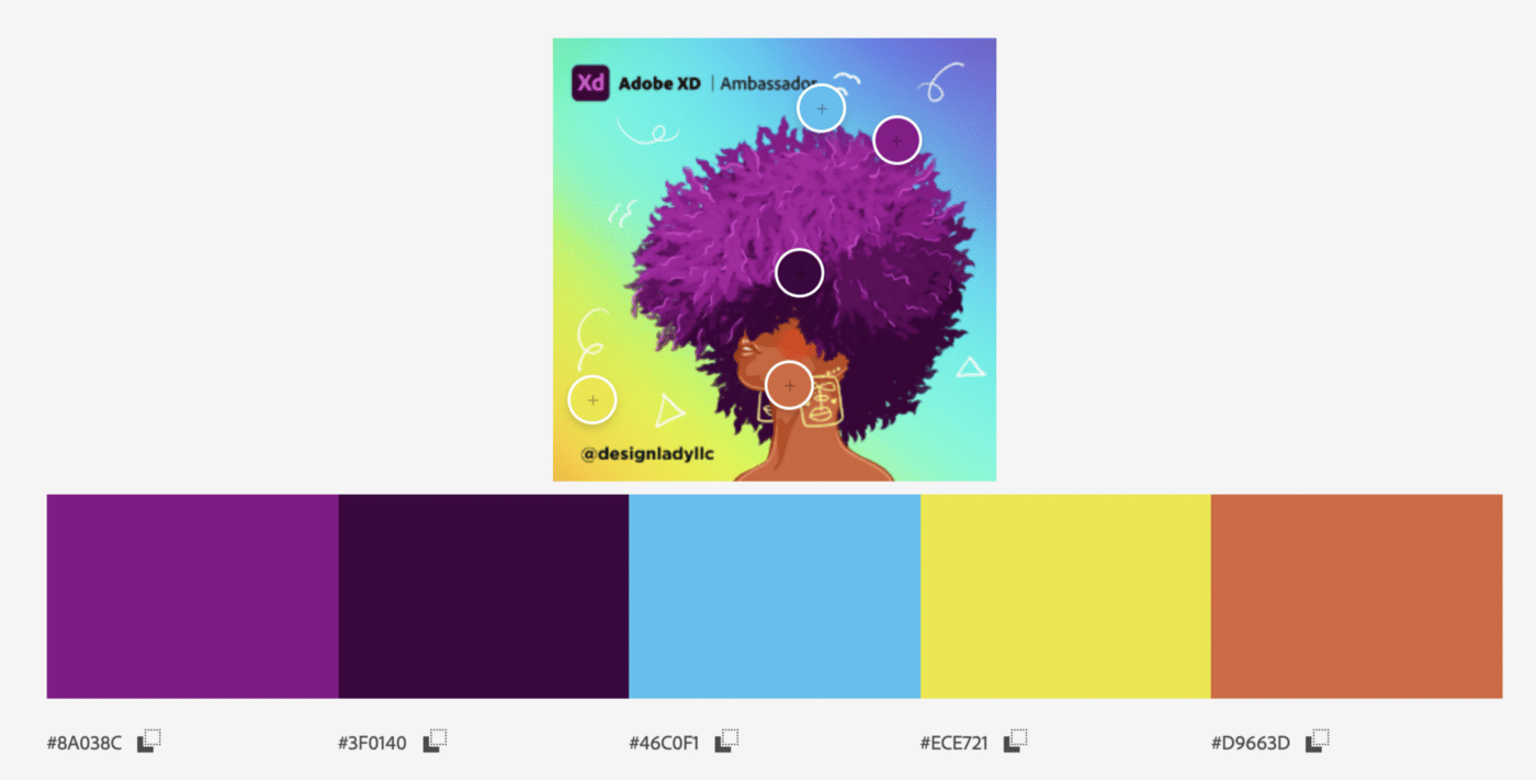
What is important for you in the UI card design? I’d like to share with you the best practices that I’ve collected. Before that, let’s start with a basic UI card overview and where cards are commonly used.
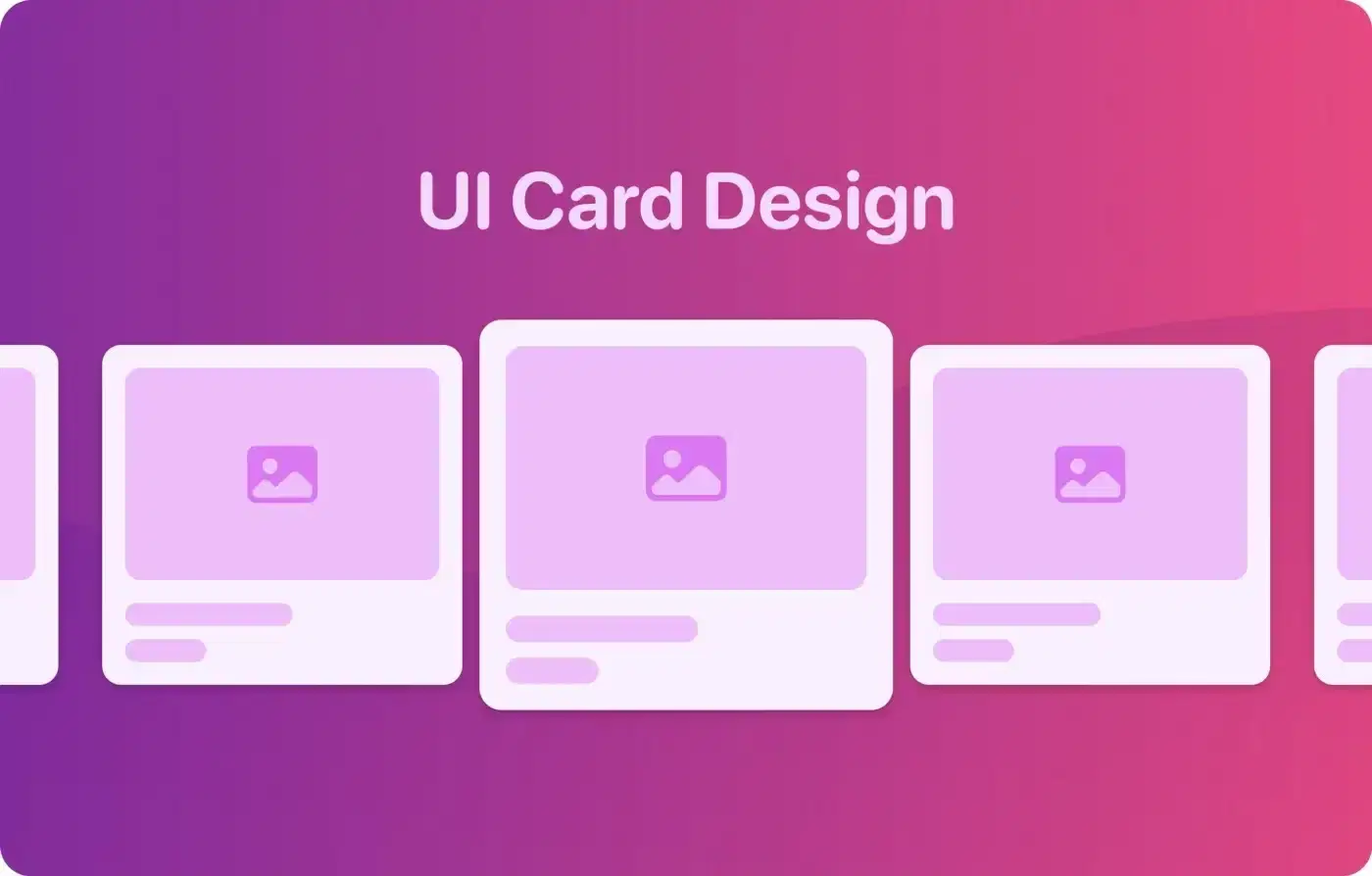
A card is a UI component that creates a visually distinct group of logically related information. It usually consists of a headline, a short chunk of description — summarising the content of the resulting page — and an optional image, button, or ‘call-to-action’.

Where are the UI Cards used?
Product Catalogs pages: big e-commerce websites such as Amazon, Alibaba, Walmart, and eBay use card components to represent each product item. Commonly, a product card consists of the product image, title, price, discount, and ‘‘call-to-action’’ that opens a product’s item details page by clicking on it.
Amazon (top) and Alibaba (bottom) eBay (top) and Walmart (bottom) Content sites (news articles, social media platforms) use card-based layouts to represent each story in a similar way so that the user could quickly scan, compare and pick something to read or watch.
Behance (top) and Dribbble (bottom) CNN (top) and BBC (bottom) Dashboard visualizations: a dashboard is a good example of how cards can be used to group related information in a way the user could easily compare and analyze data in the interface.
Mixpanel (top) and Dribbble (bottom) Collection sites: browsing and exploring is a fun and attractive experience in such huge collections — like Pinterest, and Unsplash because the card-based layout with big images is catchy for the user’s eyes. That’s why implementing cards for browsing became so popular in the web and mobile experiences.
Pinterest (top) and Unsplash (bottom) Collaborative tools: cards are flexible components — they can combine different types of information and child components. For example, such tools as Figma, Miro, and Framer use cards to present projects and files. This type of card is clean, interactive, and functional — the file-related actions are easy to access by right-clicking with a mouse on a card.
Figma and Miro Best practices
There are many guidelines and design libraries available to provide inspiration for your card design, however, I wanted to highlight the ones which are not obviously considered. I hope, you will find this collection useful and interesting for you!
1. Make a good contrast between a card and a background. In order to distinguish better the card from the background, you can make your card Outlined by adding a border or Elevated by adding a shadow.
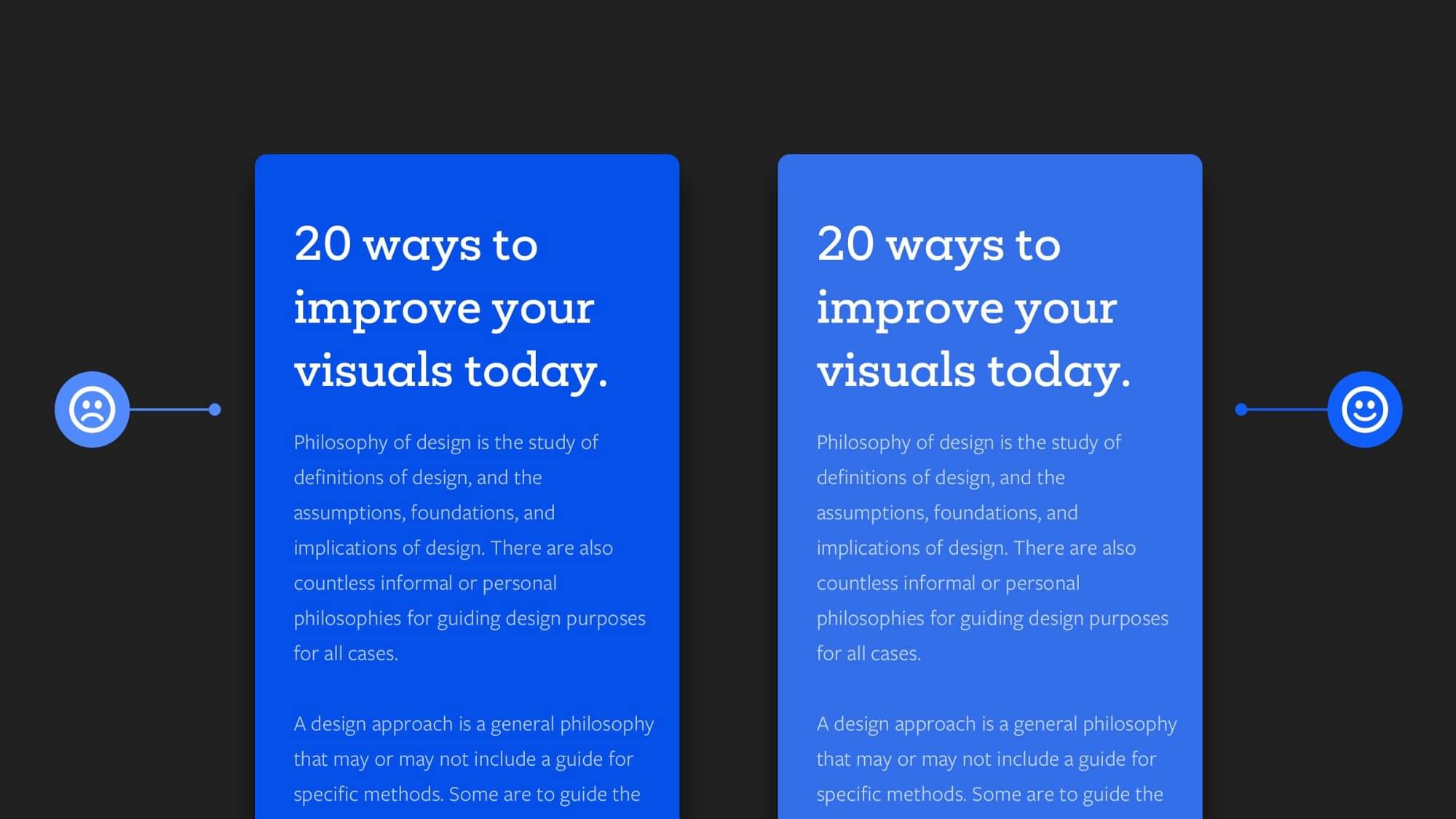
2. Strive to maintain balanced font sizes and avoid using too small fonts. Content readability is defined by the selected font and applied font sizes. In the example below, both cards almost look the same, but it is much easier to perceive the right card because font sizes are correctly selected and the overall card becomes visually balanced and nicer for the human eye.
💁 A few tips for font sizes that can help you to maintain visual hierarchy!
For Headlines, use font size between 20px — 96px or bigger, depending on the card size and context.
Subheadline/subtitle should be between 2px-10px less than its main Headline/Title so that it can be easy to distinguish them.
For Body text, font size should be at least 16px. In some cases, you can go smaller if you use a specific font that has larger characters. For example, in the Google Material Guidelines, two Body text sizes were defined as 14px and 16px.
For Button labels, the font size should not be less than the Body font size. When you need to display multiple options, for the primary actions use more prominent font styles (Semi-bold/Bold), and for the secondary actions use less prominent (Regular/Medium).
Try to limit the number of font sizes, you can use a type scale tool such as the Figma plugin Type scale or Web tool for defining a type scale.
3. Create a spacing system for paddings. Paddings — are the spaces between UI elements, they help to create a visual grouping, and maintain the hierarchy. If you want to avoid chaos in your designs and make them consistent, then you need to define the system of spacings that will be also useful for the developer’s hand-off.


💁 A few more tips for the spacing system!
Select a base unit that you will use for incrementing space values for spacing between the UI elements. Commonly, a base unit is 4px (0.25rem). It’s not a good practice to go with the odd number such as 5px, because in devices with 1.5x DPI (Dots per inch), the spacing will scale up to 7.5px which leads to a blurred result.
Define the limited number of spacing values by using the base unit as an increment or multiplying number, for example, like it’s defined in Tailwind library.
Figma Pro tip: Changing your “Big Nudge” amount from 10px to 8px will allow you to move the component to an 8px value (this is 2x more than the defined base unit) by pressing Shift key and an arrow key. That’s very time-saving!
If you would like to learn more about a spatial system, check out this great article.
4. Design a loading state that resembles a content layout as much as possible. The skeleton state that matches the style of your app’s layout will help reduce a user's uncertainty about the loaded content. Below, you can see how the loading state on the right side better communicates what type of content to expect.

A couple more examples of the loading skeleton states:

5. Define a fixed height for cards. In case, you need to design a card element, assuming that one card could have 4 lines of text and another card could have 1 line of text. The best way to approach the card design is to define one height, by leaving the whitespace for the card which has less content and making the text truncated when the card has more content.

6. Use grids for card-based layouts. Grid is a foundation for a card-based layout, they help arrange content consistently, and this is why they are so useful when it comes to card design. You can use a grid for extending the card’s width to the number of grid columns you need, and by doing so, you can find an appropriate width for your card. When it comes to responsive design, you should create a grid for each breakpoint, and arrange your cards accordingly.

You can learn more about responsive grids on Material Guidelines or Intuit Design System.
❓🙋 Questions to ask yourself when you design a responsive card-based layout:
Does the card content look consistent across all the breakpoints? (desktop, tablet, mobile)
Are the spacing values for gaps consistent?
Do you consider interactions? Would they affect the card’s size and spacing between the cards?
Do you consider long headings/titles? How would they affect the card’s content?
💁 A few Figma tips for a card-based layout:
Define constraints for cards to determine how cards in your layout should respond as you resize their Frames.
Apply the auto-layout for your card to make it automatically resized according to the items inside. Check out this tutorial from Figma.
Creating an 8px Grid allows you to arrange precisely and resize elements with 8px increment units in your design. Learn more about the 8pt grid in this great article.
7. Create a card design with different content. If you know in advance that the card may have different lengths of content, make sure to cover this case in your design. In the handoff, this will help the developer to create a code for the card in the correct way and avoid breaking content alignment.

8. Define card interactions for a better user experience. UI interaction is an action that occurs when a user interacts with the UI element through the touch screen, mouse, or keyboard device. The state is visual feedback that appears on the specific user’s interactions.

Like many other UI elements (buttons, text fields, dropdowns and etc.), the cards should have their states depending on the usage context and defined interactions. For the specific interaction, the card should be styled according to the applied state. Let’s take a look at the most common list of card states:
Default: card is in a normal state without any user interactions.
Hover: when a user places a mouse cursor (pointer) over the card.
Active: if the card is clickable, and a user presses down the primary mouse button to click on it, the card’s style should be changed to show up that the component is activated. This is the same state as for Buttons that are pressed.
Focused: when using an input method such as a keyboard or voice, the card is highlighted. Commonly, on the web, blue is used for this state, but you can choose your own that is consistent with the brand, just make sure that the color is at least a 3:1 contrast ratio against the background color.
Selected: when the card is being selected by clicking on the selection control (radio buttons/checkboxes).
Dragged: when users touch and hold a card, using an input method such as a tap or click.
UI Cards are the common components, that you can find in most web and mobile applications, so by learning from each other and sharing good practices, we could make them more visually appealing, effective, and accessible.
I hope you have found this post useful! Feel free to share your feedback, connect with me via LinkedIn or follow me on Twitter. Thank you!