Fundamentally speaking (with no regard for the platform), an animation lets an element gradually change from one state to another. Each animation needs at least these four parts:
- Trigger — What causes the animation to happen (gestures, time, etc.)
- Duration — how long should the transition take
- Easing — how an element transitions
- Property — the characteristic of the element being transitioned (position, opacity, scale, etc.)
Note: In CSS, Transitions and Animations are slightly different. Transitions are limited to an initial and final state, but Animations can include many intermediate states (keyframes) between the initial and final state.
Design Systems and Animation
In an attempt to standardize some of those 4 parts in Animation Design (mainly easing and duration), most Design Systems use Motion Design Tokens.

However, giving these to designers and developers presents some challenges. To start, they are not technically Design Tokens; they are variables. Ideally, Tokens should communicate intent within a context/interaction and let designers and developers know when and how to use a particular design decision by just reading the name (a.k.a token).
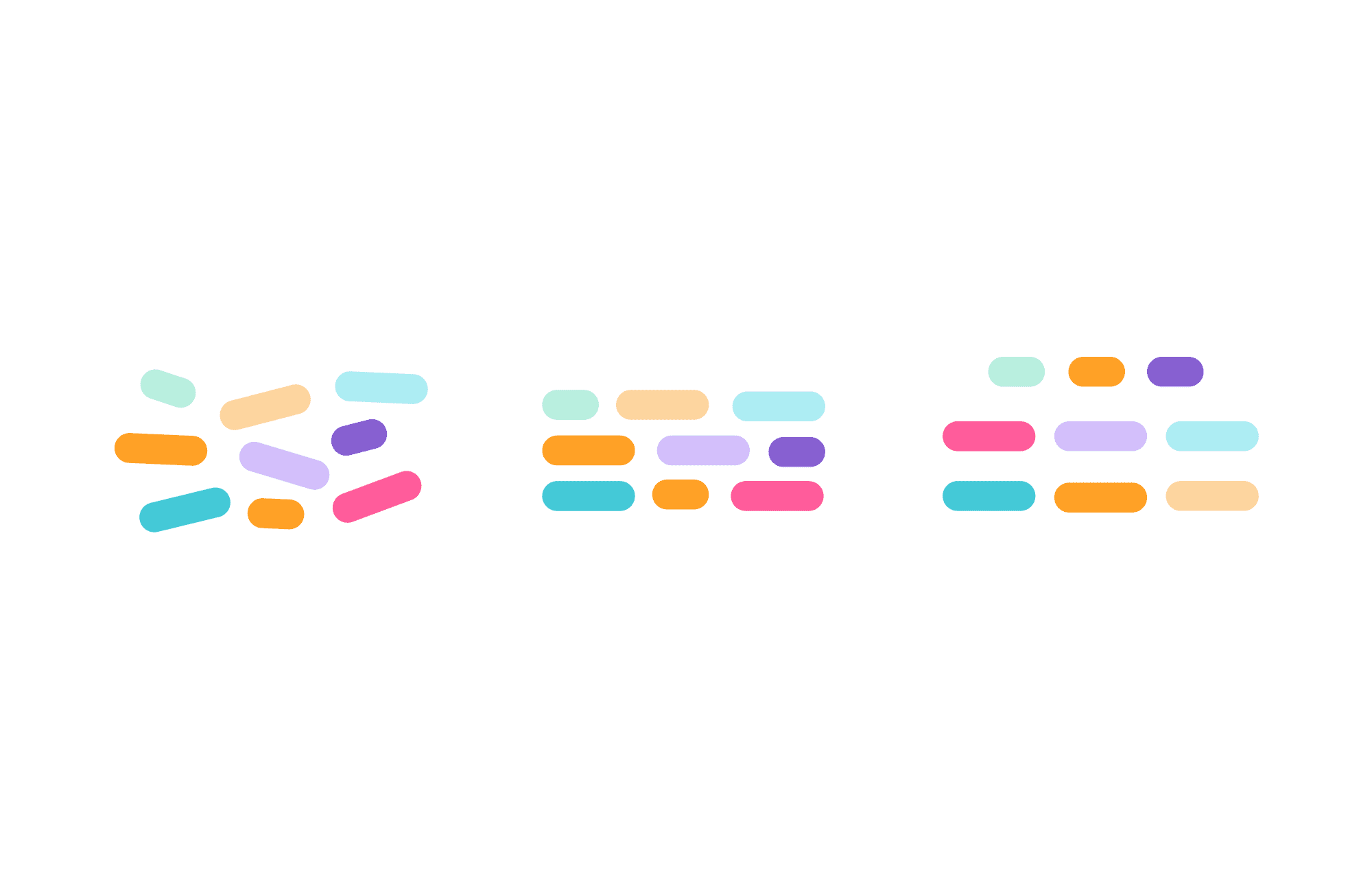
At big organizations, with hundreds of designers and thousands of developers, making these variables available by themselves may create inconsistencies as every designer chooses slightly different variables for similar transitions.
Problem
Two designers working at different product areas may end up speccing the same transition (expanding or collapsing a container, for example) with vastly different animation specs. Thus, the user may encounter inconsistencies as they move between UI areas designed by different designers.
Solution
Create new tokens that convey intent.
Every animation in digital screens, no matter how complex, uses one or more of the following transitions — there could be more, but these are the ones I see most.
🕴 Hovering in and Hovering Out

Encapsulating at least the Easing and Duration into a token that conveys intent allows designers to worry only about choreography in animations. It also makes sure that these transitions are scalable and consistent across different usages.

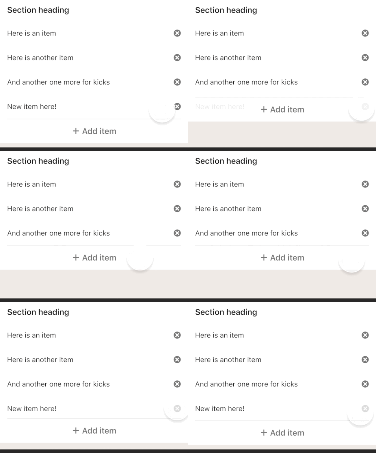
Below is a basic example of how these are combined. When designing transitions that convey Deleting and Adding actions, a designer may want to affect opacity (Appearing and Hiding) and Expand or Shrink an object.
Looking at a more complex and exaggerated example, by using these Tokens, the designer would simply have to indicate what triggers the animation, what elements animate, what Tokens to assign to each element, and when will each element start animating— In other words, the choreography of the animation.
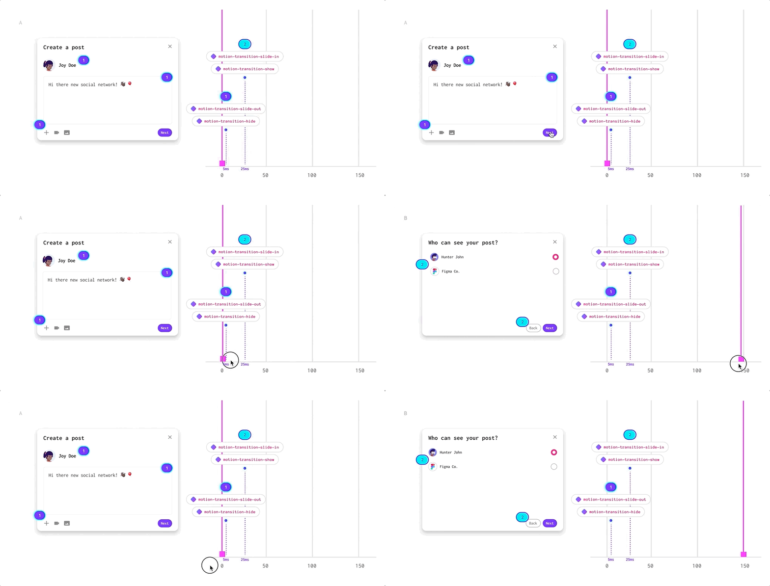
Using Figma Smart Animate which is currently very limited in regards to animation choreography. Shoutout to Alex Lakas for the clever setup above.
Note: Like with any Design System, there might be cases in which these tokens may not work for a specific use case, and the designer may have to create a specialized combination of duration and timing. However, in system design at scale for large apps, this is very rare and in most cases avoided.
Stay safe,
Oscar.
If you have any feedback/comments/suggestions, please share them in the comments. I would love to hear your thoughts.
