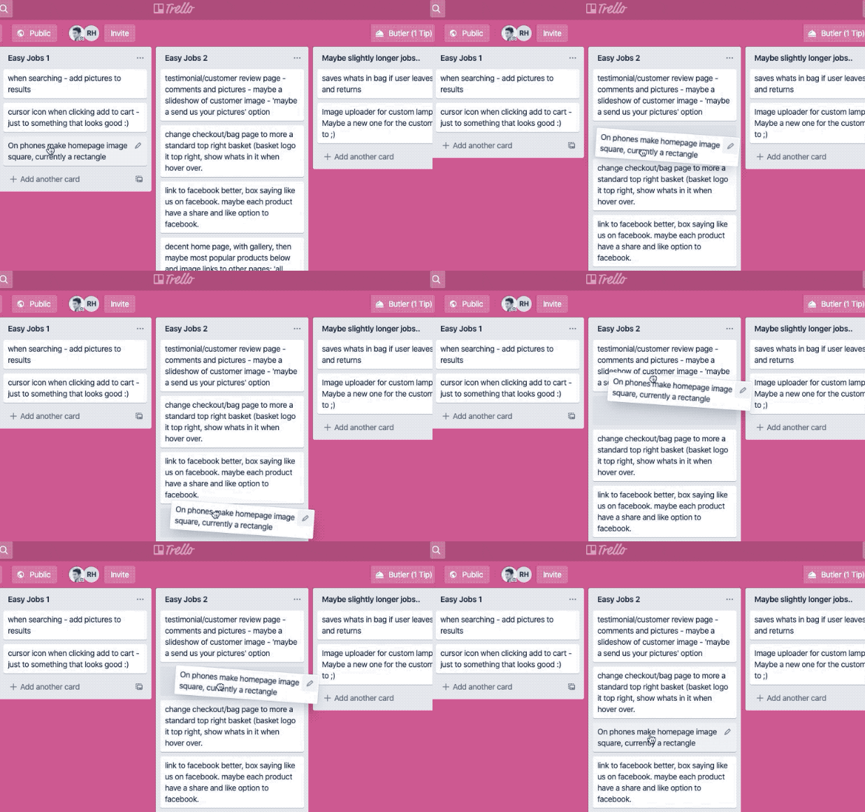
Drag and drop, in the context of a web app, gives people a visual way to pick up and move elements just like we would in the real world. This bit of skeuomorphism makes UIs with drag and drop interactions intuitive to use.
Skeuomorphism is where an object in software mimics its real world counterpart. – IDF
Whilst there may not be an obvious real-world counterpart to dragging digital cards around an interactive Kanban list, such as that of Trello, the action itself is familiar to humans, so it’s easy to learn.
Modern skeuomorphism is the bridge at the intersection of digital and industrial design. It is about facilitating non-traditional device interaction without sacrificing usability. It is about enriching and enlivening real world objects in the context of our human physiology.
Justin Baker
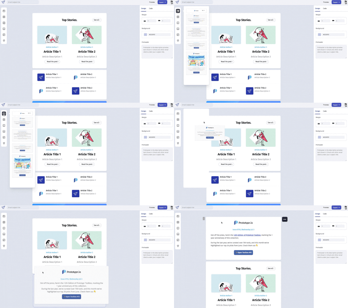
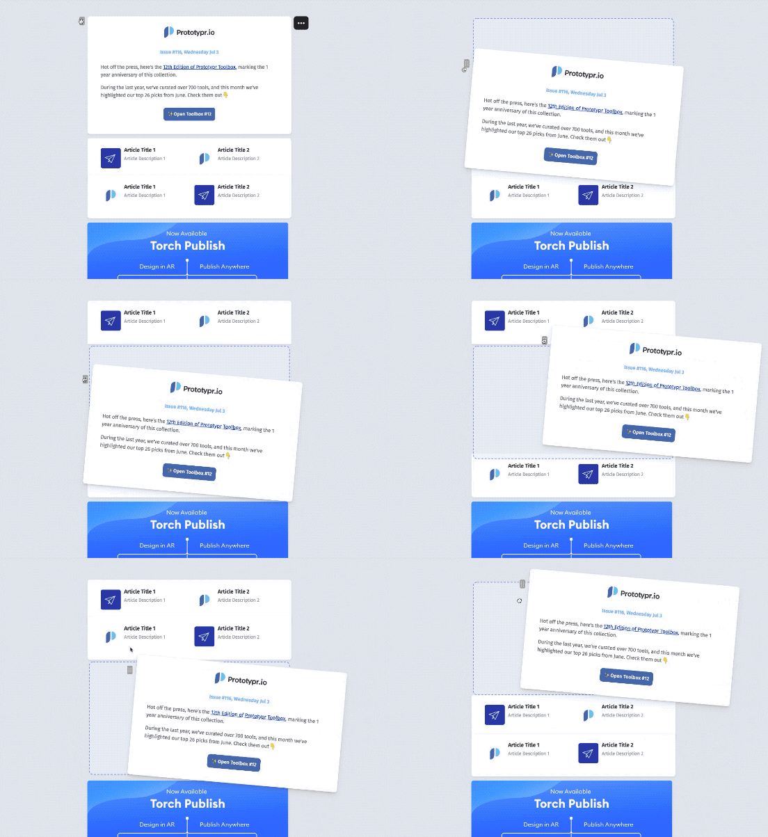
Despite these interactions becoming a common feature in a wide range of tools on the web – from Kanban boards like Trello, to actual email inboxes like Gmail, they’re pretty hard to actually build. I found this out when making my own, even with the use of open source libraries. Here’s what it looks like at the moment:
In this article, I’ll cover:
- Design considerations: Accessibility and more
- React libraries: A couple options for building a drag and drop UI
- Making it responsive: Drag and drop on mobile

1. Drag and Drop Design
Before looking into different libraries, and the technical side of implementing a drag and drop, I’d recommend starting with the design considerations. What makes a good drag and drop? Here’s a few things:
Accessible
Accessibility can be challenging for a drag and drop, with traditional drag and drop libraries skipping past it:
Traditionally drag and drop interactions have been exclusively a mouse or touch interaction.
Alex Reardon
If a user can’t physically drag and drop using their method of interaction, how can you make it easier? Keyboard interactions are a good option, e.g.:
- Press spacebar to pick up
- Use arrow keys to move the selected element
- Use space again to drop
Without prior knowledge, this area can sound like something daunting to implement. A good place to start exploring is ARIA Live Regions, which help you communicate operation, identity, and state during a drag and drop interaction. Jesse Hausler (Principal Accessibility Specialist at Salesforce) covers this his article article, ‘4 Major Patterns for Accessible Drag and Drop‘.

Drag Handle
The drag handle is the area of the draggable element that you click or touch to pick up and move an item. It also can be called the draggable area:
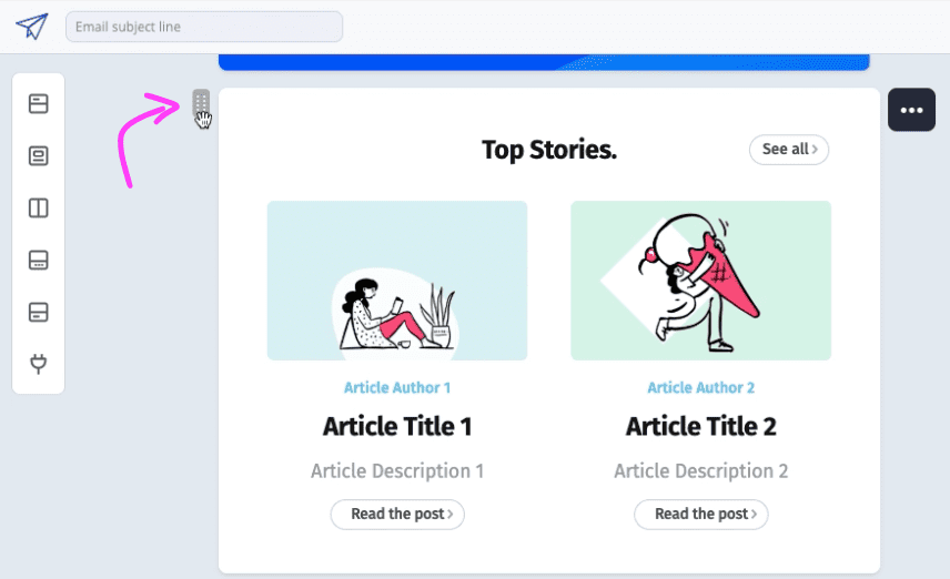
The example above shows small handle, which can work for somebody on a desktop device with a mouse cursor, but may be tricky for a chubby finger on a small touch screen. In that case you may want to make some changes.
You can also question using a drag handle at all. Whilst helpful in some contexts, in others, it might not actually be necessary:
For components that don’t typically involve drag and drop, a drag handle helps users discover drag and drop as an available action. But in cases where drag and drop is always an expected behavior, it isn’t necessary.
Grace Noh, on Marvel blog
Notion Example
This is evident in Notion. For their regular list views, a really small drag handle is present, but not for the Kanban view. In that situation, the entire card becomes the draggable surface:


Drag and Drop States
How does your user know when a drag has begun? Use of states can be a good indicator. Some states to consider are:
- On Hover
- On Press (or click)
- On Dragging
- On Dropping
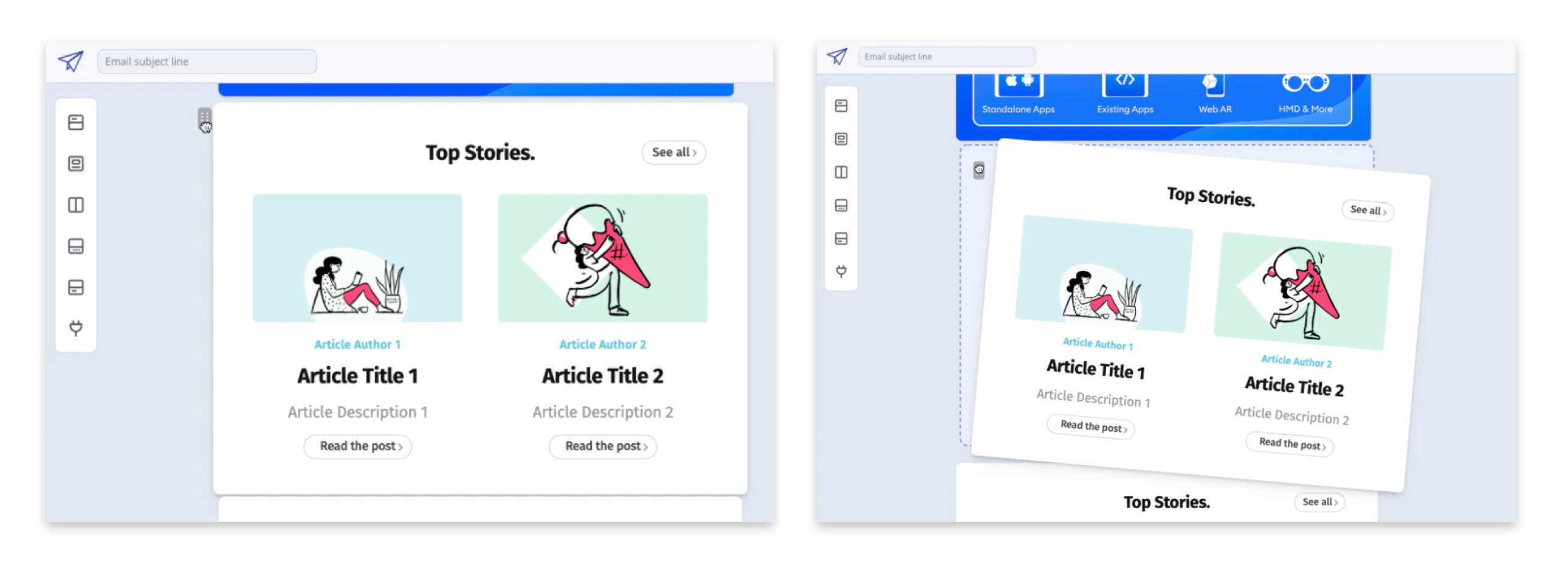
These may sound obvious, but it also depends on the input device. For example, there’s not really a hover state on a touch device.

Getting these right for the purpose of your app is important, and Grace Noh goes into much more depth on this in her article, Drag and Drop for Design Systems. In it, she covers system cursors, state styles, affordances, and more:
Luckily, people like Alex Reordon have also taken a lot of the above into consideration when building open source drag and drop libraries that we can all make use of. Check out his post, Rethinking Drag and Drop, for more. In the next section I’ll show you how I found working with Alex’s React Beautiful DnD, and actually why I didn’t use it in the end:

2. Drag and Drop Libraries
With there being ready-made drag and drop libraries available, creating your own from scratch may be something you want to avoid. However, it’s important to note there are limitations on open source libraries that lead to them not working for your design. In that case, it could actually be faster to start from scratch rather than try and build workarounds.
For example, the design tool Marvel had a unique use case, whereby components are dragged vertically between ‘Sections‘, and also horizontally:
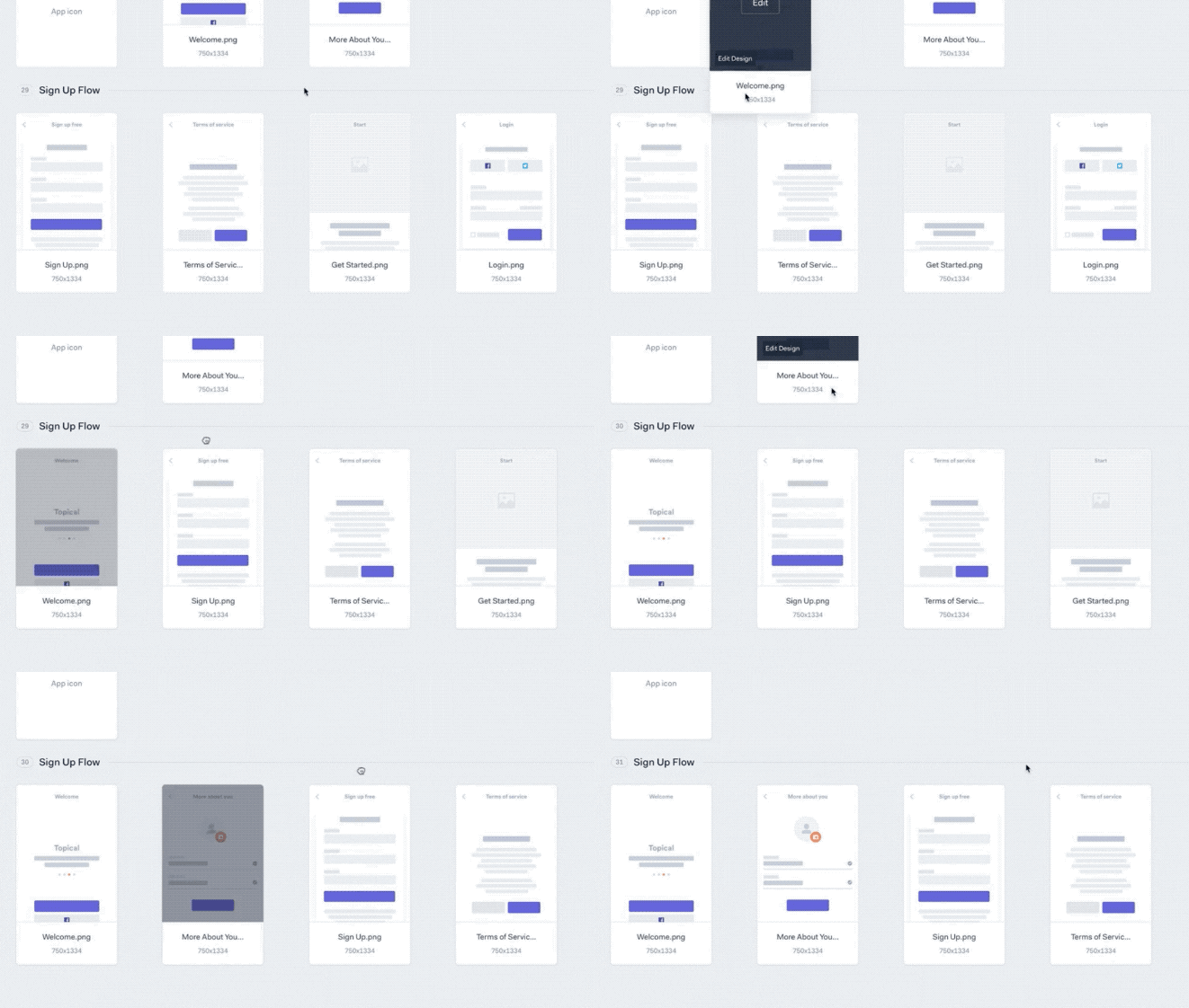
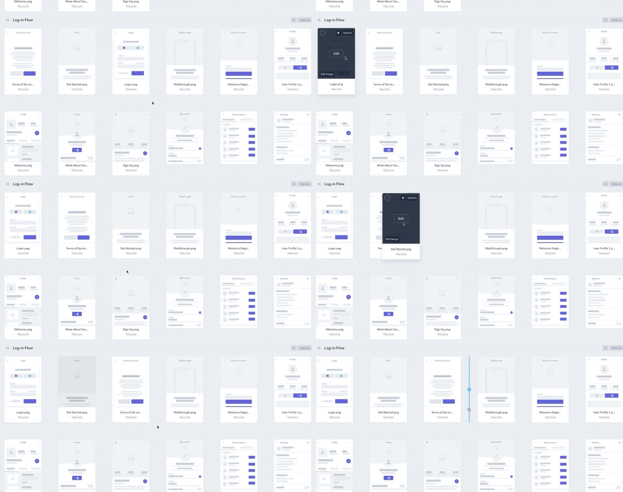
The specific needs in a UI like this could make it a better option to rethink drag and drop yourself. I found that out for myself as you’ll see below.
Now you’re aware there are limitations, I’ll go through the libraries I tried out. These are only React libraries, as Letter is made with React:

React Beautiful DnD
This is one of the most widely used libraries, check out those GitHub stats:

Benefits
The benefits of this library are huge – it has you covered for a wide range of design scenarios that are outlined in the previous section. It’s accessibility support in particular sets it apart from the rest in my opinion:
- Full keyboard support (reordering, combining, moving between lists)
- Keyboard multi drag support
- Keyboard auto scrolling
- Fantastic screen reader support
It’s also pretty limitless when it comes to input device support. Look, a thought sensor 🤯:
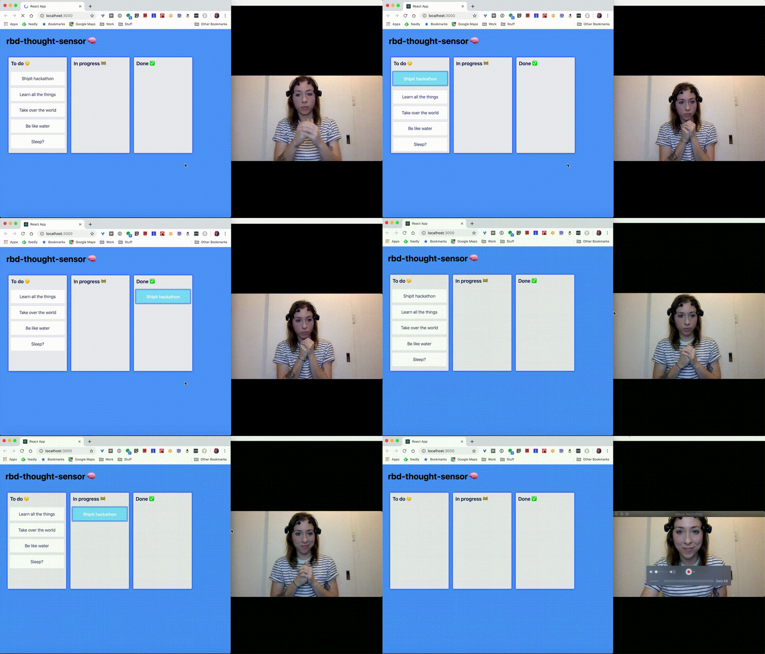
…or what about a webcam sensor:
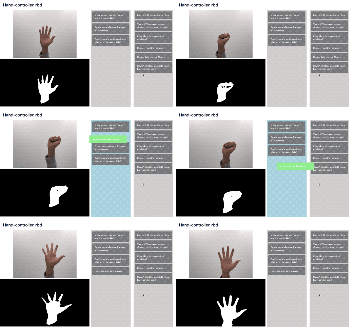
See these examples, and more here.
Drawbacks
I thought it had everything, but there was a couple limitations that meant I couldn’t use this library:
- You can’t have nested containers, meaning 2 drag and drop columns cannot overlap. This made my popout menu impossible with the library.
- There are no placeholders during a drag (see this in the next section)
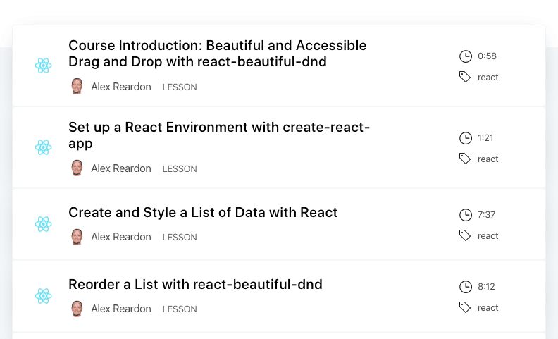
If those drawbacks don’t affect you, try it out here. And there’s an entire video guide that will take you through implementing it step by step here:
I hope to switch back to React-Beautiful when the nested scroll container issue is fixed – they’re currently working on it.

React Smooth DnD
Not as cool as React-Beautiful, but this is the one I have gone with for now. This one is by Kutlu Sahin, and has great advantages of it’s own:
Benefits
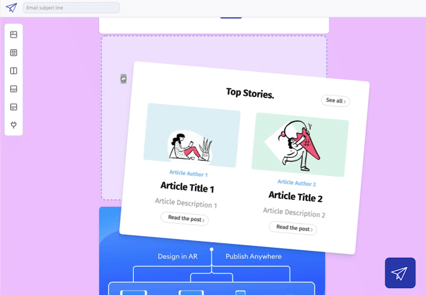
- Customisable drop placeholder – see the blue dotted line above. This has been a great improvement for the overall experience, as there’s no doubt on where the component will land.
- Slower dragging speed – React-beautiful-dnd was almost too sensitive, making it tricky to drop components in the correct place in my implementation. This library is feels more controlled and slower, which works better for large components.
- No limitations on overlapping containers – this solves the issue I had with React-beautiful-dnd
Drawbacks
There’s no mention of keyboard support or accessibility considerations with React-Smooth-DnD. It’s common knowledge now that we should be building accessibility-first, and I outlined it in the earlier section. Whilst in theory it’s easy and obvious, the reality of working with very limited time and resources means that making a drag and drop feature accessible is difficult to handle alone. I have to rely on open-source libraries for this.

One more I tried out was React-DnD. This was the first one I ever used, when Letter app was called Email Otter. I found it quite hard to use when adding animations, so switched to React-beautiful-dnd:
Libraries can be interchangeable
Overall, it’s probably fair to say that I’ve gone through drag and drop hell, and back. I also typed ‘drag and drop’ 30 times so far in this article 🤷🏽♂️ .
One thing that was a saviour is that all these drag and drop (31) libraries work relatively similarly, so it’s not impossible to interchange between them. Both React-beautiful-dnd and React-smooth-dnd are based on similar concepts – drag containers and droppable items, making the react components similar to implement from a high level.
In hindsight, before baking these into your app, it’s definitely worth playing with them in CodeSandbox. A quick search can give you editable demos of React-beautiful-dnd, React-smooth-dnd, and anything else. Investigate the data structure that’s required by whichever library you use, and make sure your app structure is flexible to switch.

Making it Responsive
You never know what size screen or device type someone will use when trying your app. If they use a mobile device, there’s a few more things to consider:
- Drag Handle Size: On touch devices, should there be drag handles? Is the drag handle usable?
- Touch Input: Touch is different from a mouse click. There are different events and states, e.g. touch vs hover.
- Drag Surface: Maybe the entire component should be a draggable surface. If so, should there a button to activate drag mode? When the component is touched to drag, we need to make sure text isn’t highlighted by mistake.
Of the 3 above, I’ve found that touch input was one of the more challenging aspects. When a user touches the draggable component, and then swipes to move it, the entire page scrolls with it. Therefore, the native touch scroll has to be disabled during the dragging of the component. To do this, React has a list of synthetic events for us to tap into (pun may not be intended):

By using onTouchStart to detect when a user presses a draggable element, scroll can be disabled at the right time.
Touch Duration
But that’s not all! How do you know if a user want to scroll, or pick up a component? For that, detecting the touch duration can be used:
- Activate on hold: If the user touches and holds the same place on a draggable component, activate the drag.
- Ignore on swipe: If the touch duration is low, such as that of a swipe, we can guess that the user is scrolling.

My next steps
Now I’ve got my drag and drop working on desktop (inside a popout menu bar – which was a whole other issue), I’m improving the experience of my editor on smaller screens.
One idea I’m exploring is making the drag and drop menu hide-able, so the entire space can be used for editing. Here’s a Marvel Prototype of that:
Thanks for reading, if you have any questions or want me to go into more detail, drop a comment. Plus, find out more about the Email design tool I’m building here.
A big thank you to Alex Reordon, Kutlu Sahin, and all the open sourcerers who made such great libraries.


 Buy me a coffee