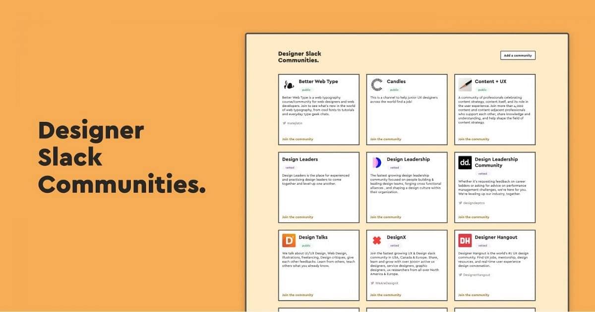
I launched Designer Slack Communities a while ago, aiming to help designers to connect with likeminded people. By sharing my website with the world, I’ve connected with so many designers. The whole experience is a first time for me, so I want to share my experience about how I built it.
What is Designer Slack Communities
Designer Slack Communities is a website where I collect all the active Slack communities for designers. It’s aiming for designers who are looking to join more communities and connect with designers around the world.
Why did I decide to build it
A few weeks ago, I attended Remote Designer Week, organized by Design X. It was such a wonderful experience. During the time, I’ve slack-met a lot of designers and got introduced to a few more Slack communities. I enjoyed the sense of community, and many designers are looking to join different communities as well. I think it would be helpful if there is a list of Slack groups for designers to join. When I search for something similar on the internet, there are resources like this. But they are either not tailored to designers, or have expired links. So I decided to build a website to collect all the active Slack communities I can find.
Gather information and design
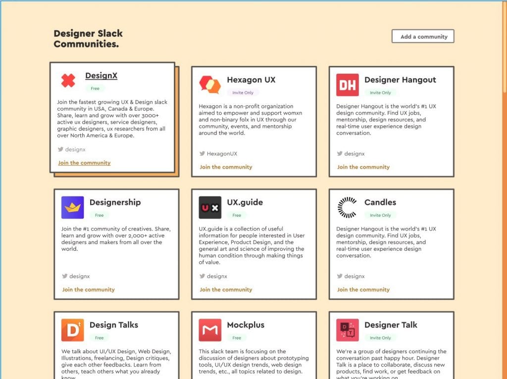
With the 20 active communities I gathered. I started to design the first version. I wanted to keep the design simple, but I also wanted to try something different this time. I’ve used too much soft shadow and pastel colour in my design work that I’m kind of tired of it. I chose to use bold borders and more vivid colours for this one. It makes the website more fun and delightful.
Building
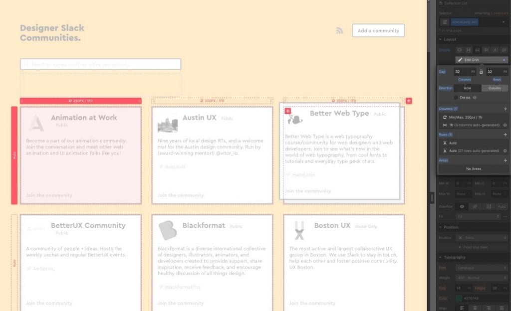
With the design done, I started thinking about how do I want to build it. I could look into different CMS options and static website frameworks. It would take me weeks to learn them and make the website. If I wanted to add new features in the future, it would take even more time to figure it out. Then I remembered Webflow. Webflow is great at quickly building a website. Although it has its limitations, a single-page website like this would be the perfect use. Thanks to the power of the Webflow CMS, it only took me a couple of hours to implement my design. The CSS grid makes building a responsive list easy. It’s widely supported across modern browsers. So I would encourage everyone to use the CSS grid whenever you can.
Launching
After finishing the development, I post my website on various Slack groups and social media. I got a lot of positive response. People were adding me on LinkedIn and Twitter. They found this website is helpful as they were searching for similar resources. I also have people saying they were working on similar things and asking if I want to collaborate. It truly felt joyful as I created something that helped people. That’s the reason why I became a designer.
I’m also surprised by the connections I made. As an introvert and a non-native English speaker, I always find it hard to connect with people. Building a side project and sharing your work is an excellent way for people like me to establish networks.
Keep improving
Within a few days after the launch, I got over 50 new communities submitted. The list became rather long. A way to sort or search for communities would certainly help people to find what they want. Webflow doesn’t have this feature built-in, but I found a great tutorial on the Webflow Forum. It uses MixItUp 3 to do dynamic searches for CMS items. With few customizations I made, the feature is working great. Another alternative is Jetboost. It’s a paid service, but the setup process is straightforward. No js code required.
https://forum.webflow.com/t/webflow-cms-mixitup-3-filter-sort-search-hash-url/96306
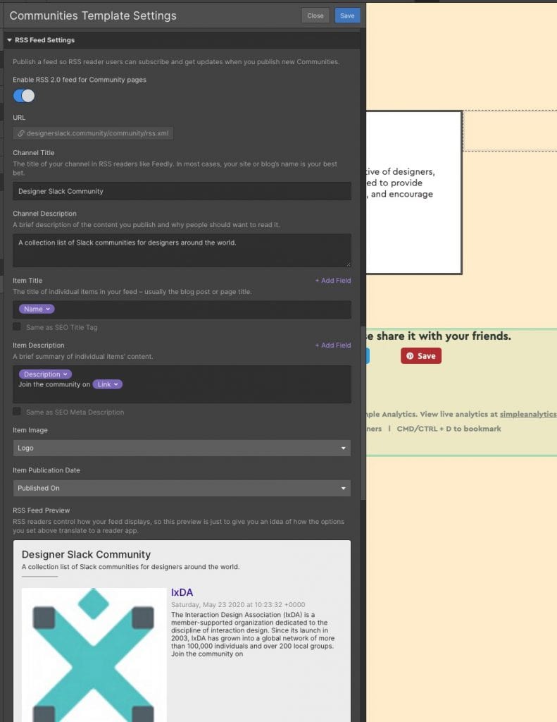
I also added RSS to the website. I’m a huge fan of RSS. It’s a great way to let visitors receive updates without manually check the website every once in a while. Webflow makes adding RSS straightforward. You can use all the fields in your CMS to create the content in RSS and preview without opening a new tab.
Someone suggested I should add social share buttons to lead more referral traffics. Thanks to the help of the Webflow community, it’s quite easy to do it. Wierperwebworks shared a project that makes this process simple as copy and paste.
https://webflow.com/website/simple-social-share-buttons
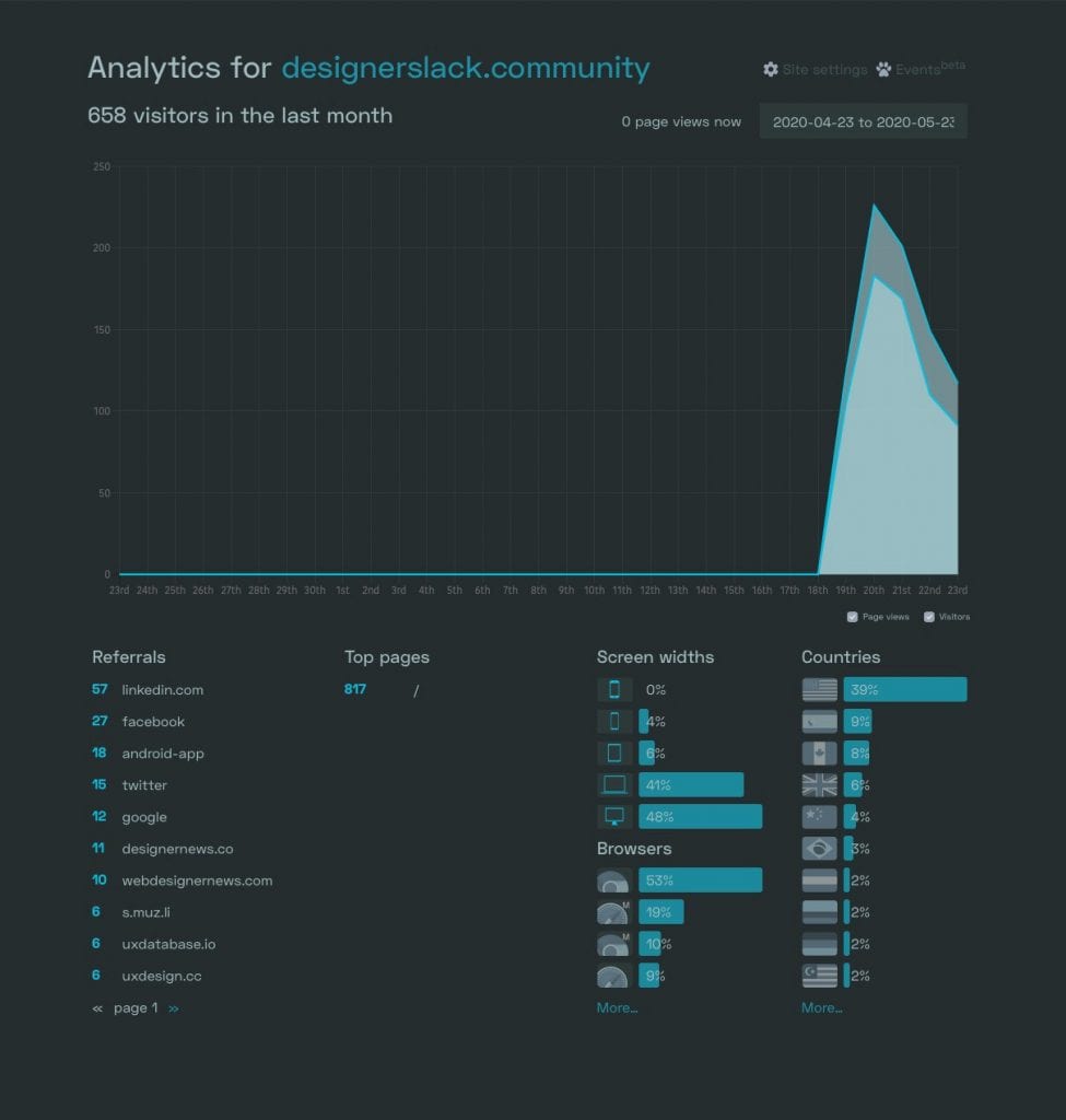
The last thing I did is to switch to Simple Analytics from Google Analytics. It’s a privacy-focused web analytics tool. It has all the essential metrics that are more than enough for me. Even though it’s not a free tool, it does feel relieved because I know it respects the privacy of my visitors.
Clone the project
I’ve made this project available on the Webflow community. Everyone can view it, clone it, use it for your own project. I hope it can help other people, just like how I got help from the Webflow community.
https://webflow.com/website/Designer-Slack-Communities
Conclusion
Building a side project is a fun process. You can get creative with it because it’s your project. I’m so humbled that I got connected with many people through this project. It may not give me any profit, but I do feel a sense of fulfillment by sharing my work and connecting with other designers. I hope this post can inspire you to make something small yourself. It doesn’t have to be the greatest idea ever. With tools like Webflow, it won’t take too much time to build it either. If you have any questions, please feel free to tag me on Twitter.
