Axure is a well-known prototyping tool with a lot of history, it has been around for years (about 18). You can create almost any kind of prototypes from simple ones to more complex ones with variables and logic without writing a single line of code (well, when dealing with the complexity you will need to write some expressions).
Prerequisites
To follow along, you need to have Axure installed. You can download the appropriate version (Windows or Mac) from Axure Website.
If you are a little bit familiar with Axure you know about widgets, interactions then you are on the right track if not, you should still be able to follow the steps in this tutorial.
What we will create
In this tutorial, we will create a slider (a very well known input control pattern) used in mobile or desktop UI. This type of control allows the user to select a value between a minimum and a maximum. If you want to learn more about this control type you can take a look at the Apple HIG here: https://developer.apple.com/design/human-interface-guidelines/ios/controls/sliders/
To make everything work(on the interaction part), we will use a little bit of logic to respond to the drag event in order to change the slider value (but we will not gonna use variables for this).
The reason for not using a variable to handle the toggle state is because we want this component to be self-contained (without dependencies) to be easily reused across projects.
Step by step instructions
This tutorial difficulty is simple to medium, to create the slider I’ve broken things into 2 simple steps.
Step 1 — Building the necessary shapes
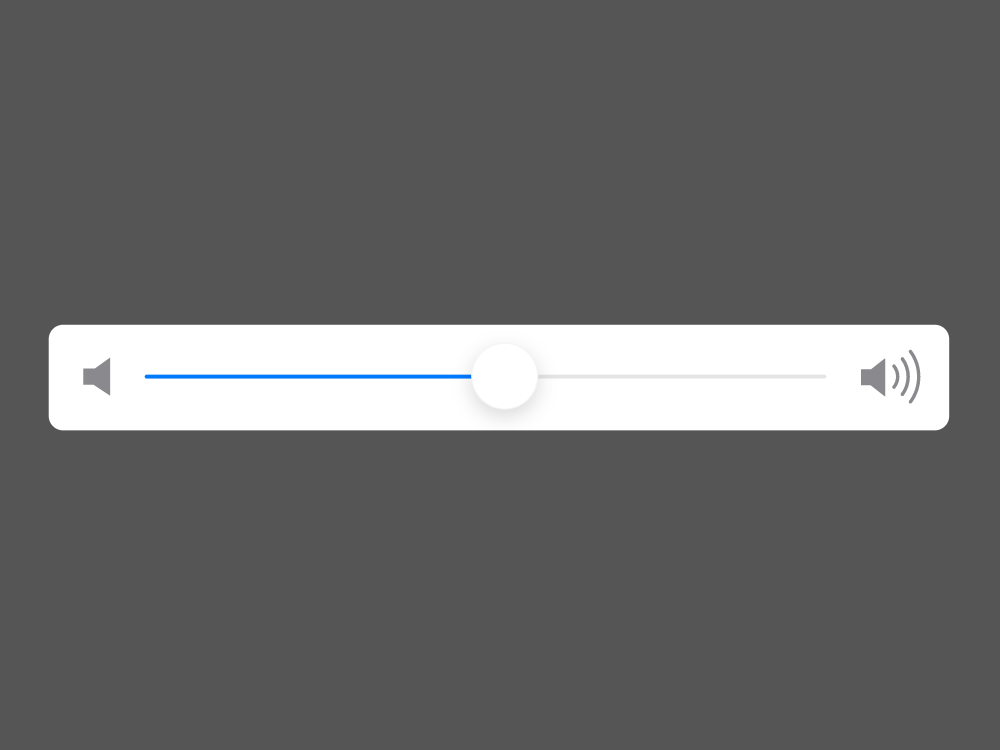
In this step we are going to create all the necessary shapes for our slider. To see an overview of the shapes and structure take a look at the image below.
Basically, we have only one group called “Slider” and inside we have:
- 2 icons (that are optional, and they represent the minimum and maximum)
- the “+Knob” which is a dynamic widget (the reason for having this dynamic widget is because we need to respond to the drag event that is available only on dynamic widgets); It has one single state (default in our case) and inside this one we have one ellipse “Knob”
- “Fill progress” — this represents the current value visually (with a blue fill)
- “Track line” — is the entire track line
- “Background” — out background for the component (can be optional)
If you don’t have too much experience with Axure shape widgets then you can read more about them here: https://docs.axure.com/axure-rp/reference/shapes/.
See all shapes properties below.
Shape properties:
Icons(optional)
+Knob (dynamic widget):
Knob(shape):
- Width/Height: 28
- Fill: #FFFFFF
- Shadow: fill: #000000, opacity: 15%, x: 0, y: 3, blur: 8
Fill progress:
- Width: 151
- Height: 2
- Fill: #007AFF
- Corner: 3
Track line:
- Width: 284
- Height: 2
- Fill: #787880
- Corner: 3
Background:
- Width: 375
- Height: 44
- Fill: #FFFFFF
- Corner: 6
Step 2 — Adding interactivity
The only interaction that we are going to add is on the +Knob dynamic widget on the dragged event. Basically, what we want is to allow the user to drag the knob on the horizontal axis in order to change the slider value.
To achieve this we will use some expressions inside 2 actions with the following settings:
a) Action Move:
- Target: This
- Move: With drag x
- Bounds (we need to use the bound options to restrict the movement on the left and on the right)
- Left: is greater than or equals: [[LVAR1.left — LVAR2.width/2 ]] where LVAR1 and LVAR2 are 2 local variables
LVAR1 = widget = Track line ; LVAR2 = widget = +Knob
- Right: is less than or equals: [[LVAR1.right + LVAR2.width/2]] where LVAR1 and LVAR2 are the same local variables
b) Action Set Size:
- Target: Fill progress
- Size and anchor: left, height: 2, width: [[LVAR2.left + LVAR2.width/2 — LVAR1.left]] where LVAR1, LVAR2 are the same local variables
If you are not really familiar with events, actions, cases you can read more about them on the Axure website https://docs.axure.com/axure-rp/reference/events-cases-actions/.
Creating a slider UI component is relatively easy in Axure. Now, we can use our new slider component in future projects. You can also download the Axure file from here: https://hi.switchy.io/1QWp