Welcome to the step by step UI guide. Please note, that this is not a “legit” process on how to create a product. We will focus on creating a clean, consistent UI, and we skip all the research/user experience/whatever you like to call it/steps.
Basic idea & rough wireframe
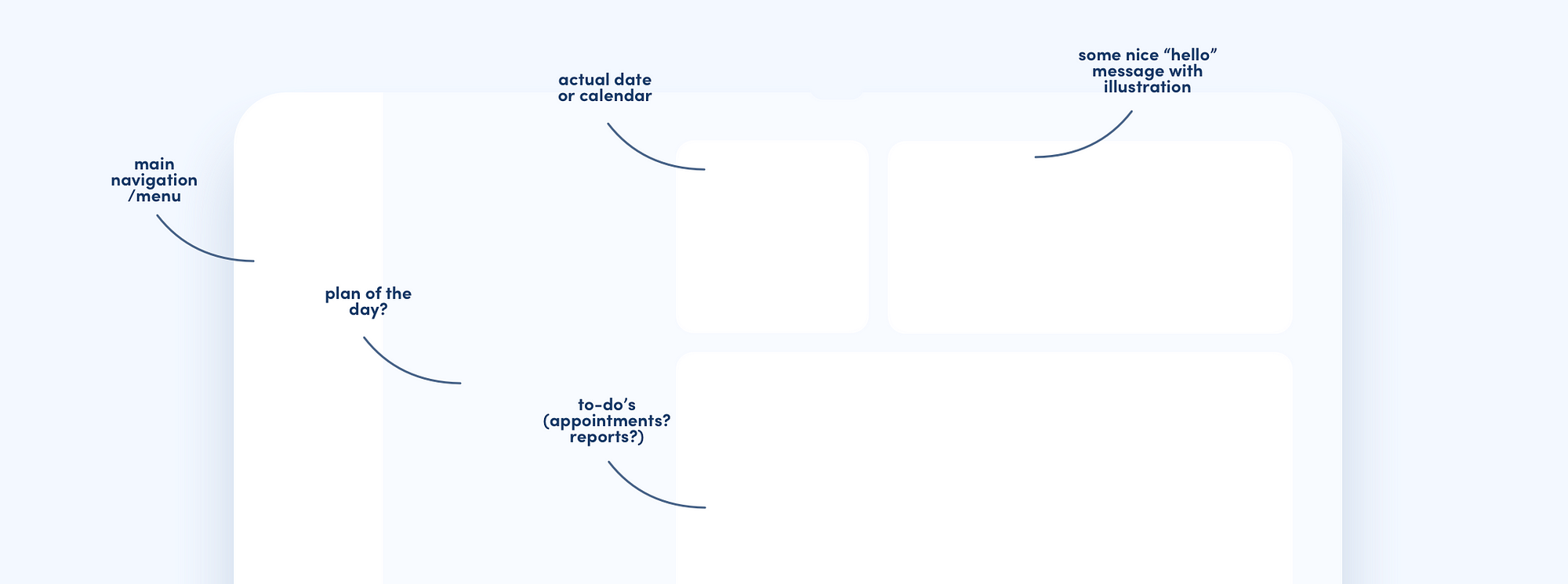
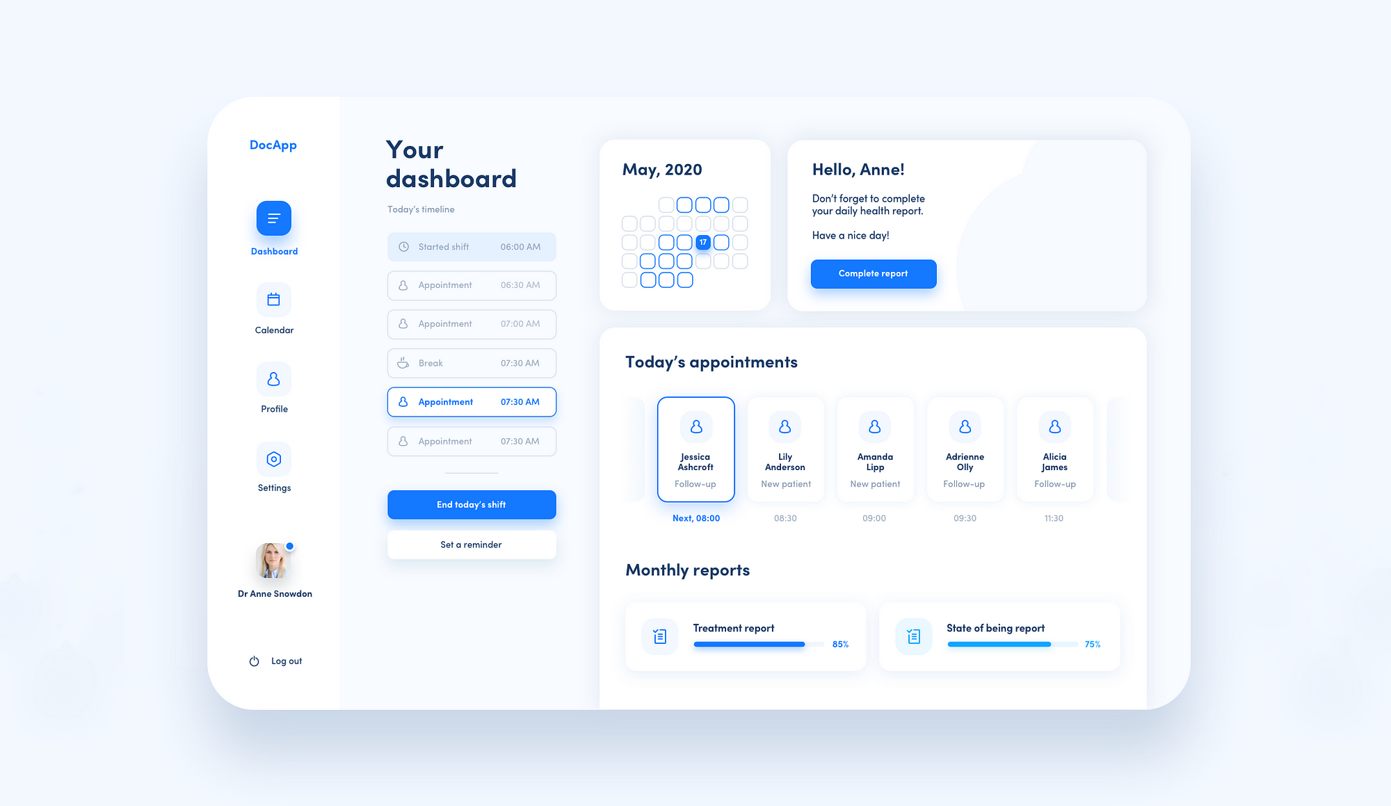
Let’s start with an idea for a dashboard.
We are going to create a dashboard for a healthcare industry, preferably doctors, who have daily shifts, different patients and other duties (my aunt is a doctor, and actually she is not only saving lives, but as she says “there’s sh*tload of paperwork to do”). I will use Sketch for the whole process.
Usually, I start with a very low-key wireframe. I create a rectangle and some other rectangles, and I change their sizes and arrangement until I’m happy with the result. I choose some random but similar colors so I actually see where the rectangles are.
At this point, I also have in mind what kind of content I want to show and where.
In the next step, I’m choosing fonts, colors, and styles that I’m going to use. So, as in my previous article, we are going to create a little design system/stylesheet/call it as you like.
Font(s)
For this dashboard, I chose “Sofia Pro” as my main font. Only this one.
Actually, you don’t really need many fonts to create a nice UI.
I prefer to work with one font, or maybe two (one for headings, one for text blocks).
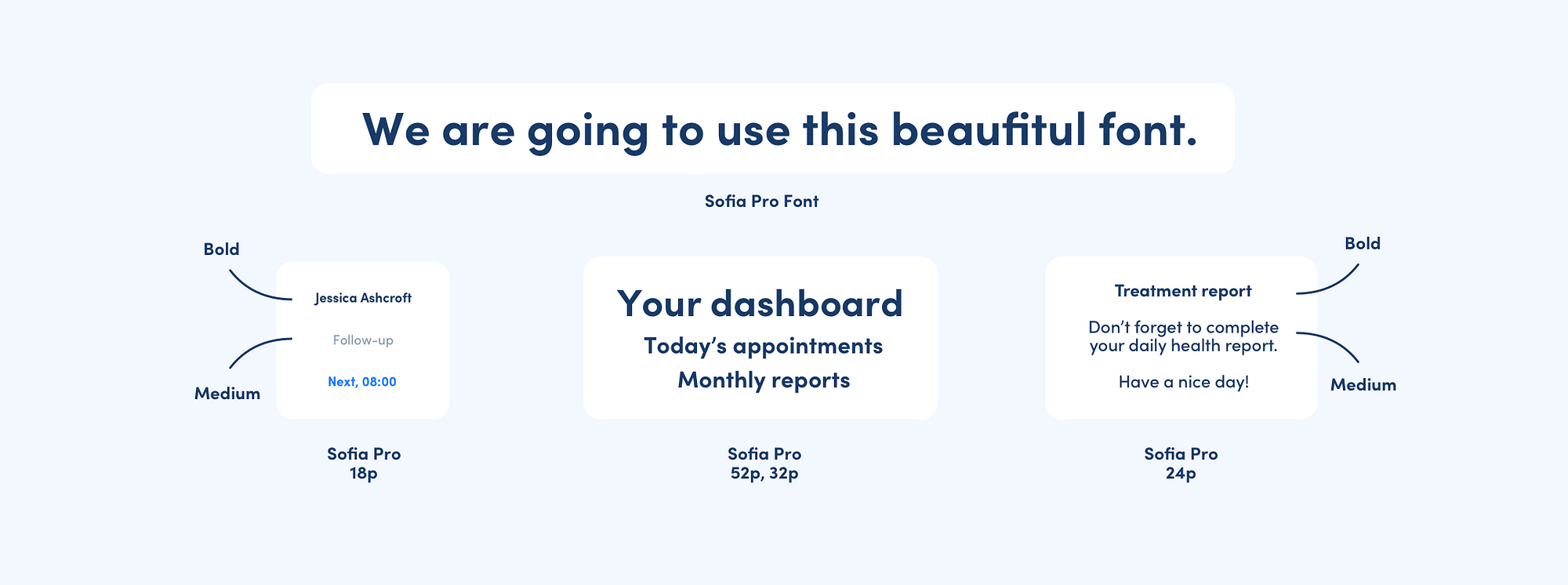
Instead of using many fonts, try to differentiate the same font with such parameters as size, weight, and color.
As you can see in the picture above, I’m using only four font sizes (52p/32p/24p/18p) and two font weights (bold and medium). I’m also using three main colors — vivid blue (accents), dark blue (regular text), light blue (detailed info, it is actually dark blue, but with opacity around 30%!).
If you have problems with choosing the right font sizes, try using the golden ratio method.
Color palette
For colors, I rarely use color wheels or premade palettes. I like to choose colors by hand. Yet, they are very helpful if you are not feeling very comfortable with color-picking.
It’s quite important to know the basics of color psychology and have the ability to choose the color palette that will be suitable for a certain kind of a product/industry.
We are creating a dashboard for healthcare, so the suitable colors would probably be blues and greens, as they are the most popular, likable colors, they are soothing, relaxing, and they create a feeling of professionalism and trust.
I choose my main color — for this project, a vivid, bold blue. I lower the opacity and I get my second color — for example, for backgrounds. I’m choosing my dark blue from the same color map (HSL). I also lower the opacity of that color and that’s how I get another, less saturated color which I can use for background. And then I choose my favorite color, the color of empty space and harmony, which in the designer world is white, of course.
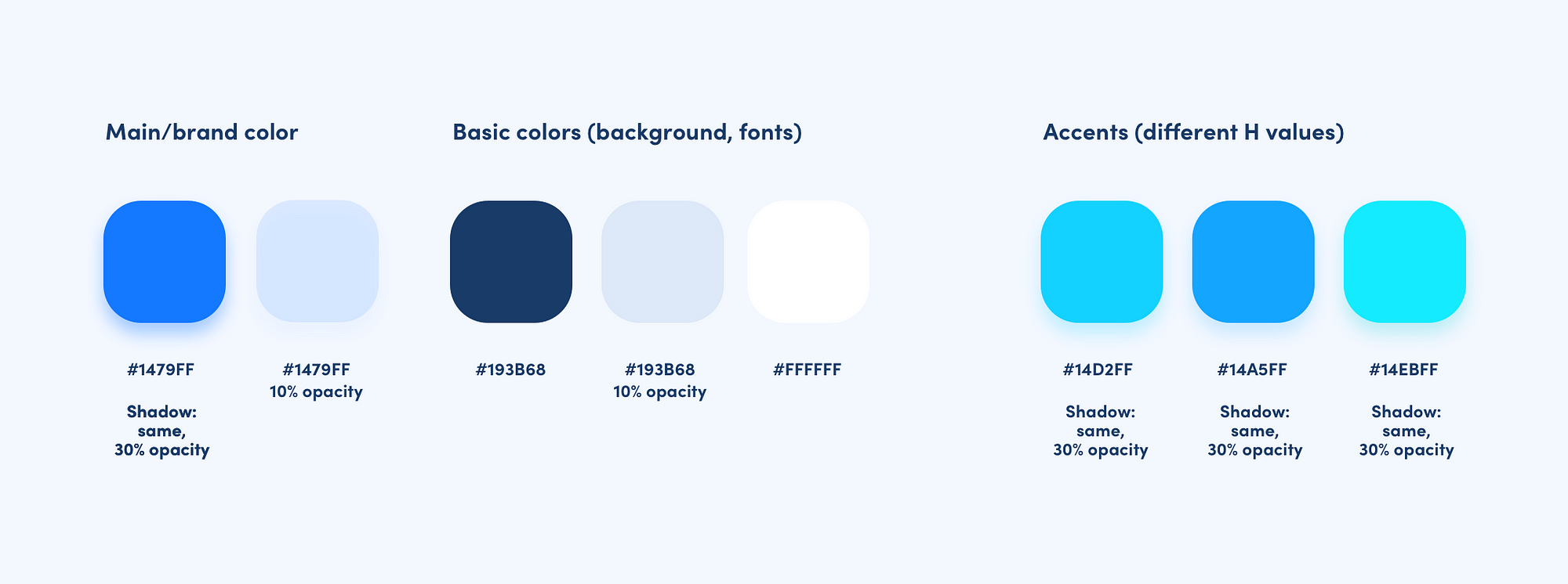
We also need some other accent colors to differentiate content. I pick them only by slightly changing the Hue (H) parameter on the color map. They will look good with each other, unless you won’t mix the cold with the warm ones.
UI element styles
We also need some other accent colors to differentiate content. I pick them When we have chosen the fonts and colors, we can create styles for our UI elements — containers, icons and buttons.
You can create a functional, attractive interface having only a few styles to work with, that you can mix depending on the element’s role and importance.
You can check the detailed parameters of the styles I created in the picture below.
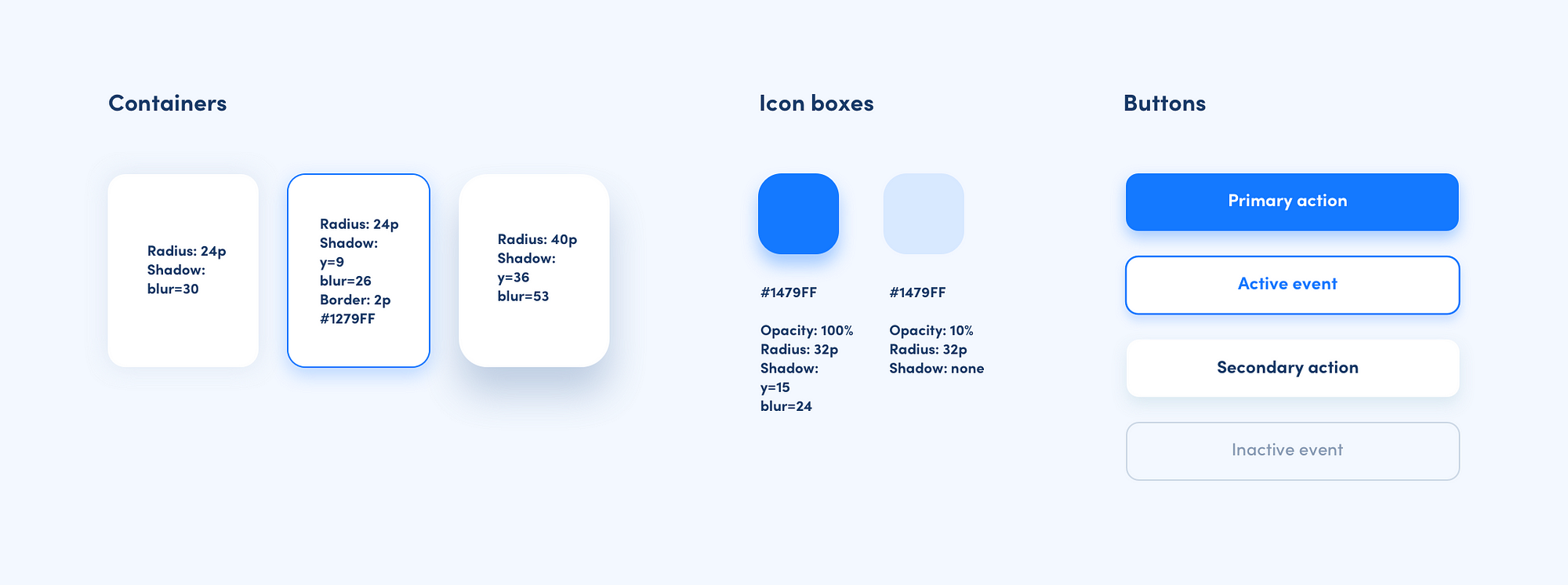
As you can see, I created only five styles in total. Some of them are used for different purposes (for ex. for containers and for buttons). Important note: primary action style should only be used for primary actions/CTA’s. And it should be saved only for the most important elements.
When creating shadows, try using the same color as the element, but lower the opacity.
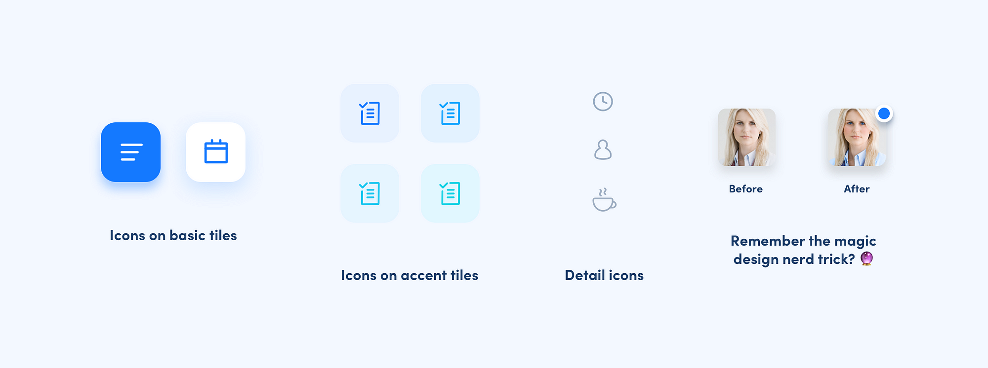
Iconography
When choosing icons, consistency is the key. I decided to use outline icons for the whole dashboard. Try not to mix outlines with solids.
Element arrangement & text content
Since we have all the things we need to create a dashboard, let’s start and rearrange all the elements until we are happy with the result. There is no magic trick here — I try different pairings, change composition, polish certain alignments, until it looks good. But here are some bits of advice when taming this creative mess:
- Remember to keep the similar margins/spaces between the elements. We won’t talk grids/layouts now, but make sure that at least major content has visually proportional spacing.
2. Abandon the fear of too much whitespace. It is every interface’s best friend. It helps any UI breathe, and it makes it look sleek and tidy.
3. Use your primary color only on a few selected elements. In another way, it will be too overwhelming.
4. Use different shadowing to create a feeling of depth. Remember that only some of the elements should cast a shadow. Leave the rest flat.
5. Elements should have consistent edge roundness in each group. For example, buttons should all have the same roundness. Containers can have bigger corner radius, but the same value for all of them.
6. Remember to center labels in the buttons, both horizontally and vertically.
7. Keep the same margins inside containers.
8. Increase the radius of the rectangle’s edges to the point where it looks very smooth. They will look very bubbly and clickable!
Creating a simple illustration
Ok, we’re almost done! Here is the last step, that will make our dashboard look more polished and friendly.
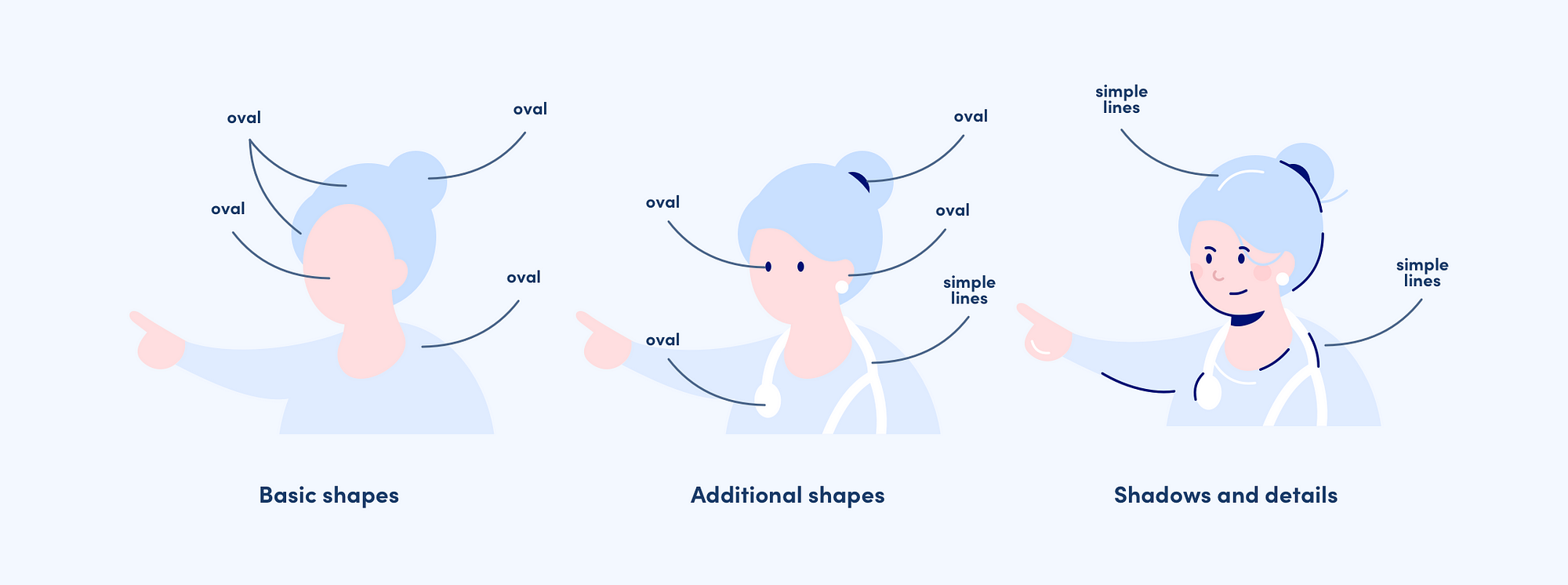
Did you know that Sketch is actually a perfect tool to create simple illustrations? I worked in Adobe Illustrator for ages (and hated it). It turns out that almost everything I was doing in Illustrator, can be done in Sketch (surprise!).
As you can see in the picture above you can create a doctor illustration with very basic shapes. For this illustration, I chose a quite popular style, where the shadows and highlights are actually simple, but contrast lines.
First, you create a basic silhouette, using almost only ovals.
When making an illustration, always start from the most basic, simple shapes — it really helps!
In the next steps, you can add and play with different details. Add shadows in the last step — dark lines for shadows, white lines for highlights.
See? As easy as pie. We are no illustrators, but we can do this!
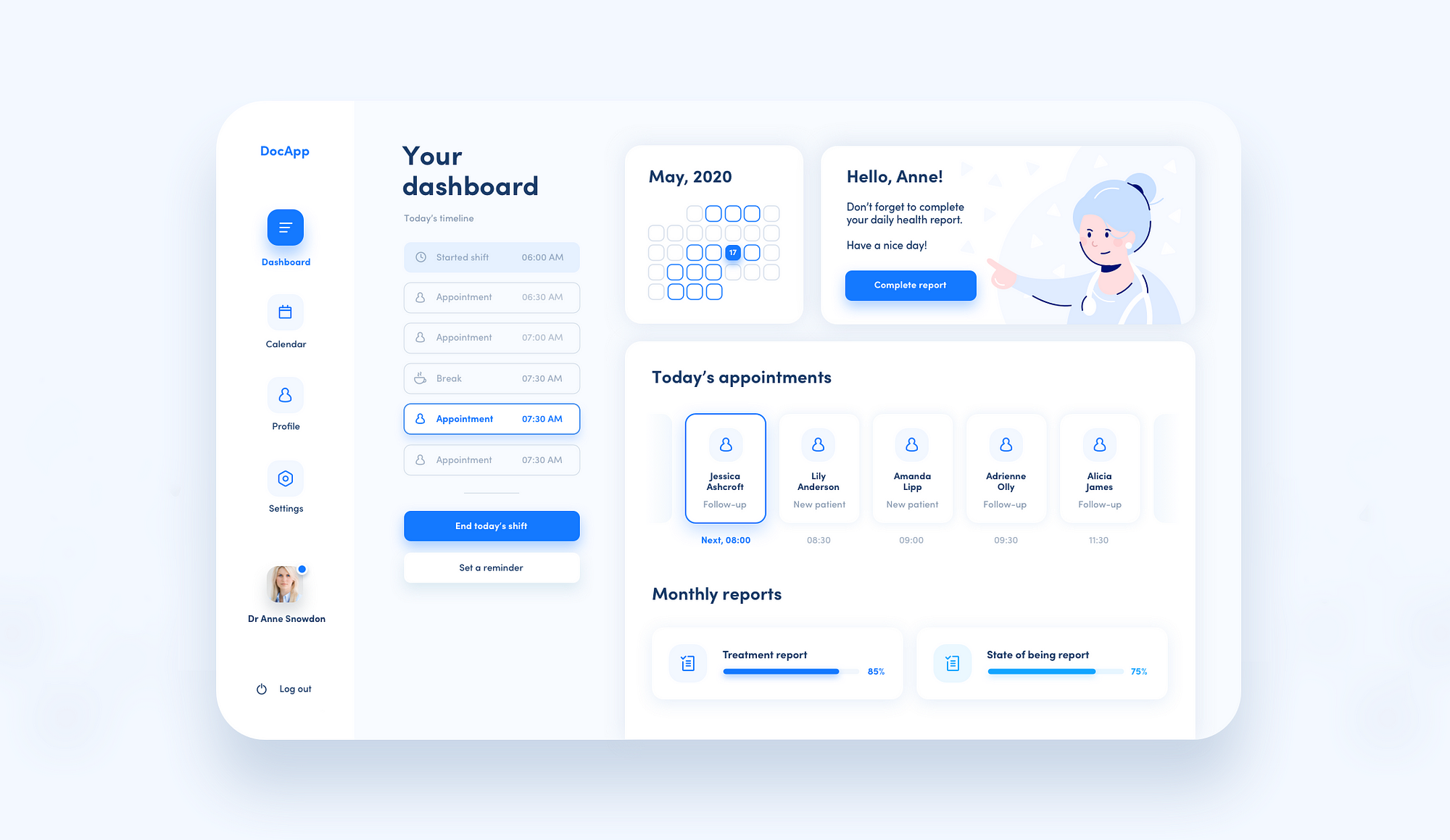
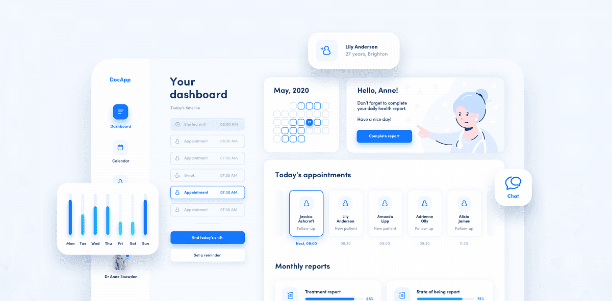
The final result
This is it! I strongly encourage you to do a similar one as a UI exercise. We learn the most by practice, and we all should practice often. Even the most professional designers get out of the track if they stop trying new things and doing UI for fun.
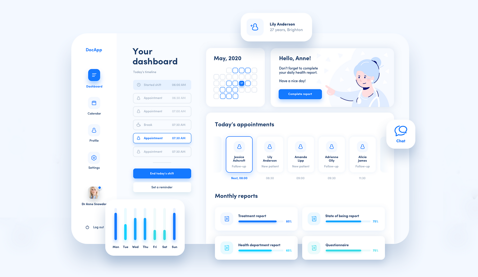
Let’s add some floating UI elements around the dashboard, and we have a very nice Dribbble shot material!
If you make a dashboard with some help from my article let me know, I’d be happy to see it. Thank you and have fun designing!
Did you like this article?
I just released a >📚 UI DESIGN BOOK 📚<
I 🖋 write about design and I’m a 👩🏻🔧 co-founder/lead designer at HYPE4 design-driven software agency!