20+ easy to follow illustrated examples
Companies are in constant pursuit of building simple and usable products. More features, new technologies, and advanced capabilities but still in a lightweight and simple to use format. More often than not, making it simple is the hardest thing there can be.
What is “simplicity”?
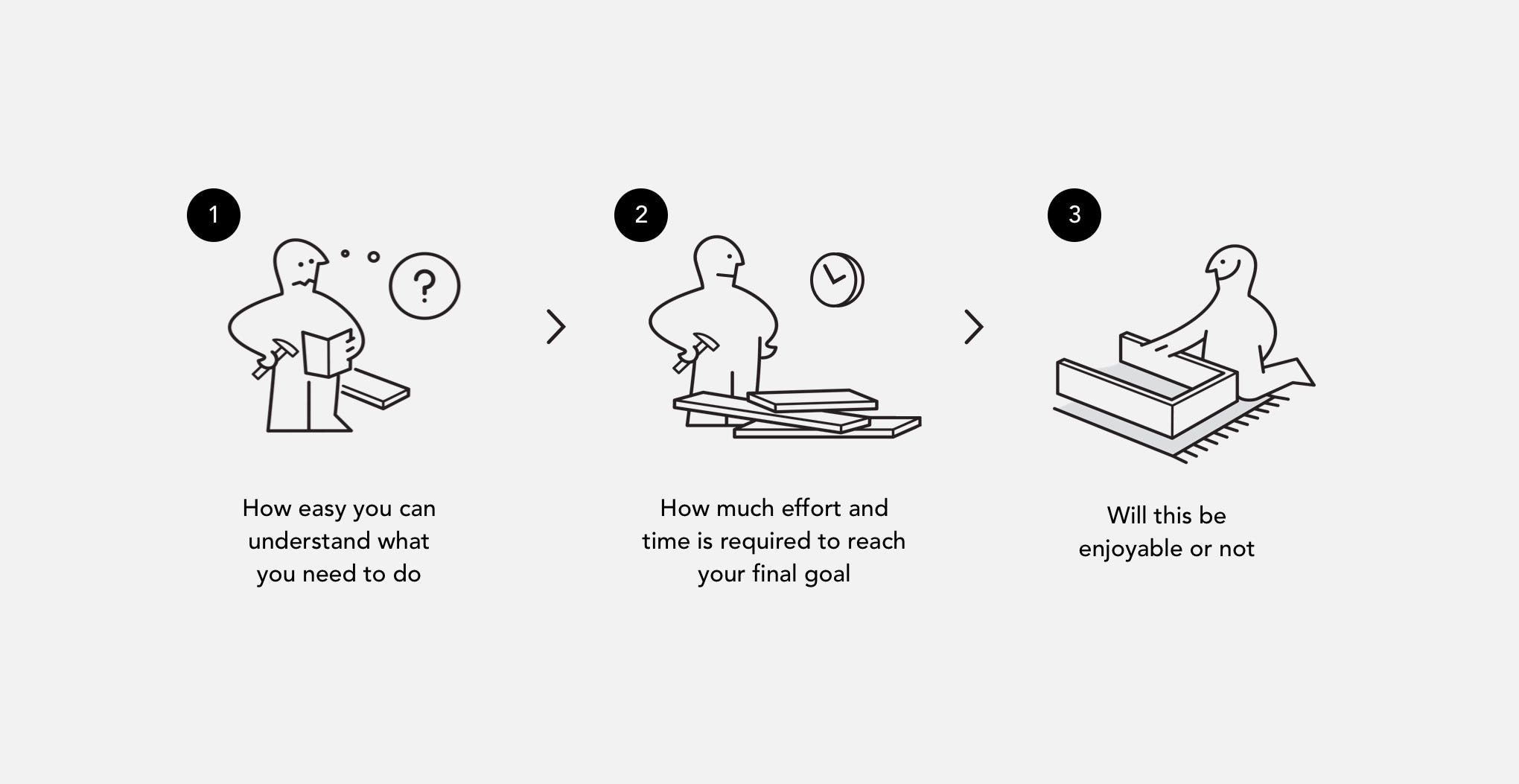
We can define simple – as something that is easily understood or done; presenting no difficulty. Simplicity is a subjective, things that appear simple for one person will not be perceived identically by another. Generally, we form our personal opinion regarding any process being simple or complex, in three quick stages:
Removing difficulties on the way of users to their goals — will help you move towards simplicity. In The Laws of Simplicity, John Maeda offers ten laws for balancing simplicity and complexity in business, technology, and design — guidelines for needing less and actually getting more.
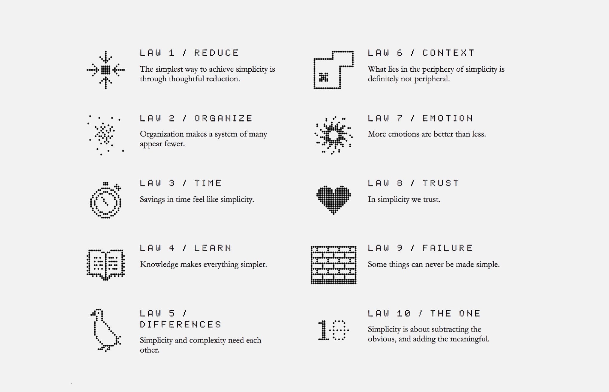
Maeda — a professor in MIT’s Media Lab and a world-renowned graphic designer — explores the question of how we can redefine the notion of “improved” so that it doesn’t always mean something more. And a book is a great read so I really recommend you to check it out.
What about complexity?
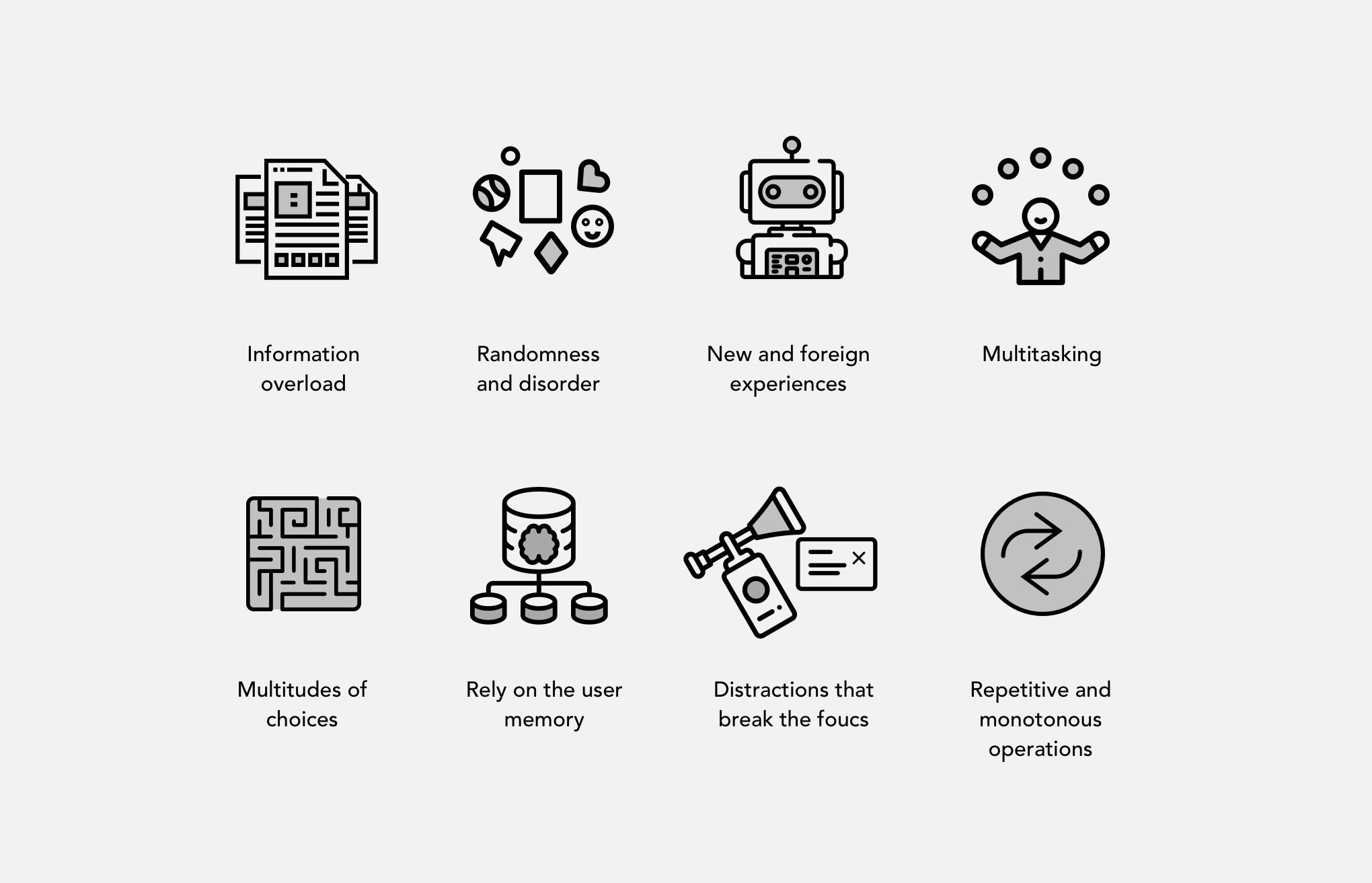
Talking about simplicity we need to mention the opposite side of the spectrum. As simplicity sense of complexity is subjective. With appropriate training, even rocket science is not so hard. But there are several factors that tend to complicate even the simplest task. They should be avoided in product design as much as possible:
So how can we apply it to product design?
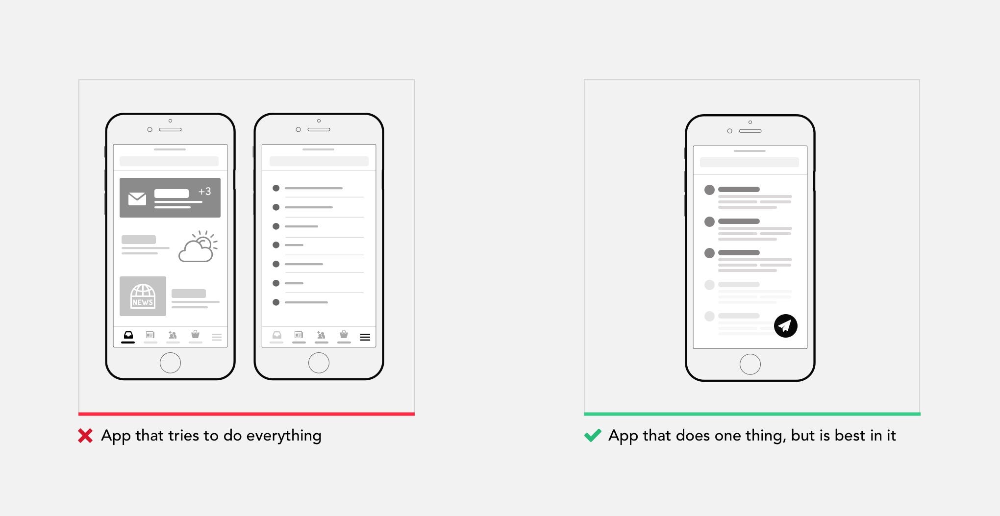
1. Build products with focused value
There is so much software that tries to do so much for so many audiences, everyone tries to be a Swiss Army Knife of the industry. If you want your product to be simple you need to define a core value and identify who is this product really for. Not every product should have Facebook built-in.
2. Remove everything unnecessary
The simplest way to achieve simplicity is through thoughtful reduction. When in doubt, just remove. Secondary information, not frequently used controls, and distracting styles. It’s as easy as that. Once you start to apply this principle you will immediately see the results. But be careful of what you remove.
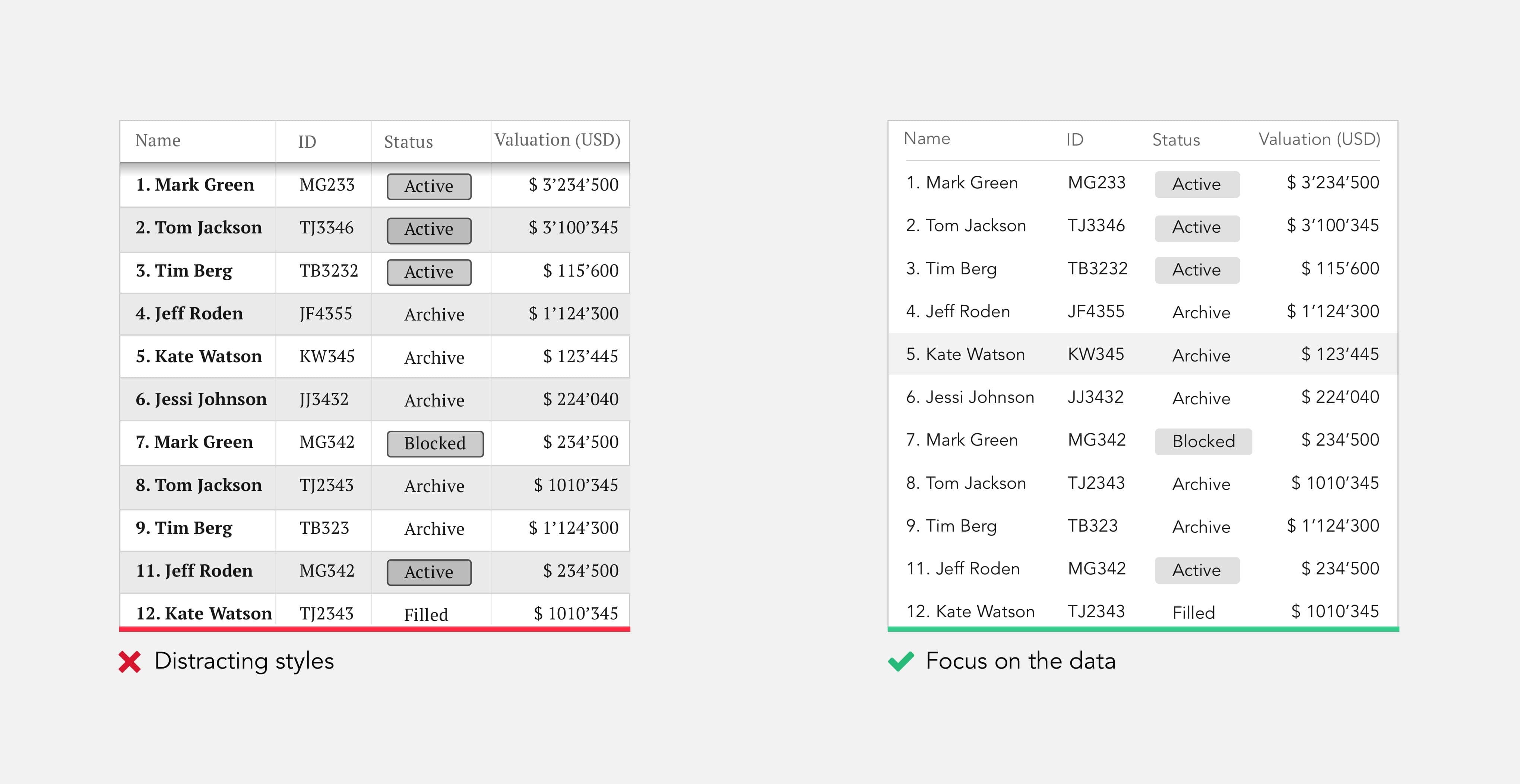
“Simplicity is not the absence of clutter, that’s a consequence of simplicity. Simplicity is somehow essentially describing the purpose and place of an object and product. The absence of clutter is just a clutter-free product. That’s not simple.”
– Jonathan Ive
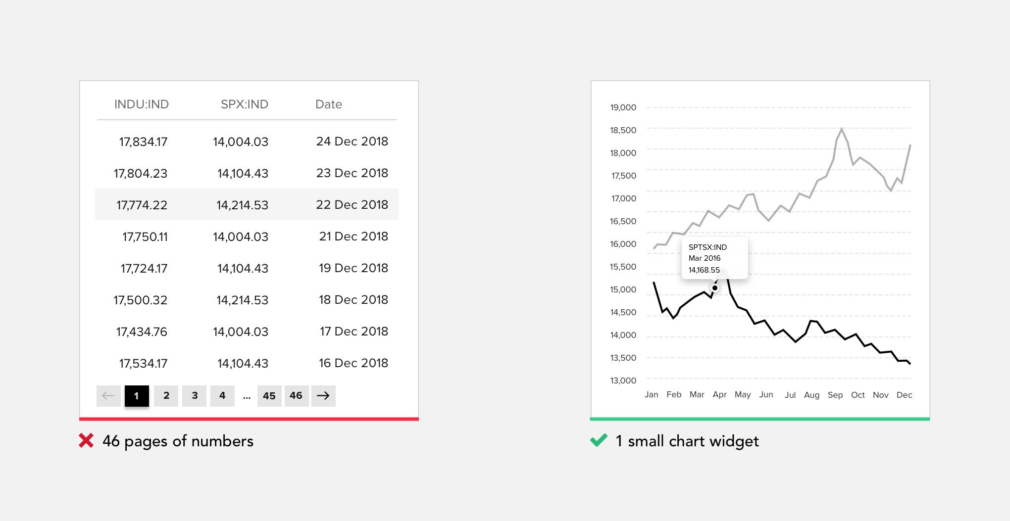
3. Translate data into a meaningful format
Majority of products that we design daily are focused on a lot of data that the user needs to make sense of in order to efficiently carry on their daily task. When you know users interested in trends and changes, help them with visual representation rather than a bunch of numbers. You always can show additional information on demand. Try to extract the meaningful from the data you have and put it in front of the user.
4. Support quick decision making
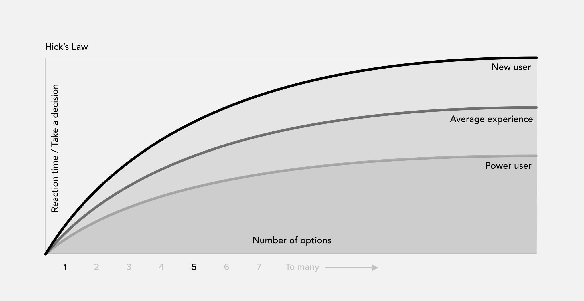
Users bombarded with choices have to take time to interpret and decide, giving them work they don’t want. This was famously explained by Hick’s Law. Hick’s Law predicts that the time and the effort it takes to make a decision increases with the number of options. So if you want your user experience to feel simple you need to support quick decision making as much as possible. Eliminate the need to choose when is not required, guide and handhold user.
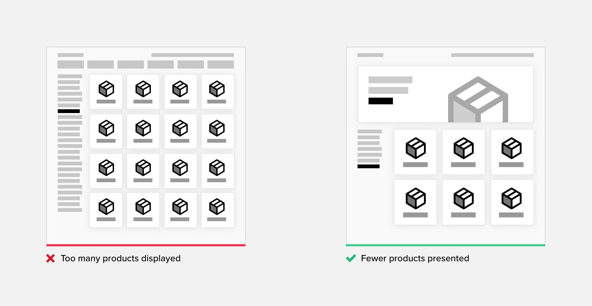
5. Too many choices will scare off customers
Current psychological theory and research affirm the positive affective and motivational consequences of having personal choice. These findings have led to the popular notion that the more choice, the better — that the human ability to manage, and the human desire for, a choice is unlimited. But in reality, research proves the opposite.
The Jam Experiment is one of the most famous experiments in consumer psychology; offering consumers less choice can be good for sales. Critically, the study reveals when precisely offering less choice may enhance your sales.
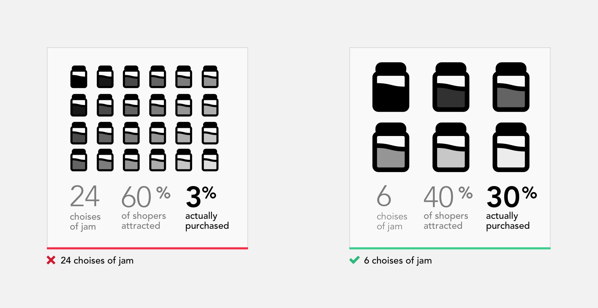
This experiment seemingly proves that customers presented with fewer choices are 10 times more likely to purchase compared with those who are shown many choices. It has been helping up as a crucial example of choice overload, the idea that presenting customers with too many choices actually inhibits customer purchases.
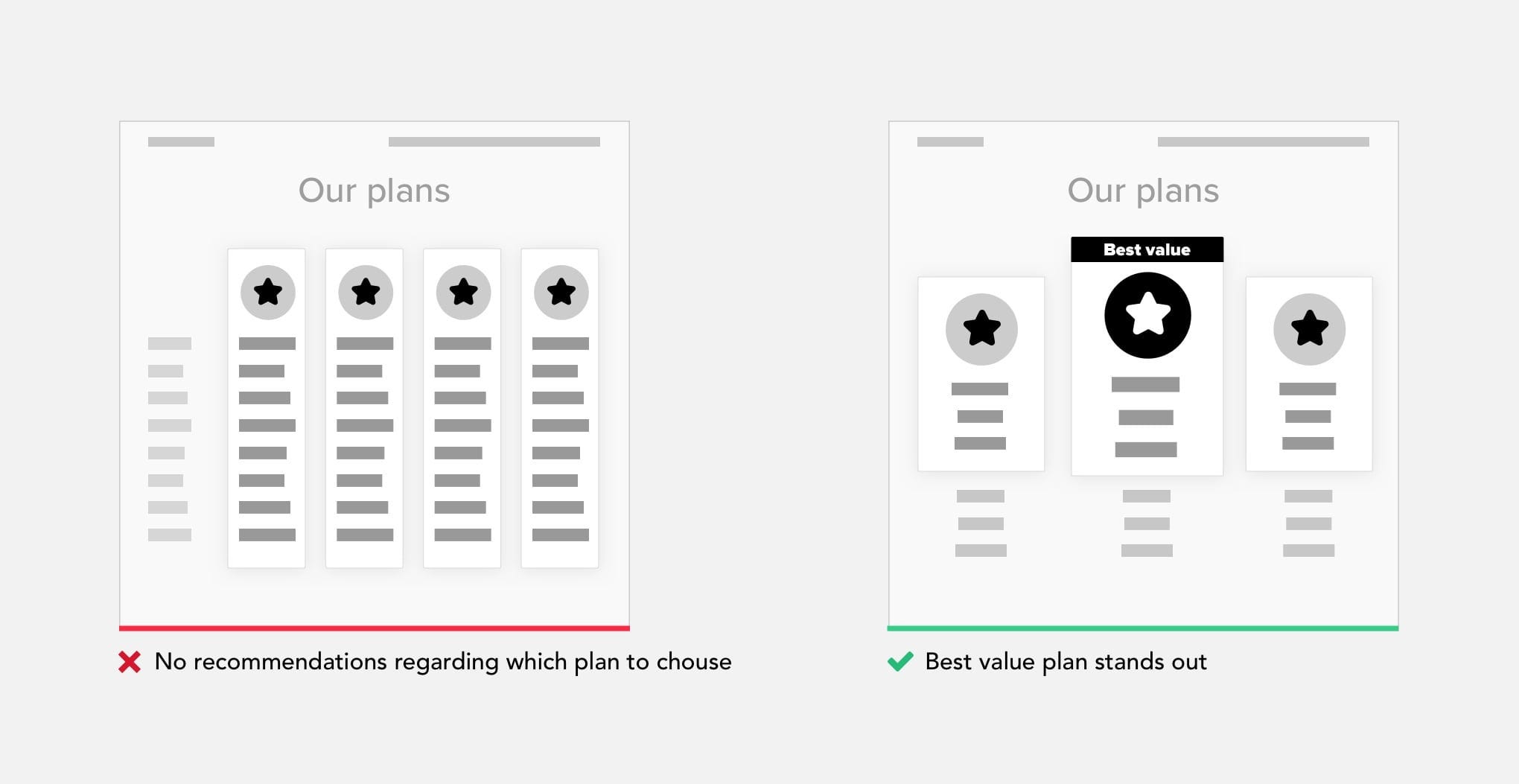
6. Provide recommendations where multiple choices are presented
When choices cannot be avoided, try to limit them. Provide a recommendation yourself or share statistics of what is most preferred by other customers. Clearly communicate to the user what the key difference between proposed options. This approach is often used on pricing plans pages.
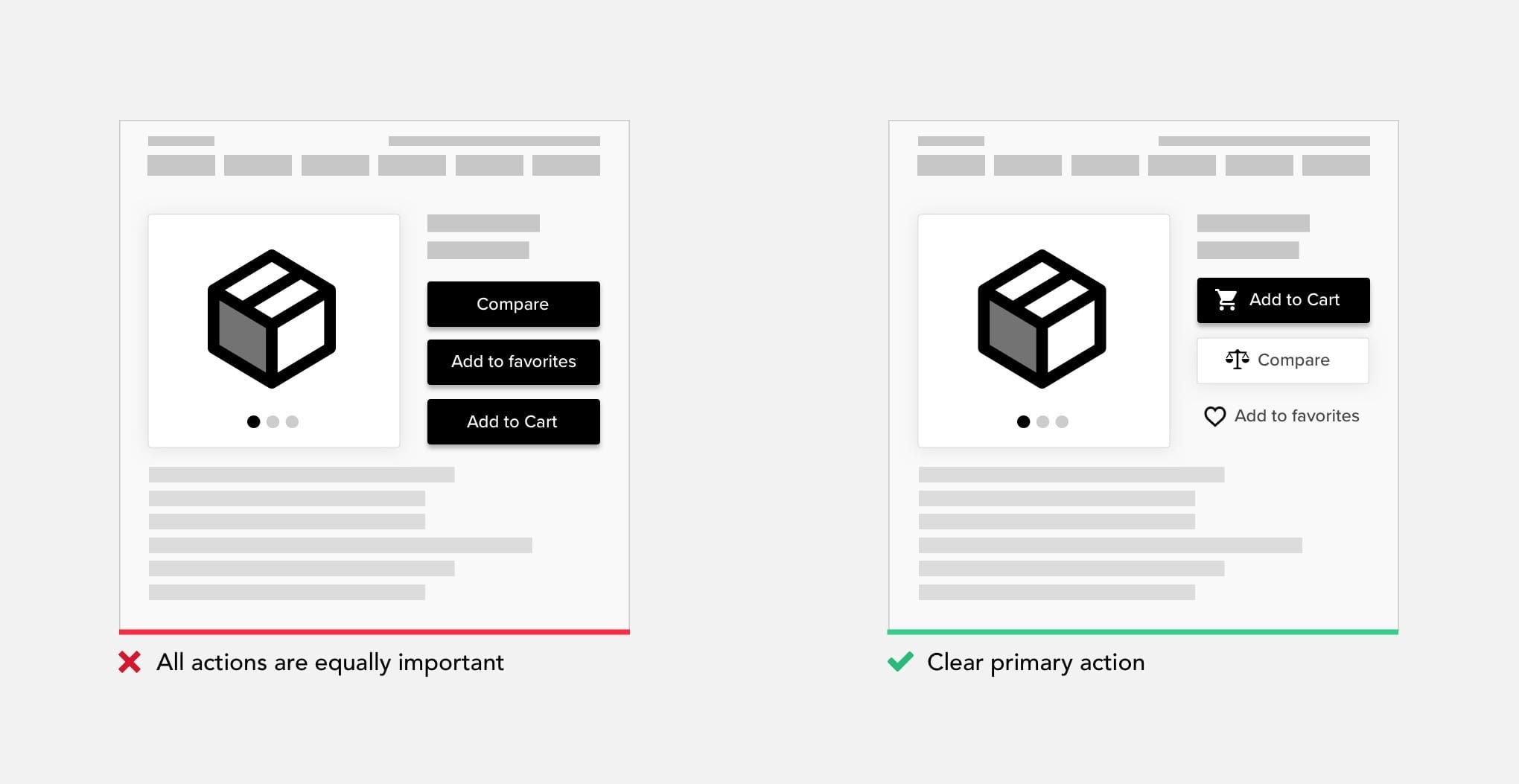
7. Draw users attention to the right areas
When you understand the journey of your user to reach their goals, on every stage of that journey are things that are more relevant and will help you to progress to the final goal. Find those key areas and draw user attention to them.
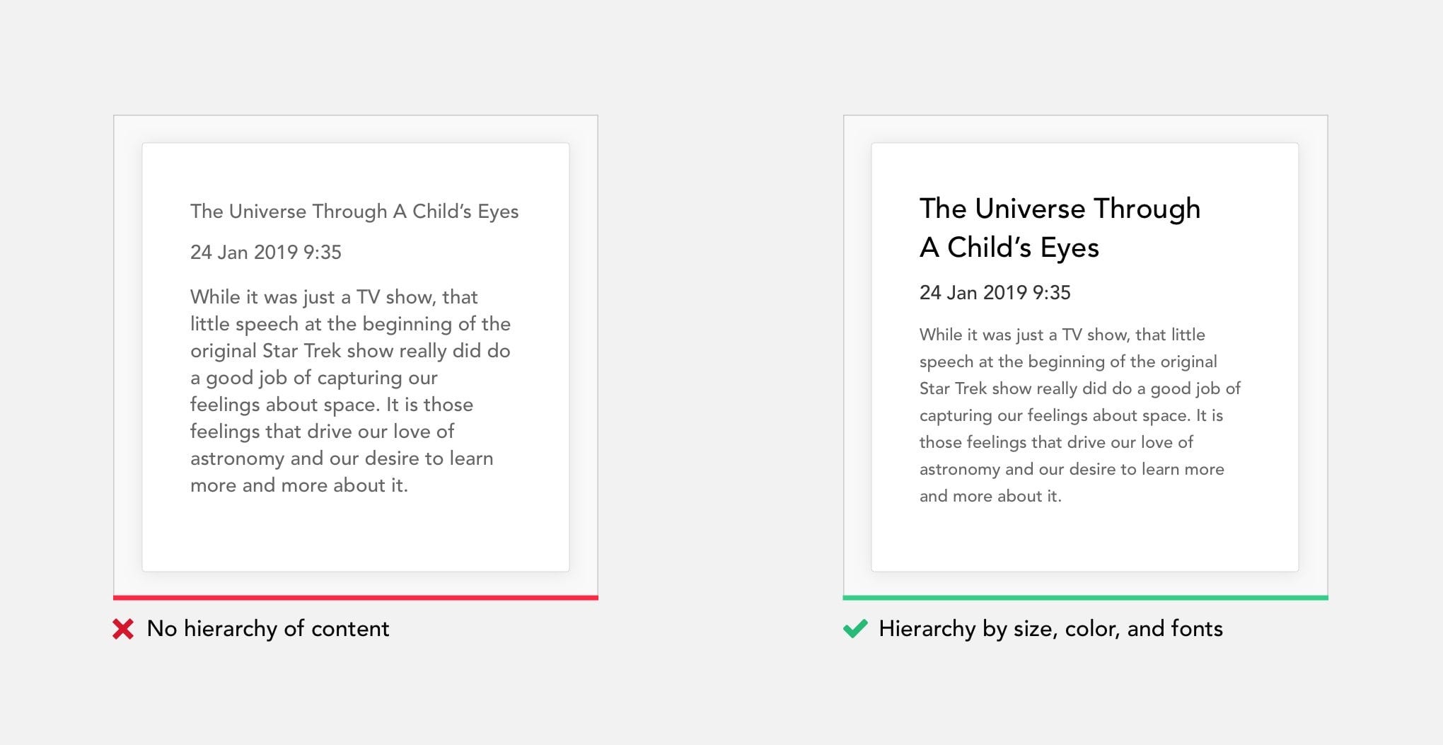
8. Use color and typography to communicate a hierarchy of content
How many times you heard — “Users don’t read”. And it’s kind of true, we are really selective to what we actually remember or deep dive to. If you ever accepted Huge User Policies without reading a word then you know what I mean. There are so many characteristics that can influence what type communicates: typeface & font, size, kerning, leading, capitalization, and color. Use that to communicate the hierarchy of content. With right use color and typography, you will be able to reflect product branding and make it instantly recognizable, much more attractive and memorable.
9. Organizations help the system of many look fewer and more manageable.
Let’s take a simple test. In the illustration below we have 2 images. Use a stopwatch to measure how much time(and effort) it will take for you to count the number of black dots in each square.
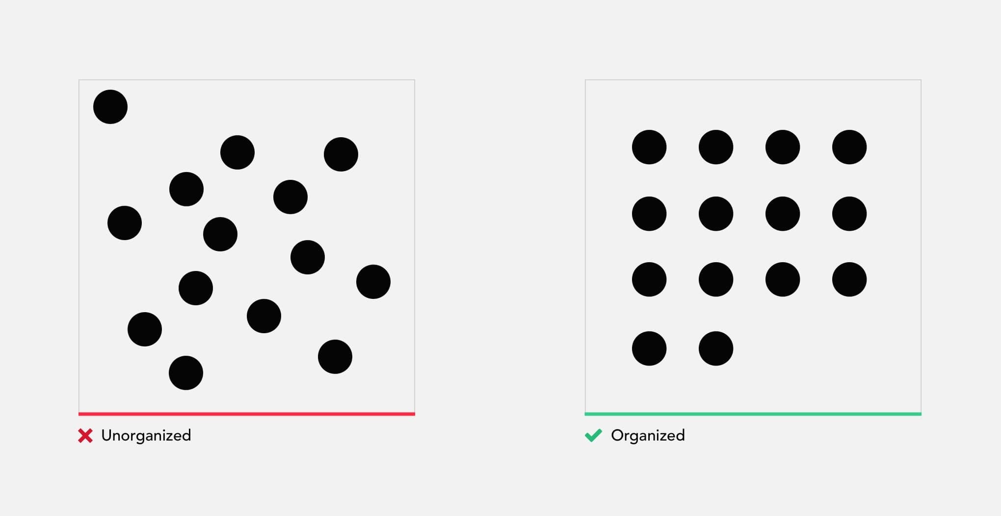
Finished? As you will see for yourself counting the unorganized square of dots took considerably more time, and in addition to that put a much more cognitive load on you. Why we had this result if the squares have an identical number of dots?
Mapping dots on to a specific matrix, helped us scan them visually, and group when counting. While in the unorganized square we had to go dot by dot, counting them individually. In addition, many of you probably made a miscalculation or was forced to double check your result with left image.
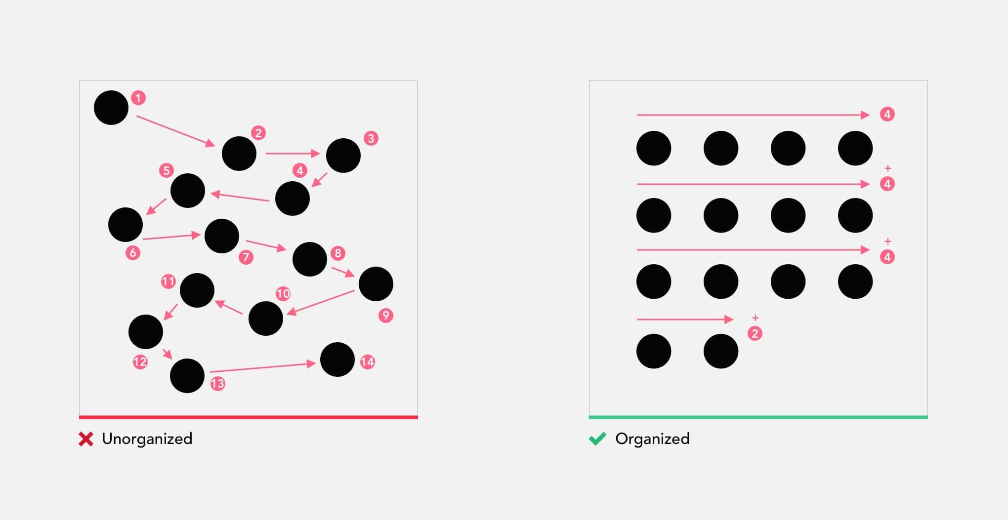
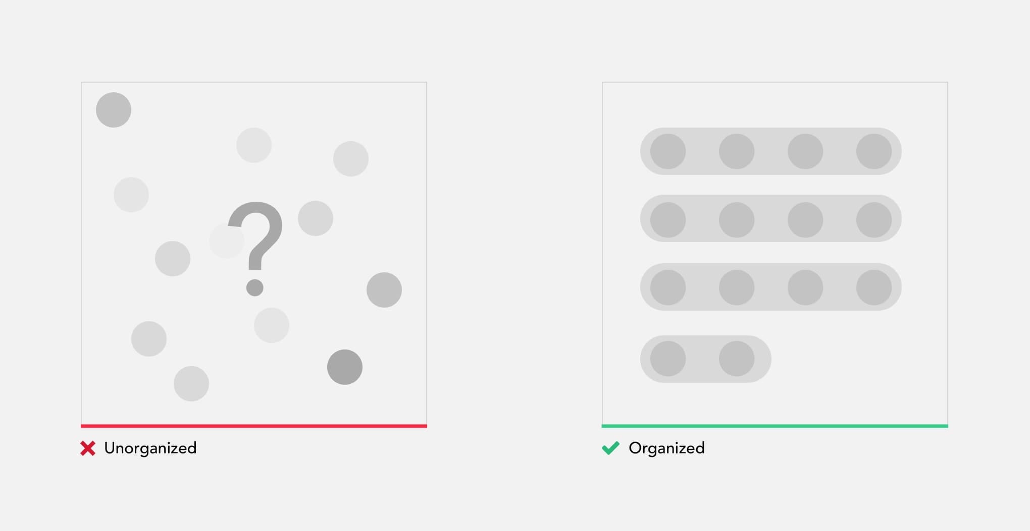
Organization of elements not only improves recognition but also makes it easier to remember. When operating any machine, it’s very important to remember the position and function of all controls. Let’s do another small exercise. It’s only a minute ago you were counting the dots in 2 images, now please recall the position of every dot in 2 squares. For majority recalling the unorganized structure is close to impossible.
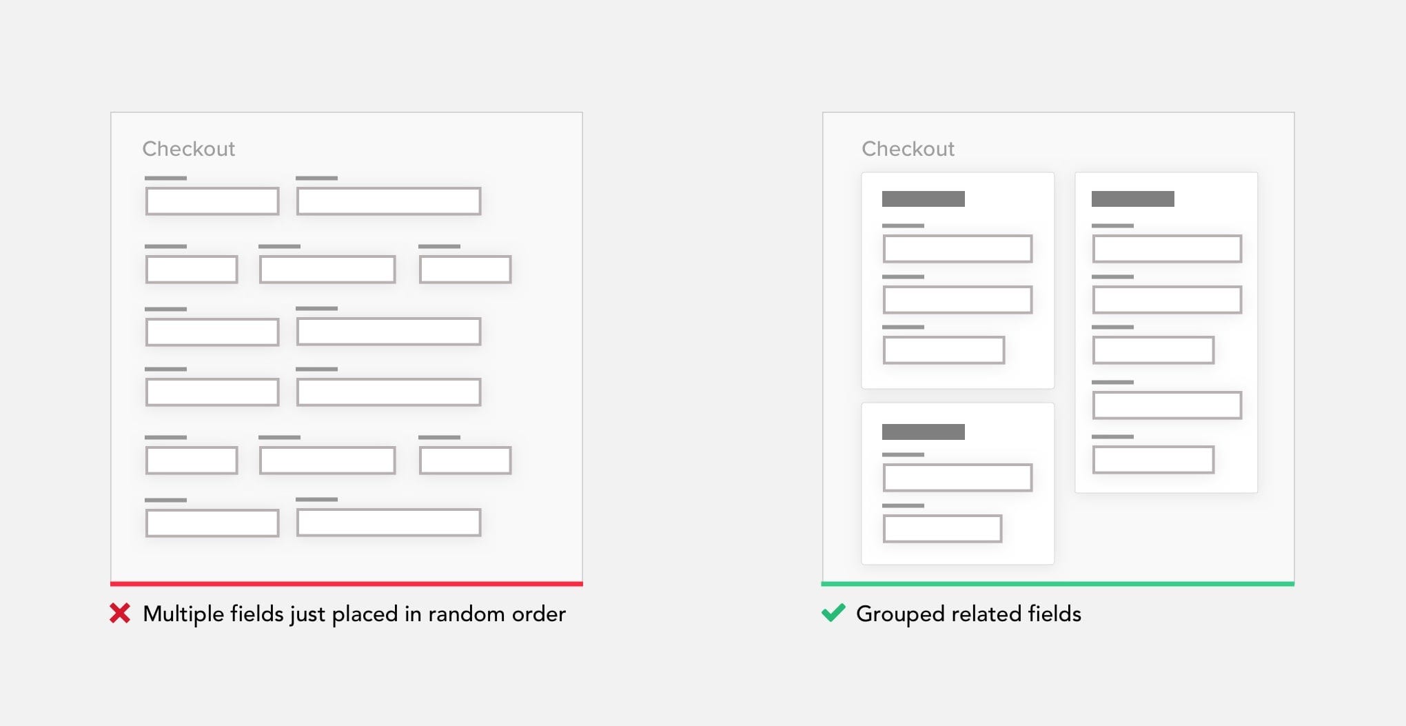
10. Group related content
Often an easy way to simplify complex page is to start grouping components. At that point, users are dealing with few groups rather than with multitudes of unrelated components. Adding borders (creating common regions) around an element or group of elements is an easy way to create separation from surrounding elements. There are multiple principles of grouping in Gestalt psychology that help items feel related: Proximity, Similarity, Continuity, Closure, and Connectedness.
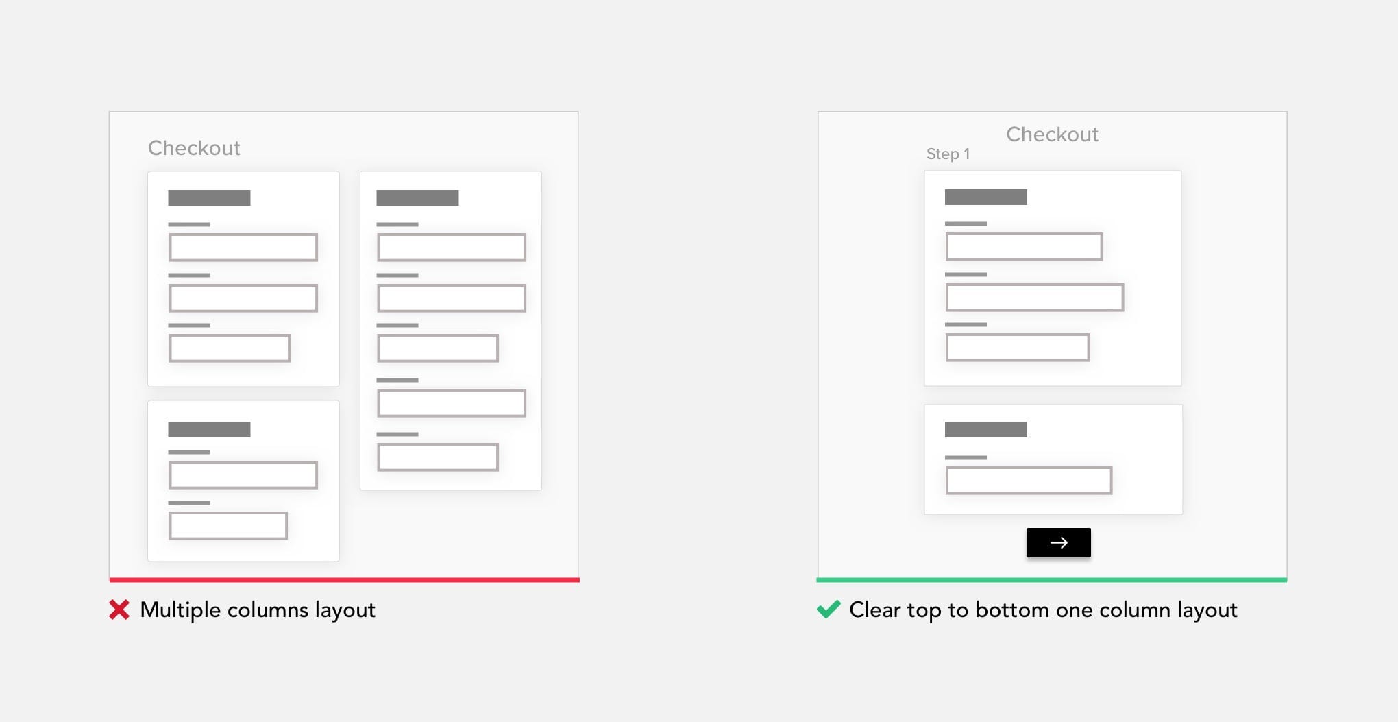
11. Break up huge tasks in smaller steps, try one column layout
Different kinds of forms are present almost in any product. It’s a way you capture user information. Sometimes even after removing everything unnecessary, those can get huge. Such forms can be very demotivation for the user to finish. So what we can do is break up that huge task into a series of smaller ones. All of a sudden it seems much easier to carry out this process to the end. Finishing small subtask gives the user a portion of endorphins and satisfaction to carry on.
When designing forms, use one column layout instead of multiple columns. One column layout is much easier to fill out. This way user doesn’t need to think what to fill out next, simply moving down the page in straight line.
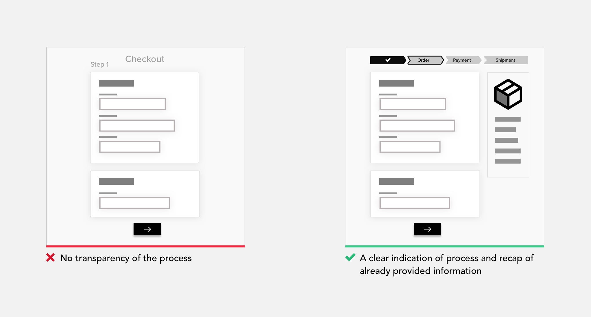
12. Be transparent in communicating the process and system status
Uncertainty makes us anxious, it should be avoided as much as possible. That’s why at any time unless it’s obvious, the user should be able to see where he is currently in the process, where he coming from and what’s coming next. Keeping a summary of the previously provided information is also a good idea, it lower loads on user memory and removes the need to go back to double check previous steps.
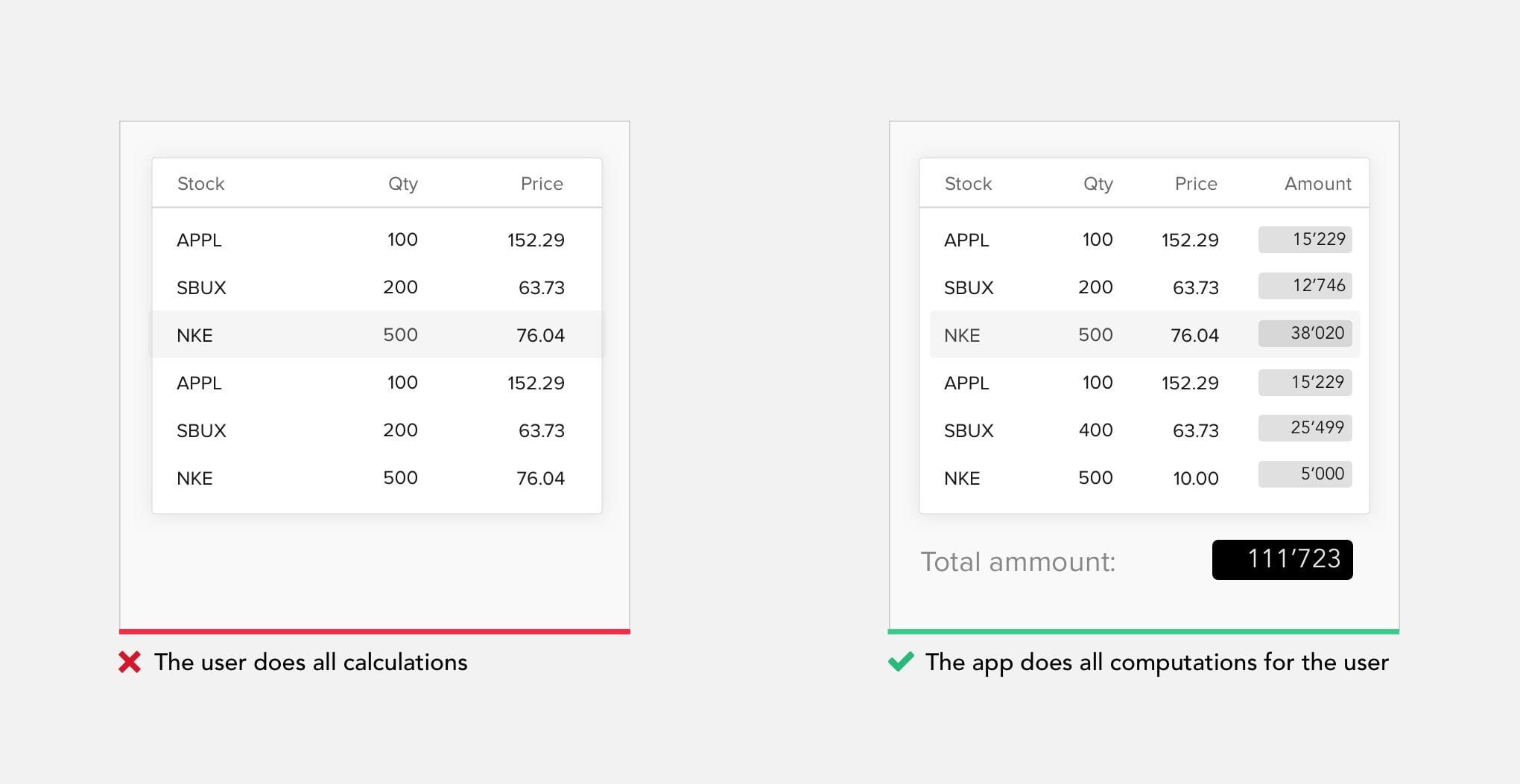
13. Do the calculations for your user
Human brain bad at raw arithmetic involving numbers. Evolutionary pressures have favored brains optimized for object recognition compared to arithmetical operations. Try to leverage the system to do all calculations instead of the user.
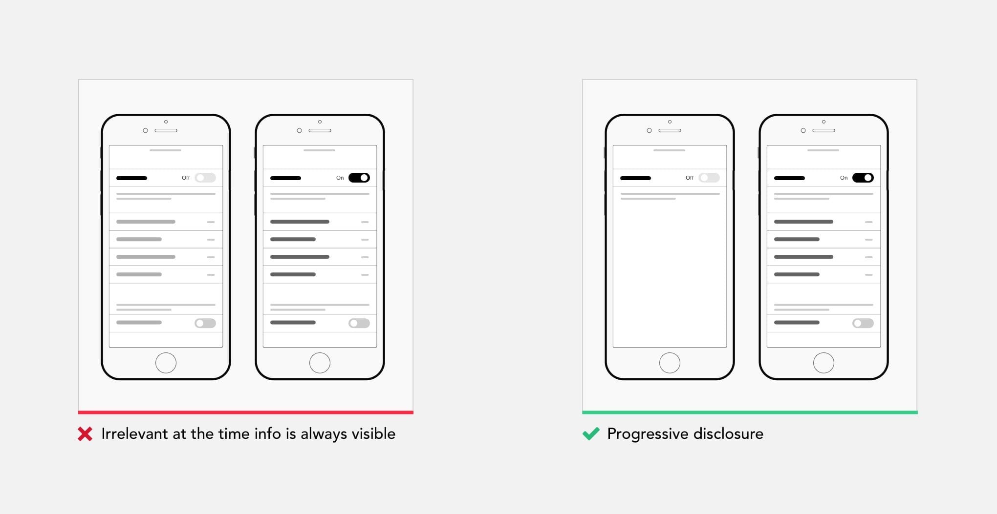
14. Hide complexity with progressive disclosure
Progressive disclosure is a design pattern used in UX design to make user interfaces easier for users to interpret. It involves sequencing information and actions across several screens so as not to overwhelm the user or hiding irrelevant information until it becomes relevant. Progressive disclosure follows the typical notion of moving from “abstract to specific,” including the sequencing of user behaviors or interactions. A good example of progressive disclosure is iOS nested doll navigation.
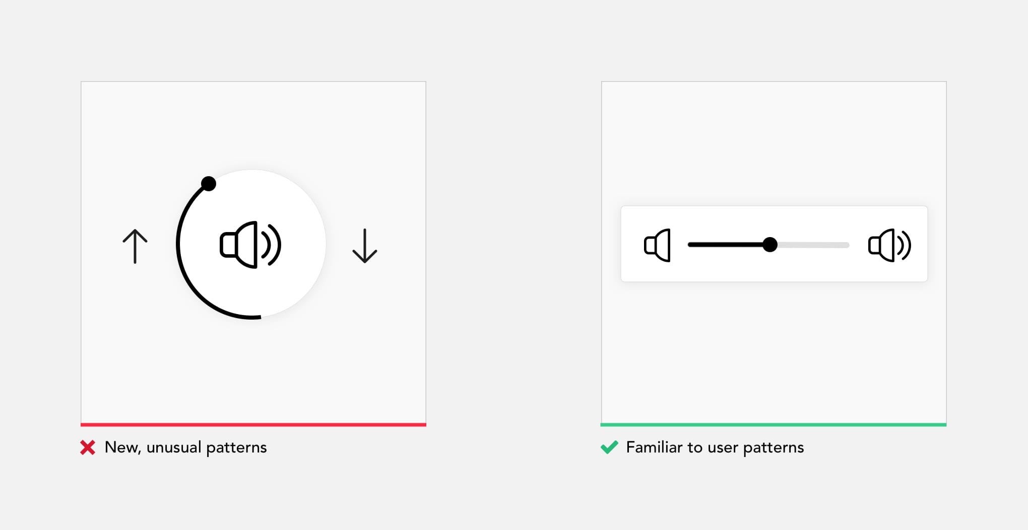
15. Rely on commonly accepted patterns and interactions
Users spend most of their time on other products. This means that users prefer your site to work the same way as all the other sites they already know, and they come on with specific expectations to how your product should look and behave. This statement holds true for any digital or physical product from social network to your fridge and reflects consumer mindset. That’s doesn’t mean you should stop innovating, more to evaluate whether a depart from traditional ways presenting navigation or controls, justifies user to change their mental model.
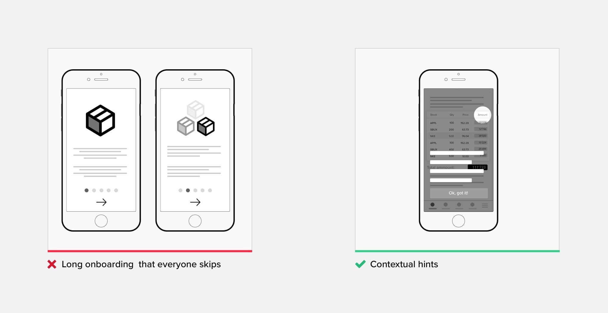
16. Design a streamlined first-time experience
The primary goal of any design should be connecting users to the value product provides as soon as possible. Think about that for a second. So anything that stands between a user and him actually operating a system, is a barrier unless it serves a functional need. The first-time experience is very important for any process, we humans are very quick to form our opinion about the product and walk away immediately if we are not satisfied.
Even the simplest task is challenging if you try to do it the first time. Sometimes additional training is required before we can operate the product. In digital design I suggest to forget a manual approach, user expectation is the product should be simple enough to understand and they expect help on demand, or when something goes wrong. Provide contextual help instead of an upfront overwhelming user with learning material, design for empty states.
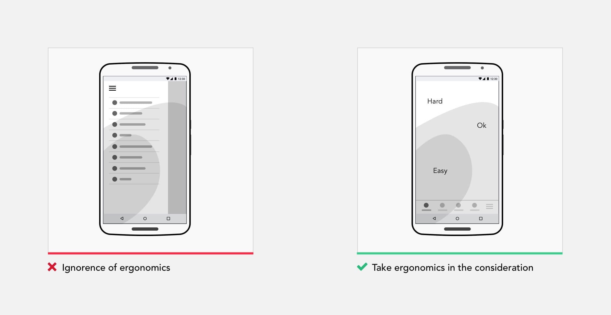
17. Keep in mind ergonomics and circumstances under which product will be used
Simplicity as we already defined by how easily you can actually use the product, with its ergonomics. Ergonomics is the process of designing or arranging workplaces, products, and systems so that they fit the people who operate them. Most people think it is something to do with seating or with the design of car controls and instruments — and it is… but it is so much more. Ergonomics applies to the design of anything that involves people, including digital products.
In 1954, psychologist Paul Fitts, examining the human motor system, showed that the time required to move to a target depends on the distance to it and relates inversely to its size. So make sure commonly used elements large and position them close to users.
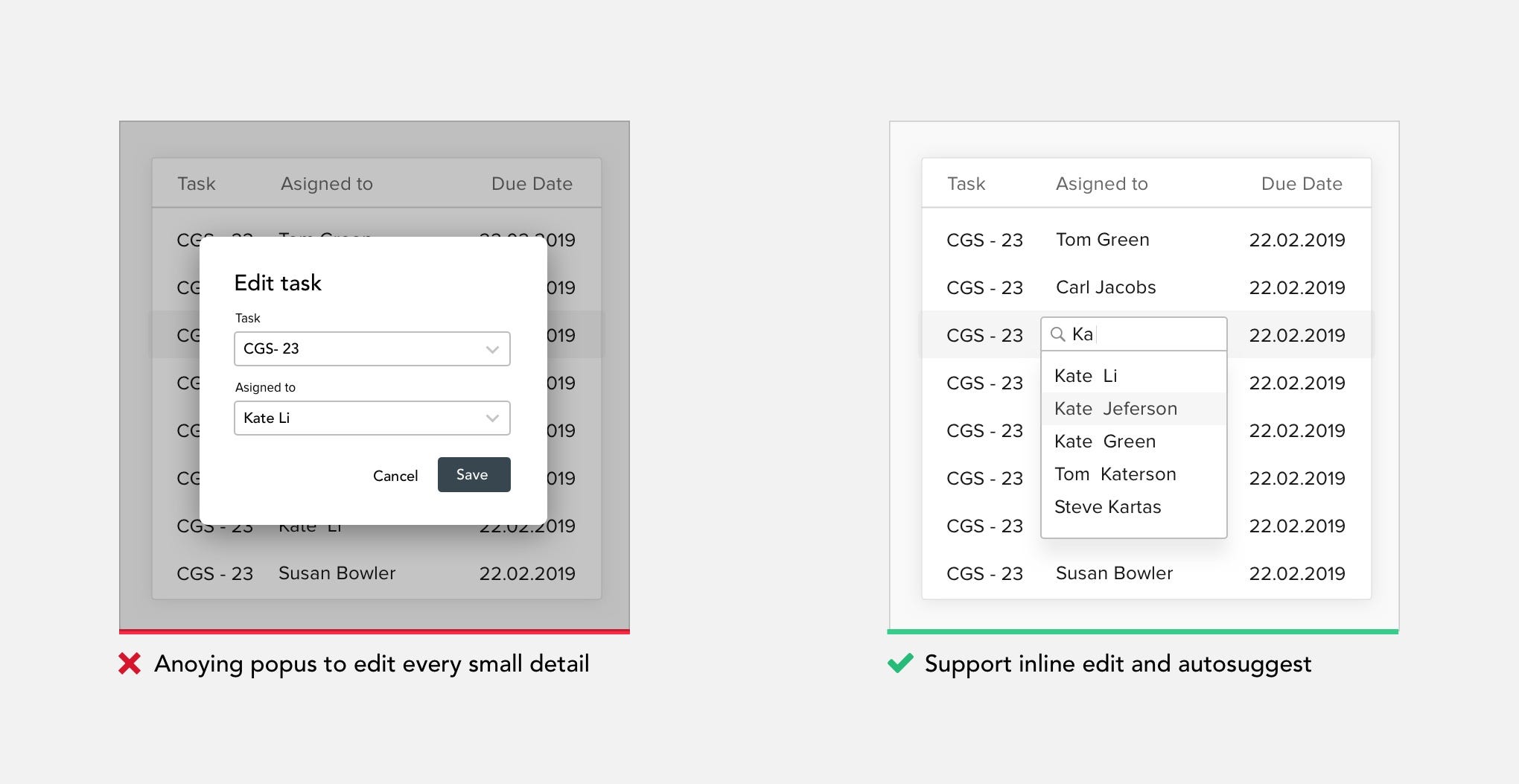
18. Support inline edit and autosuggest values
Remove all unnecessary interactions, views, steps in every process. There is an optimal speed at which the user should operate the system, it called a “state of the flow”. Don’t break that flow with popups. For all actions/values that can be changed later, support inline edit as much as possible. Autosuggest values when a great number of values is available.
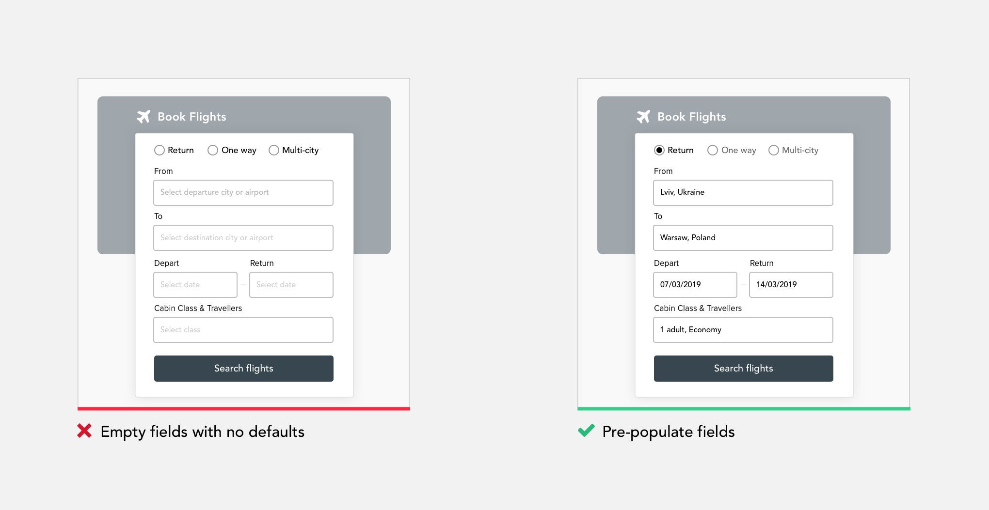
19. Use Smart Defaults to Reduce Cognitive Load
Smart defaults are selections put in place that provide answers to questions for you. This supports users to complete forms faster. Filling in forms requires people them to parse it, formulate a response, and then input their answer into the affordance provided on the form. Defining relevant defaults, designers need to understand users and the context in which they will use a product. This is only possible with deep research and testing, to learn from their users and adjust defaults based on their users’ historical data and usage patterns. Always set the default to the choice the vast majority of users (say, 90–95 percent) would choose if explicit choices were required.
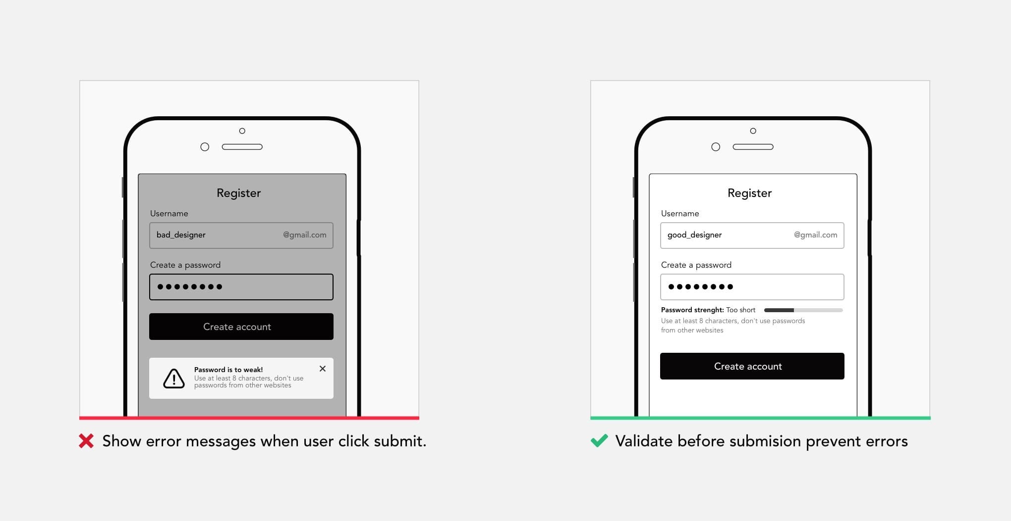
20. Prevent errors
Error messages bring a lot of stress and bring the users a feeling that they messed up or not up to the task. Ensure automatic check for entered data and provide alerts or reminders for inappropriate data entries to reduce errors. Either eliminate error-prone conditions or check for them and present users with a confirmation option before they commit to the action. Destructive and irrecoverable actions should be guarded with a forcing function to ensure that users conscious of the impact their choice will have.
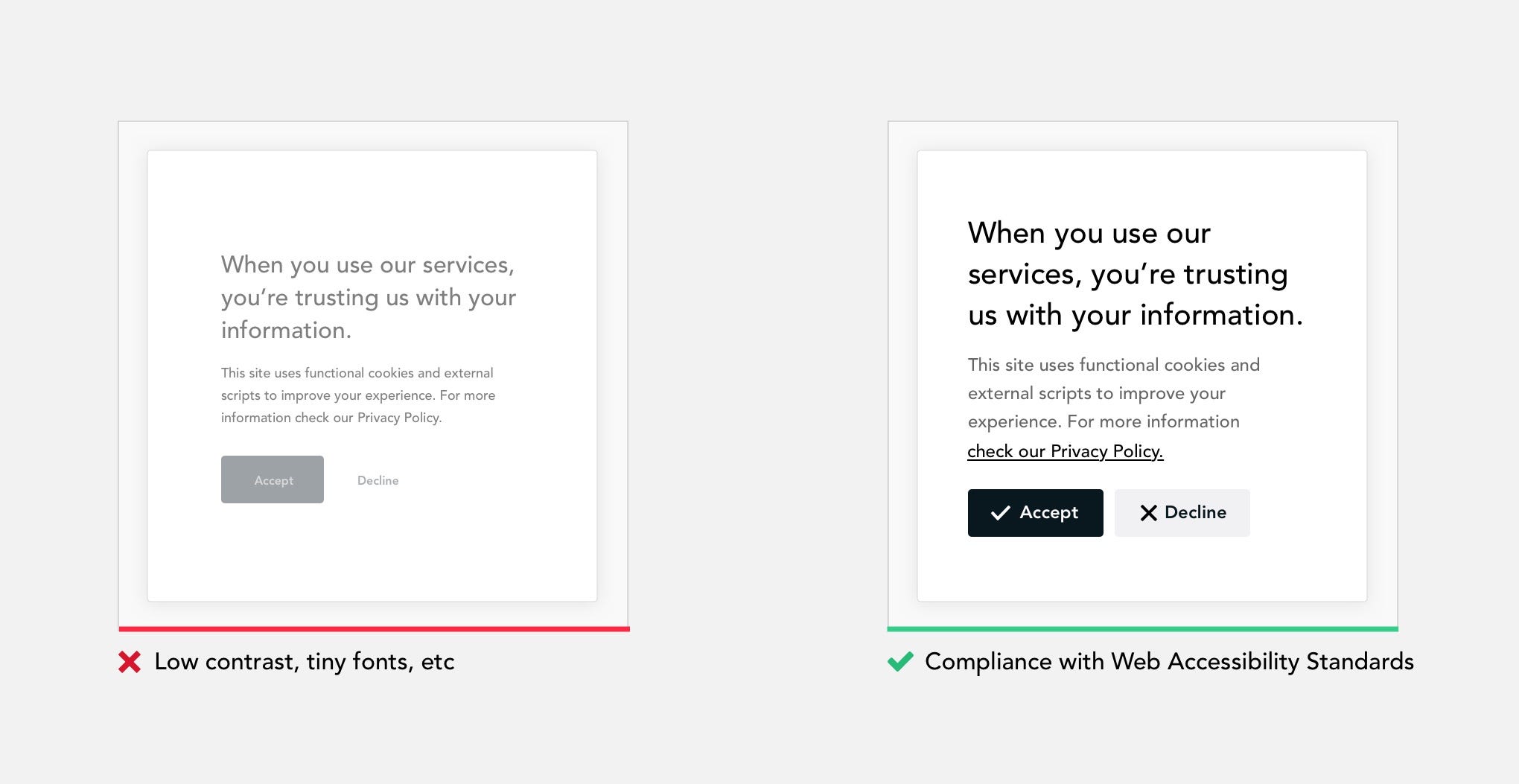
21. Design for accessibility
As a designer, your goals are to champion accessibility, make sure your product is accessible by a broader audience without exclusions. There are over 1 billion people worldwide who have a disability. Don’t use color as the only visual means of conveying information. Ensure sufficient contrast between text and its background, support keyboard navigation etc. Accessibility is not confined to a group of users with some different abilities, when you design for accessibility you improve the experience for everyone using the product.
Conclusion
Designing simple to use and understand products is not easy, but its a way to go, and there are quick ways to move towards simplicity.