Several humble observations on how people describe photos, artworks, and memes.
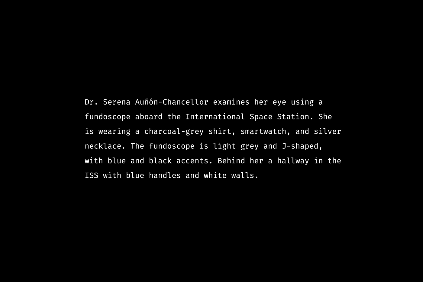
Look at this:
What did you imagine after reading the text? How clear and detailed was it? How did you visualize the fundoscope?
Done? Good. We’ll return to that in a minute.
And what about this picture?

What brooch did you envision? What were its size, shape, and color? How exactly was it drawn in your imagination?
These are real examples of alt-text from Twitter.
Twitter has been quite vigorous recently in raising accessibility awareness among its audience and proactively reminding people to add descriptions to tweets with images.

So, let’s get back to the descriptions from the beginning of this article and see that fundoscope and the brooch.
Here is an actual picture presented by the first description:

Quite expected, isn’t it?
And which of the four brooches in the picture below, in your opinion, matches the second description?

Hmm… Any of them?
Now, the correct answer. It’s the golden brooch drawn on white paper; it depicts seven dancers in red enamel dresses and is adorned with many small gemstones.
The original description in the tweet is quite generic, so if you google “drawing of a jewelry brooch,” it will match most of the search results. Here is the screenshot, by the way:

But why are we talking about image descriptions, or “alt-text,” in the first place? Let’s quickly recap.
Image description helps blind people and people with low vision to consume visual content. They browse the internet using screenreaders — programs that transform text content into speech. Besides, image descriptions are helpful for people with a poor internet connection or outdated devices: they can guess what’s depicted in a picture until it fully loads or if it doesn’t load at all.
The need for accessibility features is just a matter of time. We all will gain some disabilities as we grow old.
Content accessibility is hard to automate or implement once and for all. Each piece of non-textual content — pictures, audio, and video — should have a well-composed alternative so that people who cannot rely on one of their senses can still consume information.
Facebook and Instagram employ AI to auto-generate descriptions, but it’s of little help. The generic sentence “May be an image of multiple persons outdoors” fits half of all the photos on social media. So yeah, the best description is the one you compose yourself.
Here is a vivid example from my Insta:

The actual photo doesn’t contain any recognizable face; there is just a crowd of people and a well-known building, the Brandenburg Gate in Berlin, not just a random monument. And, of course, AI cannot “see” a large artwork with six sunflowers projected on the gate’s facade during the Festival of Lights (not to mention that this year’s festival is devoted to the ideas of peace, unity, freedom, and resistance against the Russian military aggression and genocide of Ukrainians).

Now let’s take a look at some inspiring examples of image descriptions.
In my opinion, NASA’s account on Twitter is a great role model in terms of composing image descriptions. They literally describe what’s depicted and show tons of creativity in making it exciting.

Generic descriptions like “two galaxies on the dark background” would probably fit half of all their publications. But specifying size, shape, location, orientation, movement, and color shows respect to readers who cannot see photos for whatever reasons.
A good alt-text manages to substitute the visual perception of an image with arousing readers’ imagination.
Try this: open NASA’s account via the Twitter app, turn on the accessibility mode on your phone, close your eyes, and browse the feed without looking at it. Scroll through some posts. Then open your eyes and compare what you imagined with the actual pictures.
Or you can also use the “Images on/off” Google Chrome plugin to expose all image descriptions on a webpage.

Sadly, not all of Twitter’s content is equally accessible.
Look at the tweet by Adobe in the screenshot below. All of its three images have descriptions. But they are all the same, although a sighted person will definitely notice that the depicted characters are different.


Since we are talking about Twitter, the next logical question is: how does one describe memes?
I should admit this is the least accessible part of Twitter content. I had a hard time finding a decent meme with alt-text. Most memes don’t have any description, and among those that do, you can hardly find a funny one. The challenge with many memes is that you should describe both the template used and custom captions that make it comical.
Look at the example with pensive Macron:

The first sentence introduces the meme format, and the second one cites the caption. If we lived in the ideal world, where all images on the web had perfect alt-text, there wouldn’t be a need to describe Macron’s appearance. But since we are not there yet, a short sentence about his look might be a reasonable improvement, I guess. Apart from that, it’s an example of a simple and robust description.
But things get way trickier with complex memes or data visualization (infographics, charts, diagrams). The example below demonstrates both complicating factors:

This meme is described in three paragraphs, which gives enough details but is a bit hard to comprehend. Unfortunately, I didn’t understand it, but maybe its topic is just beyond me. Anyway, it’s a pretty good example of how hard it might be to write image descriptions for pictures with lots of details and text.
Another interesting example I found recently is a post with two pigeon paintings and a reference to the “moral alignment” meme format with a 3×3 grid and labels like “lawful good” or “chaotic evil.”

The first image description in the tweet says, “Evil pigeon (oil painting by Leah Gardner),” and the second one is, “Good pigeon (oil painting by Leah Gardner).” The author prioritized her copyright info and kept silent about the pigeon poses, pink background, or hilarious laser beams flashing from the eyes of the “evil” pigeon.
As you see, not all Twitter folks realize what they are supposed to write in the image description. I noticed that the best alt-texts usually belong to official accounts of well-known organizations with a global audience (mass media, museums, research institutes) and, of course, organizations and experts in the area of accessibility and inclusion.
So, we’ve already covered sceneries, artworks, and memes. Now, a couple of observations about portraits.

The example above is quite good since it allows us to imagine the woman. Just one remark: look at the way how the image caption is cited in the image description. It’s written in uppercase, which can be interpreted as an abbreviation by assistive technology. As a result, screenreaders can spell those words letter by letter.
Unlike minimalist avatar-style portraits, portrait paintings and candid photography contain more individuality, hence a need for more elaborate descriptions, for instance:

Describing such an image, you should not only literally list its elements (woman, orange dress, chair, golden frame) but also convey the atmosphere and emotion (serene and warm moment).
And finally, alt-text for animated GIFs. After everything explored above, I don’t think the key principles will differ much. You should describe the keyframes and main actions. Notion’s team did a great job explaining their animation about the lightbox feature.

To sum up, Twitter is one of few social platforms that boldly reminds about alt-text and doesn’t hide this obnoxious feature behind “Advanced” or “Other” settings. As I said, disability is a matter of time; we all will have firsthand experience with it at some point in the future.
I’m happy to see people writing image descriptions more often; at the same time, there is a lack of understanding of why to do it and what is supposed to be written in the alt-text.
Recommended reading
Ugh, I hope I didn’t screw things up myself in this article. I’m not going to lie, it was not easy to compose proper descriptions for screenshots of tweets with images that already had alt-text. So here is some additional reading for you on the topic:
“Alternative Text,” recommendations and guidelines by WebAIM.
“8 Ways to Make Instagram Content More Accessible and Inclusive,” an article in the Combin blog.
“Avoid These Common Alt-Text Mistakes,” an article by Holly Tuke for the Big Hack blog.
Feel free to get in touch elsewhere: Instagram, Twitter, Dribbble, Behance.
Got a conference or webinar? I’d be glad to become a speaker.
Bored by “how-to” articles? Check my blog about overlooked architecture.


