Sometimes, users find it hard to read microCopy on a mobile or desktop screen either because the characters are cluttered, hazy, or too small to read.
Crabbed or hard to read microcopy creates interface friction that results in users taking more time to complete their goals or tasks.
When the interface doesn’t qualify well for the legibility metrics, it probably results in flow resistance that often makes a user feel lost.
This article highlights the crucial factors that affect legibility in interfaces.
What is interface legibility?
The quality of being clear enough to recognize or read is called legibility.

The interface should match with the legibility metrics to ensure a user can easily identify the characters and read the text.

Letter
Functional and Non-functional Interface Copies
Before moving further, we should have a basic understanding of functional and non-functional copies, as legibility affects both of them differently.

Functional copy or interface microCopy communicates with the users to help users understand the context and perform relevant actions. Few common examples would be a text on button or an alert message.
Non-functional copy provides information to the user. Display or body text in an article is a simple example to reference.
What factors affect the interface legibility?
While designing the text heavy interface, several factors play a role that counts for legibility. Let’s try to understand them —
1. Size
Font size is one of the most vital factors that affect legibility. It is hard for users to recognize and process characters in smaller font sizes.

MDL uses a minimum font size of 12 for Bottom navigation and 10 for Overline. HIG uses a minimum font size of 10 for the Tab bar.
An interface should not have font sizes smaller than 10 to make sure users can easily recognize the characters with ease without legibility glitches.
2. Relativity
Relativity does play a role for environment-dependent interfaces.

Large-sized displays comparatively have higher viewing distance as compared to small-sized displays.
The large-sized displays are generally positioned at an average distance between 18 to 30 inches, while the small-sized displays are positioned somewhere between 12–14 inches only.
A text written at 12 on larger display (like TV) is too small to read, while on the other hand, 12 is acceptable on smaller devices like mobile phones.
3. Weight
At smaller font sizes, characters with very thin light weight almost get disappeared while characters with heavy weight look jabbed.

We should aim for balance when it comes to the weight, else legibility will suffer for both the large and small size texts.
At larger font sizes, non-functional copies can use heavy weight for short line length (20–40 characters). However, for ideal line length (40–60 characters), lighter weight should be preferred.

It is hard to recognize heavy weight characters at smaller font sizes for both short and ideal line lengths. Non-functional copies should explicitly use a lighter weight at smaller font sizes.

Functional interface copy can occasionally use heavy weight for emphasis.
4. Color
The Web Content Accessibility Guidelines (WCAG 2.0) suggest an adequate color contrast ratio between text and background.
Level AA requires a contrast ratio of 4.5:1 for text smaller than 18 or 14 bold and 3:1 for large scale text which is larger than 18.
Level AAA requires a contrast ratio of 7:1 for small scale text and 4.5 for large scale text.

Using contrast ratio limits creative liberty, but it always ensures the copy is legible and serves the purpose.
5. Identical or IL1 Case
A few typefaces have identical looking appearance for characters like I, L, and 1, which affects the legibility. Users find it confusing to distinguish among these characters.

Identical IL1 leads to serious legibility pitfalls. Each identical looking character must have its unique shape.
6. Aperture
The characters like c, e, and o are hard to distinguish at smaller font sizes.

In such a scenario, we should prefer open-shaped typefaces, where characters like c and e have a wider opening that makes it easier for the human brain to process these characters more easily.
7. x-Height
The x-height refers to the height of lowercase x or median from the baseline. It determines the height of the lowercase letters like a, c, e, m, etc.

The typefaces which have comparatively taller x-heights are more legible at smaller font sizes.
8. Serifs
Serif typefaces have decorative tapers at the edges, which are called curls or tails. Sans-serif typefaces don’t have tapers or tails.
Times New Roman and Arial are classic examples of serif and sans-serif typefaces, respectively.
Multiple studies have found — the tapers at the edges of serif typefaces help the human brain to identify and process the characters quickly. This is why serif typefaces are an ideal choice for long-form or non-functional text.
Serif typefaces looks jagged at smaller sizes, which causes legibility issues.

As compared to serif typefaces, sans-serif typefaces are more legible and works pretty well even at smaller sizes and low-pixel density devices.

Sans-serif typefaces should be preferred over serif typefaces for small-sized functional interface copy.
9. Antialiasing
Aliasing refers to the sudden visual stepping at the color-differentiated boundaries. Anti-aliasing is the smoothing of jagged edges to make color-differentiated boundaries smooth and easy for human eyes.

Aliased text can cause serious legibility issues.
In general, most of the tools and frameworks take care of antialiasing. But still, we should be careful to avoid any legibility pitfalls.
The Type Test
Whenever it comes to choose a typeface for an app or web interface, we should always consider legibility on top of everything.
Designers often end-up choosing a typeface for aesthetics over usability. We should deep dive and test a typeface to pick one, which brings the personality and serves the legibility metrics.
We should at least conduct the following set of tests to match with legibility metrics while choosing a typeface —
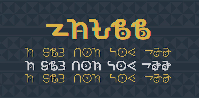
1. J — The Weird Character
J is made differently. In few typefaces, it looks like J is hanging because of taller descender height.

That is why we always write John Doe to accompany the avatars in prototypes. If J fits well, probably everything else will work great too.
2. IL1/ce — Special Characters
IL1 may look similar in few typefaces, so watch them out to avoid any serious legibility pitfalls in your interface later.
Pay special attention to the aperture of characters like c and e to make sure the typeface does not fail on the legibility metrics scale. Opt for wider shapes for the characters like c and e.

Whenever I choose typeface from Google Fonts for functional interface copy, I use Il1ce John axMce as custom type text. You can also try it
3. Weight
A few typefaces suffer the legibility issues at heavy weights especially at smaller font sizes because of low tracking or letter spacing.

Be cautious while using bold weight font for functional interface copies.
4. Write Big — Write Small
A few typefaces may look perfect at larger font sizes, but it doesn’t need to work perfectly at a smaller size as well.

Considering this, HIG introduced 2 separate fonts — SF Pro Text for fonts that are smaller than 20 and SF Pro Display for the fonts which are equal to or larger than 20.
5. Proto Content
While choosing a typeface for non-functional copies, prefer the proto-content instead of the repetitive text. The repetitive text often leads to missing key details because of balanced delusion.
Takeaway
We should choose a typeface that matches the legibility metrics and works at a scale. We should conduct a few interface-level tests because a beautiful looking typeface can fail legibility metrics depending upon several factors.
We should aim for a desirable typeface that lies under the foundation to support the user actions without even getting noticed.
I hope this article helps you to match your interface with legibility metrics and deliver a more usable experience to the users.
This article was originally published at Medium-Legibility in User Interfaces by Nitish Khagwal
Feel free to get in touch elsewhere — Instagram, Twitter, or Dribbble.
Cheerio! Bie 👋 👋