Microinteractions have become an integral part of user experience design. A good micro-interaction smoothly blends in with the design & adds value to the users’ experience by providing a more dynamic & human connection. A microinteraction is a product-moment that is built around a single action, a small piece of functionality that performs only one thing. They can drive an entire or as mostly they are integrated alongside a larger product. More than that, it provides those small moments of joy and surprises which create memories of happiness if designed in a proper way, or else they end up being dull, forgettable, or sometimes completely irritating.
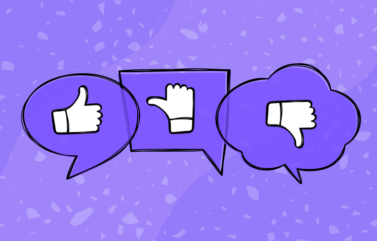
One of the most famous examples would be Facebook’s like button, this small microinteraction changed the way people perceived the platform. It was not part of the original design but today it has expanded to a whole set of reactions because it has enabled us to associate emotions with it, it’s not just functionality but rather a huge part of how we communicate with others on the platform.

Microinteractions add appeal & build a connection between the application & the user by using an instant action-reaction loop. In everyday life, we are all used to this loop.
- It gives us instant gratification.
- Keeps us informed.
- It creates a sense of assurance.
This acts like a human-to-human interaction because relationships are formed by small meaningful moments that acknowledge one another. We expect all of our actions to be accepted, validated, and reassured. As a designer, recognizing these factors & designing micro-interactions is just as important. We have the ability to create something that feels human at the same time accomplishes a task. For example, the typing indicator in chat windows, hamburger menu, on/off toggle switches, pull-to-refresh, volume control, scrollbars, or autocomplete. Microinteractions make a product or application more human.
“The best products do two things well: features and details. Features are what draw people to your product; details are what keep them there. Microinteractions are those details. Details are a delivery system for emotions. They are the ‘feel’ part of ‘look and feel.” – Dan Saffer, author of Microinteractions: Designing with Details.
Microinteractions are different from features both in size & scope. Features are much more complex and have multiple use cases; whereas microinteractions are short, simple, and effortless. Instagram feed is a feature, double-tap “heart” is a microinteraction inside that feature. Microinteractions are good for:
- Accomplishing a single task
- Connecting devices together
- Interacting with a single piece of data, such as music volume in a player
- Controlling any ongoing process, such as stop/snooze an alarm
- Adjusting a setting
- Viewing or creating a small piece of content, e.g. hover to view additional information.
- Switch a feature or function on or off
Four Key fundamentals of Micro-interactions
Targeting the user’s natural instincts by creating a sense of acknowledgment and encouraging them to keep interacting with the application is a key role played by these micro-interactions. This leads to building up a habit loop that keeps getting the user back to the application to perform the same task again and again. This enables the user to understand the working of the application and sets up a mental model that decreases the learning curve. Following are the fundamentals that enable building up of any habit:
Triggers
Micro-interactions can be triggered by a number of factors, user action based or system initiated. This helps a user to understand the actions he can perform and their outcome. The main point to consider for triggers is to keep the reactions consistent. One action shouldn’t lead to different outcomes every time a user performs it, this might hamper their learning process and lead to drop off. Consistency is the key.

Feedback
Once a user triggers any action and appropriate feedback enables a sense of acknowledgment and keeps the user informed. Feedback can be of various types: visual, sound, vibration, moment, etc. Feedbacks are really important as they enable to build a trust factor between the application and the user. Users might panic if they don’t see any feedback for their performed actions.


Rules
Rules are essential to help trigger micro-interactions at set points in a user’s journey which can help them make smarter & quicker decisions. They help interactions to perform properly and enable a higher engagement rate. The best example is a smart way of informing users when they input passwords. Upfront feedback helps a user to see if he is performing a correct action.

Loops and Modes
A loop determines the duration and repetition of an interaction based on the trigger. When you finish heating up food in the microwave, it plays a sound and if you don’t open the door, it will repeat after some time to remind you. Modes help to switch configuration of different functions & interactions adding more flexibility.

The trigger initiates the feedback, the rules define which type of feedback to present, and the loops and modes setup guidelines for edge cases and where and how the interactions will appear.
Microinteractions are mostly the last parts of a product to be designed and developed, and as such, majorly overlooked. But ignoring them is a mistake. If the microinteractions are poorly executed without any consideration, doesn’t matter how brilliantly done, it will always be surrounded by frustration & pain. The design of our product/application is as good as the smallest part of it. As technologies develop & we see thousands of applications enter the market every day, it’s important for us to take control of these powerful capabilities of micro-interactions to add more value to user’s life, create better user engagement, and generate more revenue from the application.
Amit Shetty, UX Designer, Divami Design Labs
You can also follow us on Facebook/ Instagram/ LinkedIn/ Twitter
Originally published at Divami Blog


