I find working with the grid helpful. The grid helps to maintain consistency across the different layouts and make faster design decisions. Grids give more precise control over alignments and layout on different screen sizes.
This article highlights the most important aspect of the responsive grid and how product designers can adapt grids in their design workflow.
Grid Anatomy
A grid is composed of 3 primary components that include columns, gutters, and margins. Let’s try to understand them —

Letter
Columns
Columns are the imaginary vertical blocks and are used to align the content. We define column widths either in percentage (%) or fixed values.
Gutters
Gutters are the spaces between the columns. Gutters help to separate the content. We define gutter widths as fixed values.

Margins
Margins are the space between content and the edges of the screen.
We define side margin widths as fixed values that decide the minimum breathing space across every screen size.
Flexible margins occupy the remaining space left after composing a grid with columns, gutters, and side margins.
The flexible margins change as per different screen sizes.

How to design interface using responsive grid?
Content (images, text, or UI elements) wraps inside either visible or invisible parent containers. Visible containers have a border or fill blocking while invisible containers have transparent blocking.
Visible parent containers include components like cards, banners, etc.

Invisible parent containers include sections like text or feature blocks.

Parent containers starts and ends at the edge of the column. Parent containers can never start or end at the edge of the gutters or side margins.

The content inside the parent container is placed independently and necessarily does not align with the columns.
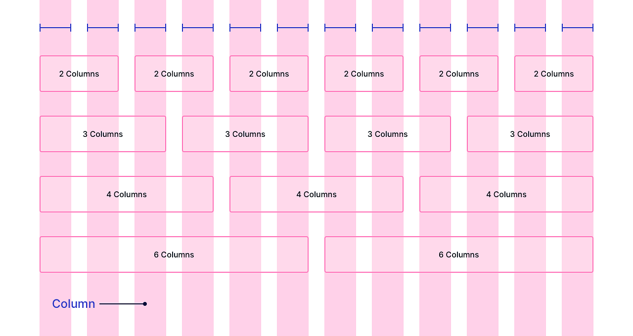
Column Structure
The number of columns used to compose a grid is called a column structure.
8, 12, 16, and 20 are a few of the most common column structures for a responsive layout. It depends upon your design requirement that which column structure you choose for your project.

The 12-column structure is the most agile. It can further break down to align content in either 4–4–4 or 3–3–3–3 sized parent containers.
Breakpoint
A breakpoint is the specific range of screen sizes where the layout re-adjusts to the available screen size for the best possible layout view.
Column structure, column widths, gutter widths, and margins depend upon breakpoint. Parent containers either stack or scale as per different breakpoints to re-adjust for the best possible view.

A column resizes to scale down if the smaller screen has sufficient available space to fit the content. A column stacks vertically if the content cannot fit within the available space on the smaller screen.
Grid Behavior
A grid can function in three different ways across different breakpoints.
Let’s try to understand them —
Fixed Grids
A fixed grid has fixed-width columns and flexible margins. The fixed grid has a fixed content width that doesn’t change in a specific breakpoint range, and the flexible margins occupy the remaining space.

Fluid or Full-Width Grids
A fluid grid has fluid-width columns, fixed gutters and fixed side margins. The fluid grid has a flexible content width that goes edge to edge as per the screen size.
In a fluid grid, columns either grow or shrink to adapt to the available space.

Hybrid Grids
A hybrid grid has both fluid-width and fixed-width components.
In modern layouts, a few elements completely bleed-off the grid and align edge to edge on the screen. Headers, footers, full-bleed visible containers or images are a few of the common examples.

If the content width is more than the available screen size, a fixed grid dramatically turns into a fluid grid adapting to the entire available space on the screen to adequately fit the content.
How to setup layout grid in prototyping tools?
I prefer the 12 column structure to design a responsive layout. As per your design requirement, you can choose any column structure. No matter what column structure you choose, foundation remains the same.
Desktop View
You should never design at large resolutions like 1440×900, 1600×900, or 1920×1080 unless it is not intentional or you know what you are doing.
1280×800 is the smallest possible desktop resolution. Both fluid and fixed-width layout designed at 1280×800 can simply adapt to larger screens, but the reverse method gets quite complicated.
So, let’s start with a 1280×800 sized artboard —
Fixed-Width Layout Grid Setup
To set up a fixed-width grid, we use fixed numeric value for gutters and columns. I recommend 74px wide columns, 32px wide gutters and 16px side margins on each side.

74px wide columns and 32px wide gutters results in 1240px wide content width (excluding 16px side margins from each side i.e 1272px) which make use of the maximum available screen size.
At different breakpoints, when the content width of a fixed-width layout is larger than the current screen size, then the fixed-width grid starts to behave as a fluid grid.
Fluid Layout Grid Setup
To set up a fluid-width grid, we use fixed numeric values for gutters and auto-calculated values (in %) for columns.

Fluid layout grid make use of entire screen size for the main content width leaving 16px side margins on each side.
Mobile View
For mobile devices, we use a fluid grid where gutters and side margins have fixed numeric values. I recommend 16px wide gutters and 16px wide side margins on each side.
We can design mobile interfaces at 360×640 sized artboard.
Mobile devices have a small screen resolution. If we display the 12 separate columns, gutters, and side margins on such a small resolution, it becomes quite cumbersome to design at scale.

So, we merge columns in a group of 3 to create 4 fat columns keeping the layout grid sleek and handy to make quick alignment decisions.
Tablet View
We set up grids for tablets in a very similar way as we did for mobile devices. I recommend 32px wide gutters and 16px wide side margin on each side.
We can design interfaces for tablets at 768×1024 sized artboard.

You can optionally merge columns in a group of 2 to create 6 fat columns for a clean and handy grid setup.
Material Design explicitly recommends 24 px gutters and side margins. You can also use these values for tablet design.
Layout Variations
Grid layout variation decides the main content structure of the layout. We use different grid layout variations for different layout requirements.
A few page-level containers wrap the main content width.
The number of page-level containers used to wrap the main content determines the layout variation.
Let’s try to understand them —
One-Column Layout
One-column layout or full width layout variation is one of the most favored flavor for the landing and lead pages.

We can either merge 12 columns to create a single column parent container, or we can distribute 12 columns into groups of parent containers.
But everything is wrapped inside one page-level container only.
Two-Column Layout
The two-column layout has two page-level containers. In general, one page-level container shares more column weight as compared to the other.

In a two-column layout, columns are either distributed in 9–3 or 8–4 parent containers to create the main content width.
Interfaces with a single sidebar are a great example of a two-column layout.
Three Column Layout
The three-column layout has three page-level containers. One page-level container shares more column weight as compared to the other two page-level containers.

In a three-column layout, columns are either distributed in 3–6–3 or 2–8–2 parent containers to create the main content width.
Interfaces with two sidebars can be a quick example of a three-column layout.
Fixed-Width Sidebar Layout
The fixed-width sidebar layout functions a bit differently.

The sidebar width is fixed across a set of breakpoint range, and the remaining space is occupied by either a fixed width or fluid width container.
Dashboard with pinned sidebars are the perfect example of the fixed-width sidebar layout.
Grid Dev Hand off
First of all, we need to understand that designing a layout in a prototyping tool and coding has a significant difference.
When it comes to code, we can either merge the columns or stack them.
We can merge the 12 columns to create a single column layout, or we can distribute 12 columns into a set of stacked or parallel groups to create parent containers for a different layout variations.
You always need to make sure your developer is aware of the fact what column widths, gutters, and side margins you have used for desktop, mobile, and tablet while designing a layout in modern prototyping tools.
Developers use fairly popular frameworks like Bootstrap, Zurb Foundation, etc. where the columns, gutters, and side margins values are quite different as per the standardized approach.

However, we can easily customize these values with a rough workaround in popular responsive frameworks for the best possible layout across different screen sizes.
Feel free to experiment with different column structures, columns, gutters, and side margin values to find what works best for you.
But, Yes! If you focus more on quick deliverables in tight deadlines, use the recommended numeric values, and conquer the grid game like a PRO.
Thank You!
You’ve reached the extreme bottom! I appreciate that!
I hope this guide brings some help to kickstart your responsive design projects with a solid grid foundation. If you find this article useful, please ❤️
Feel free to get in touch elsewhere — Instagram, Twitter, or Dribbble.
Cheerio! Bie 👋 👋
…
Responsive Grid Design: Ultimate Guide article was originally published at Medium.