Disclaimer: This project is an exploration of ideas. I have no affiliations with Shopee.
Introduction
I wanted to do a case study where I could get a few friends to participate in my user research. Shopee was my first choice because of how deeply integrated it is in the lives of my society and I was also interested to know the why behind the spike in ecommerce sales caused by the Covid-19 pandemic. Not surprisingly, a February 2020 survey in China revealed that 58% of consumers would like to “go shopping” after the pandemic1, hinting at how consumers might return to their old spending habits once the pandemic is over. It’s interesting however to see how ecommerce giants such as Shopee that have seen a year-on-year growth of 187.7% in Q2 20202 build loyalty to keep their users spending even after the pandemic.
As an avid Shopee user myself, it’s easy to start thinking of how I would like Shopee to change to better support my lifestyle and increase my loyalty, but I reminded myself that in UX I’m not designing for myself. I took a step back to first understand the business space and its real users.
Process
The three main phases in the process I used are Discovery, Strategic UX, and Interaction Design.
Discovery phase: I learned as much as I could about Shopee’s business space, problems, and opportunities.
Strategic UX phase: Using the knowledge learned in Discovery, I created a strategic vision that would become the direction of the rest of my work.
Interaction Design phase: I proposed a few solutions that could help bring Shopee closer to the strategic vision.
First let’s look at the activities I did in the Discovery phase. Onward!
Discovery
In Discovery, it’s all about getting to know the current state of the business space. By understanding user needs, how businesses are currently meeting those needs, and what unmet needs are still out there, potential opportunities are revealed. It helps inform our design and strategy.
Discovery Activity: Competitive Analysis
This was the first activity I did to get up to speed on the business space by looking at what others are doing. I zoomed in to mobile commerce, which makes up 72.9% of ecommerce revenue. The companies I looked at were Lazada, Qoo10, Amazon, and Etsy. Even though Etsy isn’t a direct competitor, it is an analogue of an online marketplace.
Some of my Competitive Analysis findings:
Finding: Cluttered home screens is prevalent
Lazada and Qoo10 have cluttered home screens that had many different interface elements screaming for attention.
Finding: Discount vouchers demand time and effort
While discount vouchers seem to be the main attraction, they come with a steep learning curve.
Finding: Product Q&A is extremely helpful
It quickly answers some of the most burning questions and enables you to make purchase decisions right then and there.
Discovery Activity: Heuristic Evaluation
After I was done looking at competitors, it was time to look in the mirror. I looked at Shopee through even stricter lens to know what Shopee is about and how it is currently achieving its goals.
Heuristic basically means “rules of thumb” or “best practices”. I looked for usability-specific issues within the most-used areas of the Shopee app. Heuristic Evaluation combined with Competitive Analysis helped me identify market gaps and opportunities for improving the Shopee app experience.
A few of my findings from looking in the mirror:
Finding: Time-slot grocery delivery
Amazon and Qoo10 are offering time-slot grocery deliveries to give customers more control. More people are working from home during this pandemic and this could benefit them by preventing work interruptions.
Finding: No product Q&A
Product details usually do not contain much useful information, depending on what the individual seller posts. Important information such as product expiry date or warranty claim information have to be obtained from chatting directly with the seller, which takes effort and time.
Finding: Tedious to find out if any parcel’s arriving today
It’s fine when there’re one or two orders, but when the number of orders grow, it becomes a daunting task.
I also found some usability issues. Here’re the ones that stood out.
Inconsistent UI behaviour

Inaccessible home button

Discovery Activity: User Testing
I moved on to user testing next, which is one of the most valuable types of user research. I got four friends to help out as participants. I carried out moderated user testing sessions using UserZoom GO, a wonderful remote user testing service. There was no noticeable video audio lag and that helped keep the participants engaged. I also made a discussion guide that served as a checklist so that I did not forget to ask any important questions.
As I was new to this, I decided not to take notes during the sessions. After each session, I watched the recordings to jot down notes such as user quotes, detailed observations, ideas, and recommendations.
The goal of user testing is to understand users’ behaviours and needs. These were my specific user testing goals:
- Get clarity on users’ decision-making process. (Why do they buy from Shopee? What do they look at to make purchase decisions?)
- Understand how Shopee supports its users’ lifestyles. (Does it help them stay safe from Covid-19? Does it help stretch their dollar?)
- Identify user pain points. (What’s their bottleneck? What do they wish Shopee could improve?)
User testing was easily the activity that gave me the most insight and also the amazing ability to truly imagine how Shopee integrates into the daily lives of its users. There were also some surprising insights that further reinforced the importance of not designing for myself and the dangers of having tunnel vision.
Some example tasks and questions in my user tests:
- Can you show me how you research for X when you want to buy it (X is something they frequently buy on Shopee)?
- Did you notice that other option?
- Tell me what you’re actually looking at on this screen and how they affect your decision.
With only four participants, I found some really interesting insights. I’m just going to share some of them here (because there’re just so many!), but if you want to see the rest, do email me at the email address at the end of the article. Here they are:
Casual users are having a hard time using the app
One user who only used the app once in a blue moon didn’t know where to start when on the home screen and exclaimed in frustration “Gosh, there’re just so many things!”.
Another slightly more frequent user had learned the basics of the app but still found the app to be hard to use because it was constantly changing.
They also get side-tracked by unrelated ads or search results and lose track of where they are and what they were doing. After they realised that they’ve tapped into an unrelated search result, they quickly go back and felt annoyed that they were tricked into wasting time.
No one buys immediately
When they were showing me how they buy things on the app, all of them added the items to the cart and said that they would leave the items in the cart and check back occasionally. One user would buy if there’s a price drop, others waited for promotional events (4.4, 5.5, 6.6, etc sales).
They always plan their purchases to maximise savings.
ShopeePay is a godsend for certain users
This was one of the surprising insights. Two out of my four participants do not use cards because they were too afraid of fraud. They transfer money from their bank accounts into ShopeePay and use ShopeePay as their cards when shopping in physical stores or dining out.
Their only complaint was that quite a few shops they frequent still did not accept ShopeePay. They also use ShopeePay exclusively for their Shopee purchases.
Users are always wary of free shipping vouchers running out
This was another surprising one. Users were hesitant to show how they usually apply their free shipping vouchers even without tapping on “Checkout”. They were fearful that doing so would use up the voucher.
They’re always monitoring how many vouchers they have left and prioritise their purchases.
Users are having a hard time receiving parcels
One user has her parcels sent to her parents’ home because she works full time. Her pain point is that sometimes Shopee Guarantee runs out before she can inspect her parcels.
Another user who works from home prefers to buy from physical stores because the deliverymen arrive during working hours, when he’s home but is unable to receive parcels.
“How can Shopee change to make you buy online instead?” Maybe if he can choose weekend deliveries or consolidate all the packages into a single night or weekend delivery.
User testing was so much fun, I wanted to do more! But the rest of the process awaits. On to the next phase, Strategic UX!
Strategic UX
Now that I’ve gone through Discovery and learned some ins and outs of Shopee’s business space and its users, it’s time to do something with them.
This is where I defined target users, their needs, and what Shopee needs to be (the vision). Defining this kind of broad strategy and goals helps me align the work I did later in the Interaction Design phase with the broader strategy. The vision was my focal point.
In order to come up with the Vision, I walked through the things I learned to weave a path of where Shopee is and where Shopee wants to be. I added my opinions into my findings to make them more useful and actionable – insights.
What I Learned
What is Shopee and how does it work?
Shopee is an online marketplace available in a few countries in Southeast Asia, Taiwan, and Brazil that allows users to buy a wide range of products.
Online marketplaces sell homogenous products, so why do customers buy on one platform over the others? Savings.
Lower price is categorically driving purchases on online marketplaces. Sellers are building up their branding on the marketplaces, but many of them set up shop on all of the more popular marketplaces. Again, it goes back to lower prices.
Would users buy from Shopee if the price is higher? From what I’ve seen, Shopee doesn’t yet seem to have the customer loyalty it so desires.
Trends in online m

arketplaces
Since price drives sales for online marketplaces, they need to pop out at users. As soon as you open up the mobile apps, colourful and sometimes even moving elements pop out at you, fighting for your attention.
The mobile apps emphasise low prices and focus on closing sales, more or less neglecting the after-sales process. It takes at least 2 to 3 taps to check an order status. Not too shabby, you say? What if you’re checking it several times a day over the course of a few days anxiously waiting for your orders to arrive? Now you’ll start to feel the pain.
The mobile apps have grown so huge and complex that new users never overcome the learning curve. Seasoned app users though have mastered the apps through familiarisation and are able to navigate around its complexities like pros.
How about the users?
The unprecedented lockdown that happened around the globe in March 2020 accelerated the growth of ecommerce. People bought more on Shopee because they couldn’t leave their houses. But was the experience good enough to make them stay on even after life starts to return to normal?
Several factors that could drive them back to their old spending habits are learnability, convenience, and time.
Let’s start with learnability. There is just so much going on on every screen – so much to read, so many buttons to understand, and so many different terminologies to get accustomed to. Users need a very strong motivation, or they might just toss the app out.
Next is convenience. The entire user experience has to be easy: from buying to receiving and also when dealing with problems such as returns and refunds.
Lastly, time. All of my user testing participants spent the most time going through reviews. It takes up a lot of time but it’s the most effective way to determine whether they should buy a product or not.
What do users actually want?
To make things simple, I asked myself what users actually want.
Going back to basics, they use Shopee because they want to get something at the lowest price possible with the suitable level of convenience. They dislike anything that makes it harder for them to accomplish their goal.
How do they presently achieve that?
How do they get what they want at the lowest price possible at their suitable level of convenience?
- Users open the Shopee app when they have something to buy.
- They search for it and look through the search results. They focus on price, free shipping, rating, and number sold.
- Once they see a listing that fit their requirement, they dive into deeper research by tapping on that listing.
- On the product page, they first swipe through the images.
- Then they skip through the rest and scan the 1 and 2-star reviews.
- Once they have an idea of the lowest price range on Shopee, they compare prices on competitor apps.
- If prices are lower on competitor apps, they continue their research there.
- If not, they continue their research on Shopee.
- If nothing unacceptable is found in the bad reviews, they continue to go through a reasonable number of the 3, 4, 5-star reviews until they feel confident to buy.
- If they deem the bad reviews unacceptable, they go back to the search results and continue their research.
- After going through the reviews and if they decide to buy the product, they add it to cart and close the app.
- They wait for price drops or promotional events to actually buy the product.
From these typical steps that users go through, it’s clear that the most time-demanding and repetitive activity is going through the search results and each listing’s reviews.
Are there any unmet needs?
Users do not shop exclusively on Shopee because they normally find electrical appliances cheaper on Lazada. Some users prefer Shopee, but price remains the main decision driver.
Users also expressed interest in having parcel collection points which gives them more control. They could rely less on family members and building management who receive parcels on their behalf. Freedom to collect parcels at their convenience could bolster more sales.
Lastly, users only do their research when they have more than a few minutes to spare, seeing that it takes them on average 15-30 minutes to research a single product. Simplifying the research process could also encourage users to buy more things more often.
The Vision
Here’s my Vision for Shopee. It combines what Shopee’s about and where I want Shopee to go by describing the future position of the company or experience.
The Vision: Be the first choice for seamless online purchases.
I wanted Shopee to compete on a higher level, not only on price, but on the overall experience. A great experience builds loyalty in the long run.
How we’ll get there
Now that I had a Vision, the obvious next thing to do was think about how to get there. Here’re some of the strategic pillars that unpack the Vision:
Make deliveries easy
Provide more options for delivery such as weekend deliveries, night deliveries, time-slot deliveries, parcel collection points, and consolidated shipments.
Make returns even easier
Convenience should also cover returns. Users should be allowed to return their parcel the same way they received it.
Enable users to buy freely
Users are constrained by the limited free shipping vouchers and plan their purchases around that. Provide a subscription plan that offers unlimited free shipping that gives users the freedom to buy whenever they wish.
Simplify important tasks
Let users find out at a glance directly on the home page if there’s any parcel arriving today.
Add a “Saved For Later” tab in Cart to help users keep their to-buy-now and to-buy-later separate, helping them keep their carts organised.
Interaction Design
Here we are at the last part of the process!
Okay, now imagine that I presented the previous part, the Strategic UX, to my stakeholders and colleagues. They had some feedback, there were some back and forth, and we decided to move forward with some of the proposals. Before that, let me just remind all of us that not everything require an interface, for example if we’re enhancing Siri there’d be no need for wireframes, maybe flows would be more suitable.
We decided (well, actually I did) to proceed to the Interaction Design phase for these proposals:
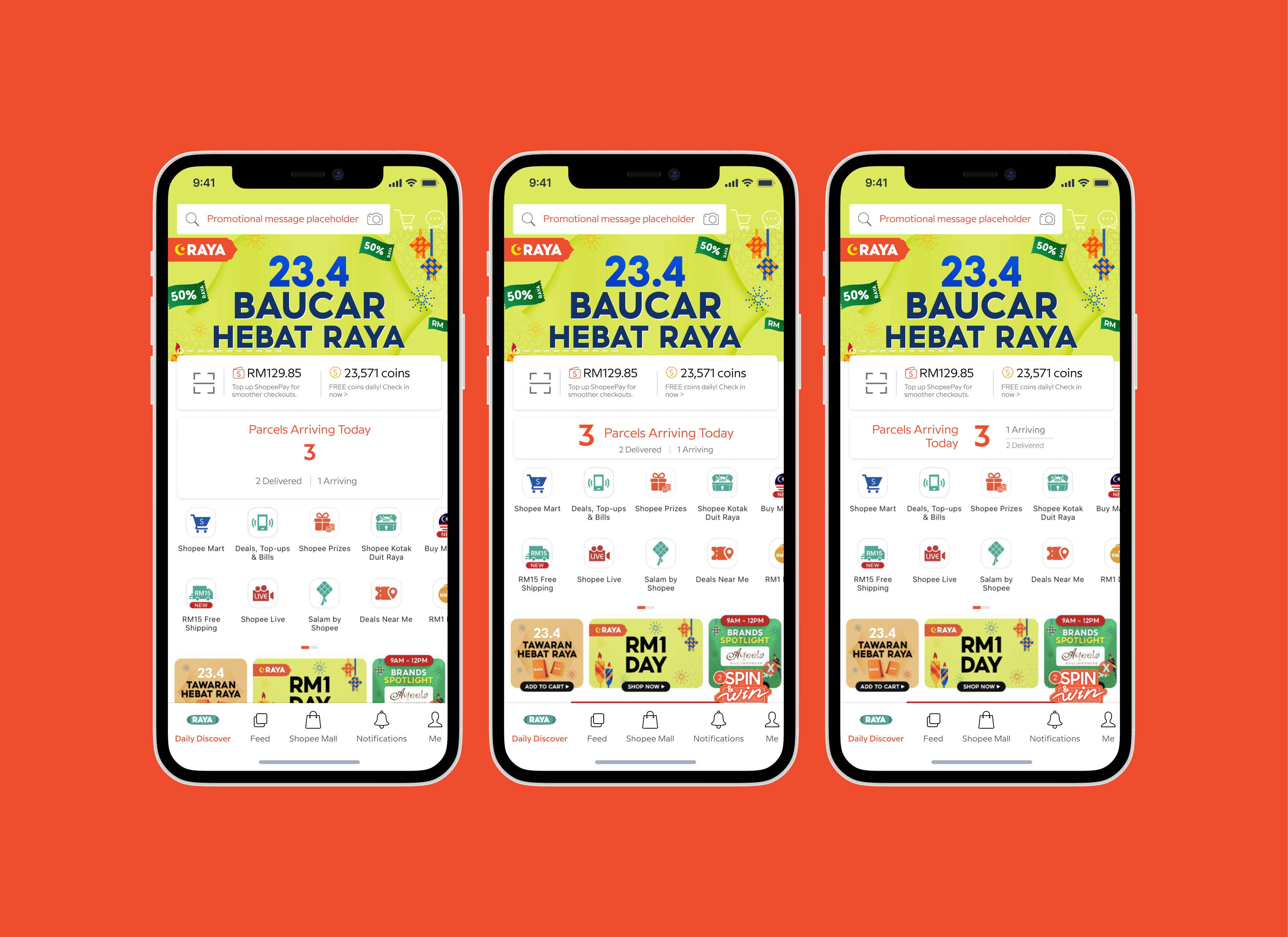
Parcels Arriving Today: Let users find out at a glance directly on the home page if there’s any parcel arriving today.
Save For Later: Add a “Saved For Later” tab in Cart to help users keep their to-buy-now and to-buy-later separate, helping them keep their carts organised.
Product Q&A: Provide publicly available information that users need to make purchase decision: warranty, warranty claim, expiry date, etc.
Shopee Lite: Be inclusive. Support casual users’ lifestyle with the benefit of convenience, at the cost of less savings, with simplicity at its core.
I’ll just be showing the first proposal here – Parcels Arriving Today.
Block Diagram
I started with the lowest fidelity – blocking out what should be on the page. I did this using Figma.

Hand-Sketching
Next, I added more details by hand-sketching just to quickly explore what need to be on the pages and possible layouts. I identified the core challenge of the page, then thought about what the user needs to do most on the page. I started adding things that would support what the user needed to do most on the page.

Wireframe
From the hand-sketching I picked the ones that felt best and created a wireframe using Figma. Wireframes are used to explore lots of ideas and get lots of feedback on page structure, feature, functionality, and content. That’s the reason it’s in greyscale – to remove the distraction of visual design.
Wireframes should cover all states such as empty and error states. In this example, the empty state would hide the new Parcels Arriving Today section, so I’ll just simply state it here. I have another more complex example which I will not show here for the sake of length. Do email me if you’d like to see it!
As I created the wireframes, the 3rd option came to mind and I added it in.

Mockup
Once the wireframes are finalised, they are then handed off to the Developers to build and also to Visual Designers, who will dial up the fidelity one last time by creating mockups. They add colours, fonts, spacing, and all the other pretty things to make the visual experience awesome.
I did just these few screens to liven up this post!

Next Steps
If this were a real project, the implemented solutions will be measured against success metrics defined beforehand. UX design is part science and part art. As with everything science, the results need to be measured and validated to determine the success of the solutions.
The solutions are further refined until the desired outcome is achieved.
But because this is just a case study, I’ll say that this project is done and thanks for reading!
You can reach me at [email protected] if you want to know more simply wanna chat!
References: