A collection of handy tips to help improve your designs instantly.
When creating efficient, and beautiful UIs for your next project sometimes it takes only the smallest adjustments to help quickly improve the designs you’re trying to create.
Just simple tweaks is sometimes all it takes to produce something that your clients, users, and yourself are truly happy with.
In this article I’ve put together a small, and easy to put into practice selection of micro-tips that can, with little effort, help improve both your designs, and the user experience.
Quick Note: Want even more UI & UX Micro-Tips? Then check out my previous article here.
Let’s dive on in…

Letter
1. It’s perfectly OK to use purely decorative elements from time to time.

Yes. The majority of text content on the screen should adhere to usability best practices. No questions asked.
But. There are times when you want to add text purely for decorative purposes, and that’s all good. We don’t want all of our designs falling into the realms of bland-land.
It’s perfectly fine to pop in the odd element purely for decorative reasons, and not have it adhere to accessibility standards… as long as not having that element there at all would affect the user experience in any way.
Live a little.
2. Make elements in your UIs distinguishable from one another.

Buttons. Notifications. Two separate, but important elements in your UIs.
If you can, always try and make sure that your users can tell them apart quickly, and easily when scanning your site or app.
Buttons, in most cases will take priority, so make sure they’re the most prominent item on the screen, and are easily distinguished between other elements (ie; notifications).
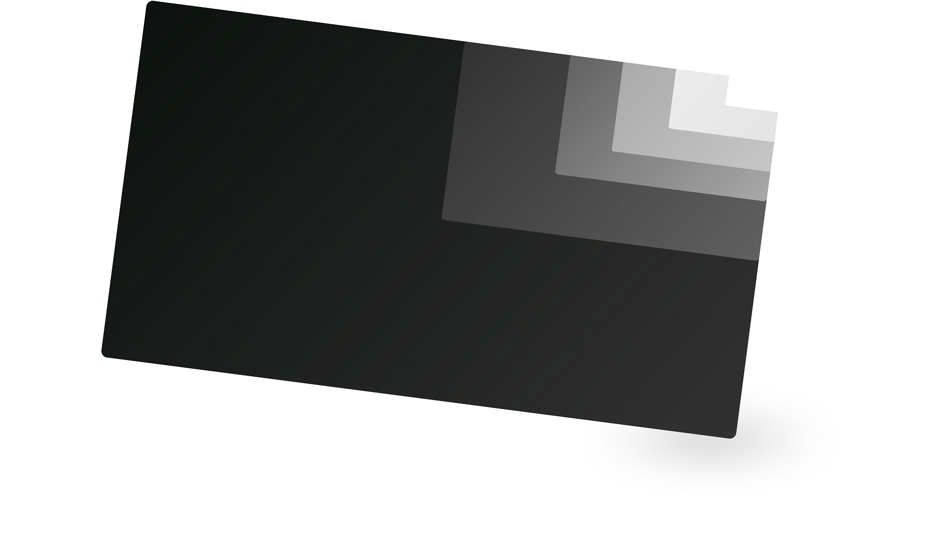
3. Just subtle amounts of shadow are all you need.

We all love a good drop-shadow right?
They can serve as subtle, but powerful visual cues within your designs when used in moderation.
But. Subtlety is the name of the game here.
Shadows in the real world are, the majority of the time, almost unnoticeable and so you should mimic this kind of behaviour in your UIs.
Lay off the heavy, and dark shadows, and dial down the opacity to achieve something a little more subtle and lifelike.
4. Using All Caps? Choose a font suitable to achieve optical clarity.

Using All Caps in moderation within your designs is all good in the hood.
Applying All Caps to certain text elements can help you achieve some variety and contrast between other text elements in your design and enhance the overall visuals you’re trying to present.
If you do decide to style things up with a handy dose of All Caps, try and make sure you choose a suitable Typeface with a tall x-height, and in a heavier font weight to enable optical clarity for the user.
5. Make Breadcrumbs stand out and easy to interpret for the user.

Breadcrumbs, breadcrumbs everywhere.
Used frequently on content-heavy sites, but not always shown the love they deserve.
With the smallest of tweaks, you can make sure that the user can easily pinpoint where they are in a site, and where else they may need to go.
This is especially useful if they’ve jumped to somewhere deep in a site via the use of Search for example.
Always try and make sure that the last item in the chain is visually different from the rest of the items, and the links, well, try and make them look like so.
Give breadcrumbs some love.
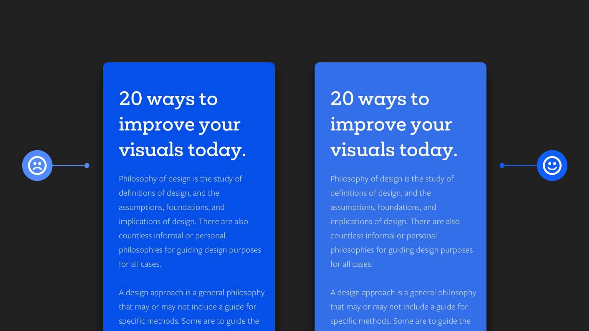
6. Using highly saturated colours? Try and tone things down with a Tint or Shade.

Highly saturated colours (brilliant blues, reds, greens etc…) can look great on a site, but when overused they can be tiring for the users eyes, especially when used with text-heavy content.
Use them in moderation when you can, and try to combine with muted colours (a tint or shade variant) of the saturated colour to avoid that dreaded eye fatigue.
Using this method can also direct attention to the saturated colour, and make the most important content front and center, with the more muted colours taking a less prominent role and giving your user’s eyes a little rest.
Look after those optics people.
I hope with this handy collection of UI & UX micro-tips you’ve gained a little more understanding on how the smallest tweaks to your designs can produce a much better end-result for both yourself, and your users.
Did you know you can create amazing UIs easier, and faster with my Design System; Cabana for Sketch & Cabana for Figma. Special Offer: Please use the code CABANA30 to receive 30% OFF. ENDING SOON!
Originally published at marcandrew.me on February 4th, 2021.