A collection of 6 amazing tips to help improve your designs instantly
When creating efficient, accessible, and beautiful UIs for your projects sometimes it takes only the smallest of adjustments to help quickly improve the designs you’re trying to create.
In this follow-up article I’ve put together another selection of easy to put into practice micro-tips that can, with little effort, help improve both your designs, and the user experience.
Quick Note: Want even more UI & UX Micro-Tips? Then check out my previous article here.
Let’s dive on in…
1. Use established icons in your UIs to avoid confusion for the user.

When adding icons to your designs always try and choose an established icon that clearly represents the action that is about to be taken.
Choose an icon that conveys the correct meaning and functionality, as anything else just invites confusion and becomes a cognitive obstacle for the user.
Don’t be too rebellious with those icons.
2. Use Proximity to signal relationships between elements.

Among the many tried, and tested Design Principles available (Contrast, Space, Repetition etc…) there is one that is key in helping you produce clearer UIs for your users…
Proximity.
Proximity is simply the process of ensuring related design elements are placed together, signalling a relationship between one another, which in turn helps speed up the user’s cognition when scanning through your Site or App.
3. 4pt Baseline Grid + 8pt Grid = Harmonious Vertical Rhythm.

When working with Type, using a 4pt Baseline alongside the ever-versatile 8pt Grid can bring a much more harmonious vertical rhythm to your designs.
You simply need to align your type to a Baseline Grid of 4, using a line-height value that is a multiple of 4 (16, 20, 24, 28 etc…)
Why 4? Well, for me personally, I’ve found that scaling in multiples of 8 in the past is just not as versatile when working with certain text sizes.
4pt Baseline Grid + 8pt Grid = Sweet Vertical Harmony.
4. It’s all good to reduce the line-height on your Headings.

As opposed to long-form body text which needs ample line-height for increased legibility, headings are usually much shorter, so you can ease back on the spacing a little.
The recommended line-height for headings is usually around 1 to 1.3 times the size of the text, and the larger you go, well, the less line-height you need to add to the mix.
Go line-height-light with your Headings.
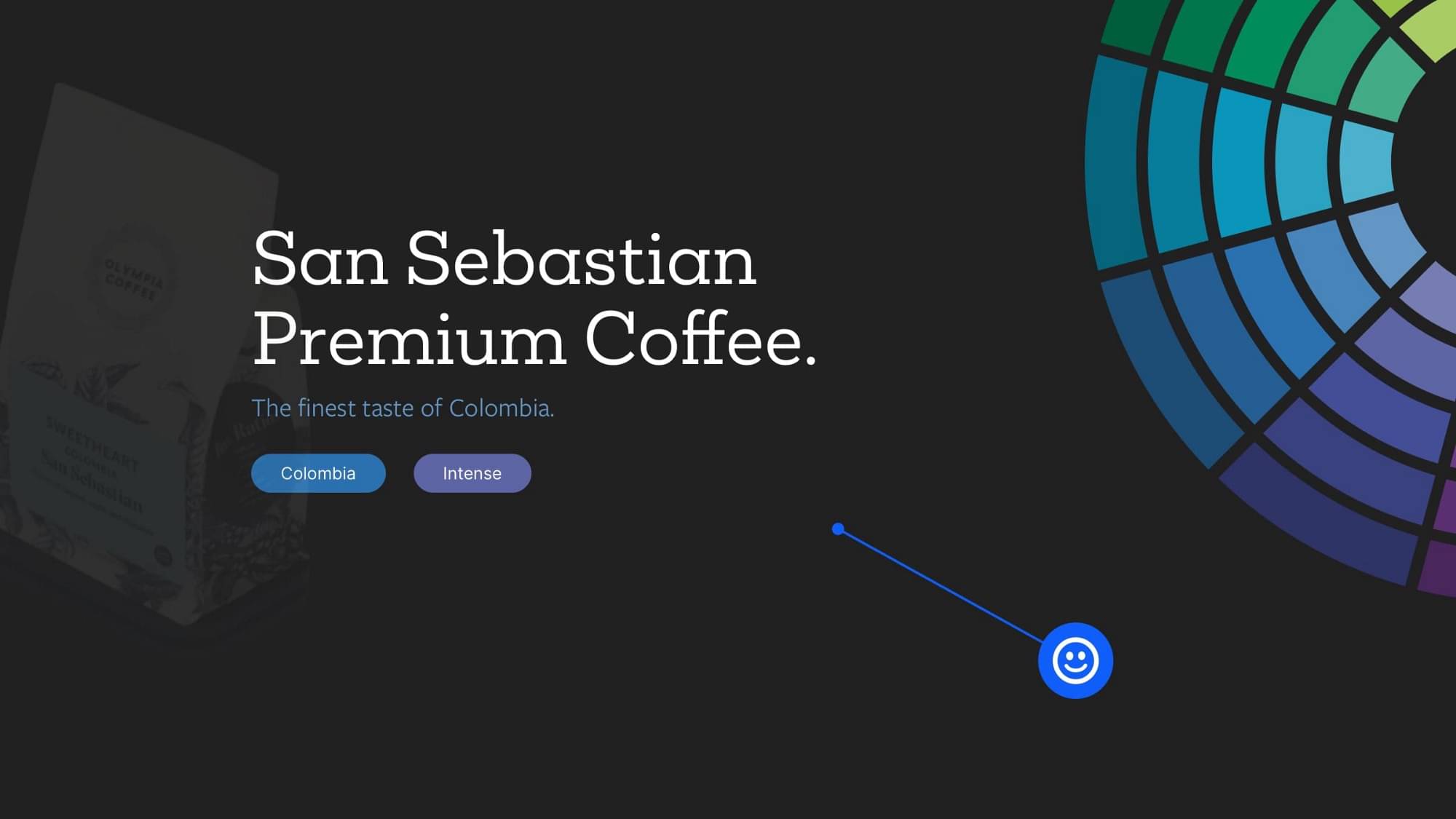
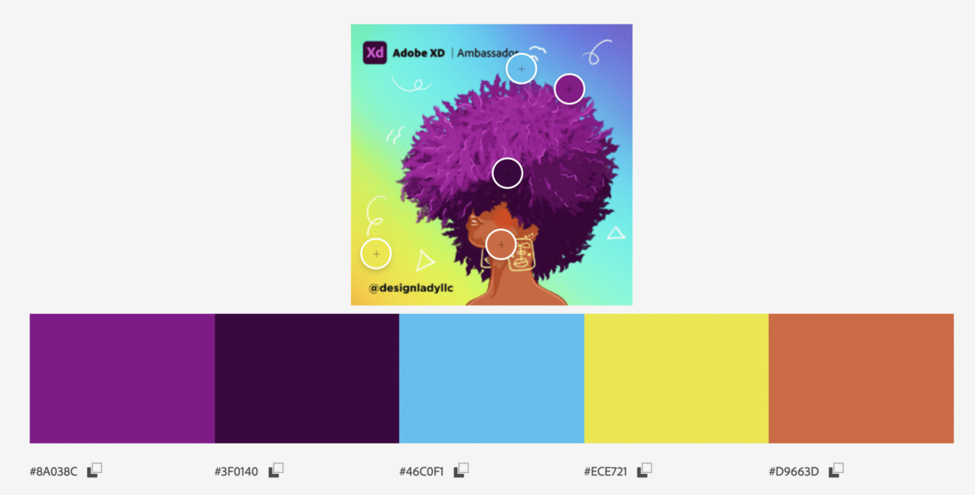
5. Having trouble picking a colour scheme? Go Analogous on the Colour Wheel.

Analogous colours, also referred to as adjacent or neighbouring hues, are among the most harmonious of colour schemes, and can help you greatly if you’re having trouble picking colours that play together nicely.
A set of adjoining hues consisting of primary, secondary, and tertiarycolours can help you create a simple, bulletproof colour scheme quickly.
Go Analogous when you need to bring colour harmony into the mix… fast.
6. Try and maximise the Signal-to-Noise ratio in your designs.

Clarity, and usability within your designs can be achieved by maximising the signal, and minimising the noise, which in-turn produces a high signal-to-noise ratio.
You can accomplish this by making sure that relevant information (signal) is presented efficiently, and irrelevant information (noise) is reduced or removed completely.
Cut out the fluff. Make things clearer. Increase your signal-to-noise ratio.
I hope with this short collection of UI & UX micro-tips you’ve gained a little more understanding on how the smallest of tweaks to your designs can produce a much better end-result for both yourself, and your users.
By the way, did you know you can create stunning UIs easier, and faster with my Design System; Cabana for Sketch & Cabana for Figma. Special Offer: Please use the code CABANA30 to receive 30% OFF. ENDING SOON!
Originally published at marcandrew.me on February 17th, 2021.


