How economic globalization, generational transition, and technology converge to flatten the consumer experience
Do you ever get the feeling that everything around you looks the same?
Interior spaces
Consumer brands
Cars
Restaurant menus
Apps
Websites
Across every consumer category, variety and originality have given way to monotony and conformity.
A triple threat of economic globalization, generational transition, and new technology has flattened the aesthetics of our digital and physical lives.
What are the origins of these regressive trends? Why do they matter? And what can founders, marketers, and creators do to stand out amid a sea of sameness?
The “Airbnb-ification” of interior aesthetics
In his 2016 story for The Verge titled “Welcome to Airspace: How Silicon Valley helps spread the same sterile aesthetic across the world,” Kyle Chayka revealed the banal consequences of Airbnb’s rapid rise. Playing on the company’s name, he called the phenomenon AirSpace:
“It’s the realm of coffee shops, bars, startup offices, and co-live/work spaces that share the same hallmarks everywhere you go: a profusion of symbols of comfort and quality, at least to a certain connoisseurial mindset. Minimalist furniture. Craft beer and avocado toast. Reclaimed wood. Industrial lighting. Cortados. Fast internet. The homogeneity of these spaces means that traveling between them is frictionless, a value that Silicon Valley prizes.”
The 2007 introduction of the iPhone opened the door to the social web, transforming our digital lives. By the time Chayka wrote his story in 2016, those technologies were reshaping our physical spaces, too — at global scale.
When Airbnb launched in 2008, it sold itself as a new way to travel, allowing users to experience cities how locals do. It was about human connection and authenticity. But it wasn’t long before a creeping sameness set in:
The same generically tasteful furniture
The same succulents and monstera plants
The same Nespresso coffee makers

From Brooklyn to Mexico City to Tokyo, interior spaces became interchangeable. As Chakya wrote:
“As an affluent, self-selecting group of people move through spaces linked by technology, particular sensibilities spread, and these small pockets of geography grow to resemble one another.”
Ironically, Airbnb’s original promise of a differentiated travel experience was neutered by the defining qualities of the hotel industry it aimed to disrupt:
Expectation
Comfort
Stability
Convenience
The social web smoothed the rough edges of taste, substituting idiosyncratic local charm for blank placelessness — a bellwether for a broader trend to come.
Blanding
Chayka’s articulation of AirSpace was prescient, but the term never quite caught on.
A different one did: Blanding.
Blanding is the copy-paste model of consumer product development and brand marketing that follows repetitive patterns in the name of modernity but at the expense of authenticity and originality.
The last decade saw an explosion of new direct-to-consumer brands gain mindshare and wallet share, especially among the millennial set. Think Casper mattresses, Away luggage, and Warby Parker eyewear.
Fueled by the internet’s democratization of ad targeting, a newly-employed generation of young people with disposable income, and a steady flow of venture capital investment, a class of insurgent startups barged its way into markets previously dominated by a small group of legacy corporations.
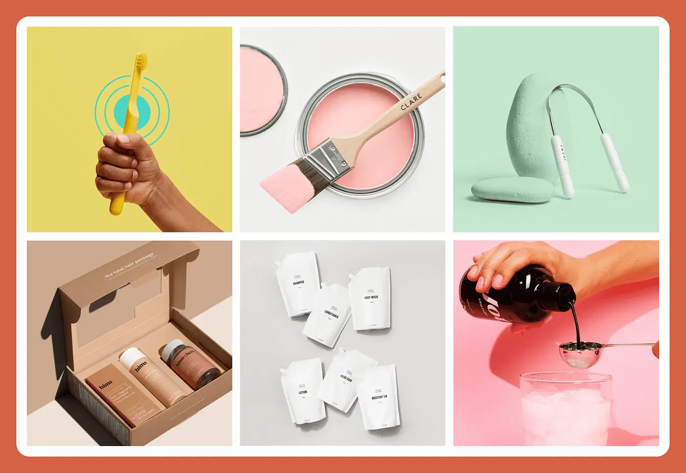
But their disruption quickly gave way to the sanitized agreeableness of blanding.
As Ben Schott wrote in Bloomberg Opinion:
“All startups seek to disrupt and disintermediate a smug status quo, or originate and dominate an entirely new niche. But what makes a brand a bland is duality: claiming simultaneously to be unique in product, groundbreaking in purpose, and singular in delivery, while slavishly obeying an identikit formula of business model, look and feel, and tone of voice.”
The hallmarks of blanding
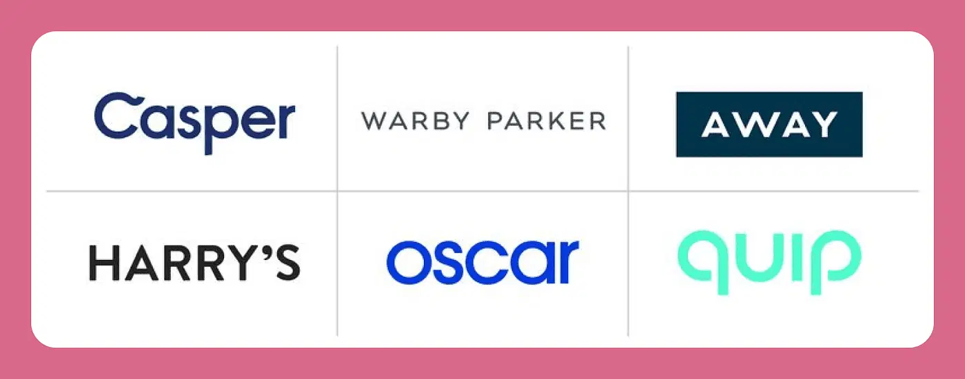
Chasing the same valuable millennial demo, many direct-to-consumer brands followed a turnkey pattern:
Underdog positioning — “We’re not like the corporate giants.”
Human-centered stories — “We started this company in our dorm room.”
Mission-driven messaging — “We’re fighting the good fight for you.”
Aspirational narratives — “We’re making luxury approachable.”
Chummy tone of voice — “Hi, friend!”
They abided by the same aesthetic conventions:
Sans-serif fonts
Ultra-clean lines
Bright but limited color palettes
Flat-lay product shots
Even their names were paint-by-numbers:
Human characters — Judy, Floyd, Billie
Colors and nouns — Blue Apron, Purple Carrot, Green Chef
Generic monoliths — Public Goods, Modern Citizen, Ministry of Supply
Ampersands — Tuft & Needle, Frank & Oak, Mizzen & Main
These prefabricated brand signifiers combined to give us what we now know as the “millennial aesthetic,” a blueprint designed to entice Instagram-obsessed young people.
Blanding 2.0: The post-millennial aesthetic
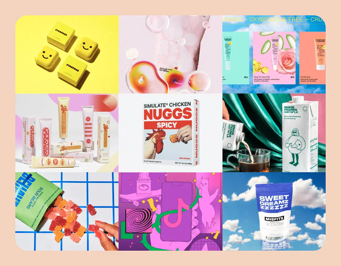
Alas, the millennial aesthetic that defined the past decade is showing its age. Some are even declaring it officially “over.” Or worse: cheugy.
But blanding isn’t dead. It’s just evolving. And Gen Z is setting the template for blanding 2.0, an explicit rejection of the previous generation’s conventions but familiar nonetheless.
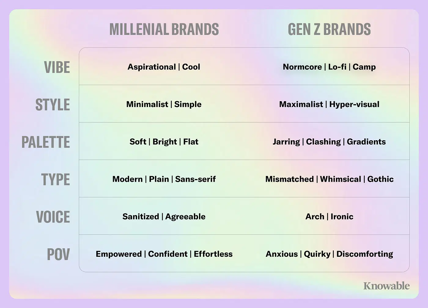
The more things change, the more they stay the same.
Blanding is everywhere
The scourge of blanding isn’t limited to Airbnbs and direct-to-consumer products. You can find examples across every consumer category.
Fashion
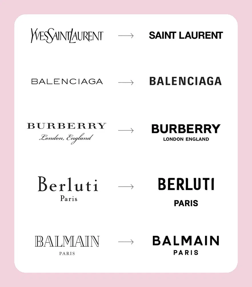
Seemingly all at once, the world’s biggest luxury fashion brands replaced their charmingly unique logos with nearly identical semi-bold, sans-serif, all-caps wordmarks. Squint, and you can hardly tell the difference.
Cars
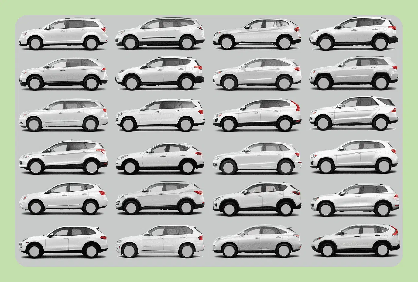
A 2021 Road & Track article titled “Why does every new car look like every other new car?” compares the form factors of midsize SUVs from 24 manufacturers. Despite a wide range of price points, they’re more alike than they are different:
The same right angle-eschewing silhouettes
The same tiny rear quarter windows
The same chrome-heavy accents
The same emphasis on statement-making front grilles
Websites
Website design, especially for SaaS companies, is depressingly mundane:
Top-left corner logo placement
H1 and H2 on one side
Exaggerated flat character illustrations on the other side
Or just take a look at the landing pages of these four subscription media products — slightly different conventions than SaaS products but indistinguishable nonetheless.

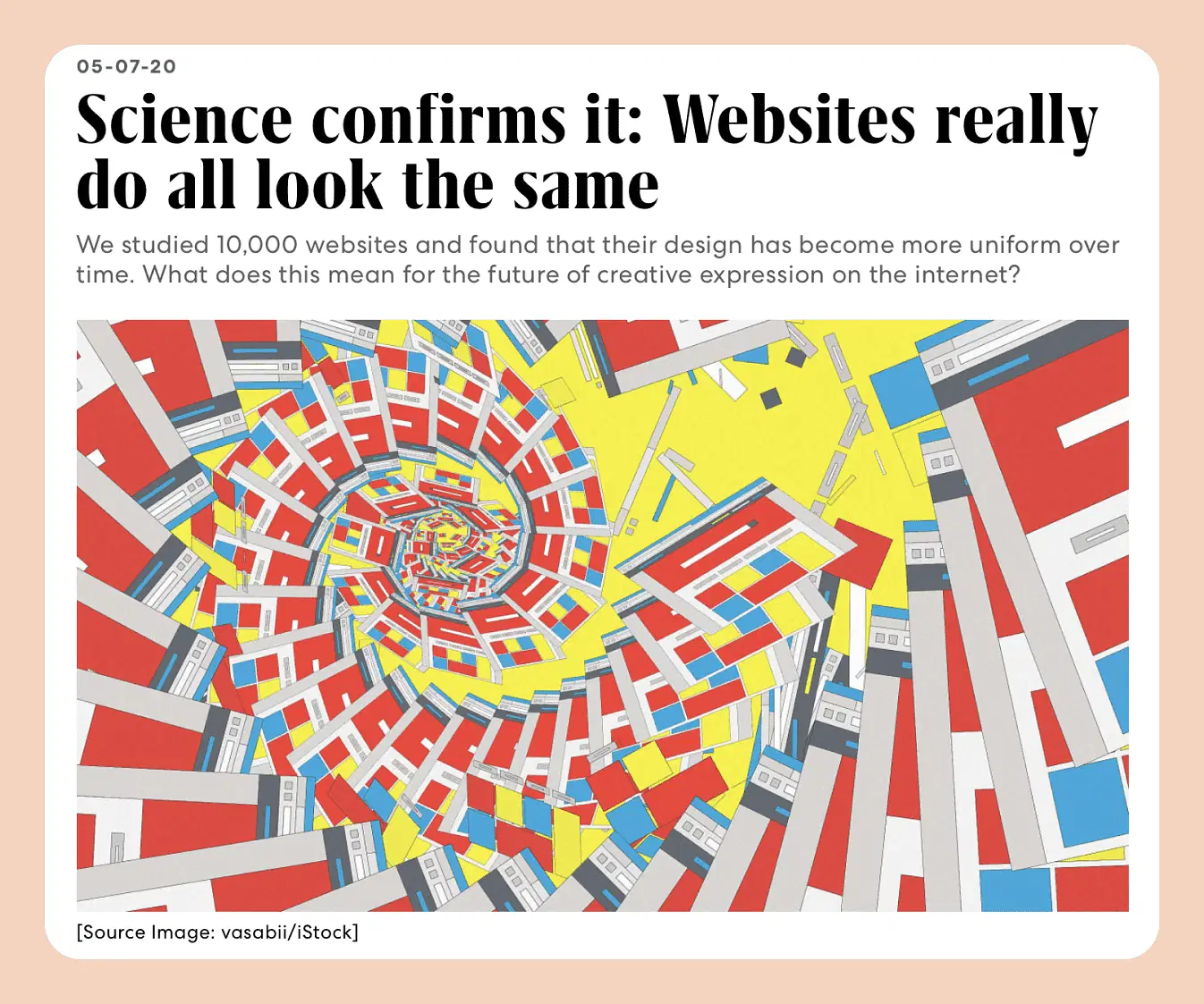
This suppression of creativity in web design has even been confirmed by science.
Restaurant menus
When you’re endlessly scrolling DoorDash or UberEats, do you ever get a feeling of déjà vu?
The same menu options
The same food photos
The same restaurant addresses
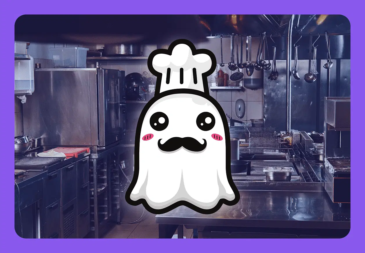
On-demand food delivery has given rise to ghost kitchens and virtual restaurants. Digital-native restaurateurs can now use the same chefs, facilities, ingredients, and packaging to fulfill orders for multiple “restaurants” simultaneously. So whether tonight’s dinner comes from Wings and Things, Wings Plus, or Hot Wings Cafe, you’re getting the same food, in the same container, from the same kitchen.
Video streaming apps
In 2013, Netflix’s Ted Sarandos famously told GQ:
“The goal is to become HBO faster than HBO can become us.”
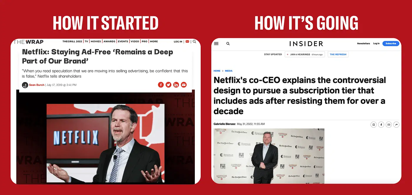
When it launched its streaming service, Netflix offered two key value propositions that differentiated it from every other market player:
Binge watching
No ads
Its aversion to ads was baked into the culture from square one. As CEO Reed Hastings said in a 2019 earnings call:
“We want to be the safe respite where you can explore, you can get stimulated, have fun and enjoy — and have none of the controversy around exploiting users with advertising.”
Never say never.
Facing increased competition from new streaming players like HBOMax, Netflix is abandoning its two core tenets by introducing an ad-supported tier and reportedly considering a traditional weekly release schedule for some of its shows.
So, yes, Netflix is becoming like HBO — just not in the ways Sarandos probably imagined back in 2013.
Social apps
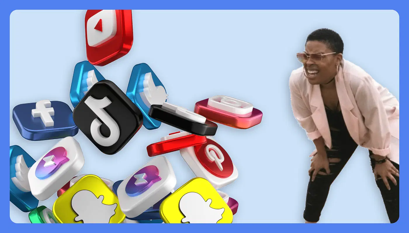
The world’s biggest social media apps are becoming more alike than different — often by brazenly copying the competition’s features. Meta’s Instagram is the prime culprit:
In 2016, it introduced Stories — a clone of Snapchat’s defining format.
In 2019, it introduced Reels, a direct response to the rise of TikTok.
This year, it introduced Dual, a facsimile of BeReal’s hot new two-way photo format.
But Meta isn’t the only guilty party:
In 2018, YouTube introduced its own Stories format, and in 2020 it introduced Shorts, a direct TikTok competitor.
On the heels of Clubhouse’s ascent in 2020, Twitter (Spaces), Reddit (Talk), and Spotify (Greenroom) all introduced similar social audio products.
This year, TikTok introduced Snapchat-like ephemeral posts.
These examples are just the tip of the iceberg. The lines between social apps will continue to blur long into the future.
The causes of blanding
The social web
Blanding has infected nearly every aspect of the modern consumer experience. And it’s not by chance that its rise parallels social media’s.
Algorithms haven’t just reshaped the way we consume content. They’ve insidiously retrained us to want the same things, flattening taste and desire like pancakes. As Chayka wrote:
“If taste is globalized, then the logical endpoint is a world in which aesthetic diversity decreases. It resembles a kind of gentrification.”
Lack of diversity in venture capital
It’s also no coincidence that the “disruptive” companies most responsible for the creep of global monotony are funded by a relatively small cohort of Silicon Valley venture capitalists. VCs are known for “pattern matching,” a method of reasoning by analogy when evaluating early-stage companies for investment. With few measurable criteria upon which to judge a startup, they instead look for familiar patterns from the market or their own experiences as indicators of potential success. Unfortunately, this methodology results in an extreme lack of diversity across the industry. Venture-backed founders are disproportionately similar demographically:
Race
Gender
Education
Socioeconomic background
Geography
When the capital that drives innovation comes from and goes to a homogenous population with a relatively narrow shared worldview, it should come as no surprise that its outputs are so alike.
Industry-specific factors
There are functional, industry-specific factors that impose uniformity, too:
Interior design and aesthetics — People crave comfort, convenience, and familiarity while away from home.
Automotive design — Form is secondary to function, and the laws of aerodynamics are immutable. Silhouettes share similarities for the sake of fuel efficiency and low manufacturing costs.
Websites — Decades of UX A/B testing have resulted in a narrow set of conventions based on empirical user data. And user-friendly design tools like Canva and Squarespace have templatized much of the internet.
Restaurant menus — On-demand delivery apps have transformed the industry by drastically reducing startup costs and enabling entrepreneurs to build multiple parallel brands using the same back-of-house resources.
Social media apps — When a few players compete for the world’s finite attention, conformity is inevitable.
Anti-bland products
Two recent products demonstrate the competitive advantage of resistance to blanding.
Liquid Death
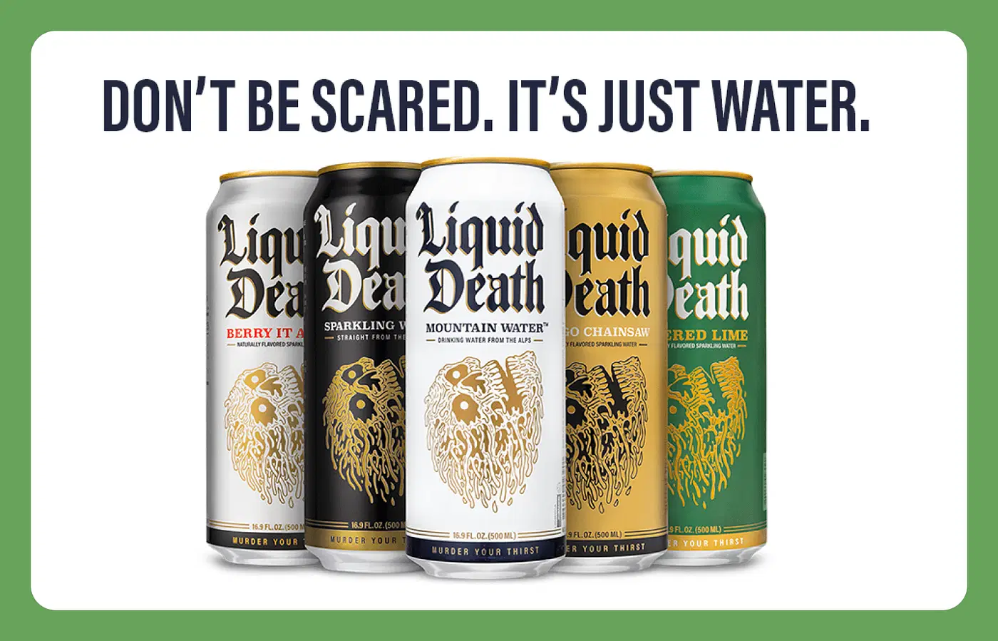
Until recently, the grocery store bottled water aisle was dominated by indistinguishable brands. Clear plastic bottles, soft blues, and images of mountains and streams as far as the eye could see.
Enter Liquid Death: a brand that zigs hard against the category’s tired zags. Death metal-inspired graphic design. Hyper-aggressive copywriting. And aluminum tallboy packaging that begs for a brown paper bag.
It’s undeniably and unapologetically different. It’s also one of the fastest-growing non-alcoholic beverage brands in recent history, achieving a $700m valuation in less than five years.
Tesla Cybertruck
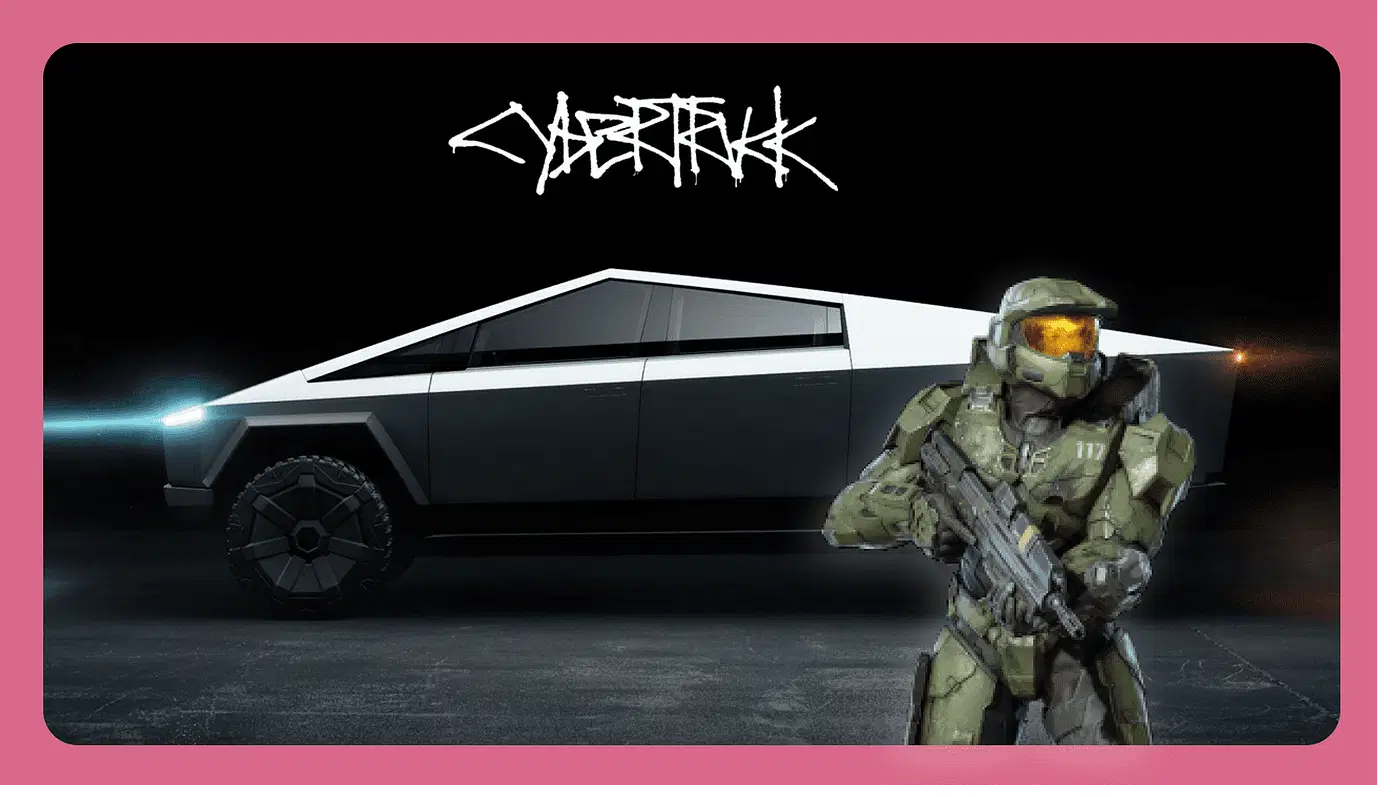
Although it doesn’t go into production until 2023, the Tesla Cybertruck is one of the most talked-about vehicles in the world today. That’s thanks to a form factor unlike anything the market has ever seen. Its designers abandoned every conceivable convention to build something entirely new. Halo’s Master Chief would be proud.
Time will tell if the final product lives up to the hype, but with more than one million units reportedly pre-ordered (5x more than Tesla’s Model 3), it’s already a serious contender.
The case for blanding and pattern matching
Of course, there’s a business case for following proven formulas:
Cost reduction — It’s less expensive to build using existing tools.
Speed — For startups, time is the most precious resource. It’s faster to follow established patterns than to create entirely new ones.
Risk mitigation — There’s safety in pursuing ideas already validated by the market.
Consumer expectation — Radical innovation often comes with a steep learning curve. It’s easier to satisfy customers by giving them something familiar.
These are conventional wisdoms, not universal truths.
And some rules are made to be broken.
Why business success hinges on differentiation
Real-time paradigm shifts like no-code, cloud computing, drop shipping, AI, and remote work are democratizing entrepreneurship in unprecedented ways.
Long protected by gatekeepers, the means of production, promotion, and distribution are now freely available to anyone with a laptop.
Today, one person with no business or product experience can do what would have taken a team of highly-trained people just a few years ago — in less time, for a fraction of the cost.
That means more crowded markets, more intense competition, and more value placed on uniqueness, or what VCs call “alpha.” Adamant Ventures founder Jason Yeh defines alpha as:
“The value awarded for being a category creator, disrupting an industry, or emerging as a market leader. Without alpha, your startup is at best an ‘also-ran’ or more likely a failure…To generate alpha in startups, you have to be able to beat the market so to speak. The market has produced all that it thinks it needs, but you disagree. You believe there is an opportunity to produce something outside of what’s expected. And, when you’re correct you’ll be rewarded.”
Submission to blanding’s gravitational pull signals to the market and investors that a business lacks the competitive edge needed to win.
In business, it rarely makes sense to reinvent the wheel completely.
But now more than ever, identifying your points of differentiation — your alpha — is critical.
For more insights like these, get the Knowable app and join 40,000+ founders, creators, and everyday go-getters building new skills and fueling their ambitions with audio lessons on business, startups, self-improvement, and more from the world’s smartest people. Find it in the App Store and on Google Play.
Enter promo code prototypr at https://knowable.fyi/subscribe for 50% off an annual membership! (codes are only redeemable on the web) 🤩🤩🤩
