We all need to get past the initial learning curve with any new product. But what can designers do to make their own product easy to learn? Read on to find out!
Learnability is what makes apps so easy to use. It’s what helps users through those awkward few moments where they meet a brand new interface and have to figure out how to do what they need to do. Today, people’s standards for usability and UX design are high – so how much effort are users willing to invest in learning to use your product?
As it turns out, that willingness to make an effort can vary a lot depending on what the product is and who the main users are. How easy it is to use your product will surely depend on what it does, right? Not quite.
There are a lot of things designers can do to help users get past that discovery phase and on to what really matters: enjoying the product. Let’s see what those are! We’ve also got some great learnability examples, so keep your prototyping tool at hand in case you feel a rush of inspiration.
What is learnability?
Learnability may sound like one’s ability to learn – but when it comes to UX design, it refers to how easily your product can be learned. The whole concept goes back to Nielsen’s Usability Heuristics, which are known for representing high standards as far as to what makes a usable product design.
This particular heuristic is all about how much time and effort users have to dedicate to learning their way around the product. Upon first encounter, we all have to get past a certain learning curve in order to truly understand and be able to use anything.
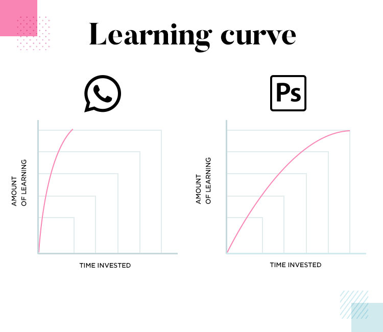
Some products have a wide array of features and functions, coming with a long learning curve. Good examples include Photoshop or Microsoft Excel – both of which have been known to make new users sweat at even the smallest task. Other products are simpler in nature, and offer a more straightforward feature that can be learned easily and quickly, like Whatsapp.
So if the learnability depends on the features and nature of the product, why do we need to lose sleep over it? Does every product come with a given learning curve? Yes, but having a complex product doesn’t mean there’s nothing you can do to help users. Improving the learnability of the product isn’t about cutting corners, it’s about getting users to the finish line with their excitement intact.
Designers everywhere should be concerned with shortening that learning curve as much as possible and helping users get to a point where they can enjoy the product in all its glory. It’s about using certain techniques to provide information and context, so that the user doesn’t need to discover the product by trial-and-error.
But before we get into how designers can do any of that, we need to cover some basic but crucial concepts that play a part in the learnability dance.
Why learnability matters: app retention and abandonment
Learnability is one of the most important usability heuristics out there, because it will influence how many people abandon your product or stick with it. These two key concepts are app retention and app abandonment, and they can have a huge impact on the ultimate success of your app.
App retention
The classic way to look at your app retention rate is how many users have kept your app after downloading and launching it in a certain time frame. Say, in the first month of your app, a total of 20 people download it. By the end of that month, only 5 kept your app on their devices. That means that your retention rate for that month is 25%. It’s a simple equation that can tell you a lot about the general direction your app is heading, and signify any changes in the health of the product.
It can be incredibly challenging to move your retention rate in the right direction. It’s hard-earned progress that comes through careful testing, designing, testing some more and careful implementation.
When looking at your retention rate at any given moment, the main concern should be answering the question: why are people leaving? This takes us to the other side of the same coin – the abandonment issues, if you will.
App abandonment
What drives users to abandon products? Usually, one wants to be sure that crucial areas of the UX design are properly tested and up to usability standards before even coding, like navigation design or the information architecture. Logically, if people can’t dive deep into your product because navigation fails at a point in the experience, they’ll abandon the whole thing.
That’s why you want to cover all your bases in the usability testing stage of the product. With that said, there could be other, more subtle, issues that might be driving users away. That’s why close inspection of your abandonment rate in analytics is crucial.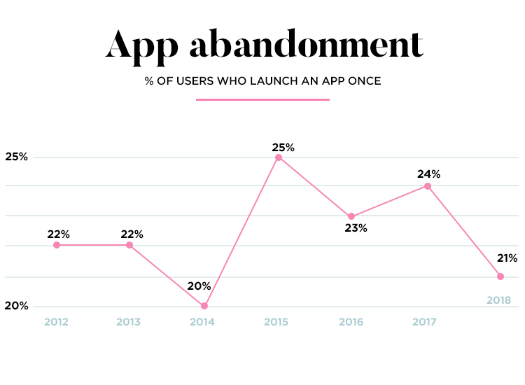
Think of the data on your abandonment rate as an illustration of a funnel. The funnel itself is your app, and inside it are all the users that have given it a chance. At first, we have large volumes at the wide top of the funnel – these are all the users who download and launch the app.
With each potentially problematic area in the design that causes users to abandon the app, comes a hole in the funnel. These little holes cause your funnel to leak, with more and more users leaving and never getting to the bottom of the funnel – which means that very few users get past the learning curve.
The analytical data gives you a little red light, which you can and should investigate fully. Armed with solid data, your team can go on to patch up any holes in the design or in the experience.
The learning curve
So what do we mean exactly when we refer to a “learning curve”? In the classic sense, a learning curve is a result we can obtain from a learning experiment.
Originally created by Hermann Ebbinghaus back in the 1800’s, it was thought up to represent how difficult it is for people to learn a task. The experiment itself is simple: a person does the same task several times while we measure how long it takes them to complete the task each time. Back then, it was about understanding the human brain. Today, we use the same concept to understand the task.
That’s why complex products have a longer learning curve. Users need to do the same task or tasks many times before they learn to do them quickly and naturally. Easy products, like the Whatsapp example from earlier, require users to do tasks once, perhaps twice before they get the hang of it.
So how can we make that learning curve shorter? Truly, in shortening the learning curve we are improving the learnability of the product.
Learnability in UX: best practices
1. Onboarding is a must
What makes a good onboarding experience? We dove deep into what it is and how designers can get it right in our post: 12 tips for onboarding experiences. In broad strokes, you want the onboarding experience to both introduce the user to the ropes, while activating and engaging users. It’s about getting people invested and giving them a sense of success.
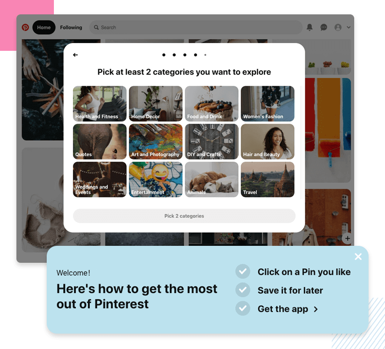
Firstly, don’t make it a wave of information. If it’s all work and no play, users might get bored, lose interest or simply feel intimidated. Instead of just throwing information at users, use the onboarding to check some of the following boxes:
- A snapshot of the benefits of the product: why should users invest their time and effort into learning it?
- A brief view of the features: show users the most crucial areas, creating good starting points for them to explore on their own.
- A task(s) that paves the way: walking users through a task gets them invested, gives a sense of accomplishment – encouraging users to stick around.
2. Tell a story
Turning your onboarding experience into a story can have huge benefits. It can make the information you share easier to understand and to remember, resulting in a product that people can pick up without too much effort.
The best thing is that you don’t even need to make it a long story with paragraphs that seem endless. Visual storytelling can make your product overall better, and represents a great opportunity to add impressive visuals to the design. It marks an opening for you to develop an on-brand onboarding experience that can enrich the entire product.
3. Be consistent. Be predictable.
UX design has plenty of margin for designers to get creative and add flare and personality to their work – but being predictable can earn you usability points.
It’s true that being consistent in UX design is important. Once users learn the meaning of an icon, they shouldn’t have to ever learn it again. That means that the visuals, copy, interactions and even animations need to be consistent throughout the entire product. This will help users remember their way around everything, as with each time they use the product it will grow more familiar to them.
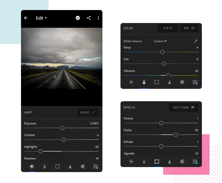
Consistency can become a problem when scaling design, such as a small app that grew overtime to offer more features and cater to more people. This was the issue folks over at Yelp ran into, and the driving force behind their bid for an efficient design system. You can read the full story on our meetup with Taron, PM at Yelp, on our post: flexibility and consistency at Yelp.
4. Look for ways to add context and additional information
With complex products that have lots of features, it can be worth considering adding more information for the user. Something people can read and use as a guide to the current screen of features. These little pieces of information can be divided into parts, so that the interface itself gives users important information, piece by piece, as they advance in the product.
Here is where a cool concept comes into play: progessive disclosure. It’s most commonly used when creating the information architecture of products – with that said, perhaps the best example of progressive disclosure out there is video games.

With intricate games where entire universes are built, giving users all the information at once would be overwhelming and ruin the initial experience. That’s why we feed users little pieces of information that they can apply to the screen at hand, so they can process through it all without losing their sanity. Little popups and help boxes around the interface slowly introduce the user to the rules of the game, and arms them with the knowledge they need in order to advance in the game on their own.
You want to apply this concept to the learnability of your design. It’s not always easy to conceal information in an interface, particularly so in minimalist designs where empty space is all but sacred. That’s why many products out there also make use of other ways to deliver helpful information to the user, such as sending users emails with information, tutorials and helpful videos and links.
5. Navigation design and information architecture are holy
In truth, your navigation design and information architecture (IA) are the backbone of your product. They make or break the user experience. Together, they make it possible for users to succeed in their goals, making the general structure of the entire platform logical and offering paths to the important corners.
However, when things go south in navigation or in the IA, you have yourself a real problem. People can’t learn their way around a structure that makes no sense, just like they can’t learn to use a feature they can’t reach due to a navigation error. These kinds of mistakes will make it impossible to understand the true dimension of your learning curve, straining data and creating massive holes in your funnel.
What we mean here is that before you start optimizing the learnability of the product, you want to make sure you have a solid base on which to build. The product needs to meet your usability standards. This way, you build a product with the goal of it being simple, logical and consistent from the start. Once it’s put together, it’s time to identify areas for improvement – which takes us to the next topic: testing the learnability of your design.
How to test the learnability of your product
As with everything in UX design, you want your decisions to be based on data rather than your own intuition. As a person who’s been involved in the project, the whole thing may seem simple and easy to learn in your eyes. But what about completely new users? What are the factors that make the learning process slower for users?
That’s where testing comes in. You’ll recognize a common factor among all these metrics. That is, that each metric needs a standard set by you and your team. This is true for most product testing, and works as a minimum grade – similar to that math passing grade that had some of us sweating back in high school. You set a standard, a line in the sand that says “anything beyond this point means a failure”. You can read more about the theory of testing and metrics on our guide to usability testing.
UX design KPIs
The KPIs are your key performance indicators. You can find KPIs in many sectors out there like general business management, marketing… and UX design. These pieces of data are a way for you to understand how people are reacting to the product design, as well as what areas of the product can be improved.
It’s a powerful window into the behavior of users, but it can often be an overwhelming topic to a newbie. There are lots of different types of data with every product, and knowing which ones you need to focus on or how to interpret the data you have at hand can be challenging. The topic of data analysis within UX design is worthy of its own post, but let’s go over some commonly used KPIs and how they could relate to your learnability optimization.
Task Success Rate
This KPI looks at things in a simple light. Each user has an objective when using any given product – a task they must accomplish. This KPI will look at every single little task in your app and ask: out of all users who tried, how many succeeded?
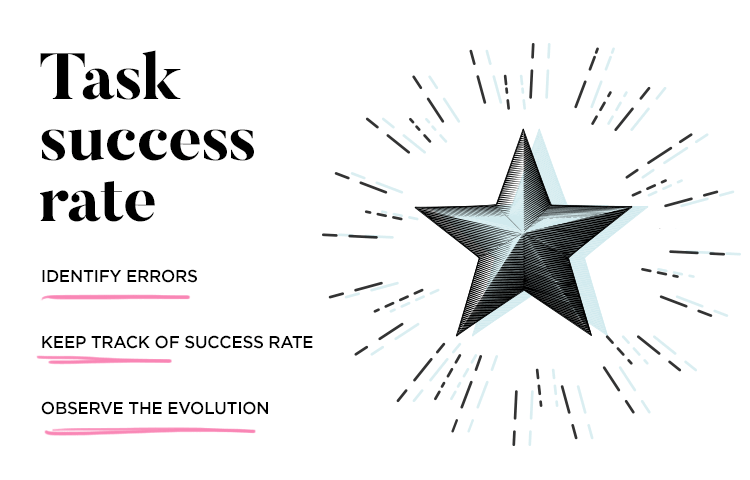
This is a simple number that won’t tell you the state of the product by itself, but it does serve a crucial purpose. In fact, try to always be mindful when looking at a single KPI – isolated pieces of data can be misleading. In this case, the success rate doesn’t tell us why users failed the task, but it’s a crucial flashing red light on our dashboard that something isn’t right in that task.
Aside from that, the success rate can also paint a picture when it comes to learnability. In this case, it’s important to track the success rate as well as the time on task of first-time users – and see how they evolve from there. Do users need to spend less time on tasks as they grow more familiar with the interface? Does the success rate improve quickly for new users?
Time on Task
Another way of taking a snapshot of the performance of the product is to look at how long do users need on the task at hand? Ideally, you don’t want them to take too long. Pauses and long times on any task can mean the user is confused, frustrated, trying hard to complete the task or simply lost.
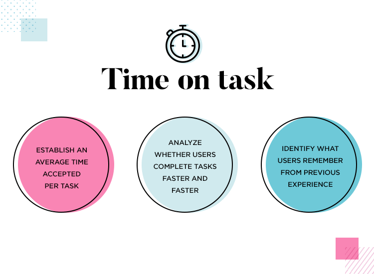
But how much time is too much time on the task? It’s a difficult question, because each product and each task will have their own standard. Some tasks will be simple and short, with nothing more than a couple of seconds being needed for completion. Other tasks, such as forms and tasks that consist of many other subtasks, can take a bit longer simply because of what the task is.
It’s up to you and your team to come to an agreement on what timeframes are acceptable for each task, and compare test results to your standards – use them as a reference point. From there, you can start tracking how user behaviour evolves from the first use. Remember the meaning behind the learning curve: do users complete tasks faster with each time they complete a task? Do they remember what to do from the previous experience?
Navigation vs. Search Bar
UX design has many faces and levels, with some websites being very hierarchical, holding large quantities of content – while other websites consist of one or two key screens. No matter the dimension, however, every website needs navigation. It’s not just about putting as many links as you can in the homepage, it’s about getting the user to where they need to go. It’s about making it easy to discover and make the most of the product.
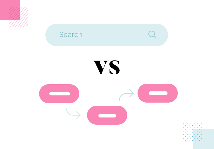
This metric is about validating your navigation design and information architecture. Usually, users will try to complete a task using the navigation. However, when that fails, the search bar is the second logical step. A high task completion via search bar can indicate some friction in the navigation, or perhaps larger problems with the architecture of pages.
In the learnability context, this metric can tell us how easily users can learn their way around the product. Do they remember their way after they completed the task with the navigation? How does this metric evolve over time?
Learnability examples: designs that got it right
1. Whatsapp
Whatsapp is one of those products that was originally made for mobile phones, taking mobile-first to a whole new level. Back in 2009, Whatsapp made history by making SMS a thing of the past. Today, it has evolved into a massive platform that hosts 1 billion daily active users. Logically, Whatsapp innovated the communications sector and made a huge difference for users.
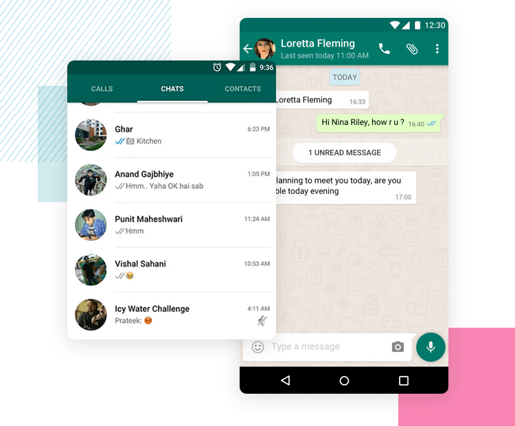
With that said, we firmly believe that its UI design contributed to that success. In fact, Whatsapp has changed little over the years. That could be due to a desire to not anger users who spend lots of time on the platform, who showed a negative reaction to even slight changes to the app back in 2019.
We believe that while many factors contributed to the success of Whatsapp, there’s no denying that the interface is intuitive, straightforward and easy to learn to use. The onboarding experience focuses on helping the user set up the account – taking the person through the roughest part by the hand. From there, people can easily find their contacts and start chatting.
2. Facebook
Facebook has an intuitive UI design that makes the most of the platform, letting users set up their account and letting them explore on their own. Most users flock over to set up their profile, liking pages and groups and finding friends. Regardless of how you feel about the entity, the UI Design does check some very good boxes.
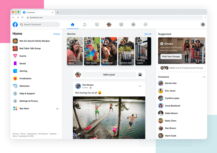
For example, even though the platform itself has quite a few features by now, it’s still easy to navigate – thanks to the two navigation bars. Together, they take users all around the platform, but let users focus on the main attraction: the scrolling through content on the homepage. It’s a simple concept in theory that can be complicated to implement – keeping things simple and easy to learn isn’t someone a designer can achieve on the first try!
3. Discord
Discord makes the most of taking something complex and simplifying it for users. Even though most Discord users are already tech savvy, the design is simple enough that just about anyone can create an account and set up a server.

The walkthrough is minimal, with users being done with the whole thing in under 2 minutes. It potentializes a casual tone, with helpful copy and wraps it up before users get overwhelmed or bored. And in part, that’s the beauty of many of these examples – showing the ropes doesn’t have to take long!
Discord users swear by its efficiency and keep coming back, showcasing that the platform is easy to understand and use by virtually anyone. The learning curve here was shortened as far as it could, but gets the job done!
4. Duolingo
Duolingo gets the onboarding game right. The app lets users personalize their onboarding experience by asking users to either start from the basics of their chosen language, or take a placement test. This influences everything that follows, while tooltips show users all the main features the app has.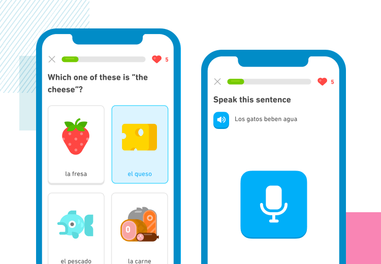
What we love about this onboarding is that it gets users learning quickly, much like Facebook and Discord. That means users are invested early on, and get to the whole reason they downloaded the app after only a few moments. The UI itself makes navigation easy by requiring little navigation at all – users simply need to click on their languages to get the most from the app. Now that’s easy to learn!
5. Slack
Another prime example of simplified navigation, Slack has excellent onboarding and great learnability. While the initial forms and information take place in a popup, the real onboarding happens with the chatbot. This makes the whole onboarding experience casual and conversational, reducing the effort required to get through it all.
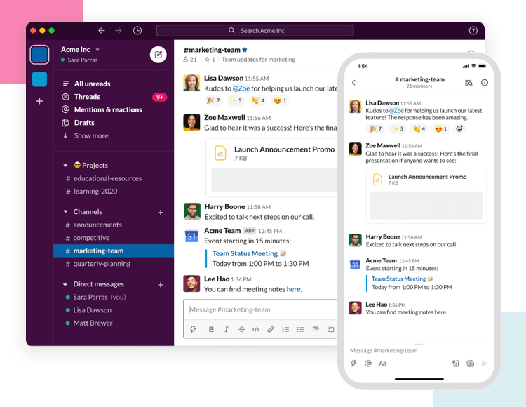
We love that the form input fields all have explanations that add context, making the questions easy to understand and quick to answer. Aside from that, Slack also makes the most of the simple vertical navigation bar, making it easy to explore and use. We totally understand why it’s such a wildly popular platform – one can learn to use it within mere minutes.
The wrap up
Learnability marks an important aspect of your product that has a direct impact on users’ first impressions. It’s the kind of thing that can be overlooked or misunderstood, but is always deserving of attention and care. You want to dedicate true time into not just creating a product that has useful features, but also looking for potential problems in testing. A UX designer’s work is never done!
Hopefully, though, with this post you’ll be properly armed with the theory and practical sides of learnability and how it relates to UX design. And now, on to accompanying those metrics and creating the perfect funnel for your users!


