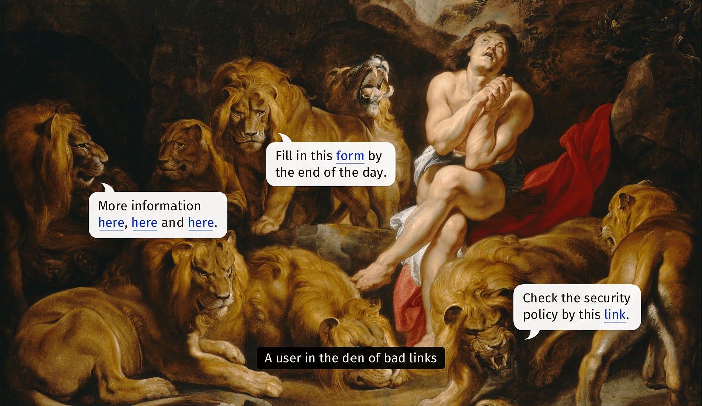
Designing Better Hyperlinks: A Detailed Guide
Why are “click here” and “by this link” poor choices? And is it acceptable to use “read more”? All these phrases have become so common that many people don’t see any problems with them. How many times have you encountered or composed the following on websites, in emails, or on intranets? In this article, I’ll explain popular wording and formatting mistakes and will show more accessible and informative alternatives.
Touch-First Cursor: Round Pointers vs. Mouse Arrows
Apple reinvented the mouse cursor to be 'touch-first' on the iPadOS, building on the original mouse pointer, and adding 'Pointer Magnetism' and more accessibility features. Here's a look at rounded pointers vs arrow pointers.

Accessibility: The Biggest Scam in UX
I can’t even possibly count how many times I have seen designers describing their work as accessible, throw around words like “inclusivity” and “universal design”, just to present a minimalistic — totally up to trends — white and *choose any color* prototype, thinking that’s it. Stop right now, I hate you.
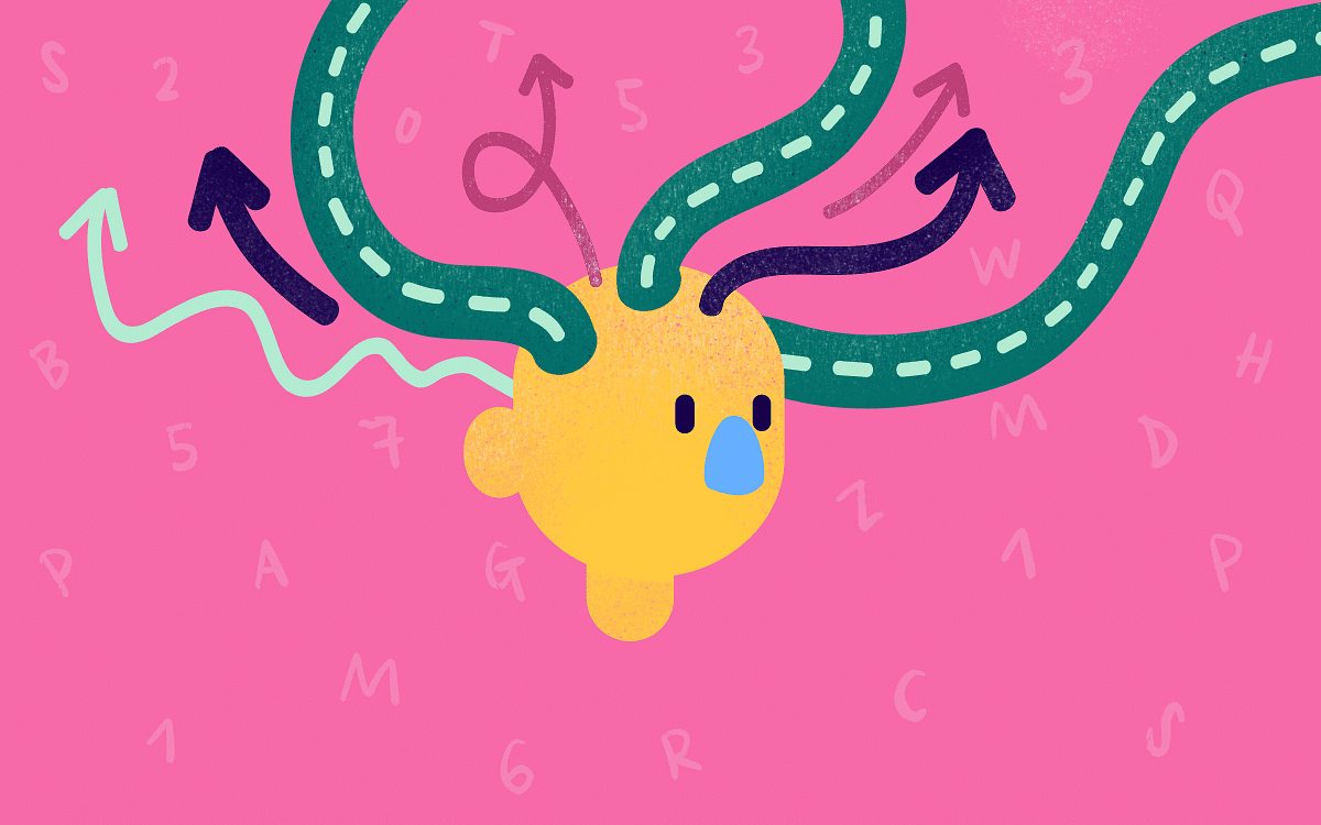
Design Through a Neurodiverse Lens: Exclusive vs Inclusive
The Source is a fortnightly letter from Prototypr for its community of ~600k viewers. Written by Sophie Clifton-Tucker, The Source tackles taboo topics, exposes unseen truths, and gets the scoop on the latest in the tech and design sphere. It’s estimated that between 15-20% of us are neurodiverse, so a product that isn’t optimised for […]
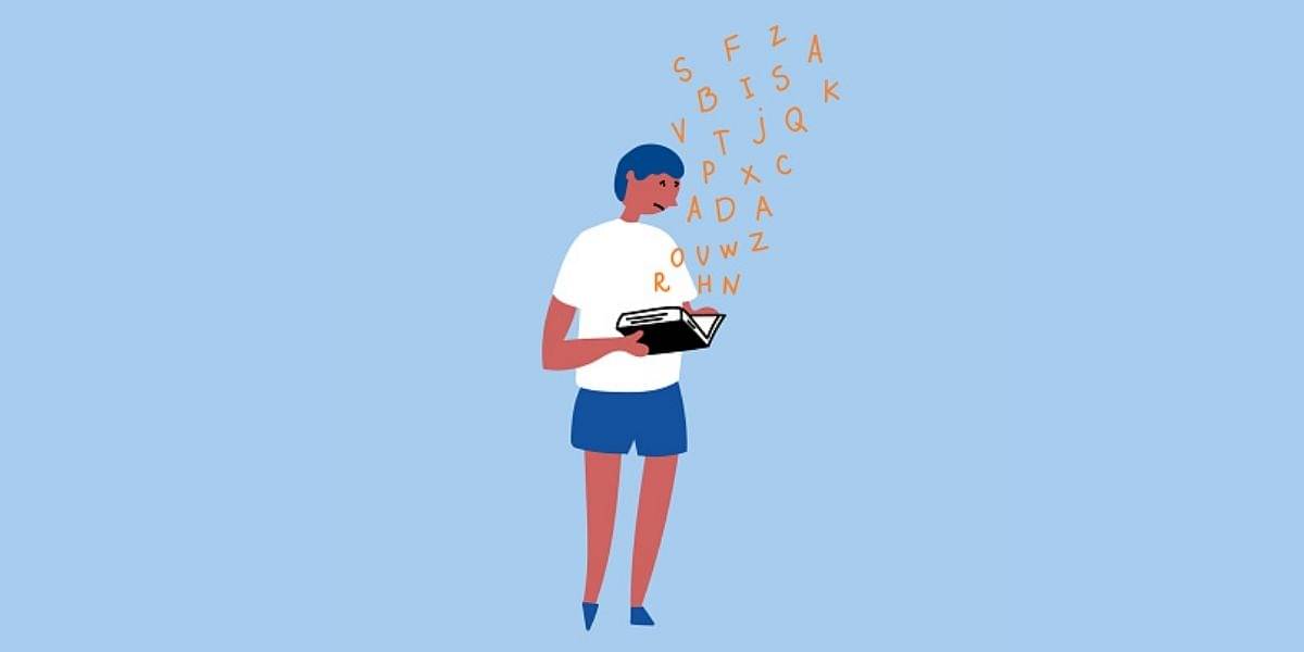
Neurodiversity and Inclusion: Choosing Kinder Design
‘Neurodiversity’ refers to the myriad beautiful ways in which people experience, and interact with, the world. It is the idea that although all brain differences are ‘normal’ (whatever normal may be), no two brains are the same – and thank goodness for that! From night mode to alt tags, Medium’s text-to-speech function and Twitter’s font […]
