‘Neurodiversity’ refers to the myriad beautiful ways in which people experience, and interact with, the world. It is the idea that although all brain differences are ‘normal’ (whatever normal may be), no two brains are the same – and thank goodness for that!
From night mode to alt tags, Medium’s text-to-speech function and Twitter’s font slider, visual impairments have been increasingly catered to across platforms in recent years, which is great, but what about the others who need a virtual helping hand?
You will most likely know someone neurodivergent; you may even be neuro-atypical yourself. In fact, it’s estimated that 1 in 7 of us experience some form of neurodiversity (and that’s without taking into account that many conditions go undiagnosed), so applying a one-size-fits-all, utilitarian approach to design simply isn’t going to cut the mustard any more.


Designing for people of different abilities
ADHD, Autism, Dyspraxia, and Dyslexia all fall within the neurodiversity spectrum. How can we as designers ensure we’re catering to the needs of each?
🧡 ADHD or Attention Deficit Hyperactivity Disorder is typically characterised by inattention and a sensitivity to sensory inputs.
In her May newsletter, UX designer Tamara Sredojevic announced the completion of her app website for people with ADHD, and offered some invaluable tips on designing for this audience:
- Bring structure to your copy
When designing for a neurodivergent audience, it’s important to balance blocks of texts with images. It helps bring a structure that is necessary for most people with neurodiversity. You can also use icons next to your headings to make the text easier to grasp. - Choosing a font for people with ADHD
In general, we know that sans-serif fonts are easier to read. And it’s particularly true for people with neurodiversity. ADHDers specifically also like fonts that resemble handwriting – such as Comic Sans. But these fonts can also create confusion with certain letter combinations. So a good alternative is a mono-spaced font, such as Consolas or Courier New, because it’s got fewer opportunities for confusion between letters. - Picking imagery for a neurodivergent audience
Too many images can confuse readers – any reader. So when designing for a neurodivergent audience, think about images as a way to structure the page. Another thing to avoid is superimposing text over an image. It’s harder to process. Finally, photographs work better than illustrations – even if they can quickly look dated.
♾️ Autism spectrum disorder (ASD), as with ADHD, can cause sensory overload. Autistic people often communicate and interact in a different way to neurotypical people, and may have different ways of learning or paying attention. They may also be hypersensitive to colour, sound, textures, movement and light – all important factors to consider in the fledgling stages of your design.
Individuals with ASD respond to visual stimuli entirely differently than someone without ASD. Due to their hypersensitivity, they prefer things that are simple and quiet.
– Lalatendu Satpathy
Further reading:
👉 Autism Friendly Digital World
👉 Designing for autistic people
🫶 Dyspraxia affects an individual’s movement and coordination. Dyspraxic people, too, can suffer from sensory overload, so avoid busy screens with too many graphics or a lot of text. Some colour contrasts can also prove tricky, particularly black text on a white background. Dyspraxic people can also be highly creative, empathetic, and unique thinkers, which is also true of other neurodivergent people.
Further reading:
👉 Dyspraxia and web accessibility.
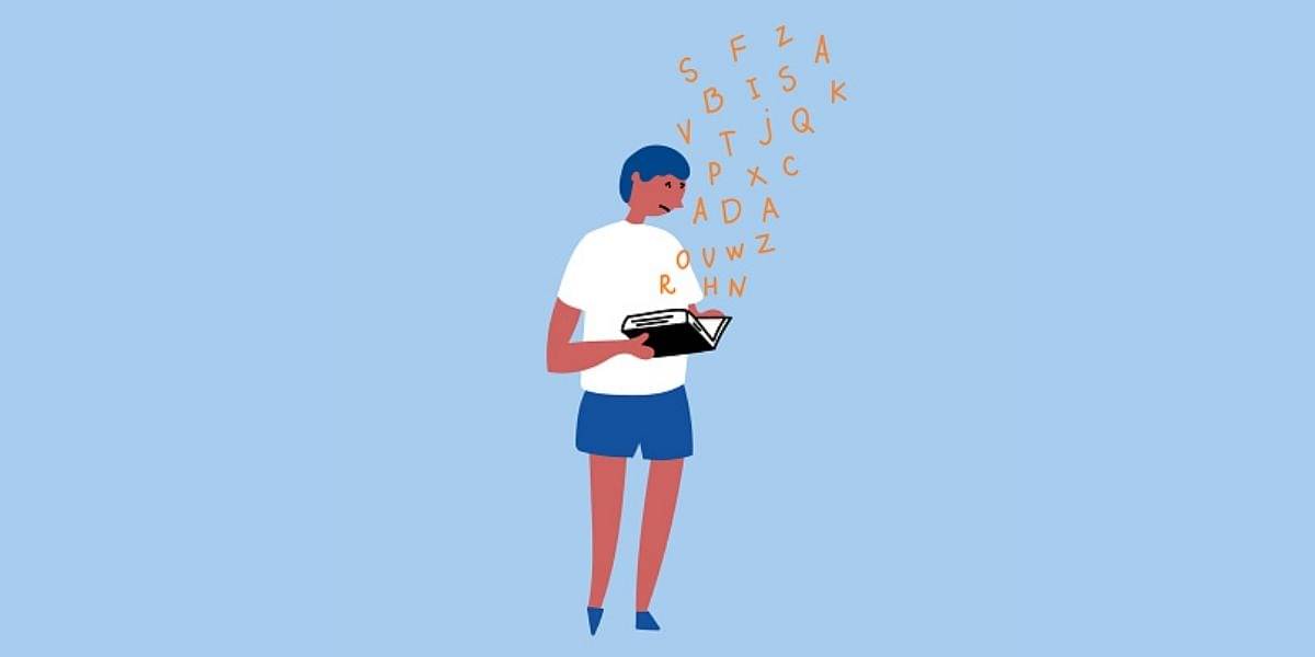
✍️ Dyslexia causes difficulties with reading and writing due to something called ‘phonetic decoding’. Advocate and educator Dean Bragonier explains: “Phonetic decoding is essentially our ability to identify these squiggly lines, translate those lines into a sound in our mind and then string those sounds together to compose a word.” Sounds exhausting! So how can we make it easier?
Around 16% of the world population is experiencing a form of Dyslexia, and yet there is such a limited understanding of what it means to be Dyslectic.
– Danny Ruchtie, Head of Design and CodeSandbox
UX Research Strategist Jennifer Keene-Moore and CX Manager Anita Cator delivered a presentation on designing for dyslexia that included these great tips:
- Allow for customization of visual preferences (colors, fonts, and text magnification).
- Use large san serif fonts with plenty of leading (consider checking out fonts like Open Dyslexic).
- Don’t center your text, always left justify.
- Content should be clear and concise. Use headers, short sentences, and bulleted/numbered lists.
- Use dark grey for your text. True black on a white background can create a blurred effect.
- Preferred line length is 45 characters. Maximum line length should not exceed 100 characters.
- Use visual and auditory alerts.
- Add captions on video content for the hard of hearing.
- Reinforce text with icons.
- Use bold text rather than italics or underlines for emphasis.

Further reading:
👉 7 neurodivergent disorders to consider when writing and designing your UX

A11y Allies: Designers for diversity and inclusion
As previously mentioned, Big Tech has gone some way towards building more inclusive platforms, but there are still some gaps in their design that desperately need to be filled in order to truly celebrate their usability.
Here are some pioneering designers who are helping to smooth over these cracks:
- UX/UI designer Evert Martin has built ‘Leo’ – a web-based eReader designed specifically for students with Dyslexia. The Leo platform aims to create a more accessible educational future by allowing students with dyslexia to access course material in a way that best suits their learning needs.
- As aforementioned, Tamara Sredojevic has successfully completed her website project for people with ADHD (hurrah!). Inflow can help users to learn about their brain, whilst providing techniques to overcome challenges.
If any distraction creates stress in our user’s minds, our design is wrong.
– Evert Martin, Leo Reader
Want more? Dyspraxic UX/UI and product designer, Radeyah, has put together this awesome list of resources:
My current top 5 Accessible design resources 💯
- Government Design Principles
- Color Safe
- WCAG 2.0 and Link Colors
- Give users “Break in case of emergency” features
- Material Design Accessibility


As we learn and understand more, we must apply this knowledge to our design or risk having your product be the metaphorical staircase in an elevator-free building: useful, but only to some people. A design with inclusivity and neurodiversity in mind is not just ‘nice to have’ – it’s imperative.
Disclaimer: Although I’ve been previously branded a knowitall (thanks mum), I’m open to any and all corrections regarding this piece. I hope I have been sensitive when tackling this topic, and can only apologise if I’ve made any errors. Please shoot me a message if so and I would be more than happy to learn, and amend.


 Buy me a coffee


