An Interview with Olvy
Designers make great founders, especially those who can code. Meet Arnob, Nishant, and Rupak, the designer/developer trio behind Olvy - a product designed for creating beautiful release notes that add joy to shipping software products.
Since their initial launch as a fledgling indie team of 3, they’ve listened to users, adapted, and pivoted their product, leading them to a round of funding and new hires.
They’re no stranger to building and shipping things fast - Arnob previously launched Culrs, a colour palette tool that’s also available as a mac app, whilst Nishant lead engineering at Atlan, helping build the product from the first git commit. They’re smart about which tools to use and when.
Website builders should facilitate creativity and help us tell our story, rather than getting stuck with constraints.
In this interview, we’re focusing on how they designed and built their latest product, and the tools and techniques they used to create meshy gradients and animated SVG illustrations on their landing page (hello Framer Sites):


But first, let's start with the problem they’re solving.


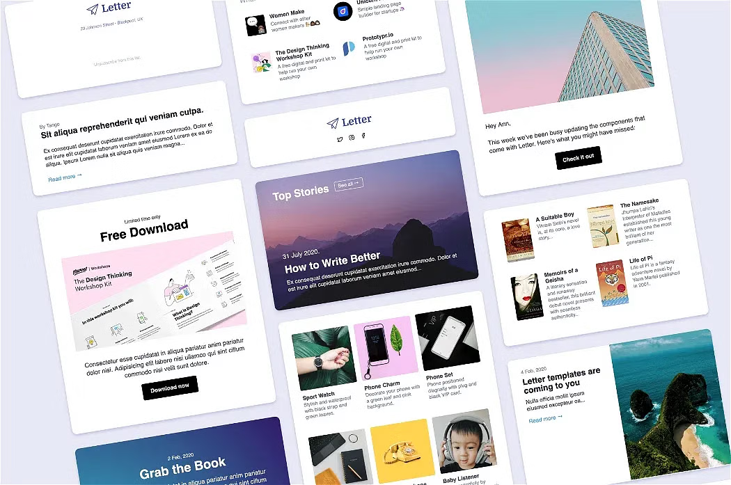
Letter
Discovering the Problem
What is Olvy Feedback, and how did you discover the problem you’re trying to solve?
Olvy started as a Changelog and a Release Notes tool, used by some great companies like CodeSandBox, Polygon, and a bunch more.
While we were building the first version of the product we realised there is a bigger problem to solve. As a product’s audience grows, you go from knowing every user to receiving feedback from 1000s across multiple channels (e.g. Discord, Slack, email, Intercom), which is hard to digest. We experienced this first hand after Olvy was featured on ProductHunt, finishing as product of the day - we gained thousands of users, but struggled to act on their feedback.
While we were building the first version of the product, we realised there is a bigger problem to solve.
Olvy Feedback therefore acts as a single source of truth for all those communication channels. Through an ecosystem of plugins, Olvy captures feedback and makes it actionable by highlighting patterns in feedback, and turning them into JIRA or Linear tickets to pass onto an engineering team.
How are you discovering your first users?
We launched a beta page to tell the story we experienced above, and to see how many people resonate with it. We launched it as a standalone landing page to target users who have a similar problem, and allow them to sign up to our waitlist.
Since Olvy is popularly known for it’s Changelog tool, we already have a user base. Olvy Feedback builds upon Changelog, but it’s also something new, so we needed separate space to share this story, and at the same time, enable those who can relate to the problem to sign up and learn more.
We launched a beta page to tell the story we experienced.
Landing Page: Design to Launch
Here’s how Arnob and co set up the Olvy Feedback landing page with minimal resources.
How did you create the landing page for Olvy Feedback in such a short time?
Answered by @Arnob Mukherjee
Website builders should facilitate creativity and help us tell our story, rather than getting stuck with constraints. The website builders of the past were very CMS based (think WordPress or even SquareSpace) - they appear easy to use at first, but you end up learning their entire system to customise a template, which can be constraining and clunky.
The best tools get out of the way, you forget you're using one
In contrast, modern companies are becoming more and more expressive - visual bookmarking tool, MyMind is a great example - we’re now very story oriented, and need more creative freedom to express our stories in different ways.
The blank canvas: Framer Sites
Designers love canvases and designers at Olvy love them too. The Framer Sites workflow feels like home to any designer. I can create designs like I would in Figma – Framer works just the same as how I create mockups. But the magic part is that in the click of a button, we can be live with a fully functional, responsive website:

When a designer sits in front of that empty digital canvas, it’s like a canvas of dreams, stories, creativity - everything can be as beautiful as we imagine. We feel like Framer Sites is a tool sent by the gods for designers to just do that – think of the possibilities, and then make them come to life for fellow humans out there, in no time.
Why No Code? You have great developer and design expertise.
Answered by @Arnob Mukherjee
I’ve been more of a fan of writing code than using a no-code tools – this feeling has essentially been because of the flexibility that code brings. You can do anything if you are writing raw code.
You can do anything if you are writing raw code.
However, it takes time. We realised we’d need more scalable way to run the website than going through a lifecycle of writing and deploying code.
Less code = more content
For me there were two reasons:
For SEO, it’s is important to create dedicated pages for certain keywords of our product, so we may need a lot. Our previous marketing stack was based on Gridsome and Tailwindcss – without a CMS. That meant to edit content, we’d have to change things in a codebase, and then redeploy - too much work!
We’re also still in the early stages, and wanted to launch our beta site as fast as possible. I started looking for a situation where I as a designer could just set things up on my own, and go live in no time.
As soon as I tried Framer Sites, I decided to switch our Marketing stack entirely to it. No-code opens up collaboration too, so as our team grows to more designers and marketeers, they can easily start using Framer, without getting into a hassle of asking engineering help. The whole department becomes independent.
No-code opens up collaboration...the whole department becomes independent.
Your site uses a lot of gradients and animation. How is it possible with Framer Sites?
Answered by @Arnob Mukherjee
When we were thinking about the new branding, we went with gradients to create a smooth and calm feeling that reflects the nature of what our product solves. We’re creating a feedback management tool after all - it does a lot of heavy lifting, sorting through chaos to create something manageable, hopefully making make people’s lives less chaotic.
We were looking to quickly get started, and explored different types of mesh gradients on our moodboard. We started looking for packs which hits that right emotion that we decided and then we found a pack in yellow images called “DUSK - Animated Gradients Backgrounds”
It was straight forward to drop into Framer Sites. Here’s the link to it.

For the colours, we keep the Olvy Brand Pink #FD9BBD as our base, and combine it with both a colder and warmer palette. These colour combinations sit really well together, presenting itself as funky and energetic, and sophisticated and calming at the same time. We always try to present this trait in our brand assets and product videos.
CSS Effects in Framer Sites
Answered by @Arnob Mukherjee
Framer also comes with in built animation options. You can customise each element, changing when and how it appears on the screen. For example for this section we wanted the text to flip as soon as it enters the viewport:

And here’s a quick step-by-step for how it can be done in Framer 👇
Select the text
Selected the Text Set the trigger to Scroll – this ensures the text animates on scroll.
Set ‘start from’ to ‘middle’ – this ensures the animation triggers when the text is in the centre of the viewport.
Set animation triggers Then hit “Enter” and configure the states. In our case, opacity 0 for the first state, and then translate it to 100% opacity.
You can also set the rotation x with perspective.
Finally, set the transition smoothness with the in built transition option:
Set the transition


Animations that Tell a Story
In this part, Rupak shares the process behind creating the animations, and how they help in telling the Olvy Feedback story.
The Illustrations
Answered by @Rupak Mishra
We are still in the process of figuring out our visual identity for a longer term, but a few thoughts are currently in place that act as our north star for creating illustrations and brand assets.
At Olvy we are a little obsessed with beautiful designs and we are in a constant state of creating something that sets us apart. The simplistic flat illustrations are created by me in Figma.

Figma ⇒ Adobe After Effects
We used animation to help share the story we wanted to convey to our lovely audience. Animations help explain how Olvy works, but in a much more creative way.
My primary tool to create such lovely animation is Adobe After Effects.

After creating all the illustrations in Figma, I carefully import the files first to Adobe Illustrator, and carefully arrange the layers of each file depending on the kind of animation I would do going ahead.
Once done, I import the Illustrator files to Adobe After Effects, and proceed with animating these illustrations and to bring it to life.
Though the animation looks kind of complex, if you look carefully, you could see that I have animated the same basic properties.
The three basic properties that need to be considered to achieve this animation are Position, Rotation, and Scale. That’s the main properties when creating such beautiful animations.
Make it Loop
One thing that was strongly considered to make a landing page animation was to make it on a loop. This means the first frame and the last frame of a scene are always the same, so the whole animation appears to be in a seamless loop. That’s why the animation appears to be so pleasing to eyes without any interruptions.

Lottie: Web Animations
We used our favourite tool Lottie to bring it to the web. We always try to experiment with Lottie animations and bring forward something exciting. I create these animations in Adobe After Effects and with the help of Lottie plugin these animations can easily be exported into .json files.

A Story Through Animation
These animations further tell the story behind Olvy.
1. Companies Start Small
The idea behind the first animation above was to show that any organisation starts small with a few loyal users – those with whom you communicate all the time. You listen to their complaints and feedback, and come up with solutions to their different problems.
In the first screen of animation, I used a few head illustrations, and animated their position and rotation properties for various characteristics: hair, moustache and head. This was to resemble the constant engagement your user has with your product.

2. A Growing Company
A really good sign of a successful business is customer growth. And surely everyone wishes for the same – but comes at cost.
The second and third screens introduce a surge in user engagement, showing how chaotic it can get across different communication channels.

3. The Olvy Feedback Problem
At this point of the landing page story, we’re showing how a great product can have users constantly engage with it: feedback, feature requests, and complaints on all platforms: twitter, slack, discord, mail, etc.

The animation shows that an increase in user base also leads to an exponential increase in requests. To analyse and decode all of these, you need a lot of resources.
That’s the problem – then we move to the solution that Olvy provides. The last animation shows how Olvy simplifies the process for our user so, making their life easier.
Remember: Rotation, Position and Scale
Though the animation looks kind of complex, believe me if you look carefully you could easily see that I have animated the same basic properties that i stated earlier: Rotation, Position and Scale. Also made it appear in an infinite loop by keeping the first frame and the last frame of the animation same.
Launching and Hosting
How is the experience of hosting the site with Framer? What is the process of setting up the domain like?
Answered by @Arnob Mukherjee
Hosting the site on Framer has been super smooth. It was mostly a one click connection with your domain service provider. The hosting speed also is amazing, having tested on different internet speeds, and the loading time is smooth.
We actually use their file hosting to show the background videos and it loads blazing fast.

What’s Next?
We’re working on lots of ideas:
We’ve created a layer of ecosystems to capture feedback with different Integrations, letting you push feedback to Olvy
We’re working on analyzing feedback to find actionable patterns.
Olvy also allows you to send personlized messages in Slack or Discord to the same user that started the feedback
Check out our latest beta page release which talks more about the problem: https://beta.olvy.co/.
We would also love to extend early access to Olvy Feedback and Release Note Tool to your team and would be happy to answer any questions on a short call. You can book a time on this calendly link, and I can demo the product and what we’re planning. We are super excited about this and hope to see you soon.

 Buy me a coffee