A collection of handy tips to help improve your designs instantly
When creating efficient, accessible, and beautiful UIs, it takes only the smallest tweaks to improve your designs.
In this follow-up article I’ve brought you another selection of easy to put into practice UI & UX micro-tips.
Tips that can, with little effort, help improve both your designs, and the user experience.
Quick Note: Want even more UI & UX Micro-Tips? Then check out my previous articles here and here.
Let’s dive on in…

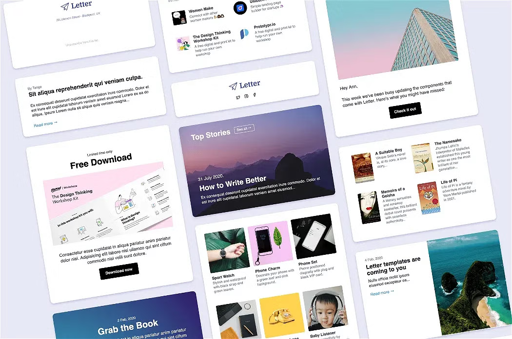
Letter
1. Want to speak in a more informal tone? Try going all lowercase.

Using a heavier font weight, and caps can sometimes come across a little too formal.
Try choosing all-lowercase, and a lighter font-weight.
This can present a more informal, and approachable message when working on certain projects.
2. Use weight, size, and colour to indicate hierarchy within your type.

When working with type, elements don’t need to scream “Look at me!” all the time.
But. They do need to have a balanced hierarchy in place.
Just subtle adjustments via the use of weight, size, and colour is all it takes to achieve this.
This allows the user to scan and find the most important elements, avoiding any confusion in the process.
3. Light Text on dark? Fatten up that font-weight for the best legibility.

When setting dark text against a light background you can, occasionally, opt for a lighter font-weight.
But…
… when it comes to the reverse: light text > dark background…
… you should look at fattening up the font-weight a little, especially for long-form copy.
Aim for the best legibility, and avoid straining your user’s eyes.
4. Create the right emotional response with your typeface choices.

Try to choose the appropriate typeface for the content you’re presenting.
Users are savvy, and have an intuitive sense of when content is talking to them, and when it’s not.
The correct choice of typeface is key in making your content speak to them directly, and on an emotional level.
5. If you (have to) use multiple typefaces, try to stick to the 2 max rule.

For me, I try to stick to the 1 Typeface rule whenever possible.
But.
If the project demands it, I recommend maxing out those typeface-combos at 2.
No more.
Combining typefaces well can be tricky for the inexperienced.
Go easy on yourself and don’t just add another typeface just because you can.
Using a maximum of 2, and then a combination of weight, size, and colourcan bring instant visual harmony to your designs.
6. All-Uppercase + Letter-Spacing = Better Legibility.

Working with short lines of text, in all-uppercase?
Well…
… It’s a good idea to increase the spacing between those letters to achieve better legibility for the user.
Doing so makes the words easier to read and process because the letters are more distinguishable from one another.
Just small increases in spacing between the letters is all that’s needed to improve legibility and add a touch of polish to your uppercase type.
I hope with this short collection of tips you’ve realised how the smallest of adjustments to your designs can produce better end-results for both yourself, and your users.
–
Did you know you can design easier, and faster with my Design System; Cabana for Sketch & Cabana for Figma. Special Offer: Please use the code CABANA30 to receive 30% OFF. ENDING VERY SOON.
Originally published at marcandrew.me on March 16th, 2021.