Jakob Nielsen’s guide for best practices with examples.
Jakob Nielsen’s 10 Usability Heuristics for User Interface Design are essential for every designer and developer to know and understand, in order to provide a seamless user experience for all end users. These timeless heuristics are broad rules of thumb that can be applied to everything from physical products to websites and mobile apps.
In this article, I’m going to explain and review each one with examples.
1. Visibility of system status
The system should always keep users informed about what is going on, through appropriate feedback within reasonable time.
It’s important to always keep your user in the loop during interactions to help avoid potential errors and frustrations. While we don’t need to tell them every single action that’s taking place (that could be overwhelming!), there are plenty of important cases such as:
- When a submit button on a form is clicked
- When a purchase order has been received
- When an item is added to or deleted from your cart
- When a login attempt is successful or not
- When data entered is incorrect or in the wrong format
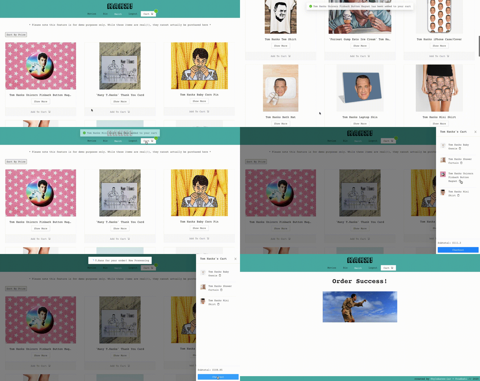
Check out this mock e-commerce example below, which notifies the user when items are added to their cart, deleted and purchased. It also shows a visual tally of how many items are currently in the cart to keep the user informed of the cart status:

If we didn’t provide visibility of the “Add to Cart” feature here, a user could keep clicking that Tom Hanks mini skirt and end up purchasing twelve by accident! No judgement if that’s what they intended, but you probably only wanted one. 😉
2. Match between system and the real world
The system should speak the users’ language, with words, phrases and concepts familiar to the user, rather than system-oriented terms. Follow real-world conventions, making information appear in a natural and logical order.
Keeping in line with the e-commerce example, it would be very confusing to the user if you decided to call the shopping cart something like “itemsArray” since that was how the cart was being saved in the backend. Referring to it as a “cart” or “shopping cart” ties in the real-world example of shopping in a store, which most users can relate to.
Throughout the shopping experience, as items are added to the cart, a green check mark appears with the notification. This image is familiar to the user: a check mark indicates success, and the color green signifies “good to go” from traffic lights and other conventions.
When the order is complete, we see the words “Order Success” instead of something confusing like “Affirmative in your Request for Processing”. While the second option could also be accurate, it most likely doesn’t speak the user’s language.
3. User control and freedom
Users often choose system functions by mistake and will need a clearly marked “emergency exit” to leave the unwanted state without having to go through an extended dialogue. Support undo and redo.
Perhaps the user didn’t realize how expensive the Hanksy art was, and feels a bit overwhelmed by their looming $4,200 subtotal! This is why we have a delete button in the shape of a trashcan (matching between the system and real-world) so that they can easily undo the “Add to Cart” functionality.

Some other good examples include Gmail’s option to undo a sent email message and the undo/redo option when editing documents on Google docs. This is a very user-friendly practice as people often change their minds and experience instant regret. Some other websites with “quick buy” options may take advantage of this, negating the user’s ability to have control once they’ve clicked the purchase button.
4. Consistency and standards
Users should not have to wonder whether different words, situations, or actions mean the same thing. Follow platform conventions.
There are 2 different kinds of consistency in products: internal and external. Internal consistency refers to your own product, website or app, such as maintaining the same color for call to action buttons across the website. If you decided to use that color for something else, the user may no longer have that strong association in place.
External consistency refers to general conventions across all products, not only your own. For example, many mobile versions of websites and apps use a hamburger menu to collapse the menu options. Since this design is so prevalent, most users will understand what this icon is for. If your mobile site uses something vastly different and unclear, the user may be confused.

Another example of a consistent web standard is that clicking the website logo or title will bring you back the home page. When websites don’t have this option, it can feel confusing and/or frustrating for users.
5. Error prevention
Even better than good error messages is a careful design which prevents a problem from occurring in the first place. Either eliminate error-prone conditions or check for them and present users with a confirmation option before they commit to the action.
A great example of error prevention can be found in banking or money transfer websites and apps. Before making a transaction or transferring money to a friend, the user is often prompted with a note asking “Are you sure you would like to transfer $X to Y account?”. These messages and additional confirmation steps can save users a lot of trouble, especially if they didn’t mean to do that action.
6. Recognition rather than recall
Minimize the user’s memory load by making objects, actions, and options visible. The user should not have to remember information from one part of the dialogue to another. Instructions for use of the system should be visible or easily retrievable whenever appropriate.
Recognition is preferable to recall because it involves a larger amount of context clues, helping the user to do less mental work to find what they’re looking for.
For example, if you were asked “Is Paris the capital of France?”, you are given 3 context clues: Paris, capital and France. If you were asked “What is the capital of France?”, you are only given 2 clues: capital and France.
It should be easier to answer the first version (recognition), because you have more information to work with and reference. The second version (recall) takes more work, and with the addition of many other recalls, the user can feel a bit fatigued and/or frustrated.
A good digital example of this can be found in Google docs. When you want to edit text but you aren’t sure of the exact style name, images are provided to give you visual clues and help you recognize your options:

7. Flexibility and efficiency of use
Accelerators — unseen by the novice user — may often speed up the interaction for the expert user such that the system can cater to both inexperienced and experienced users. Allow users to tailor frequent actions.
Most of us relatively tech savvy users rely on using accelerators every day, probably without even thinking about it. These shortcuts can help us get things done faster, both in work and in play, but we still need our features to be inclusive to everyone.
A perfect example of this would be copy and paste functionality for text. A novice user could take the following steps:
- Highlight text
- Navigate up to “Edit”
- Click “Copy”
- Click where they want the text to go
- Navigate up to “Edit”
- Click “Paste”
This will work just fine, but a more experienced user can cut down those steps to save time:
- Highlight text
- Hit ‘Command + C’
- Click where they want the text to go
- Hit ‘Command + V’
Another example of this flexibility can be found on Instagram, where users can either find and click the ❤️ icon, or just double-tap the post to “like” it.
8. Aesthetic and minimalist design
Dialogues should not contain information which is irrelevant or rarely needed. Every extra unit of information in a dialogue competes with the relevant units of information and diminishes their relative visibility.
When we think about the signal-to-noise ratio of a website, where “signal” includes the relevant information and “noise” includes anything else that may be purely decorative, it’s best to aim for a high ratio favoring “signal”. This can include any text and graphics that efficiently communicate your goals for the business and for the user. Since a user needs to process all the information and visuals on a given page, it’s important not to overload them with unnecessary content.
Here we have a pretty great example of a website that doesn’t follow along with this particular heuristic:

This website is clearly awesome in many, many ways, but in terms of the user interface design, the amount of graphics and animations distract from the key goal of the website: convince the user to lease a car through this service. All of the cars bounce upon hover, include often misspelled flashy headlines and blinking lightning bolts for some. There is quite a lot to process and look at!
Then again, maybe Ling is actually a genius because I find it so difficult to click away.
9. Help users recognize, diagnose, and recover from errors
Error messages should be expressed in plain language (no codes), precisely indicate the problem, and constructively suggest a solution.
We should naturally always aim to prevent errors from occurring in our products, but if they do occur, we need to present them clearly and direct the user to a seamless solution. These error messages can be a combination of easily understood text, color and icon notifications.
For example, if you try to click “Login” on Pinterest.com without entering an email or password, you will see the following error:

Here we’re given a clear message about what went wrong and how to fix it, and the input has been highlighted in red (a common color denoting “stop” or “error”).
10. Help and documentation
Even though it is better if the system can be used without documentation, it may be necessary to provide help and documentation. Any such information should be easy to search, focused on the user’s task, list concrete steps to be carried out, and not be too large.
Most users will need to search for help at some point, especially if it’s the first time they are interacting with a website or if they’re trying to learn more about a process. Some help documentation can be dense and frustrating to search though, so it’s important that these are clear, concise and easy to navigate.
For example, Pinterest.com does a nice job with their help section. As the user types in a search term, suggestions are offered for matching help articles. When an article is clicked, the wording is easy to understand and laid out in simple steps for any user to follow:

There you have it! Please remember to keep these guidelines (and your user!) in mind for a seamless user experience when designing your next project.


