Hi! I’m a UX/UI Designer that likes to write UX analyses of games.
In this case, I will analyse and make suggestions about the Xbox Passkey screen.
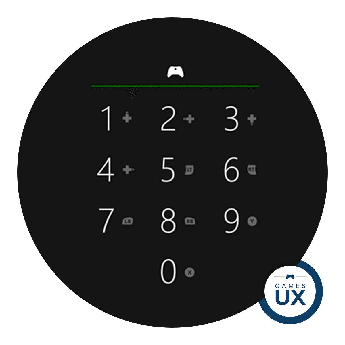
Xbox Passkey
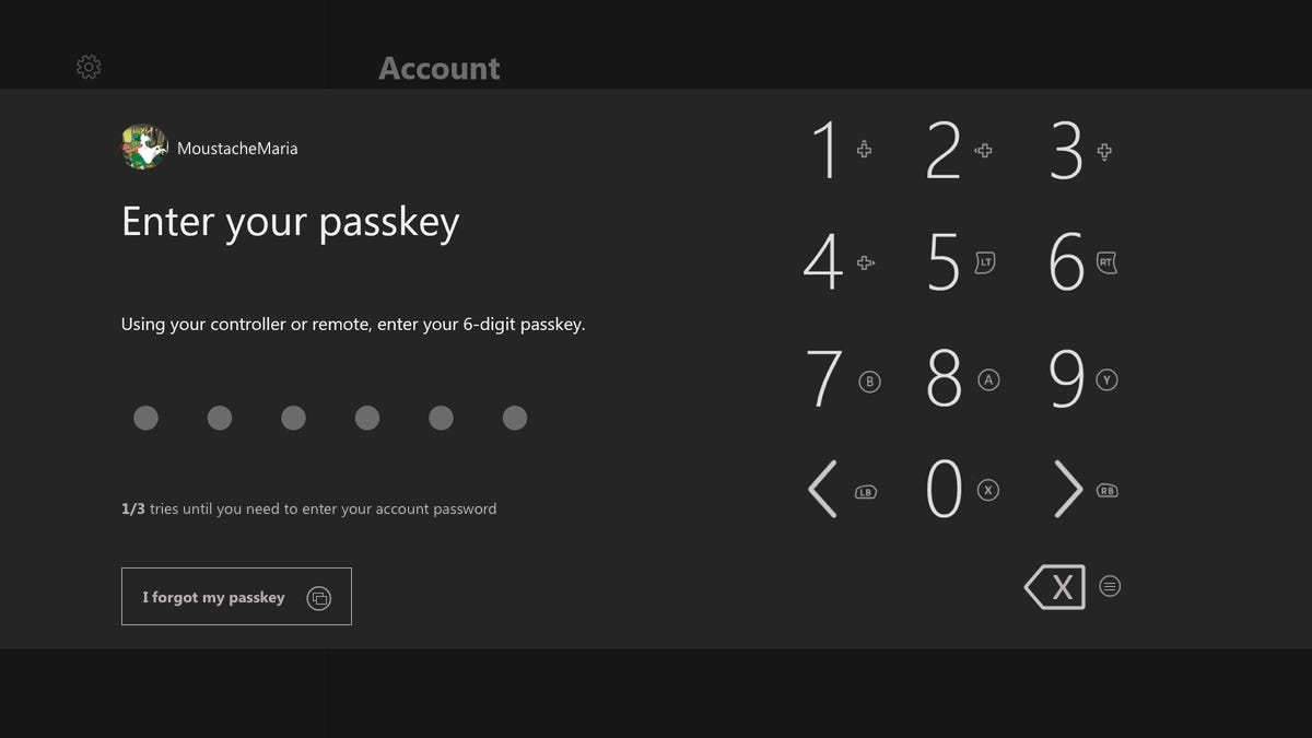
What is an Xbox Passkey? It’s a 6 digit password that the users can use to enter the Xbox live account instead of using e-mail and password.
It’s most commonly used since it’s quicker to enter than the password – has a limit of 6 digits instead of a full keyboard to enter the password.
It works as an additional layer of security that the users can use on the Xbox to ensure no one without permission uses the console. Like my siblings…
I turn my Xbox on with the controller, enter the Passkey, and I’m ready to play. Microsoft can tell you more about it in detail if you want to use it on your Xbox: https://support.xbox.com/en-US/help/family-online-safety/passkey-guest-key/create-and-manage-xbox-one-passkey.
Conditions of play
The issue itself allows an understanding of my conditions. I usually play sitting in a comfortable armchair in front of my TV of 37’. I was 1,5 to 2 meters away from the TV. With, in this case, an Xbox One S with that beautiful and ergonomic controller.
What would I change and how?
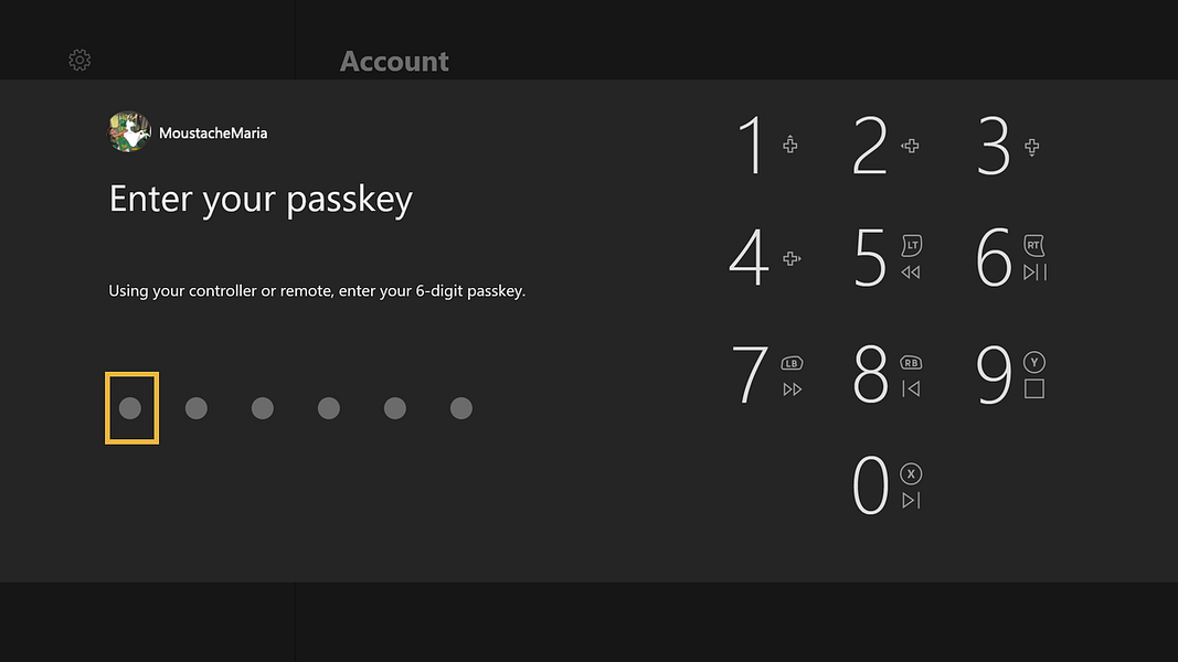
1- Instructions image adapted to this task
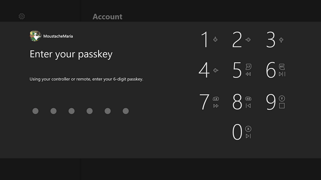
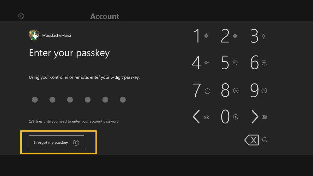
One of the things I investigated was the input instructions image (yellow rectangle, image 2). As you can see on the blue rectangles on image 2, it has iconography associated with media/reproduction of media. I was curious about that, so I raised a couple of questions to understand those icons inside the blue rectangle.
Does this mean the top controller buttons do the actions bellow, on the Passkey (example X is to jump to the left digit)?
No. I found out it did not influence the input of Passkey digits. Yes, I tried multiple “button” combinations, just like a good fighter game.
Does this mean there is a device without the top buttons and the reproduction buttons are the equivalent?
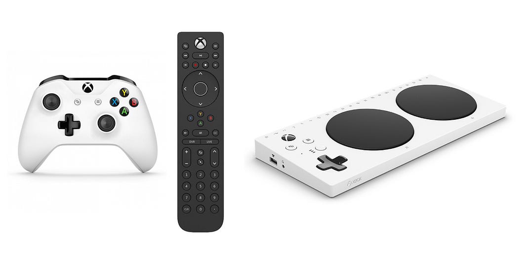
No. I went and investigated the devices used to input the Passkey. The Passkey is a feature for Xbox One consoles — users need an Xbox controller or a remote to use it. Xbox also has an Adaptive Controller but, as the name says, it’s an adaptation of the existing controller — with the same buttons but with a different design.
Does this reproduction icons have anything to do with the Passkey?
No, they don’t. Users don’t need them. I went to the internet and friends and asked them if they knew. It’s the representation of the controller buttons equivalent for the reproduction of media: it tells the user which button to press when watching a video or using media.
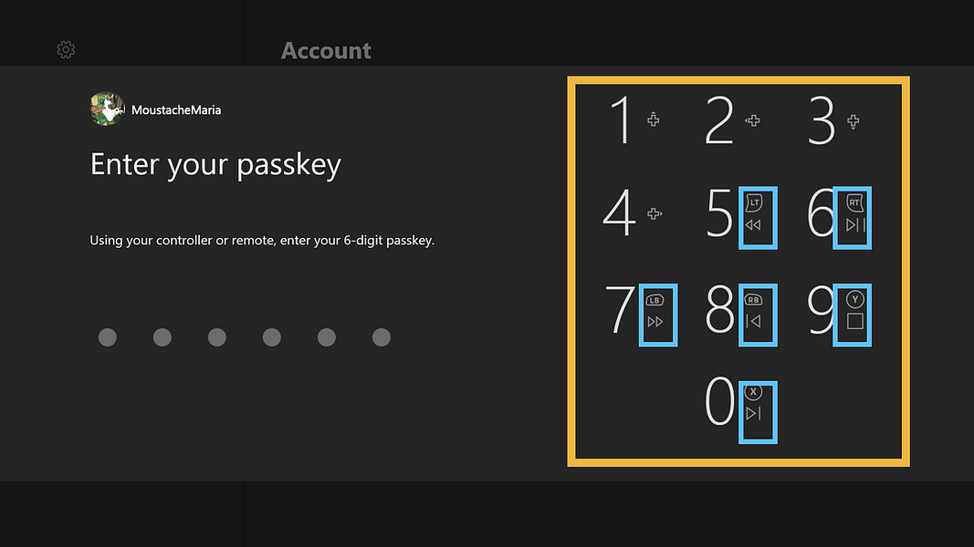
Why it needs a change?
It’s not relevant information. In such a simple screen, it can confuse users to think they can use them to alter the digit inputs. They can’t.
What would I do?
Take them out.
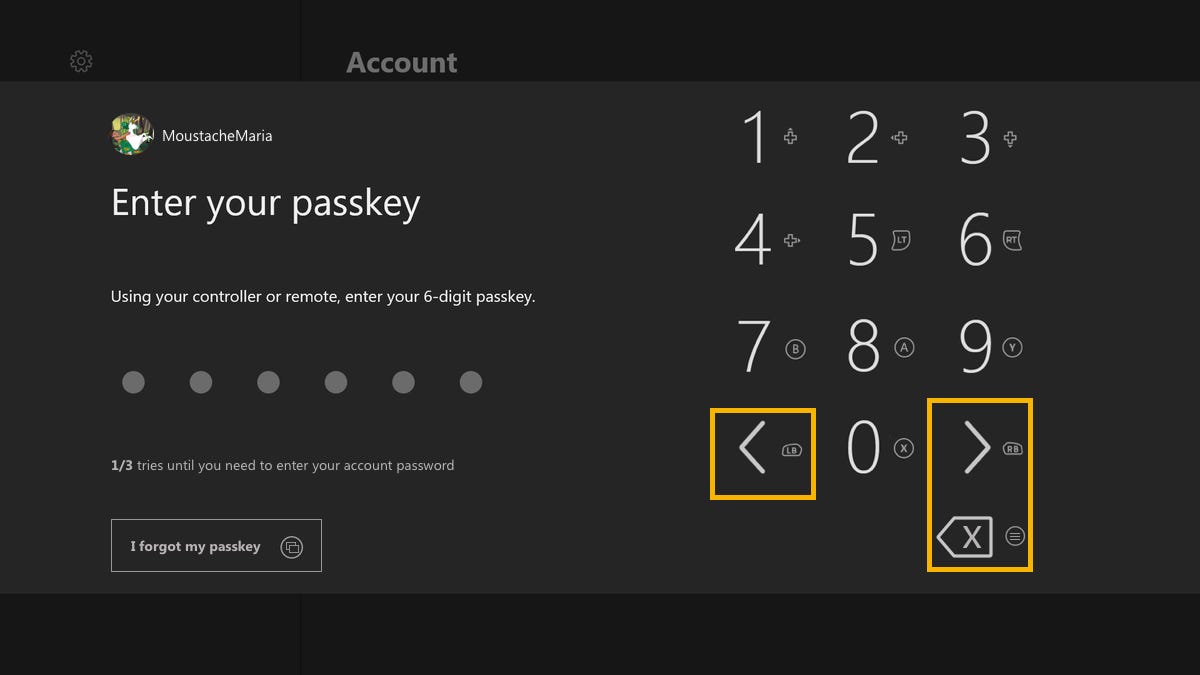
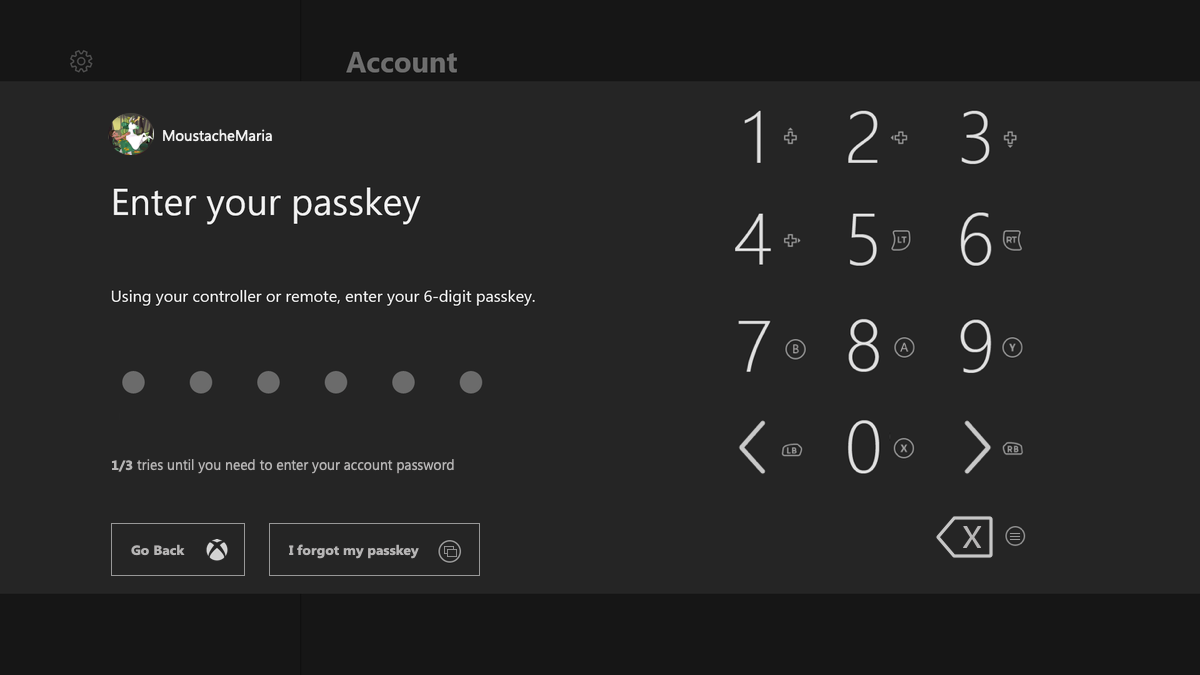
2- Allow users to correct a wrong input.
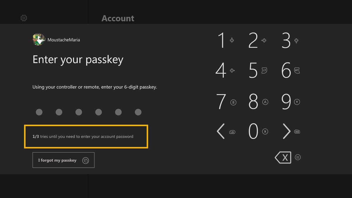
The user is entering the Passkey and makes a slip. Enters the wrong digit. What happens? The user needs to complete the 6 digits to try again. There is no “back” button or way to correct any mistake.
And a user can only make 3 tries — after the third try, the user needs to enter the account’s password with a keyboard.
Why it needs a change?
It’s one of the most important things we should keep in mind when designing: humans make errors. It can be slips or mistakes, on purpose or not. Still, we make them, and our job as designers is to prevent them from happening by understanding how users perform a task and minimize the probability of human error. One of the ways to do that, because even with all the tips and help, we still make errors — is to help people recover from errors. Allow them to go back and correct. To try again.
If you are interested in more stuff about error prevention check this amazing article: https://www.nngroup.com/articles/slips/
I work with critical systems, and I really need to have this on my mind all week:
“…prevent interaction problems from occurring in the first place: either eliminate error-prone conditions or check for them and present users with a confirmation dialog.”
Written by Jakob Nielsen as the #5 Heuristic for User Interface Design. You can check the other 9 here: https://www.nngroup.com/articles/ten-usability-heuristics/
What would I do?
Help users recover by having 3 extra buttons: to go left, to go right and to delete.
Used the LB and RB buttons to go left and right respectively, since there are the ones used on the Xbox virtual keyboard to do the same movement. To do that I rearranged the digit buttons and used all the “letter” buttons for the numbers. And using the menu (3-dashed) button to the delete action.
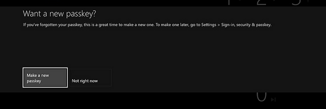
3- Allow users to recover Passkey on the first screen.
Instead of an error, the user already knows that forgot the Passkey. What can the user do? Enter a wrong Passkey 3 times and then, enter the account password (image 7) to ask for help.
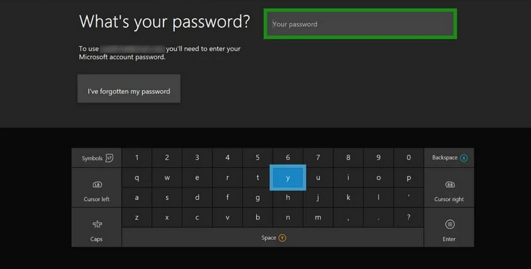
But look, here the user can recover the account password. What about the passkey? The user needs to enter the password correctly and then can recover the Passkey on the next screen (image 8).
Why it needs a change?
It demands 3 Passkey mistakes, a total of 18 inputs to go to the account password screen. In here you need to correctly enter your password to then go to a screen that asks if you want a new Passkey.
Like I’ve said on the previous point: we should help users.
What would I do?
A button to recover the Passkey if forgotten (yellow rectangle, image 9). Drawn like the ones on the next screens + the icon representative of the view (2 rectangles) button on the controller to perform that action.
4- Users don’t know what’s going to happen next.
All of this happens without knowing you only have 3 tries or you will be forced to enter your account password.
Why it needs a change?
Users should know what is happening. You have feedback on what you did but not of what the system is doing or in which step of the task you are right now.
Users should know they have 3 Passkey tries like they know if they have failed a passkey input.
What would I do?
Tell them it’s the x/3 try or they will need to enter the account password.
5- Go back button if the user has more than 1 account.
If the user has more than on account connected to the Xbox One, it’s possible to have a Passkey for each account.
When selecting an account to log in, if the user selects the wrong account to enter the Passkey and start playing, on the Passkey screen, the user can go back and change to another account by clicking on the home button. But the info of that possible (and very useful) action is not available on the screen.
Side note: if the controller is assigned to an account, it will always ask for the Passkey of that account when turning the Xbox one with that controller. In that case, this will happen if the user wants to switch to another account.
Why it needs a change?
If a user selects the wrong account to enter the Passkey, it should be informed on the screen of the option available to recover from that error. I talked a bit about errors on point 2.
What would I do?
Inform users that they can select another account by clicking on the menu button.
If an Xbox has more than 1 account and the user did not log in to an account yet or if wants to change accounts — a “Go Back” button should exist on the Passkey screen to inform users that they can go back to switch accounts or to give up on entering that account.
Final Thoughts
I usually say to my coworkers that if they need someone to test something, I’m really good at looking for the fastest and most obvious path without much focus. And in doing that, I make a lot of slips.
This Passkey issue is something that, believe me, happened to me multiple times. Especially when I’m angry because some game turned my Xbox off or some bug forced me to turn it off, it was particularly frustrating when I was not at home. Someone not used to controllers or consoles wanted to use my console and had trouble entering the Passkey. The reproduction icons were confusing; the non recovering from mistake issue was very frustrating. Even if you are not used to consoles, you are more than used to enter an account. It’s something that most sites have BUT with the possibility of correcting wrong digits, with help to recover the password.
I noticed some changes on Xbox general UX – on the main screen, on the store. I’m positive that more changes will come until the launch of the Xbox Series X and I’m pleased about that. Probably the Passkey is going to be one of the affected parts. Hope it is!