Barring those who have made a conscious and concerted effort to turn them off, push notifications disrupt our flow on a daily basis. You pick up your phone to check the time or your to-do list, and the first thing you see is that you’ve received 9 messages from 4 different people, who are waiting for your response. Let’s start with an assessment.

What is the state of play with notifications?
They capture our attention
In 2015, researchers from Florida State University published this study on attention and phone notifications. Participants worked on an attention-demanding task on a computer, during which some received automated call or text alerts on their personal phones. As it turns out, those who received text notifications performed poorly compared to participants who didn’t. Those who received call notifications performed even worse than those who got text messages. Here’s the most interesting part: simply knowing that you have received a text or missed a call might impact your attention as much as actually using your phone. That’s because some of your focus is now allocated to remembering this notification that’s waiting for you.
They get in our way
Fast-forward to the 20’s. Today, push notifications may be the most obvious form of interruptions because they pop up on or slide into our screens ; but they’re not the only ones that cut off our flow. For instance, I would love to have Discord open, or to use Twitter, without having the constant reminder that I have things to catch up on. The notification badge, with or without count, disrupts our focus. If you open Twitter because you want to message someone, the badge immediately calls for your attention instead of letting you pursue the task you had in mind.
An alternative design could be one that lets you check your notifications whenever it suits you, making it a deliberate choice, by removing their constant presence on the homepage and keeping them contained to a dedicated zone. Dr. Richard Davidson, founder and director of the Center for Healthy Minds, and professor of psychology and psychiatry at the University of Wisconsin–Madison, uses this expressive comparison:
“Our attention is being captured by devices rather than being voluntarily regulated. We are like a sailor without a rudder on the ocean — pushed and pulled by the digital stimuli to which we are exposed rather than by the intentional direction of our own mind.”
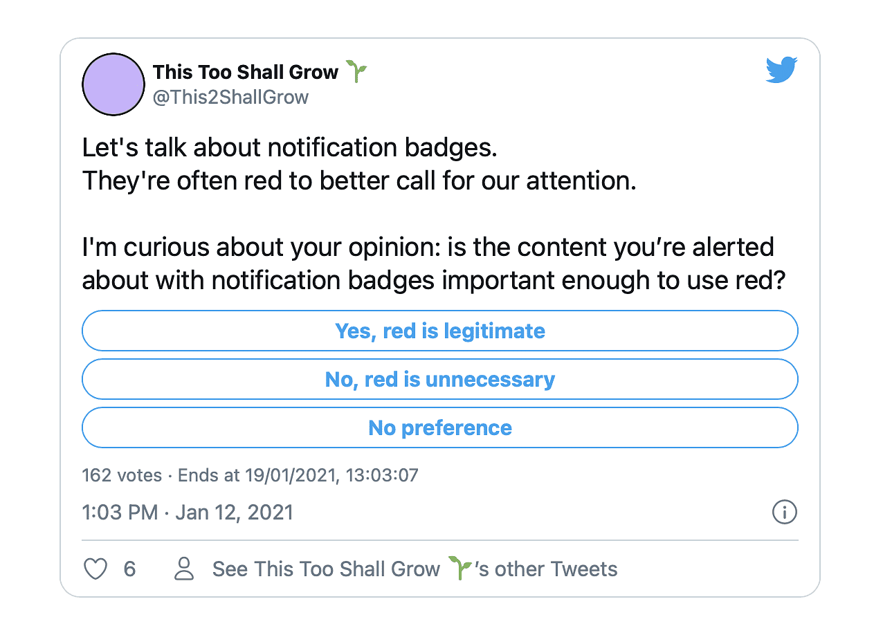
What’s with the red?
There’s also the issue of the colour. Many notification badges are red by default. Red is the colour that stands out the most in our daily life. Whether in a city, in nature, or at home, this hue contrasts the best against any background. As a result, red is also consistently used to alert us of important signals, including in the physical world. By important, I mean “that which could have strongly negative consequences if we miss them”. The stop sign, the red light, the no-crossing light, the stove, the train’s emergency window breaker, the car dashboard’s red lights, and more, use red as a signifier.
So not only is red more striking, but we’re also conditioned to be particularly attentive to red signals. Now, I ask you: is the content you’re alerted about with notification badges important enough to use red? I’m curious where your mind is at. I created a poll on Twitter, and you can vote below or over there.
Let’s talk about notification badges.
They’re often red to better call for our attention.I’m curious about your opinion: is the content you’re alerted about with notification badges important enough to use red?
— This Too Shall Grow 🌱 (@This2ShallGrow) January 12, 2021
Cognitive overload
The quantity of information we consume today, along with multi-tasking, contributes to cognitive overload. We’re constantly being summoned: we switch between tasks and different platforms without dedicating appropriate levels of attention to each. In the example I mentioned above, you 1) open twitter.com, but before completing the “send message to friend” task, you 2) are prompted by the notification badge. So you 3) open the notifications panel, switching to a “read notifications” task. Some of them require a reaction from you, where you 4) switch to “post reply” or “like tweet”. Once you’re done going through this list, you 5) can finally return to your original messaging task.
“I have strong willpower, I would stick to the original task without checking my notifications”, you say? That’s great! Though as we’ve seen above, the niggling awareness of new information waiting for you is enough to impede your focus.

Meaninglessness & anti-notifications
There is no way to separate the useful or the relevant from the noise. Take emails: a promotional newsletter from The Fork, or the LinkedIn announcement that someone you don’t know started a new job, are given the same importance as an email from your client saying they accepted your budget. Gmail tabs and inbox filters can help with that, but most email providers don’t have that kind of feature enabled by default. John Herrman, tech and media reporter, has eloquently written about this topic:
“I’ve met dots that existed only to inform me of the existence of other dots, new dots, dots with almost no meaning at all; a dot on my Instagram app led me to another dot within it, which informed me that something had happened on Facebook: Someone I barely know had posted for the first time in a while.”
“The same badge might lead to word that Grandma’s in the hospital or that, according to a prerecorded voice, the home-security system you don’t own is in urgent need of attention or that, for the 51st time today, someone has posted in the group chat. New and flourishing modes of socialization amount, in the most abstract terms, to the creation and reduction of dots, and the experience of their attendant joys and anxieties.”
Here are some examples of irrelevant notifications:
- Other people – whom I don’t know – commented on a post I’ve commented on
- A post is trending on a certain hashtag, and I could comment on it to benefit from the hype
- A page I follow has shared a post

Those are what Adrian Zumbrunnen calls “anti-notifications”: notifications that aren’t about you or meant for you, but are instead about others. None of the screenshots above concern me, yet LinkedIn decided on my behalf that having them in my feed wasn’t enough, but that I should also be notified of them.
How are mindful notifications helpful?
What are mindful notifications? Here’s my attempt at constructing a definition.
“Notifications are mindful when their mental cost and attention required are suitable to the information communicated to a given user. It enables them instead of hindering them. As much as possible, it’s signalling instead of interrupting.”
I asked people in the Ness Labs community to tell me about their relationship with notifications. Here’s what they shared:
“I’ve turned most notifications off, entirely, especially sounds but also quite a few badges. This has increased my productivity and my equanimity. I find myself no less informed as a result. I am experimenting with widgets on my iPhone to surface the information I want convenient access to” – Manley
I also found Karin’s approach interesting. She has a feature phone for personal use, and a smartphone for her professional life only. On her smartphone, everything is off by default – including badges and sound – and she only allows a few selected apps to notify her. This mindset of starting with a clean slate and only turning on the relevant alerts helps ensure that she makes her digital life work for her, and not the other way around.
Another member mentioned she has no social media, and that she keeps her phone free from work emails and news apps. She can still log in to her personal emails and calendar if needed, but she purposefully added friction to make it a difficult and deliberate act.
Designing mindful notifications
Managing the level of attention
Dear designer, what’s it going to be? A mobile and/or desktop push notification? An email? An SMS? An in-app notification only? A blinking LED? A sound? A badge? A vibration? And chances are… a blend of those?
Designers have a range of signifiers they can use and potentially combine, to adapt to the appropriate level of attention required. Does it require users’ full attention, right away? Does it just need to be available for users when they want to retrieve that information? What’s the worst case scenario if users miss the notification?
To be mindful of users’ attention, here’s what factors in:
- The urgency. “In 10 min: call with x person” lets you know that it’s time to finish your current task, take a short break, and pour yourself another tea before your meeting.
- The importance. “You have 2 months to fill in your income tax papers” isn’t urgent, but you certainly don’t want to miss that task. Thus, this information might not require a push notification, but it needs to stand out.
- The context. “Here’s your QR code ticket for train 1234, carriage 5, seat 6” is a very relevant push notification to receive 1 hour before your train departs. Chances are you’re already on your way to the station. With this alert, you don’t have to search through your emails for your ticket: it’s contextually-relevant. Again, it works for you.
Those factors aren’t mutually exclusive. A security update on your software is both urgent and important. Choosing the right level of interruptions applies to human contact as well, so designers can and should apply that consideration to their work.
Giving users control
While having good defaults matters, the relevance of a given notification can vary for different people. Thus, another essential element is to enable users to personalise the following aspects:
- What they’re notified about: likes, mentions, messages, company communications, etc.

- How it’s delivered: email, push notification, SMS, a mix of those, etc.

- When it’s delivered: bit by bit, bundled, how frequently, etc.

When it comes to user control, designers should also allow us to mute – temporarily or forever – certain notifications. Here’s how Twitter’s site and Telegram’s desktop app do it:

It’s even more relevant if, in addition to the settings, it can be done directly in the notifications list, as on LinkedIn:

Most Operating Systems also offer a highly customisable “Do not disturb” feature, as seen here on OxygenOS:

Learning from hindsight
In order to limit unexpected consequences and detrimental features, mindful designers should take second-order thinking into account, and carry out thorough UX research with a varied pool of users to challenge their assumptions. Take the example of the Apple Watch:
“The Apple Watch was initially conceived as a way to keep you off your phone, offering clever filters and even adaptive vibrations to help differentiate between notifications you care about and those you don’t. Instead, the Watch turned your wrist into yet another buzzable surface, this one even harder to ignore.”
To help anticipate the future, here are some tools that are useful for ethical design in general, including notifications:
- Ethics for Designers – the Toolkit has interesting worksheets such as the Moral Value Map and the Ethical Contract
- The Tarot Cards of Tech that I’ve shared in a recent newsletter, asks ethical questions, including “How does your product encourage users to engage, and how does it make it easy to disconnect?” and “In what situations might it be inappropriate or distracting to use your product?”
- Ethics Litmus Test is a physical product: a set of cards to assess what you’re working on. They’re currently sold out, but the PDF is available for free. Some examples: “Is this important or urgent?”, “Are the incentives helping or harming?”, and “What if this happened IRL instead of on a computer?”.
I’m particularly fond of that very last question. We tend to disregard those annoying interactions because they happen between “tech” and us, without fully acknowledging that “tech” in and of itself isn’t creating them. “Tech” is not a sentient being, it doesn’t make the decision to send us those distractions – humans do. With that in mind, as both designers and end-users, we ought to ponder whether we would allow the same behaviour coming straight from a person, rather than via the intermediaries that are our devices.
If someone tried to talk to you every week for a year and you just never listened or even looked at them, and they kept going, how long would you let them? So why are you letting newsletters do it?
If someone came to tap on your shoulder a few times per week to let you know that their store had 20% off, and you were never interested to begin with, how long would you let them? So why are you letting push notifications do it?
If it’s intrusive and works for someone else’s agenda only, it might be best to disable it.
“Allowing an app to send you push notifications is like allowing a store clerk to grab you by the ear and drag you into their store.” – David Pierce
—
Shit’s broken. Notifications today impede our focus, get in the way of our plans, cause cognitive overload, and are too often devoid of meaning. Their default settings don’t usually serve us, so much so that we tweak them to reduce their number, frequency, or even completely shut them down.
Designers, developers, and makers have responsibility and a role to play in crafting mindful UX: weighing the pros and cons of each notification, evaluating its relevance, giving power to the users, and trying to mitigate unintended consequences.
Let’s get to work. ✌️
—
If you enjoyed this article, you can subscribe to my newsletter below: