Mindful UX protects users’ mental health, privacy, and mental state. It’s inclusive and accessible. It aims to prevent harm and to help recover from it.
Managing the level of interruptions
A product has various ways to communicate information. Visual and auditive senses are the most commonly used. Digital items sometimes use touch, for instance with haptic feedback. Some notifications require your attention immediately, for instance if your cooking timer goes off and you don’t want to burn your shakshuka. Some are neither urgent nor important. Yes, airline company newsletter, I’m looking at you, especially at the moment. Finally, some don’t have any fixed level of urgency or importance: you will adapt them to your contextual needs. My phone is always in silent mode, but I’ll activate the ringtone if I’m expecting an important call.
We can admire Slack’s fantastic workflow for notifications. (Source)

In real life, how do you decide on the way you’re communicating news with someone? It can depend on:
- Your interlocutor (professional relation, family, long lost friend)
- The number of interlocutors
- The nature of the news (sensitive or not)
- The urgency
- The importance: paying your taxes might not be urgent if the deadline is 2 months from now, but it is important as you certainly don’t want to miss it
Based on all of that, are you going to call, email, text, video call, send a Twitter DM, leave a post-it note? Are you going to send reminders?
Limiting distractions, protecting your attention
We all know about this, you don’t need me to spell it out: everyone is competing for our attention. You might have already taken measures to limit distractions: your phone might be in silent mode, you might even disable some notifications, block ads, disable autoplay, etc. Android and iOS even carry native features to help us protect our attention.
Apart from the digital measures I’ve just mentioned, there’s another way you can mitigate distractions. If you share your physical workspace with others – like I am doing in our current lockdown – you can signal when you’re available to be interrupted and when you’re not. Leave a sign on your door, place an object on your desk, etc.
There are even different levels for that:
- Available
- Only disturb if urgent
- Do not disturb under any circumstances
Paying attention to accessibility
An accessible product is a product that’s usable by everyone. The quintessence of inaccessible design is Terms & Conditions. Never-ending walls of text with little to no page layout, all written in legalese. For those of you who don’t know, “legalese” represents legal lingo that’s completely closed off to the uninitiated.
An easy way to be more mindful of accessibility in your daily life is to adapt your communication. If you want to use jargon with people who might not be familiar with it, explain what it means – just like I did above with “legalese”. In a group discussion, give background and context so that everyone has the same level of information and everyone can follow. When writing up a document, highlight the key information to make it easily scannable.
Removing visual clutter
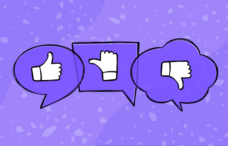
We are well aware that visual overstimulation is detrimental to us. I even asked people on Twitter about it, and the results are telling.

Whether it’s in your room or at your desk, trimming down the visual clutter allows, by contrast, to shine more light on what’s important, on the few things that you decide to leave in sight. Not only does that make it easier for you to find something you’re looking for, but it’s also nicer and less stressful on the eyes because you have less visual stimuli.
The same applies to your digital places. Leaving white space and room to breathe is beneficial and so much more relaxing. Here’s what my phone and laptop screens look like: much better than having files and apps filling up space.

Avoiding cognitive overload
Cognitive load refers to the mental effort we have to make to use a product, achieve a task, etc. We’ve all known someone who had the bad habit of starting Matryoshka sentences – or Russian dolls sentences if you prefer. “I had a call with Tamara, because we have a group chat with Marie, and by the way did you know Marie and Tamara had never met? Because last time we met with Awa and had delicious ice cream, I can give you the address, and it was such a sunny day” and this sentence alone tackled 6 different topics. Yes, some people talk like that, and it exhausts me because I can’t follow.
Some strategies to make it easier:
Chunking
Do you write phone numbers as 0123456789 or 01.23.45.67.89? Splitting your content in smaller chunks makes it easier to both scan and memorise.
Reducing the number of options
You don’t have to go all the way and reduce your wardrobe to 15 items, but… I suppose that’s the spirit? In UX, this is known as Hick’s law. Choosing what to have between 10 options will take longer than between 3 options. That won’t stop me from having 10 different teas at home though. 😌 This isn’t something to apply religiously, just to be aware of and to use whenever relevant.
Recognition rather than recall
Yet another interesting UX principle for your daily life. Recognition leaves cues (e.g. “Are mint & lime in a mojito?”), whereas recall doesn’t (“What are the main ingredients in a mojito?“). The end goal of these questions is the same, but the former is easier to answer: you just have to recognise whether the information given to you is accurate.
You can then make your environment work for you. I leave my keys in the lock, so that I’m naturally prompted to take them with me as I go out, I don’t need to remember it. If I want to wear something specific the next day, I’ll take it out of the wardrobe and leave it in plain sight. If I need to eat something soon, as it expires the next day, I’ll place it on the kitchen counter.
Choosing between streaks or flexible goals
Several products use streaks to entice you into practising something daily. Headspace does it for meditation, GitHub does it with your code commits. Streaks can be useful, but they shouldn’t be a default goal for any habit you want to learn. Aiming to be flexible, and to complete a task 3 or 5 times per week, is much more realistic than sticking to it everyday, especially if you’re just getting started. Streaks create pressure to perform everyday, while more manageable goals leave room for contingencies.
Additionally, since you’re more likely to complete flexible goals, you can observe your own progress, which encourages you to keep going. Finally, it’s important to differentiate whether your completion of a task comes from pressure or from desire. Daily streaks are more likely to be completed from internal coercion, and malleable goals from desire, because if you don’t feel like doing it on Monday, it’s no big deal. Listen to yourself, listen to what you feel like doing in the moment, and adapt.
This story was originally published here.