Finding a balance between visual flair and effective communication
Amid all controversy surrounding Cyberpunk 2077, I also have my share of issues with the game. Not only did my physical copy arrive late, because of COVID-19’s impact on postal services, but I also had all the well-documented issues playing the game on PS4. When I finally got my hands on it, I had fun and time flew by while playing. The world is so detailed and enjoyable; it’s impossible not to lose yourself in it.
Despite the fun I had, I did notice some UX issues throughout. The menu navigation could be improved. The imperfect organization of information also impacts some tasks that players need to perform inside the menu —taking time to understand the connections between elements and taking time getting there, etc. Some stuff is excellent, such as giving you a heads up if you have new items available (a “new” badge inside the item card); the number of cards and information is so dense that these small tips are beneficial. Still, it has some bugs, and currently, I’m even having issues just opening the menu.
I thought about making a full UX review of both the HUD, the menu, and other elements (like the map), but it does not make sense to review something that I can’t fully experience. So I will focus my review on an overview of the HUD, which has a lot of stuff to be discussed, and I did not notice any major bug that could impact the UX’S analysis of its default version.
Cyberpunk 2077 in a nutshell
Cyberpunk 2077 is an action RPG developed and published by CD Projekt Red. Playing on the first-person perspective as V, a mercenary, the players get to explore Night City — an open world from the Cyberpunk universe.
V, the main playable character, is entirely customizable. It’s possible throughout the game to develop skills of different sorts (from use of blades to engineering), fight close up with melee weapons or without them, have ranged combat with smart weapons, or use your cyberware to have a bit of advantage in combat while using an immense amount of weapons, armor/clothes, items, etc… that help you survive in Night City.
The open-world city is divided into six regions, each with its environment and feel. In common, they have the violence (like from gangs or corporations) and the heavy dominance of robotics in everyday life. The city is full of diverse types of NPCs, commercials, music, consumables, mini-games, and other amazing details that give life to Night City.
Play conditions
I think it’s important to understand my context. I usually play in a comfortable armchair in front of my 37″ TV, two meters or less away from it. I play on a PS4, with headphones. So far I’ve played only 20 hours of the game, and this review is from that time frame (after Hotfix 1.06) and some issues raised by friends who are also playing the game (thanks for the screenshots!).
Cyberpunk 2077’s HUD (heads-up display)
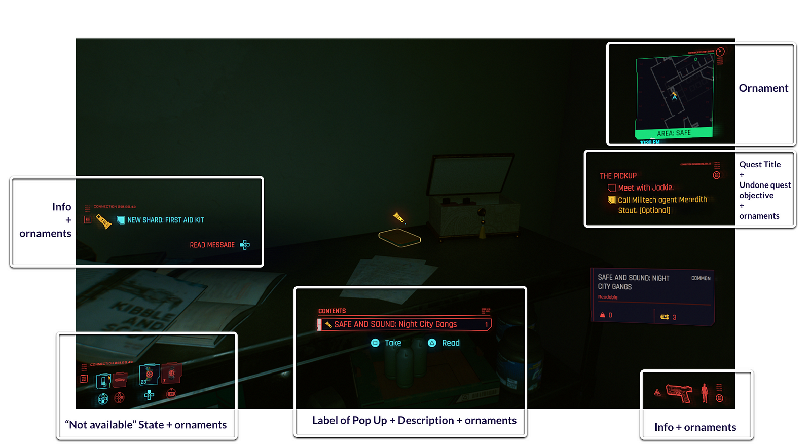
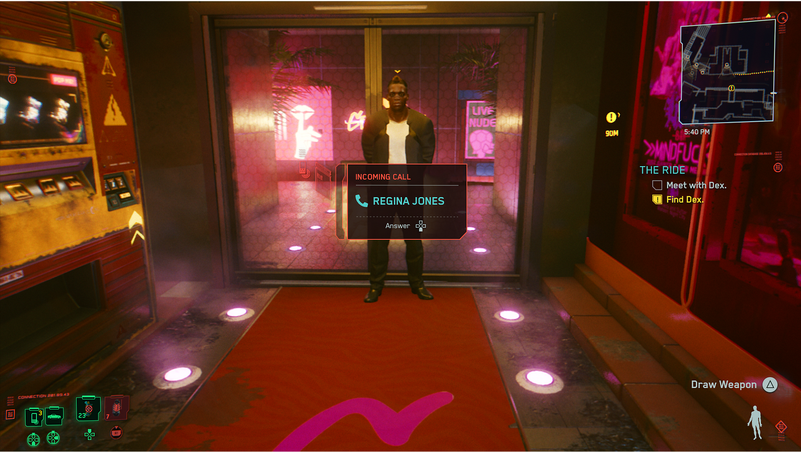
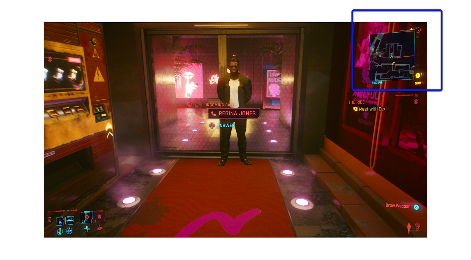
Cyberpunk 2077’s HUD is divided into 4 main fixed areas when you are not engaged in combat:
- Top Right: Minimap centred on the character’s current location (with active quest path and world information on map) and the world’s current time
- Center Right: Active quest and its objectives with info about the state
- Bottom Right: Immediate character instructions. Current gun (available ammo and max ammo), character’s body position (standing or crouching), and available actions with instructions
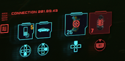
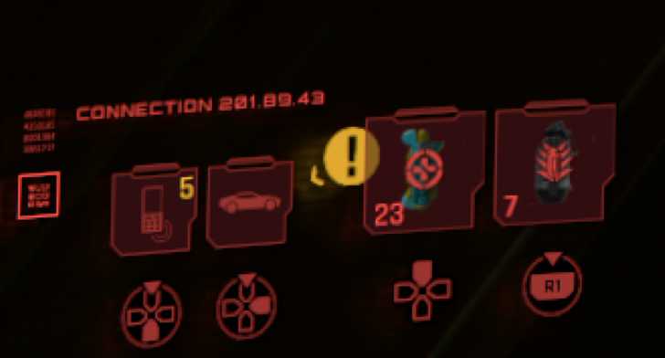
- Bottom left: Available equipment (phone and car, with an indication if you have received messages on the phone and the amount) and available items
Not fixed on the screen: the floating navigation icon that indicates the direction of the current quest’s objective.

This HUD has the same primary structure as The Witcher 3, with the main changes coming in terms of the visual style, and the navigation icon from The Witcher 3 moved only on the Minimap’s borders, not on the entire screen.
When the player draws a weapon the HUD, a new fixed area appears with character stats (health, level, XP) and ammo slots on the top left of the screen. In combat, an icon with your current character status will appear on the right end of the health bar indicating status effects like bleeding, hydration, and so on.

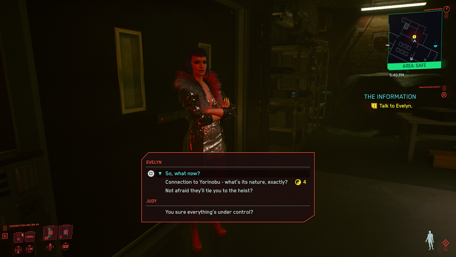
If the player engages in combat (or other action that demands extra effort like diving or encumbered by weight) a stamina bar appears, fixed on the middle of the screen, and the Minimap borders turn red with info “Combat” (and in cases “Area: Hostile” or by opposite in green “Area: Safe”). The enemies also come equipped with their own UX elements: health, info about combat status (if they are engaged, alert, not alert, etc.), and if you tagged them.
The HUD adapts itself to the character’s current need not to fill the screen with too much unnecessary information. The in combat, out of combat with a drawn weapon and out of combat with no drawn weapon differences are a good example of that adaptation.
It’s possible to see that adaptation every time the character’s action demands different info or more/less info to be shown. When you drive a car you see the car speed but not your body position, or when you braindance you only see the quest information and specific braindance features info.
Positive notes
The updated HUD is, of course, an important positive. Along with this positive point, I would also like to note:
- The Equipment+Items area has a simple and straightforward color code: blue if available, red if not available.
The color code is recognizable and does not require learning. The game even starts with everything red and has you get to stuff- it turns blue, so even if you are not aware of the cultural meaning, you are taught at the beginning of the game.
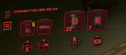
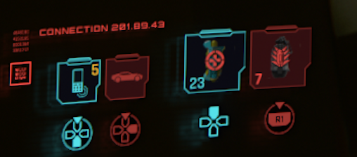
- Info about the amount of each item and max possible, if there is a limit.
It’s always important to keep the players informed of the currently available option and how many times can be used. This info (that is updated as the player uses the items, guns, equipment) is important for the player to make decisions without going to the menu — it accelerates the game’s pace. In this case, since the amount of info can be overwhelming, and anything can happen while exploring the city, being always ready is a good way to go.
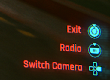
- Info about the controller button/action needed to perform a character’s action.
Like on the previous topic, it’s essential to keep in mind that the character can perform an overwhelming number of actions. It’s possible that the player can remember how to perform all actions at some point of the game, but an always present memory aid can accelerate the reaction time if something is forgotten. It can get frustrating to look for instructions on a menu, and oh boy, the Cyberpunk 2077 menu has a lot of info.


- It’s possible to hide any area of the HUD.
On the menu, it is possible to hide any area of the HUD. This option lets players choose how they want to approach the game and adapt the HUD to their style and needs.
What would I change on the HUD and how?
1. Rethink color code
If you look at the HUD at the beginning, the first impact is clear: too much red. These over the top use is prejudicial to the game’s flow if you notice that comes a more significant issue: there is no color code by types of info or feedback on HUD. The default color in most of the game is red, and it’s used as an ornamental color, to give a description, to give feedback when something is not possible to be performed. The same rule applies when you change the HUD color (or the game changes), but I will focus on the red HUD — the main one.
The blue is used when an item or equipment is available, to count ammo, and on the Minimap when you can are not in combat — you think blue is when the character can do something, has freedom or items/ammo available. But it’s also used on texts inside pop-ups, even the “error” ones, and on the icon that describes the immediately available action… but the description of the action is red — confusing, can I do it? There is some limitation to perform this action?


I would say that probably the goal was to reduce to a minimum of colors available (to red, blue, and a bit of yellow) by creating a unique visual style related to the story. Being immersed in the story and playing with color to do it is exceptionally positive and rewarding for players, enhancing the experience — but not when you mess the color code. It loses meaning and confuses players.
The use of colors lacks consistency, and the usage of color should come with an awareness of how these colors are used in the real world. A color like red with such a significant cultural print on most players should be used more cautiously. Red usually means an error, a stop or a malfunction. Not description and info. The same applies to yellow and green.
Why does it need a change?
- No consistency inside the HUD’s colors decrease learnability
- No color code demands memorization of the different meanings of the same color
- Creates confusion between the world/cultural meaning and the different game meanings of the color
- Can cause frustration because the immediate reading of the color is the one the player already knows from the real world
What would I do?
Completely rethink color code and introduce new colors to the HUD while keeping the ornaments with the “story” color and adding a bit of that color to the black (when used, like on the background of pop-ups). So we can try a balance between usability, interaction, and color storytelling.
The blue saying “available” and by contrast, red “not available” makes sense and I even point it out as something positive. But to rethink the colors, I would change this code.
Red and green to convey positive or negative state:
Red — Not available, error, danger on numbers, icons and cards (texts if a pop up) +ornaments.
Green — Available, success, free to go on numbers, icons and cards (texts if a pop up).
Yellow to navigation and secondary info related to the state:
Yellow — Navigation + Warning on numbers, icons, and text.
Blue and grey do give info:
Blue — Current quest related text (titles) and icons + important info.
Grey — Secondary descriptions (text) + secondary info. Also used on minimap and time since they can change color to convey state.

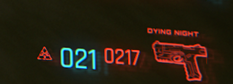
2. HUD’s extra graphic elements that are just ornaments only with unreadable characters
Additional visual elements on the HUD as ornaments can be fun and create more immersion, but only if they don’t interfere with the HUD functions. Some people told me that sometimes they were trying to read those elements, thinking they were giving extra info, only to find out they were there just as an ornament — despite being impacted by the character’s current cyberware.

Having readable words and numbers that equal the real world was interpreted as extra info that the player needed. That did not happen when it’s not a recognizable word or number.
Why does it need a change?
- Frustration, when the players try to read and interpret something, is just an ornament
- Should keep the focus on the essential elements — do not distract players with unnecessary info. It’s the same logic when the HUD adapts to the situation
What would I do?
Keep the ornaments but only with unrecognisable visuals elements that are not an active part of the HUD like bar codes and unrecognisable chars. Since they change depending on the cyberware, it would be cool to see some animation on the ornaments after the change, maintaining the HUD concept as a “product” used by the character.
3. Change character’s navigation icon limits
The icon moves on the screen depending on the direction but sometimes overlaps other HUD elements and gets lost on the screen. I do like the icon available and not fixed on the screen, helping the player navigate but not in the way is currently done since it can get lost on the screen.

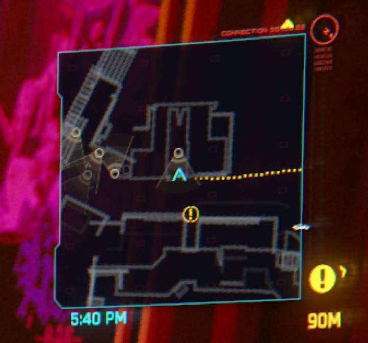
Another info about the character’s navigation that I would change is the dotted path on the Minimap. It gives players the optimal path to the currently selected quest.
Why does it need a change?
- Frustration when the icon is lost on the screen, especially when time is involved or when you are performing other distracting action
- The path giving an optimal path (on Minimap) goes against a big part of the game that it’s the exploration of the Night City
- Confusion when the icon overlaps other HUD elements
What would I do?
- Keep the icon floating on the screen telling you which direction to go but without overlapping the HUD areas;
- By default, the optimal path on the Minimap would only appear on main story missions or when driving a car. On settings players could choose to:
— Always use it
— Use when driving a car
— Use only on the main story’s quests
— Both previous options
— Not to use it
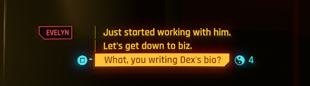
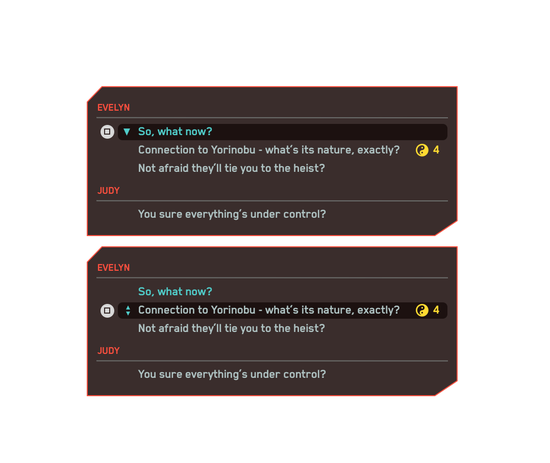
4. Rethink dialogue feature area
Colors on dialogue feature are extra bright and have high contrast( hard to read — harder with timer). The 5 dialogue elements (person, action button, text, result, and timer) are visually distinct and not grouped as a feature (hard to read-timer).

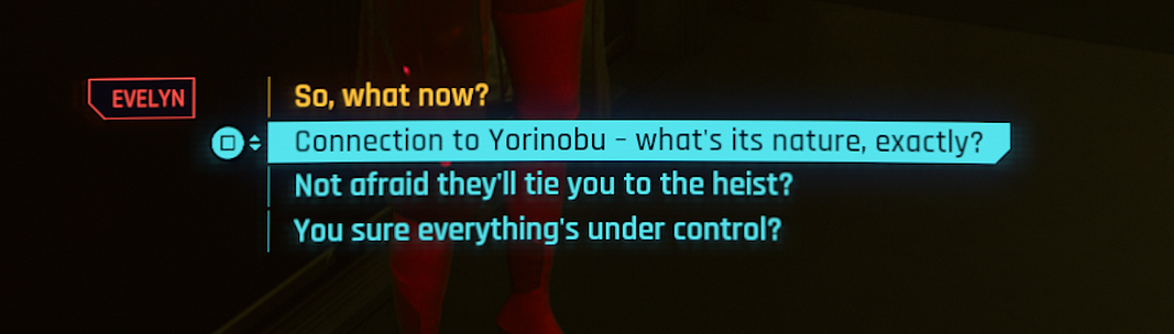
There is also a big issue with this feature — sometimes the button to select a dialogue is needed to perform a character’s action. The world’s time does not stop with the dialogue feature, and sometimes you need to perform something (or avoid it) while on dialogue.
Why does it need a change?
- Aggroup by color and shape the color dialogue, so it’s quicker to read and more comfortable to choose
- Not being aggrouped creates an extra mental effort to connect the pieces when it’s not necessary
- The feature is essential to the game, and it should have more efficient usage
What would I do?
Keep all dialogue info inside a pop-up that groups the different elements and has contrasted with the background, subtitles, and the rest of the HUD.
Also, inside the pop-up, the different people you can talk to are grouped with their respective possible dialogue + action button + text + result.

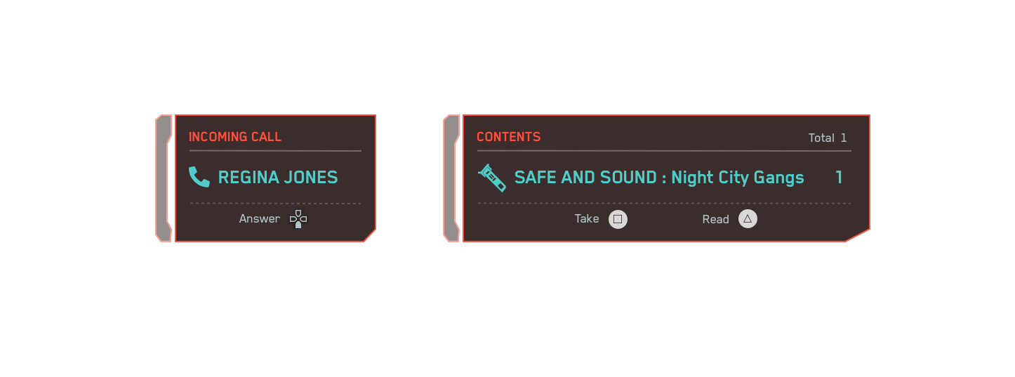
5. Group pop up info on the middle of the screen
The different features that appear in the middle of the screen suffer from the same issue as the dialogue feature.
Why does it need a change?
- Aggroup by color and shape, so it’s quicker to read and more comfortable to choose
- Not being aggrouped creates an extra mental effort to connect the pieces when it’s not necessary
- It’s easier to reproduce and adapt to different info
What would I do?
I would create a pop up with the same basic structure for all of them, but different from the dialogue since they are usually not as impactful for the game as the dialogue feature. The dialogue decision making is mostly based on interpretation and selection of text (=response) as the other pop-ups require an action selection.
You can see bellow a redesign I did to reutilize the pop up on different possibilities (check image 10 to see in context). They are consistent but different from the dialogue feature giving the dialogue the independent visual construction it requires.
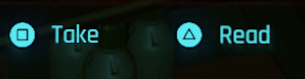
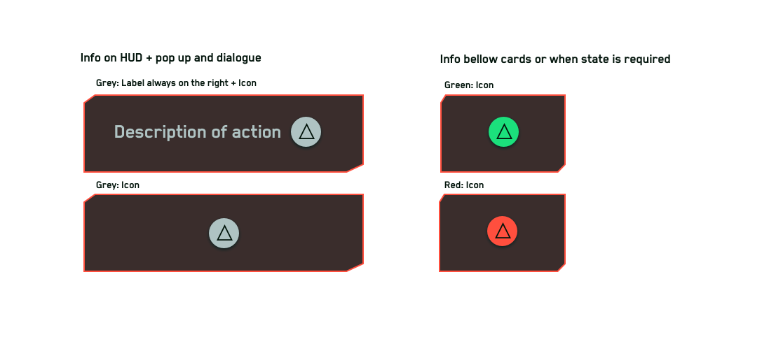
6. Consistent standard for action button info components
I’ve talked about this issue on point 1 about the color, but its UI component needs to be more consistent.
If you look at image 8 you can have two types of action button info: with or without a label but the game has 5 different variations of this component.
Why does it need a change?
- Exactly the same points as issues 4 and 5.
What would I do?
Reduce the different variations to two: one without a label and the other with a label. I would argue that the label should be on the right and the icon on the left — it’s easier to read what we want first to make a decision, instead of seeing the action first and then read. It requires more time to scan.
If the info is connected to a component that has a state (and a color code associated), follows the color code; if it’s just info on the screen, grey.
Other issues found
- Actions that require the use of the same action button at some points of the game.
- Subtitles too bright and with colors so different that don’t look grouped
- Hard to select items in the game environment
Final thoughts
I enjoy how feedback is continuously given to players on Cyberpunk 2077’s HUD and how the HUD adapts to the player’s tasks: exploring, driving, combat, braindance, etc. All the info you need at the moment it’s there by default.
But there are some serious UX issues like the ones I discuss in this article. The major one for me is the lack of consistency between not only UI components but actions available. It’s confusing and a bit frustrating. On a positive note, just fixing the UI components’ consistency problems would decrease confusion when reading the HUD and making decisions.
It felt like some solutions were still more focused on the visual appeal than on the usability and player’s experience. I ultimately believe you can find a solution in between.